It's Getting Gold in Here

Since Karly's gone, I thought I would do my best to gold up this hizzy in her honor. Goldeness may be next to Godliness because it's all about surface, so it only take a cheapo can of spray paint to turn even the most ordinary object into something that looks expensive and klassy. If the recession depression is getting you down, hustle out and spend $5 to give something the Midas touch. You know it's going to make you feel better. I'm here to help you pull the paint trigger with some scintillating finds that are designed to bring the bling back into your life.
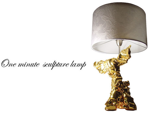
marcel wanders

Zany Dutchman Marcel Wanders contradicts the age old aphorism that, "You can't polish a turd." Well, apparently you can!

richard powers

Richard Powers

Boyfriend's big black speakers getting you down? Surely he wouldn't mind a bit if you got after those nasty cases with some super shiny lussssster. Tip: wait until he goes out on a late night bar crawl to transform his AV equipment. Men can get a little touchy about their electronics, so best to let him booze it up a little. High Five sure to follow!
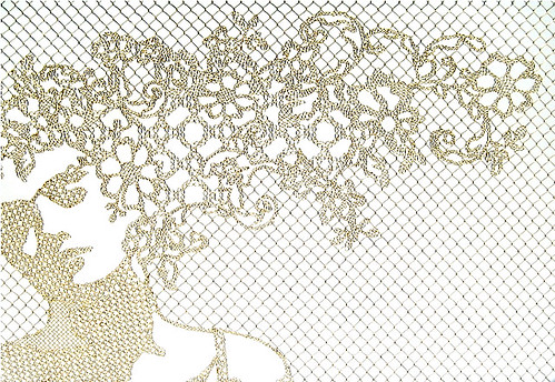
demarkersvan

Once your golden piece de resistance is finis, you may want to protect it from his angry adoring clutches with a fabulous fence. Demakersvan makes gorgeously crocheted fences out of plastic coated wire in a variety of designs, including this golden girl.
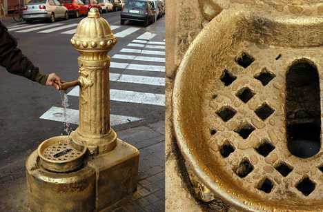
gold guerrila art

While you've got the paint out, why not take a cue from these guerrilla artists and put gold back on the streets. Oh, and please start at Wall Street...
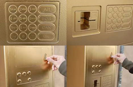
gold atm

Because we surely need some gold back in our banks! This gold painted ATM is probably worth more than the "money" inside it.
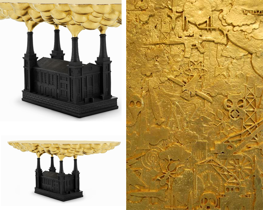
studio job

Speaking of gluttony and financial ruin, Studio Job has got those bank bitches' number with their piece, Robber Baron. Holy crackatoly, do you see the tiny guns, atomic stars, airplanes, and other symbols of technology gone horribly awry? I desperately need this as a coffee table. Since this piece costs more than a bank (which isn't that hard these days), I'll be busy trying to figure out how I'm going to make this myself.
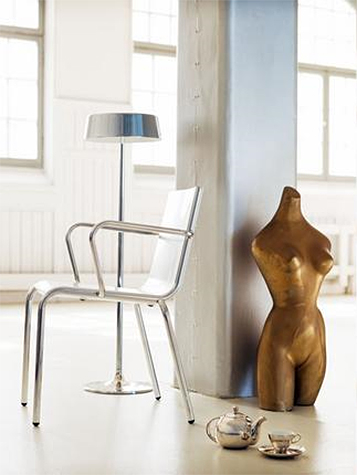
per ranung

Per Ranung

While I try to reinvent the wheel, I think anyone could handle this as an at home project: whip out the paint can to emphasize va-va-volume in sculptures. Glossy surfaces always look rounder than matte ones. Let the model instruct you on how best to apply this rule to your fashion decisions.

rebecca duke

If you accidentally get some paint on the floor, don't worry! Just go ahead and spread it everywhere. If Dolce and Gabbana can have a solid gold bedroom, so can you.
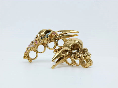
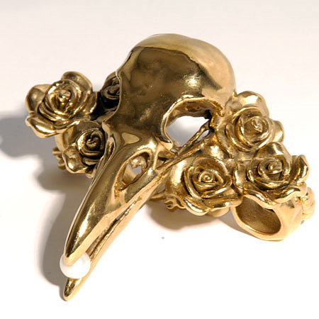
gisele ganne

gisele ganne

Perhaps you'd prefer something more precious and smaller in scale, like these rings from jewelry designer Gisele Ganne's Divorce series. Just slip on these gold knuckles and leave a lasting impression on your significant ex's face.
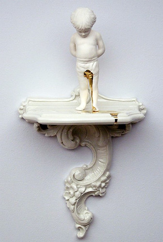
ricochet designs

I also love that Ricochet Studio isn't afraid to take a golden shower. I really covet Accident for my little boy's nursery because -- as the designers themselves acknowledge -- it happens.
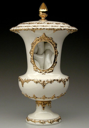
ricochet designs

Ricochet makes all kinds of oddly twisted ceramics with a golden flourish, like this Urn with an intestinal interior. Love these guys. Found via Sara Says Awesome's quirky blog.

For fine details like those on the Ricochet pieces, may I recommend you dispense with the spray paint and switch to Rub 'N' Buff, the most amazing product in the universe. No, I do not get paid to advertise their wares, but I should (wink) because I have covered everything from frames and knobs to thrift store junque to all manner of TJ Maxx and Ross' craptacular "goods" with the Buffer. You will be amazed at how much a tiny tube will cover.

Like, I'm pretty sure the artist responsible for this travesty could have saved himself a whole lot of money:

gold kate moss

Yes, Mark Quinn's solid gold Kate Moss statue has an estimated worth of $10 million pounds. It probably would have cost less to buy Miss Moss herself and coat her and her naughty bits in Rub 'N' Buff. After all, odds are that it would only take one tube to do the whole job.

I think that I shall never see a home as lovely as a tree

swissfamilydisney

Swiss Family Robinson attraction at Disney World

Hi ya Design Crisis fans!  I'm Raina and I'll be filling in for Karly today while she's drunkenly heckling Pottery Barn shoppers on vacation.  My days are spent chasing my two-year-old daughter around and writing a couple of little interior design blogs, "If The Lamp Shade Fits" and "The Daily Bed."  I've worked in design and retail since my teen years and previously owned an interiors shop and a clothing boutique for nearly a decade.  Enough about me, let's get to today's topic...

Who doesn't love a tree house?  Given the worldwide economic bloodletting and skyrocketing home foreclosure rate, les cabanes dans un arbre (it's sexier in French) may soon become the shelter of choice if not necessity.  Let's take a tour through some superlative examples of the genre.

Stockholm-based architects Tham + Videgard Hansson Arkitekter have designed a hotel with individual rooms to be suspended in trees and accessed by rope ladders and bridges.

treehousehotel1

The suites will be clad in mirrored glass so as to give the structures a Harry Potter-esque cloak of invisibility.

treehousehotelplan

Each unit will sleep two people and include a living room, double bed, small kitchen, bathroom and roof terrace.  The hotel is due to start construction in 2010.

Continuing with the box-in-a-tree theme, Canadian architects StudioLukaszkos designed this award-winning 410-square-foot lakeside project called "4treehouse."  The first floor contains a sheltered bedroom with the two upper floors open to the elements.

4treehouse

British builder Amazon Tree Houses creates "inspirational bespoke retreats for inspired locations."  Budgets for these more traditional fairy tale tree houses start at $7500 and head upwards of $150,000 (and beyond).

amazontreehouses1

amazontreehouses2

Lest you think tree houses can only be built in mighty oaks, I give you the "Palm-Fiction" designed by German builder BaumRaum.

palmtreehouse

BaumRaum (translation "tree room") combines "the creative and constructive expertise of an architect with the long-standing experience of a landscape architect, a tree expert, and established, reputable craftsmen."  Working internationally, the design firm specializes in modern shapes and luxe interiors.

baumraum1

baumraum2

As part of a recent marketing campaign for the New Zealand Yellow Pages, a tree house restaurant was built in a giant redwood (all suppliers to the project were Yellow Pages advertisers).  The restaurant, located north of Auckland on a privately-owned redwood plantation, was a limited-run engagement open from January 9th to February 9th. The structure, now available for private parties, seats 18 people on split levels with service provided from a kitchen located on the ground.

yellowrestnz

If you prefer to live out your tree house dreams in the safety and warmth of your own home, you may want to think about one of these fantasy beds.

appletreebed

"Under the Apple Tree" canopy bed from Attila Design.

lovellbed

"Tree Bed" from Shawn Lovell Metalworks.

treehousebunkbed

"Tree House" loft bed from VIP Kids.

For further inspiration, check out the tree house porn coffee table book "Treehouse Living: 50 Innovative Designs."

treehousebook1

See thee in the canopy!

Control: I Like to Have a Lot

Ok, I'll admit it. I'm something of a control freak. It might be due to years of photographic training -- the need to frame, level, expose, repeat, as perfectly as possible every time -- but I suspect it was that very aspect of my personality which drew me to photography in the first place. These days I find myself constantly rearranging my home as if prepping for an imminent photo shoot: Karate chop pillows, adjust accessories, and shift the console table over two point five inches so it's lined up squarely behind the couch. Of course, if I stand over there it's not centered anymore, and then I find myself cursing the dogged pursuit of perfection, and wondering how to resolve this urgent (!!!) crisis. I could blame it on interior design. When looking at the perfectly styled, immutable compositions of interior photographers, it's hard to remember that rooms only look like that from one particular perspective, for that particular instant in time.

Exhibit A:

kelly wearstler

Everyone's favorite design diva Kelly Wearstler is a stickler for symmetry. Even the chair legs rest at the same places on the carpet (don't think for one second I haven't tried the same tactics on my own rugs). But in real life, the chairs are probably caterwonky, the cocktail tables may be shifted, while seated you can't see the mirrored ceiling, and generally the whole room dissolves into chaos. But you can't blame the girl for trying to control the room, or the photographer for trying to control the perspective of the setting.

kenneth josephson

That's what photographers do. We live in a 3D world, but a photograph is a 2D representation of that world. Back in the 70s, Kenneth Josephson proved that point most humorously with this ship that could just as easily have sailed over someone's head, or perched atop a building, or -- if flipped to the other side -- existed as nothing but a blank square.

Not that sculptors haven't tried to control the vantage point from which their 3D objects are viewed.

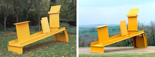
anthony caro

A man after my own heart, control nazi (with a small "n") Anthony Caro decided back in the 50s to dispense with all that "viewed in the round" crap that most sculptures in modern times adhere to. His pieces were often built to look good from one angle, and one angle only. Take that, messy free thinkers!

But generally, it's easier to control perspective when you only have to define two dimensions, since you don't need to deal with peeps nosing around the "wrong side" of things.

john pfahl

john pfahl

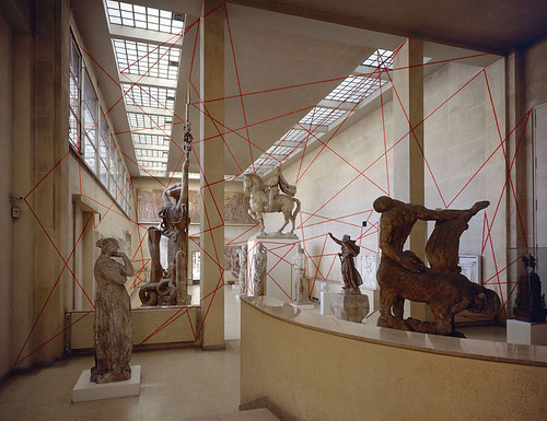
In the 70s, crazy John Pfahl took perspective control to absurd levels. Elements were arranged within the picture plane and then photographed to line up perfectly. Easy, right? Can you tell that I'm going somewhere with this?

felice varini

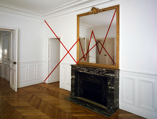
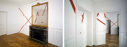
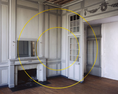
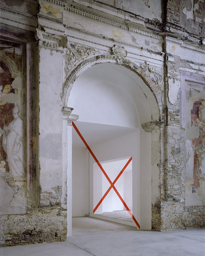
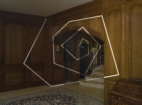
Check out this image by Felice Varini. It's kind of a funny nod to Caro's work and sculpture in general, sort of like, "hey -- this is the right way to look at these sculptures. Stand right HERE. Or else."

felice varini

Because if you don't, everything goes to hell in a handbasket. Pronto, good buddy.

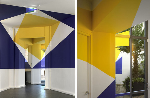
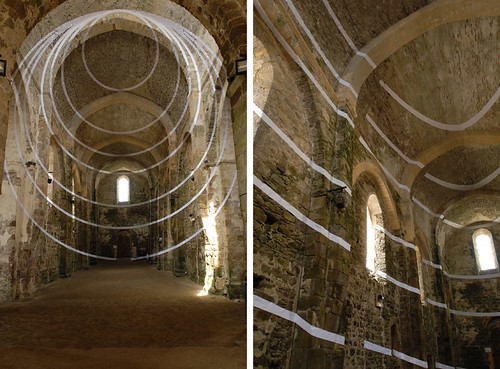
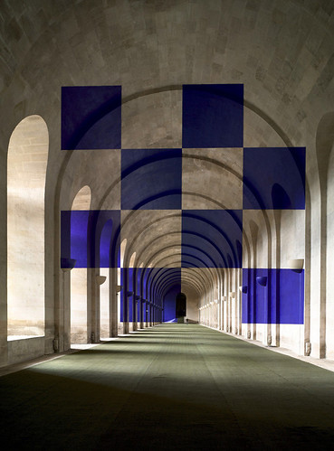
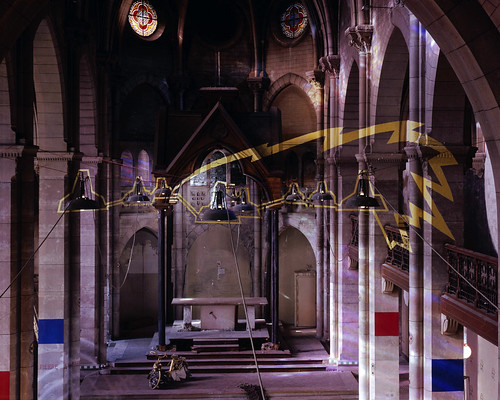
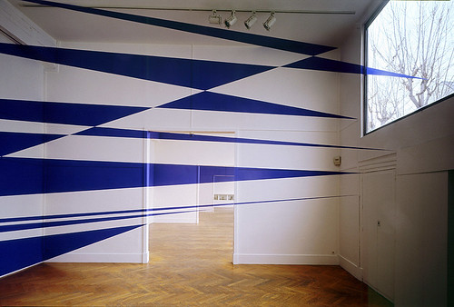
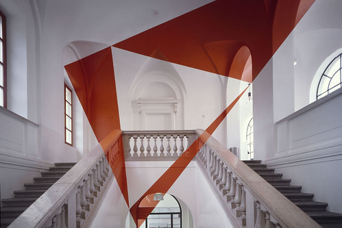
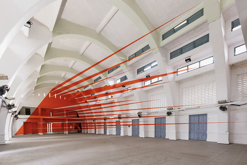
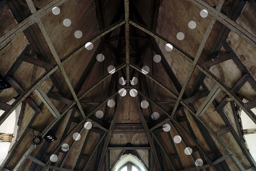
And here is where I get all nutty about Varini's insanely awesome 3D sculpture/images, because they appeal both to my obsessive photographic need to frame, and to my real life (nascent) understanding that if perfection is possible, it is certainly fleeting. Just don't move and inch, and everything looks... perfect.

felice varini

felice varini

felice varini

This is one of my favorites because it looks so simple.

felice varini

Sike!

Enough lecturing. Here's where I present you with an avalanche of Varini's eye candy. More than anything else I've seen recently, I wish I could see his works in person. The level of detail, the labor involved, the utter INSANITY of watching your environment morph as you change vantage points -- it all just wrecks my mind. I love it.

felice varini

felice varini

felice varini

felice varini

felice varini

felice varini

felice varini

felice varini

felice varini

Did I say that I wanted to paint a supergraphic in the baby's nursery? Silly me! I want to paint a Varini in the nursery. Oh, and I would also like to move my house into a centuries old cathedral, but that's another story.

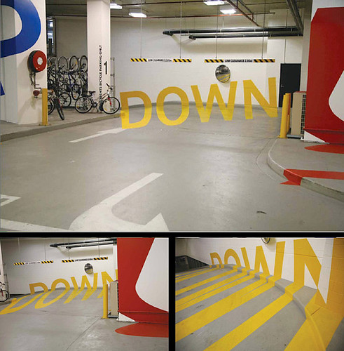
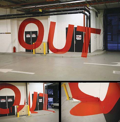
Although, Baby Gigantor (the current frontrunner for his name -- do you like it?) might be better off with something like these parking garage murals with controlled vantage points from Axel Peemoeller:

axel peemoeller

axel peemoeller

Any child of a self confessed control freak needs to learn how to take directions at an early age.