Welcome back for week four of the One Room Challenge, aka the madcap race to completely transform a room in six short weeks. [You can catch up on previous weeks HERE.] Ok, I'm not going to mince words... week four hurts. It is rough like a cheese grater on your soft and vulnerable pinky knuckles. It is the point where fantasizing and planning meet the cold hard slap of reality. In a dystopian turn, I inevitably come to loathe every idea that previously seemed like a bright and shining beacon of awesomeness because I am my own worst client. Deep breaths. Let's do this.

Last week my wonder husband who still loves me but doesn't like me anymore dropped in an overhead light so that we could see. If you are wondering why we didn't go with sconces, it's because the space felt too narrow and I didn't care for the idea of sconces on opposing walls. Now I thought the gift of vision would be a major improvement, but like many things the room looked better in the dark. I see cellulite. Everywhere. Adding insult to injury, I had to match the ceiling texture to the rest of the lumpy bumpy ugliness. I also textured my hair in the process. Kinda feels like dry shampoo.

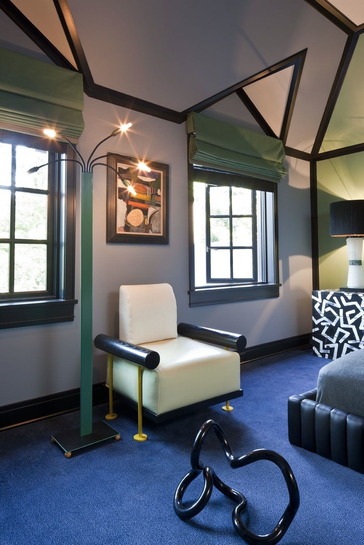
I decided to paint out the ceiling and wood work in Black Beauty. I had this on a wall at our old house, and it's warm and dramatic. Just like me. Sadly you can still see orange peel in the raking window light, but at least the extractor fan looks skinnier in black. And even though my paint job reminds me of putting on eyeliner with two kids grabbing at my legs (erryday), I do think the black moldings are a vast improvement. Sanders my magical amazing incredible paint guy made me try the new Benjamin Moore Grand Entrance enamel paint and I LOVE IT -- goes on like pudding and hides pesky brush marks. Delicious.
So that's the end of the good stuff. The bad stuff goes a little something like this: the more time I spent in that room, the more I felt the beadboard from the original design had to get out of my life. It was too many elements for this tiny space -- too many stain/paint/weird transitions. And that meant I had to make a life decision about the wallpaper I oh so optimistically purchased two years ago.

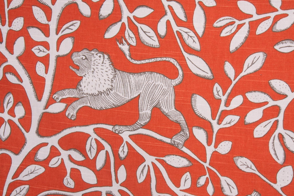
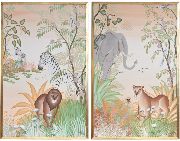
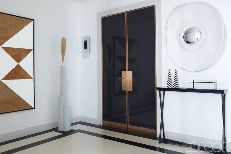
Long ago I planned for this beatific wallpaper trifecta, for which I was sure I deserved an award. The middle paper was installed in the foyer years ago. I grew afeared of a long term relationship with the color in the wallpaper on the left. But I still loved the Little Greene wallpaper on the right and thought it would be right at home in the powder room. Except that this paper is very... absorbent. We have two little boys. It's a very real problem that affects my design decisions. The beadboard would have repelled moisture, but without it I was at a loss.

I decided I should get new wallpaper. Is there anything, ANYTHING more of a true Design Crisis than choosing wallpaper? It's like holding a mirror to your very soul and looking into the blackest depths. It's like getting married... but more expensive.

I had a serious case of Goldilocks and the Three Bears going on. Nothing was working. Cole and Son Nuvolette would have been my top choice but the pattern didn't resolve in such a small space.

Then I started to get really picky about print quality... I'm just not loving the vast majority of digitally printed papers. Honestly, as a photographer I was surprised at the resolution on some of these. I realized I pretty much only go for screened or gravure printed papers because apparently I like to look at my wallpaper with a microscope.

Then I was tripping on the pattern repeats. A lot of patterns look good on a little square but have obvious weird repeats when you see them installed on unbroken walls. I tend to gravitate towards large carefully hidden repeats or small textural papers, probably because I used to count the flower people and creepy alligator men in the wallpaper of my childhood bedroom. We'll discuss that some other time.

Finally, the expense factor got super scary. I am obsessed with some of these papers, but wow. When wallpaper is priced by the square foot, I get spooked and file it away for my brave and well heeled clients. At one point I was calculating literally thousands of dollars in paper alone for that one tiny toilet room, and I just had to step back.
Let's not forget that the whole reason I started searching for new wallpaper was this:

This guy had been sitting in the cat's food-filled water bowl, then he ran with his catfood stew pajamas across the house and all over my wallpaper samples.
The criteria became clearer. Durable, inexpensive, awesome. I decided to go with a non woven for the durability factor. And then I decided to go with this for the awesome and inexpensive factor:

Designer's Guild's Bain de Minuit in zinc. Ike approved.

I was the decider! I felt good! I was pumped! I ordered four rolls and steeled myself for the award I thought I deserved a few years ago but definitely deserved now.
And then I saw that Holly from The English Room had chosen the same paper for her design. And then I freaked out.
Basically I had looked into my soul and found... someone else's soul. Even worse, someone might think I was trying to steal their soul.
I felt terribly guilty and ashamed -- about what I am not sure, but it doesn't really matter because I am the guiltiest person in the world. I should immediately start wearing hairshirts and flagellate myself with glass studded whips just for fun. I was sure Holly would think I was a jerk, but she didn't even bat an eyelash because she has better things to do than to worry about what other people are doing.
Meanwhile I feel like I am constantly worrying about what other people are doing -- worrying like it's my job. And partly it is. I am supposed to be up on design trends -- what's coming in the future, and most certainly what's been done. People pay me for this. And yet it really is a vicious cycle, made even more cruel by the speed of the internet. One trend must die in order to sell sell sell a new one. We are all scurrying to get ahead of the curve, and for me that often means zagging where others are zigging. It's juvenile and contrarian, frankly. And I'm not sure it does me any lasting favors, but it is turning me into a crazy(er) person.
I like this wallpaper. It's awesome and soon it will probably be in every house in the world, much like the infamous Woods wallpaper. But that's ok. I had that wallpaper too, and I loved it. So friends, the afterschool special lesson of the day is: if you like it, do it. And do not apologize for your choices. Unless you are me, and then you should apologize for everything.
Sorry about that!
There have got to be some people making good progress this week. Go find them! Check back next week to see if I actually hung this paper. Or that paper. Or some other paper.
Abby M. Interiors
Because it’s Awesome
Bijou & Boheme
Calling It Home
Chez V
Chinoiserie Chic
Copy Cat Chic
The Decorista
Design Crisis
Design Indulgence
Design Manifest
The English Room
The Glam Pad
Little Black Door
Mimosa Lane
My Notting Hill
The Pink Pagoda
Simple Details
My Sweet Savannah
Verandah House
