Some Other Things I Learned in New York

If you missed Part 1 of this giant juggernaut of a post, feel free to check it out here. But like any good soap opera, this post works just fine if you haven't seen the previous episodes. New York, I miss you so much. Let's talk about all the silly little idiosyncrasies that make me want to start spreading the news.

1) Babe vs dude, and a little shop called Meg.

I'm not exactly sure what all this gender business amounts to (or if it matters at all), but Austin is apparently a "dude" town and New York is a "babe" town. I felt instantly transported away from dudedom when we stepped into Meg, a little boutique on the lower east side. Maria (only the cutest shop girl ever) treated us like her besties -- mainly by referring to us as "babe" about 150 times within the span of 20 minutes. I wanted to pack her up in my suitcase and take her home with me so we could play dress up forever and ever.

2) I love Central Park.

central park

Is it cheesy for me to say that? Frankly, I don't give a damn. I think the existence of Central Park -- an entire mini forest preserved amongst the most expensive real estate in the world -- speaks to the goodness of humankind. The end.

3) New York, your food confuses me.

So we went to The Hurricane Club for drinks and dinner, and despite the lovely ambiance (which was much swankier at night) the food was very underwhelming. And I think something must be wrong with me, because I felt that way about much of the food in NY.

friend of a farmer new york

Sorry about the ugly camera phone picture, but this is my breakfast at Friend of a Farmer. I was super excited about being served in a mini cast iron skillet (although it does remind one a bit of Denny's, no?), and the restaurant itself was charming and homey beyond words. But the food? It lacked the flava. Maybe my taste buds have been burned out by BBQ.

4) The road to heaven is paved with rugs.

New York is filled with the most incredible textiles. I snapped this pic at a boutique in the West Village (can't remember the name -- was obviously too dazzled by beauty) right before I tried to lay down on the floor and roll around like a dog.

5) The Met is ENORMOUS.

Trying to navigate the labyrinth that is the Met is sort of like trying to navigate the labyrinth in Labyrinth. In other words, not so easy and occasionally annoying. And filled with lines. We missed several key exhibits (Alexander McQueen) because there were just too damn many people, but I did manage to take in a few things.

I always forget what a revelation great paintings are when seen in person.

6) Anthony Caro on the roof of The Met was amazing x infinity.

anthony caro roof

I was feeling pretty pissy about The Freaking Met (mainly because they closed down all the contemporary galleries early) but then we stepped out onto the roof and oh my gawd...

anthony caro roof

I've always liked Anthony Caro's sculptures, which employ various methods to control the viewer's perspective of the work. But watching them interact with the New York skyline took it to the magic level bonus round.

anthony caro roof

anthony caro roof

Did I mention that they also had a super fancy bar up there? So you could catch a buzz, look at great work, watch falcons glide over Central Park, and ogle cute outfits. Heaven.

7) Ground Zero is still sad.

Frankly we just ran into Ground Zero after doing our part as good little capitalist consumers to stimulate the economy at Century 21. I wasn't expecting to see it, and I certainly didn't expect for it to make me feel that way. But it did.

That's it for my big fancy trip, dudes babes. Back to our regular schedule tomorrow.

Have a good one!
Control: I Like to Have a Lot

Ok, I'll admit it. I'm something of a control freak. It might be due to years of photographic training -- the need to frame, level, expose, repeat, as perfectly as possible every time -- but I suspect it was that very aspect of my personality which drew me to photography in the first place. These days I find myself constantly rearranging my home as if prepping for an imminent photo shoot: Karate chop pillows, adjust accessories, and shift the console table over two point five inches so it's lined up squarely behind the couch. Of course, if I stand over there it's not centered anymore, and then I find myself cursing the dogged pursuit of perfection, and wondering how to resolve this urgent (!!!) crisis. I could blame it on interior design. When looking at the perfectly styled, immutable compositions of interior photographers, it's hard to remember that rooms only look like that from one particular perspective, for that particular instant in time.

Exhibit A:

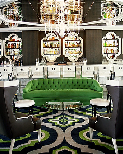
kelly wearstler

Everyone's favorite design diva Kelly Wearstler is a stickler for symmetry. Even the chair legs rest at the same places on the carpet (don't think for one second I haven't tried the same tactics on my own rugs). But in real life, the chairs are probably caterwonky, the cocktail tables may be shifted, while seated you can't see the mirrored ceiling, and generally the whole room dissolves into chaos. But you can't blame the girl for trying to control the room, or the photographer for trying to control the perspective of the setting.

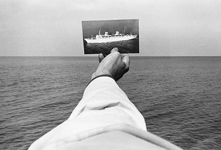
kenneth josephson

That's what photographers do. We live in a 3D world, but a photograph is a 2D representation of that world. Back in the 70s, Kenneth Josephson proved that point most humorously with this ship that could just as easily have sailed over someone's head, or perched atop a building, or -- if flipped to the other side -- existed as nothing but a blank square.

Not that sculptors haven't tried to control the vantage point from which their 3D objects are viewed.

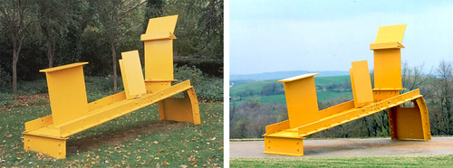
anthony caro

A man after my own heart, control nazi (with a small "n") Anthony Caro decided back in the 50s to dispense with all that "viewed in the round" crap that most sculptures in modern times adhere to. His pieces were often built to look good from one angle, and one angle only. Take that, messy free thinkers!

But generally, it's easier to control perspective when you only have to define two dimensions, since you don't need to deal with peeps nosing around the "wrong side" of things.

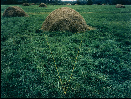
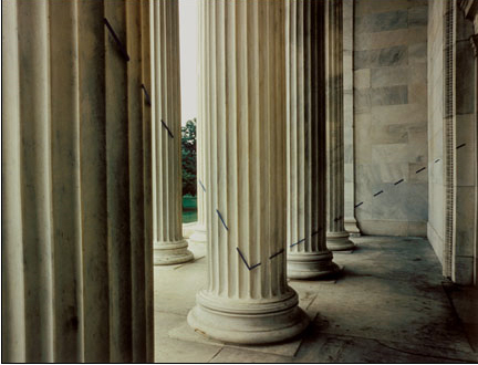
john pfahl

john pfahl

In the 70s, crazy John Pfahl took perspective control to absurd levels. Elements were arranged within the picture plane and then photographed to line up perfectly. Easy, right? Can you tell that I'm going somewhere with this?

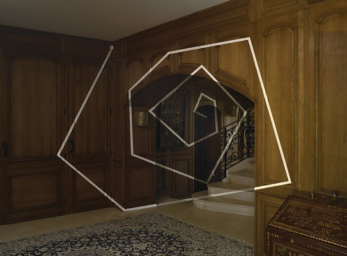
felice varini

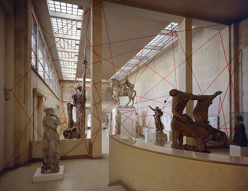
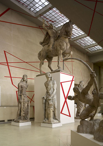
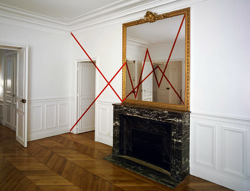
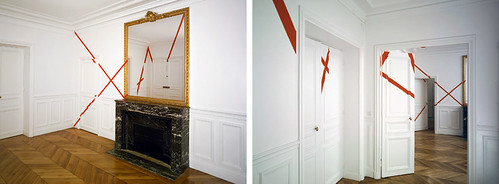
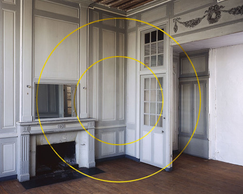
Check out this image by Felice Varini. It's kind of a funny nod to Caro's work and sculpture in general, sort of like, "hey -- this is the right way to look at these sculptures. Stand right HERE. Or else."

felice varini

Because if you don't, everything goes to hell in a handbasket. Pronto, good buddy.

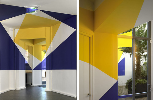
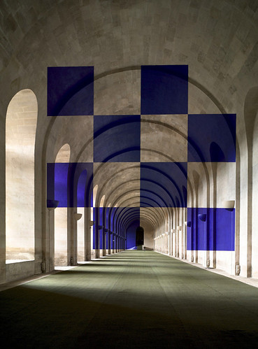
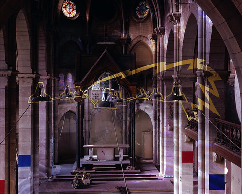
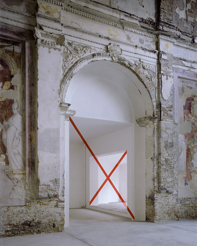
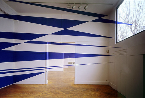
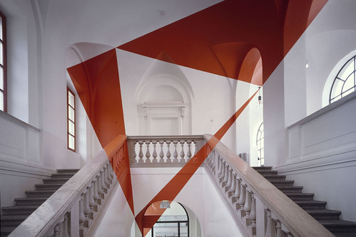
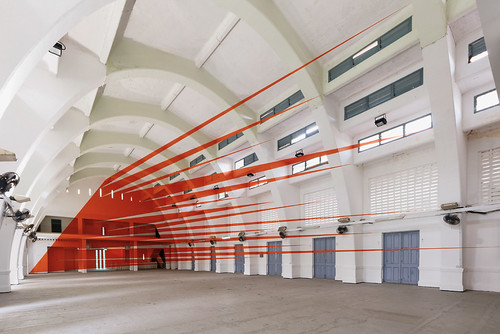
And here is where I get all nutty about Varini's insanely awesome 3D sculpture/images, because they appeal both to my obsessive photographic need to frame, and to my real life (nascent) understanding that if perfection is possible, it is certainly fleeting. Just don't move and inch, and everything looks... perfect.

felice varini

felice varini

felice varini

This is one of my favorites because it looks so simple.

felice varini

Sike!

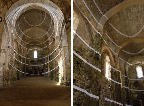
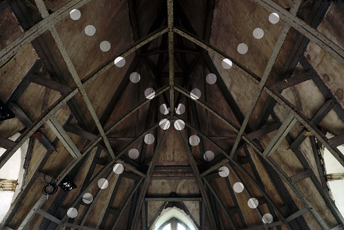
Enough lecturing. Here's where I present you with an avalanche of Varini's eye candy. More than anything else I've seen recently, I wish I could see his works in person. The level of detail, the labor involved, the utter INSANITY of watching your environment morph as you change vantage points -- it all just wrecks my mind. I love it.

felice varini

felice varini

felice varini

felice varini

felice varini

felice varini

felice varini

felice varini

felice varini

Did I say that I wanted to paint a supergraphic in the baby's nursery? Silly me! I want to paint a Varini in the nursery. Oh, and I would also like to move my house into a centuries old cathedral, but that's another story.

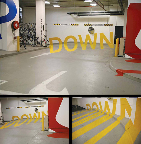
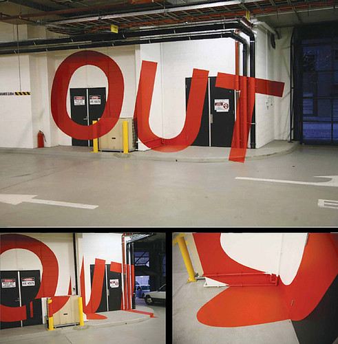
Although, Baby Gigantor (the current frontrunner for his name -- do you like it?) might be better off with something like these parking garage murals with controlled vantage points from Axel Peemoeller:

axel peemoeller

axel peemoeller

Any child of a self confessed control freak needs to learn how to take directions at an early age.