Palette Cleanser

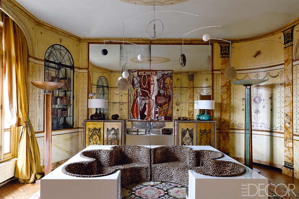
Is it just me or are things looking really overdecorated lately? This might come across as a little ironic since I recently swathed a powder room in crazy marble wallpaper, but I can't help it. My eyes are tired. It seems like every room has to have trim and contrasting pattern and 75 colors and fully accessorized vignettes and statement furniture everywhere. I'm not judging, for I am most definitely guilty of all infractions. And don't get me wrong, I will always have a flair for the dramatic and a soft spot for this: design crisis

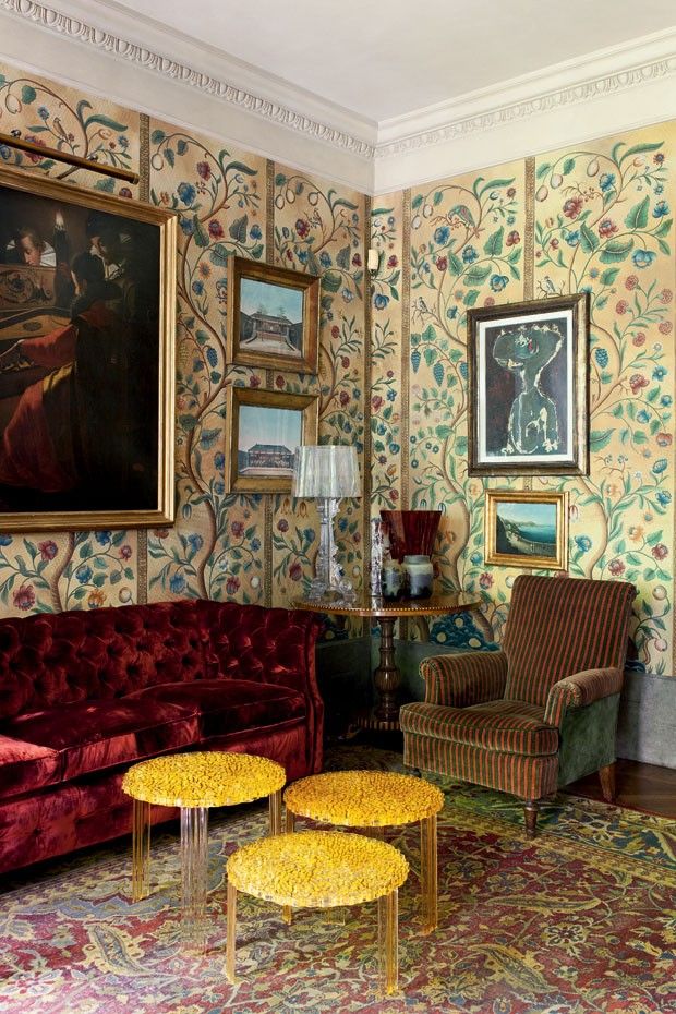
That is super weird. I love it, and I will always love wallpaper. But like I said, my eyes are bleeding from all the stuff in every picture everywhere and I feel an overwhelming urge to clean up the visual clutter.

design crisis | palette cleanser

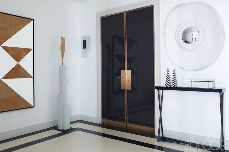
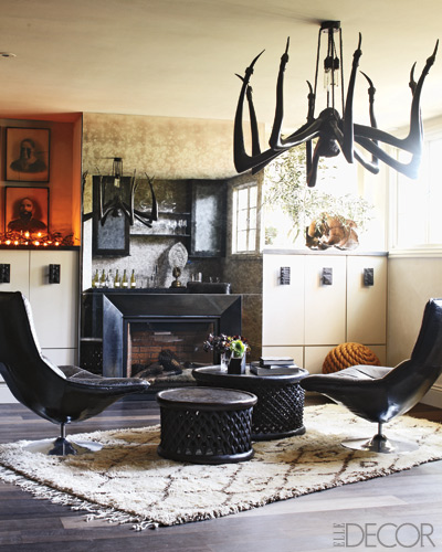
AHHHHHH isn't that nice? Does anyone actually live here? Who cares?! It's all about organizing the room around one statement moment and then editing everything else out. Like a fine ocular sorbet.

design crisis | palette cleanser

White paint makes that easy. If you have great light and good architecture, white paint works. Personally I don't think I can ever live with white white whiiiite paint, because we have a lot of sheetrock and not a lot of windows. I might be feeling anti ornamental at the moment, but if you live in a sheetrock shack you're going to have to do some decorating.

design crisis | palette cleanser

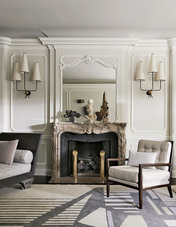
Even dirty off white is more forgiving. This is a nice amount of ornamentalism for me. There is a lot going on here, but keeping things neutral and monochromatic lets the eye rest.

design crisis | palette cleanser

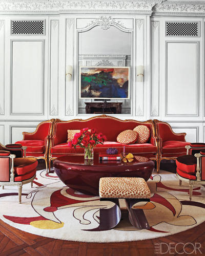
For those of us with yucky architecture and light, color may be a necessity. I don't think cleaning house necessarily means painting everything in neutrals and going gently into that good night. Robert Couturier is my homeboy because he knows how to let even a fancy room breathe. Bold color on the walls and wee pattern on the sofas dictates neutral art, no pillows (!!!), very little clutter, and curtains that don't pop. Matching sofas reduces the number of design elements in a large room. This is a space that could be translated to a real person's house for sure.

design crisis | palette cleanser

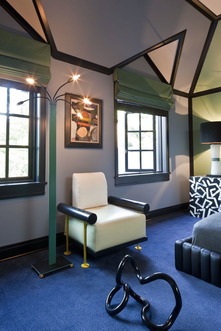
Or how about a mostly tonal room with zero pattern? So doable. The focus is all on the delicious yet judicious use of color. It might even be nutritious.

design crisis | palette cleanser

Same idea, but as a kitchen. Sexy, moody, interesting, and clean as a whistle.

design crisis | palette cleanser

I have to admit it is hard not to love a good white room, though. The architecture and textural elements here are layered enough to keep things lively, and that lamp is everything.

design crisis | palette cleanser

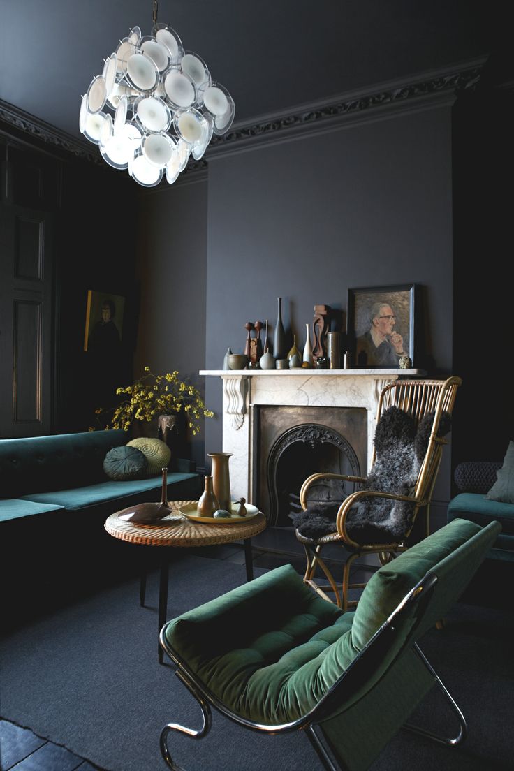
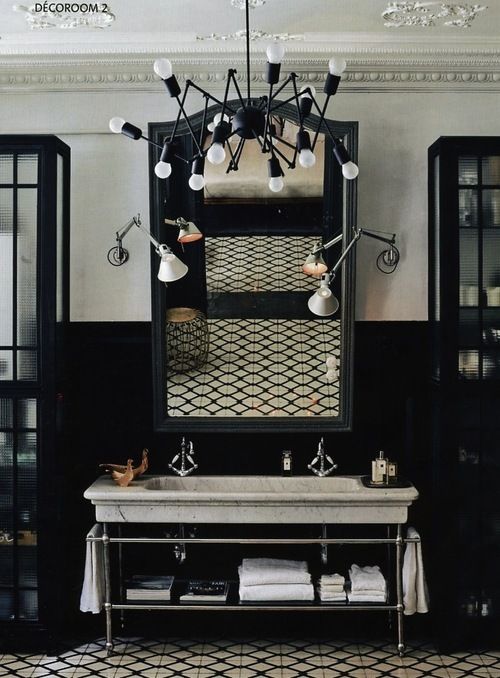
At the opposite end of the spectrum, a bright white Vistosi chandelier in an otherwise dark room has impact without punching you in the face. The paint color and furnishings are unique, but everything else is kinda blendy and nothing is upstaging the diva.

design crisis | palette cleanser

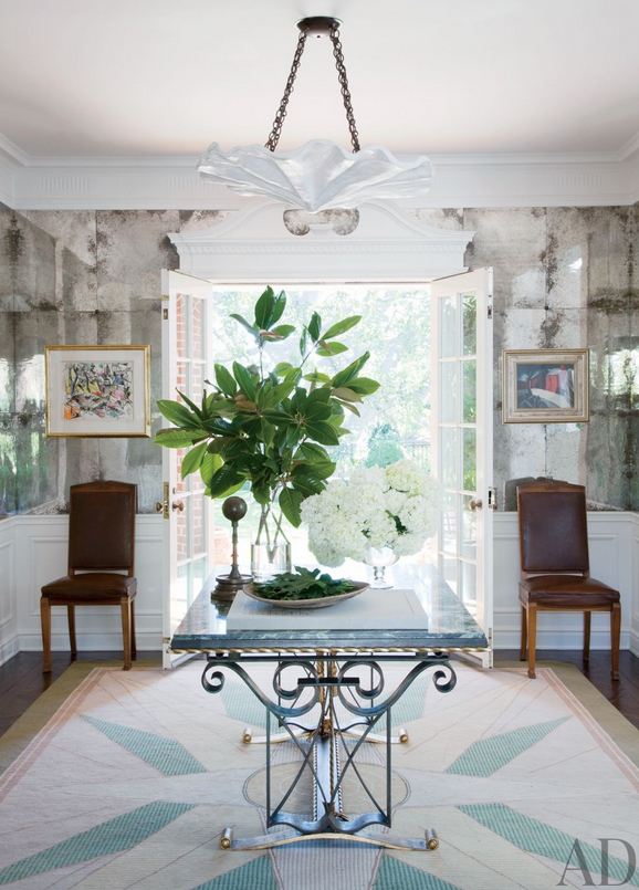
Blendy blendy, but not blandy. It's all about the floors and that bizarrely awesome chandelier.

design crisis | palette cleanser

This is like the good twin to my evil twin powder room. I really wanted everything to feel like it was chiseled from the same material. It might have helped if I had 10K to spend on marble, but I think I did ok with $300 spent on wallpaper.

design crisis

And then there is this room. There are quite a few design elements going on, but the balance is good. I spy plenty of breathing room. It's clean and fresh and interesting. I want to live here. That rug!

Isn't it nice be simple sometimes?

Modern Memphis

I can't believe it's been almost four years since I first wrote a post about Memphis design... At the time I felt like I was standing on the edge of a cliff, leaping into the void. There was still something so raw and surreal about all those sharp edges and blazing bright colors. Fast forward to the riot of color that is the 2014 Pantone Palette, and Memphis seems old hand. Maybe. damm design

Modern Memphis is still playful, but a lot more polished. These sculptural lamps by Damm Design provide the perfect foil to old, dark, and dirty (You know I'm down with ODD).

alessandro mendini

That's not to say that Modern Memphis is totally tamed... it still has all the angular bite of the original iteration.

jean louis denoit

Maybe with just a little less color.

safe house usa kelly behun

christian may memphis wallpaper

Get all the flavor and only some of the crazy with pillows by Safe House USA, a Kelly Behun style supergraphic, or Christian May's appropriately titled Memphis wallpaper produced by Black Crow Studios.

kelly wearstler

Or don't hide your love for the Memphis... trick it out a la Kelly Wearstler. Hello venus flytrap lamp! That thing is a man eater for sure.

Perhaps you're feeling a little gun shy about reliving the Esprit era? Don't get your graffiti tights in a wad. Relax. There's something for everyone.

gray malin

Gray Malin's photography is pretty.

robert couturier

Robert Couturier also loves my favorite Clarence House fabric ever.

kelly wearstler

And Kelly Wearstler is pretty much just Ettore Sottsass with high heels.

bungalow buff strickland

My own brush with Memphis? Just this pair of Beetlejuice chairs I bought in the middle of a dirt field, strapped Beverly Hillbillies style to the top of my car, and drove 100 miles home to meet my husband who was SO HAPPY to see them.

Ok, that last part is a lie but the rest is truth. Commitment is what it's all about. Do something outside of your comfort zone. Push it. Push it real good.

Just don't get divorced in the process.

Every Pretty Room Needs a Touch of Ugly

I probably should have subtitled this post Crazy Erin's Rules, because I won't be surprised if most of the world thinks I took a side trip down magic mushroom alley on my way to crack town. But if we all worry about what most of the world thinks then no one will ever do anything interesting. So I say if not ugly, then every room at least needs something weird or vaguely dangerous or just plain unexpected. Something that feels a little alien, something that heightens contrast. A touch of ugly sharpens pretty and blurs the line between decorating and art.

design crisis

I am obsessssssed with this room. That top drawing is the stuff of nightmares, naked lady or not. But the juxtaposition of confrontational and demure is perfect and amazing. 100% commitment is everything here.

design crisis

Robert Couturier is a master at creating tension and contrast by combining traditional and contemporary elements in unexpected ways. I think I should hate that rug and the red on red on red, but in this space I love it. I can never figure out how his rooms began, and that is probably why I like his work so much. There is no formula, no magic combination of proscribed perfectly matched elements. It comes off as pure alchemy. For me, adding one detail that feels a little off, or disturbing, or rough around the edges, is a step in that direction and away from overdecorated doom.

Some food for thought:

design crisis

design crisis

design crisis

design crisis

design crisis

design crisis

design crisis

design crisis

design crisis

A splash of ugly is the punctum -- the piercing of the veil. It's the thing that recalls humanity and brings life to a room.

Or at least that's what I think. How about you? Maybe I've been watching too much True Detective.