Welcome back, me! After a long and lovely family visit, I'm easing into the daily routine. Which means that I'm still feeling a bit lazy. I'm looking forward to catching up with y'alluns, but first I would like to thank the fabulous Collyn of ModFruGal for sharing her amazing, inspiring home while I was away. If you were a naughty imp and you missed her home tour, catch it here.
Greetings and formalities are out of the way, so let's get down to bizness -- rug cruising.

Rug? Who? Wha? Yep, it's a little hard to see past the tongue, but there's a rug in there. Somewhere. Designed by Bartoli, the Rosetum is part of Nodus Rugs' enormous, eclectic rug collection. Featuring everything from the merely mundane to the beyond bizarre, Nodus stands at the forefront of the art rug movement.

Take, for example, this twist on the traditional by design duo Studio Job.

Perished Persian's pattern is formed by tiny interlocking forms.
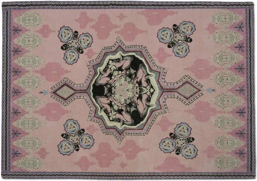
This one's named Eros. Since we are a familyish blog (cough), I'm not going to zoom in on that.
Nodus does feature an array of more classic forms, like these fine specimens:
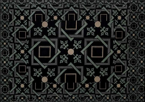
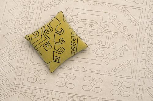
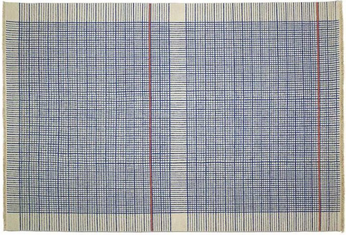
But their most interesting offerings seem to fly in the face of traditional warp and weft rugs.
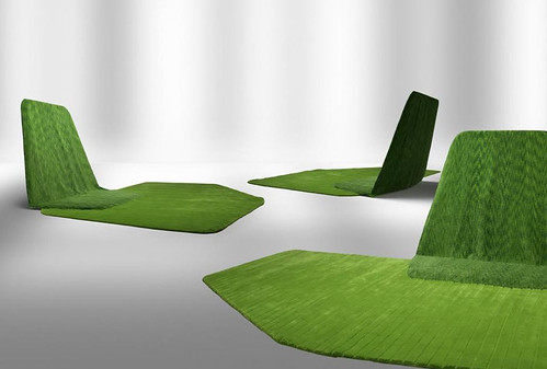

And then there's this dude from the ever zany Brothers Campana. Computer: zoom in.
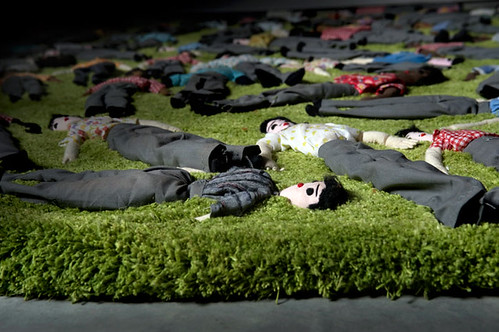
It's Getting Gold in Here
Since Karly's gone, I thought I would do my best to gold up this hizzy in her honor. Goldeness may be next to Godliness because it's all about surface, so it only take a cheapo can of spray paint to turn even the most ordinary object into something that looks expensive and klassy. If the recession depression is getting you down, hustle out and spend $5 to give something the Midas touch. You know it's going to make you feel better. I'm here to help you pull the paint trigger with some scintillating finds that are designed to bring the bling back into your life.
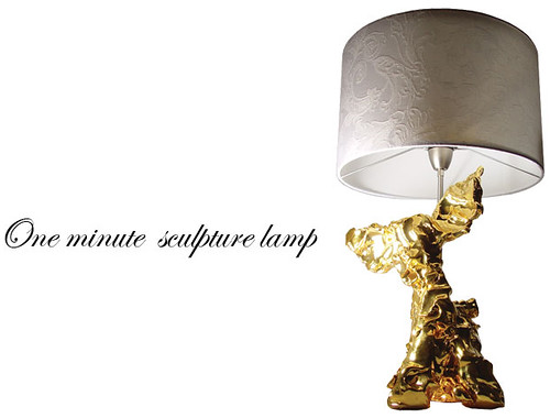
Zany Dutchman Marcel Wanders contradicts the age old aphorism that, "You can't polish a turd." Well, apparently you can!
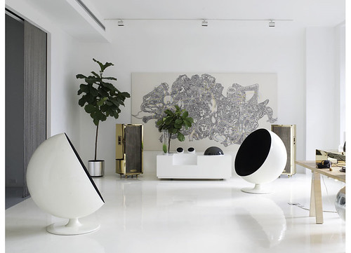
Boyfriend's big black speakers getting you down? Surely he wouldn't mind a bit if you got after those nasty cases with some super shiny lussssster. Tip: wait until he goes out on a late night bar crawl to transform his AV equipment. Men can get a little touchy about their electronics, so best to let him booze it up a little. High Five sure to follow!
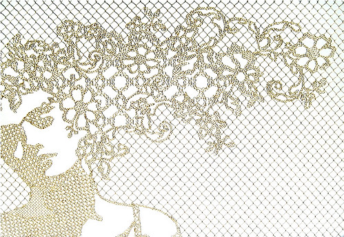
Once your golden piece de resistance is finis, you may want to protect it from his angry adoring clutches with a fabulous fence. Demakersvan makes gorgeously crocheted fences out of plastic coated wire in a variety of designs, including this golden girl.
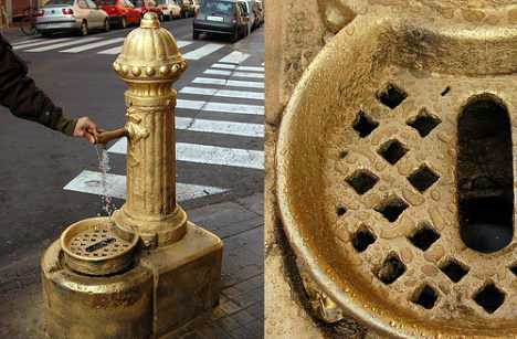
While you've got the paint out, why not take a cue from these guerrilla artists and put gold back on the streets. Oh, and please start at Wall Street...
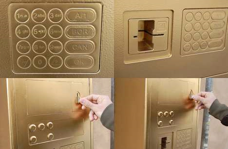
Because we surely need some gold back in our banks! This gold painted ATM is probably worth more than the "money" inside it.
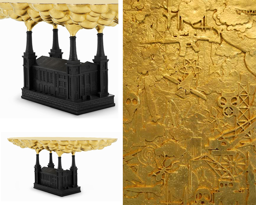
Speaking of gluttony and financial ruin, Studio Job has got those bank bitches' number with their piece, Robber Baron. Holy crackatoly, do you see the tiny guns, atomic stars, airplanes, and other symbols of technology gone horribly awry? I desperately need this as a coffee table. Since this piece costs more than a bank (which isn't that hard these days), I'll be busy trying to figure out how I'm going to make this myself.
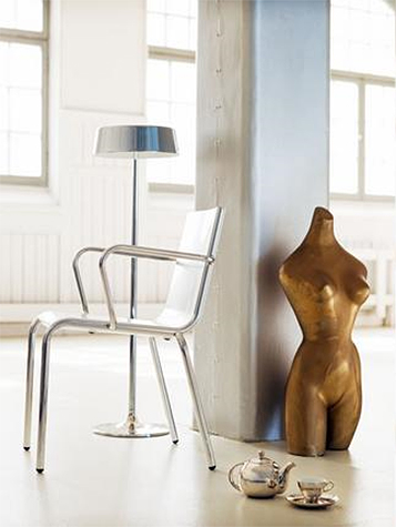
While I try to reinvent the wheel, I think anyone could handle this as an at home project: whip out the paint can to emphasize va-va-volume in sculptures. Glossy surfaces always look rounder than matte ones. Let the model instruct you on how best to apply this rule to your fashion decisions.

If you accidentally get some paint on the floor, don't worry! Just go ahead and spread it everywhere. If Dolce and Gabbana can have a solid gold bedroom, so can you.
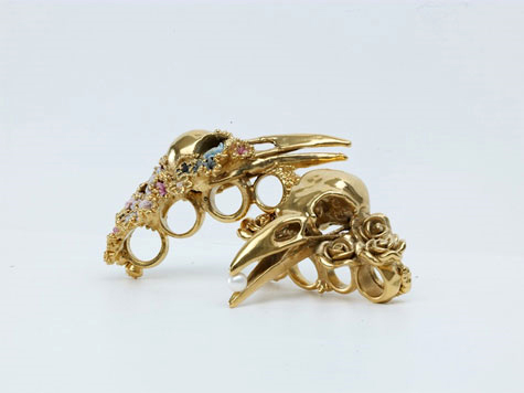
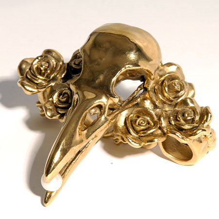
Perhaps you'd prefer something more precious and smaller in scale, like these rings from jewelry designer Gisele Ganne's Divorce series. Just slip on these gold knuckles and leave a lasting impression on your significant ex's face.
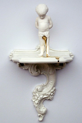
I also love that Ricochet Studio isn't afraid to take a golden shower. I really covet Accident for my little boy's nursery because -- as the designers themselves acknowledge -- it happens.
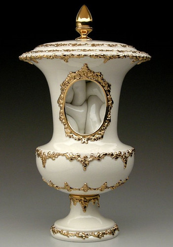
Ricochet makes all kinds of oddly twisted ceramics with a golden flourish, like this Urn with an intestinal interior. Love these guys. Found via Sara Says Awesome's quirky blog.
For fine details like those on the Ricochet pieces, may I recommend you dispense with the spray paint and switch to Rub 'N' Buff, the most amazing product in the universe. No, I do not get paid to advertise their wares, but I should (wink) because I have covered everything from frames and knobs to thrift store junque to all manner of TJ Maxx and Ross' craptacular "goods" with the Buffer. You will be amazed at how much a tiny tube will cover.
Like, I'm pretty sure the artist responsible for this travesty could have saved himself a whole lot of money:

Yes, Mark Quinn's solid gold Kate Moss statue has an estimated worth of $10 million pounds. It probably would have cost less to buy Miss Moss herself and coat her and her naughty bits in Rub 'N' Buff. After all, odds are that it would only take one tube to do the whole job.
Supersize Me
When Karly and I went to the Round Top antiques fair last month, the most common sentences uttered between us were either, "If only it was a tenth of the price!" or "I just wish it was bigger." At that moment I realized I had developed a severe case of megalomania, although (silly me!) I should have seen it coming a year ago. Sometimes I feel like I'm just stumbling around aimlessly in the world of design, being as I am just a lowly artist type, and it so often happens that I'm a bit slow to catch onto the latest trends. But methinks this one caught me unawares because I mistook it for art. But it's not art. I don't think. Take, for instance, the work of Dutch design duo Studio Job:
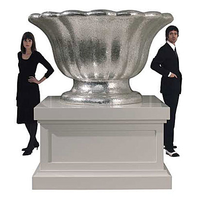
Their dazzling white gold, mosaic-covered, Silver Ware series for Bisazza featured traditional tabletop pieces in monstrous proportions; the teapot alone is six feet tall (photos courtesy of Dezeen and The LA Times).
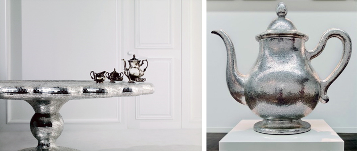
Yet, only a few years ago, according to the International Herald Tribune:
Studio Job was condemned by Dutch design critics for its disdain for function and for its self-indulgent symbolism. "It was horrible," recalled [co-designer] Smeets. "We were accused of making bad art by the art world, and bad design by the design world." Today they are being lauded, for exactly the same reasons, as the poster boy and girl of the new expressionism in design.
So caught between art and design -- or let's say concept and function -- Studio Job occupies a nether region of functionless and lack of concept, wrapped up in a shiny package with a (very) high price tag.
But what's the difference between Studio Job's giant spoon:
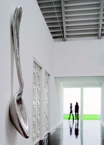
And Claes Oldenburg's giant spoon (photo from Minneapolis Sculpture Garden):

No, I don't think the only difference is the cherry on top, but seriously no one disputes Oldenburg's status as a "real" artist. Is it only because he thought of making things that are usually small really big first? (This sculpture was made in the mid 80's, but he started making gigantical sculptures in the 60's.) And he's certainly not the only artist to make giant sculptures. Take the always colorful artist Jeff Koons, for example (via If It's Hip, It's Here):
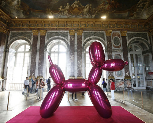
I'm extremely distracted by the gorgeous background, but how is this giant balloon dog different from, say, designer Jaime Hayon's giant creepy doll thing (other than the difference in zeros on the respective price tags. Hint: artist Jeff Koons' is exponentially more expensive):
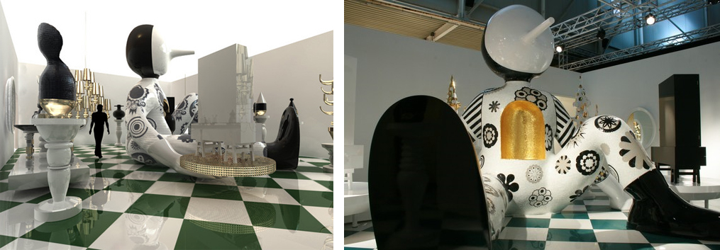
Both sculptures are big and shiny, but could we say that Jeff Koons' includes some kind of cultural critique of society, whereas Jaime Hayon's does not? Maybe. I'd be interested to hear some of you super smart readers argue either side of that point.
What is it about epic proportions on everyday objects that make them so interesting, anyway?

Is there anyone who is not transfixed by this ridiculously ginormous rubber duckie? I didn't think so. And no, it's not photoshopped.
The design world definitely seems to have picked up on the "Bigger is Better" aspect of our culture, because big is REALLY BIG right now.
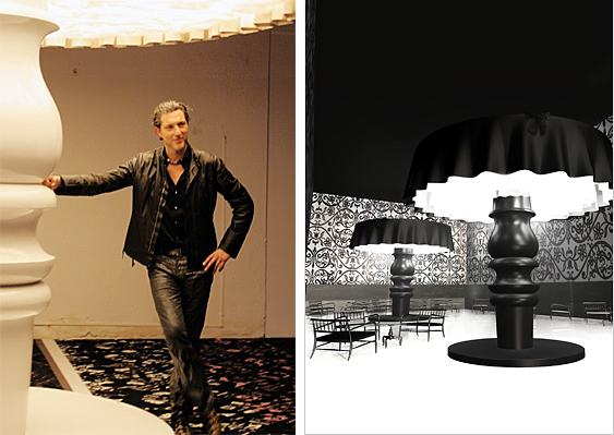
Marcel Wanders certainly looks pleased with his gargantuan "table" lamps. Of course, there's no table in the world they could fit on... except maybe one of the silver "tea platters" by Studio Job, featured near the top of the post.
Perhaps he was just trying to one-up Philipe Starck's design for the Parris Landing Condominiums?
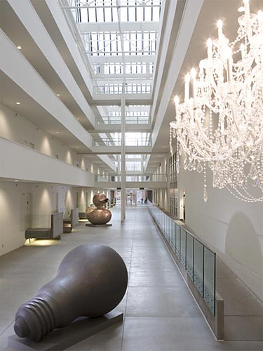
Whatever the case, a relatively scaled down megalomania is wending its way through the homes of middle class consumers everywhere, as evidenced by this popular pad on Apartment Therapy:
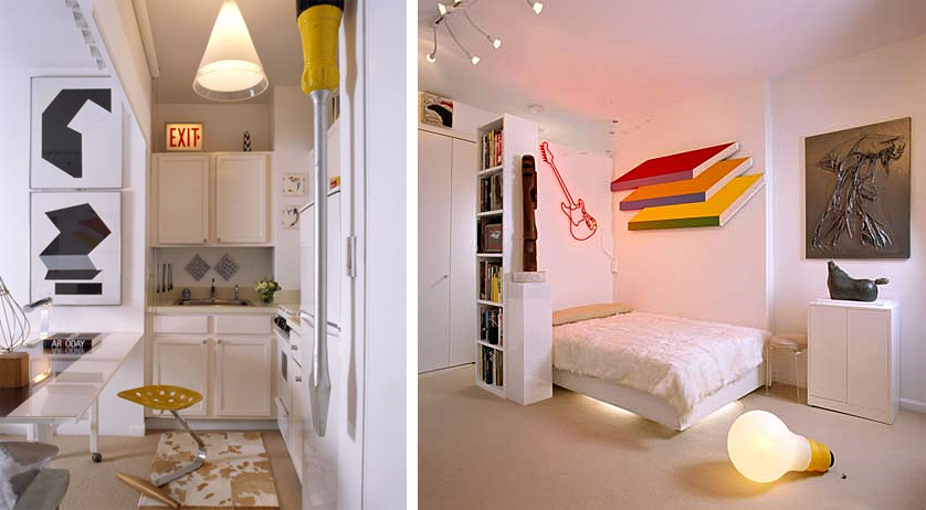
How much do you love that giant screwdriver on the left??? It looks dangerous, which I am quite sure is the appeal for me. And check out the Mini-Me version of Starck's giant light bulb. The surge of supersized objects doesn't end there, though:
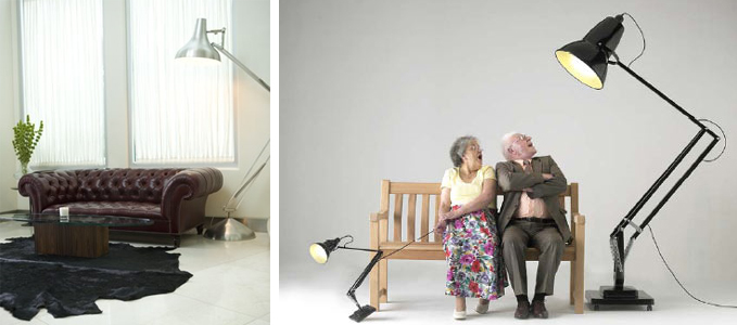
Even the typically refined anglepoise lamp -- designed in the 40's with smaller scaled homes in mind -- has been pumped up by massive steroid injections. Unlike a scintillating six foot tall teapot, this lamp could fit right in to today's McMansions. (photo on left via Desire to Inspire, photo on right via Apartment Therapy)
Another example of Design/Art's (Des'Art?) trickle down economics:
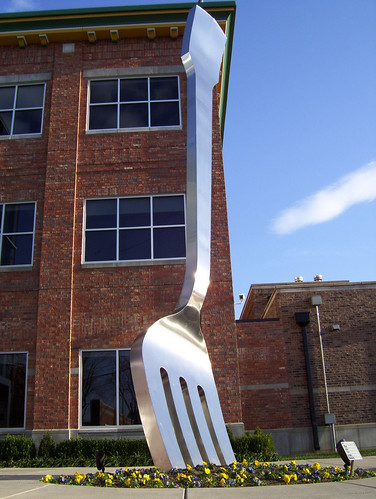
Giant fork sculpture in Missouri via some guy's Myspace evolves into giant fork wallpaper from Anthroplogie (pictures via Apartment Therapy):
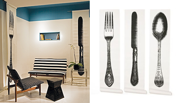
Becomes giant fork in Mads Lauritzen's surrealist photograph. Because improper proportions are surreal.
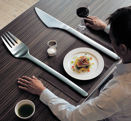
For some reason giant cutlery is really popular right now, and that brings back painful memories of those huge wooden forks and spoons that everyone's Mom had on the kitchen wall. Whatever you do people, please don't go there.
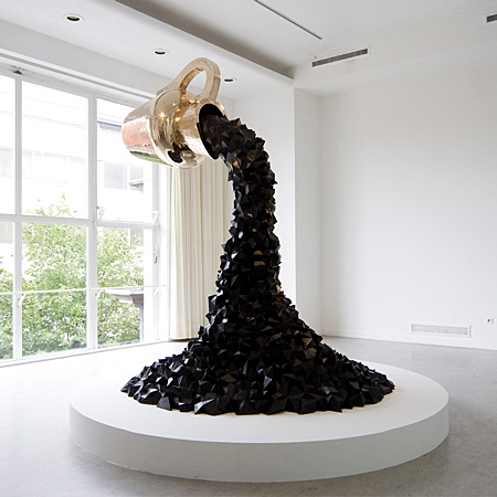
I have to admit that I like some of the more practical supersized designs. There's a big difference between Studio Jobs's giant golden coffeepot dumping a stylized brown river of what I can only hope is coffee:
And these nifty giant golden hand chairs seen in the sweetly elfin Jonathan Adler and adorably scathing Simon Doonan's house, which was featured in Met Home:
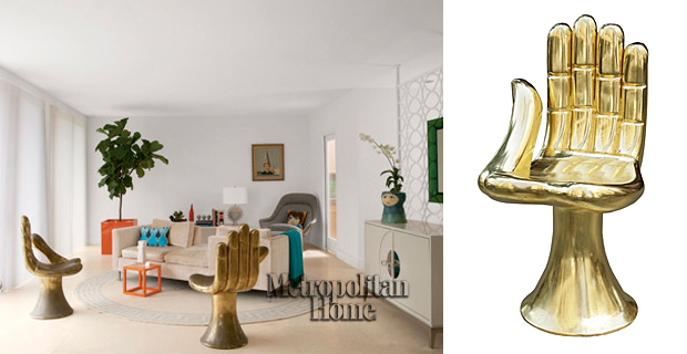
By the way, I'm sure Adler got his chairs from super chic antiques dealer Todd Merrill, but I've seen them in hideous colors for as little as $30 on Craigslist and Ebay. Gold spray paint anyone? Or white, even?
Whew, I'm tired from thinking so much today, and I really hope I haven't worn you out too much to discuss exciting things like: art versus design, or the decline of western civilization, or whether all design will simply grind to a halt in the face of a deepening recession. Is megalomania bound to shrink in direct proportion to our shrinking economy?
In case the real question you want to answer is, "Why do I have to read this crap? I'm not in school anymore," I have a present for you:

It's a super cute, supersized bunny! And if you like it, you won't click on this link to find out what happened to it.