Palette Cleanser

Is it just me or are things looking really overdecorated lately? This might come across as a little ironic since I recently swathed a powder room in crazy marble wallpaper, but I can't help it. My eyes are tired. It seems like every room has to have trim and contrasting pattern and 75 colors and fully accessorized vignettes and statement furniture everywhere. I'm not judging, for I am most definitely guilty of all infractions. And don't get me wrong, I will always have a flair for the dramatic and a soft spot for this: design crisis
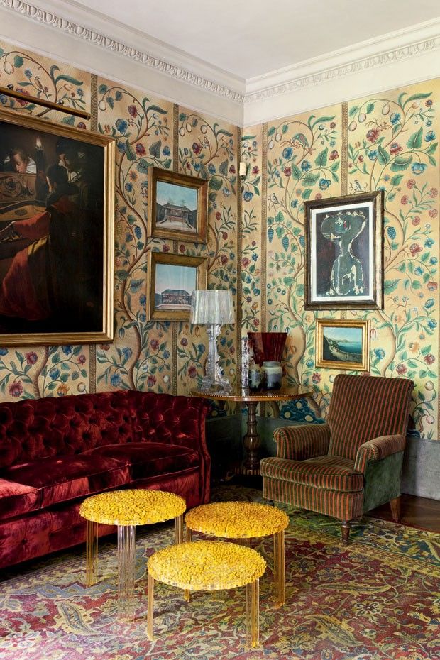
That is super weird. I love it, and I will always love wallpaper. But like I said, my eyes are bleeding from all the stuff in every picture everywhere and I feel an overwhelming urge to clean up the visual clutter.

design crisis | palette cleanser

AHHHHHH isn't that nice? Does anyone actually live here? Who cares?! It's all about organizing the room around one statement moment and then editing everything else out. Like a fine ocular sorbet.

design crisis | palette cleanser

White paint makes that easy. If you have great light and good architecture, white paint works. Personally I don't think I can ever live with white white whiiiite paint, because we have a lot of sheetrock and not a lot of windows. I might be feeling anti ornamental at the moment, but if you live in a sheetrock shack you're going to have to do some decorating.

design crisis | palette cleanser

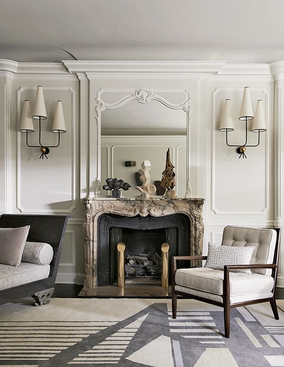
Even dirty off white is more forgiving. This is a nice amount of ornamentalism for me. There is a lot going on here, but keeping things neutral and monochromatic lets the eye rest.

design crisis | palette cleanser

For those of us with yucky architecture and light, color may be a necessity. I don't think cleaning house necessarily means painting everything in neutrals and going gently into that good night. Robert Couturier is my homeboy because he knows how to let even a fancy room breathe. Bold color on the walls and wee pattern on the sofas dictates neutral art, no pillows (!!!), very little clutter, and curtains that don't pop. Matching sofas reduces the number of design elements in a large room. This is a space that could be translated to a real person's house for sure.

design crisis | palette cleanser

Or how about a mostly tonal room with zero pattern? So doable. The focus is all on the delicious yet judicious use of color. It might even be nutritious.

design crisis | palette cleanser

Same idea, but as a kitchen. Sexy, moody, interesting, and clean as a whistle.

design crisis | palette cleanser

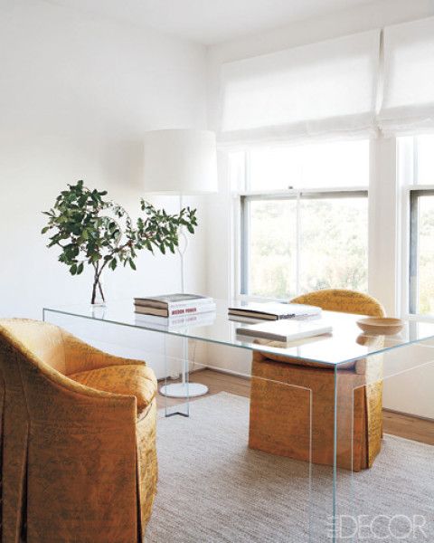
I have to admit it is hard not to love a good white room, though. The architecture and textural elements here are layered enough to keep things lively, and that lamp is everything.

design crisis | palette cleanser

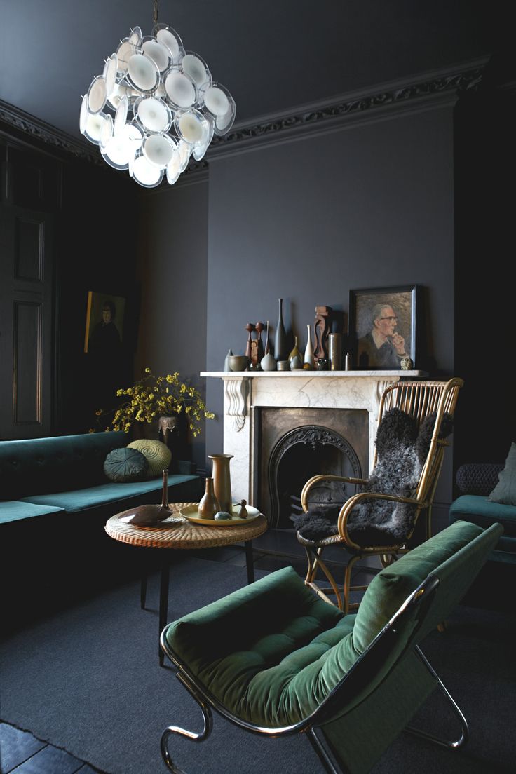
At the opposite end of the spectrum, a bright white Vistosi chandelier in an otherwise dark room has impact without punching you in the face. The paint color and furnishings are unique, but everything else is kinda blendy and nothing is upstaging the diva.

design crisis | palette cleanser

Blendy blendy, but not blandy. It's all about the floors and that bizarrely awesome chandelier.

design crisis | palette cleanser

This is like the good twin to my evil twin powder room. I really wanted everything to feel like it was chiseled from the same material. It might have helped if I had 10K to spend on marble, but I think I did ok with $300 spent on wallpaper.

design crisis

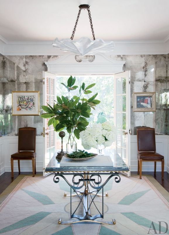
And then there is this room. There are quite a few design elements going on, but the balance is good. I spy plenty of breathing room. It's clean and fresh and interesting. I want to live here. That rug!

Isn't it nice be simple sometimes?

Calling All Fabric Fiends

Has something ever hunted you down and utterly possessed you in a wholly unhealthy way? In a way that pervades even your dreams and interferes with the ability to eat or watch project runway or maybe even shower? This is that thing. WHAT IS THIS PILLOW FABRIC?!

nick olsen bedroom

Everything about this bedroom by Nick Olsen is magical perfection to my eye... even the west elm rug. But I really need that pillow fabric. Need. It. I also saw that Suzanne Kasler used it on a chair to captivating effect, though I can't track down the image and frankly can barely even think to type this short post.

Help!

Luke's Mini Mod Nursery Tour

What what? It's tour time!

untitled (1 of 1)-4

I'm sure you had nothing better to do than refresh your browser 800 times a day until I posted the latest tour, right? Or, if you're like me, you barely have time to eat and sitting down at the computer for three minutes is a major luxury.

Thanks for spending that three minutes on me. Let me try to make it worth your while.

untitled (1 of 1)-9

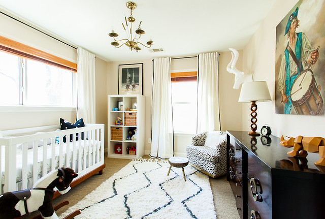
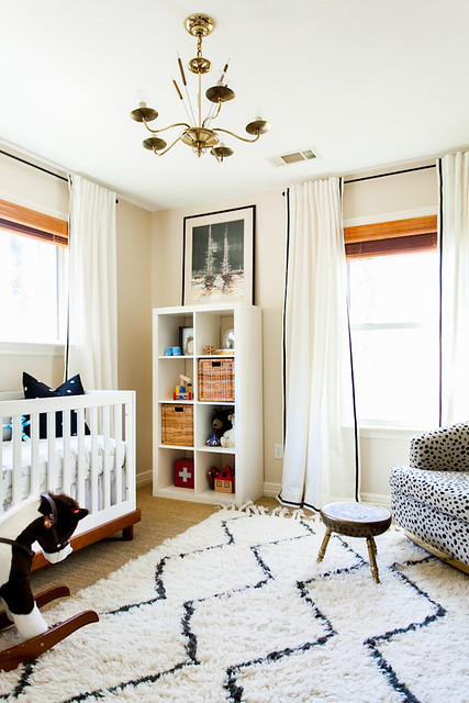
Much like the rest of our house, this room was a hot mess when we moved in. Tobacco green carpet that reeked of tobacco, hideous paint, a weird booby light fixture that hung long and low from the faux wood fan... it pretty much had it all.

untitled (1 of 1)-8

For a while it was Ben's office, but then I got knocked up and the baby had to sleep somewhere besides our bedroom, duh.

untitled (1 of 2)-2

Except, guess who's never ever ever in his entire seven months of life slept here?

untitled (17 of 19)

Thanks a bundle, pyloric stenosis and insane food allergies. I hated sleeping, anyway.

untitled (1 of 1)-2

But it's kind of ok because that means I can keep my sock monkey shrine unbesmirched by snot, and also the hot air balloon sheets that I am unnaturally fond of are still clean months after their debut.

details 2

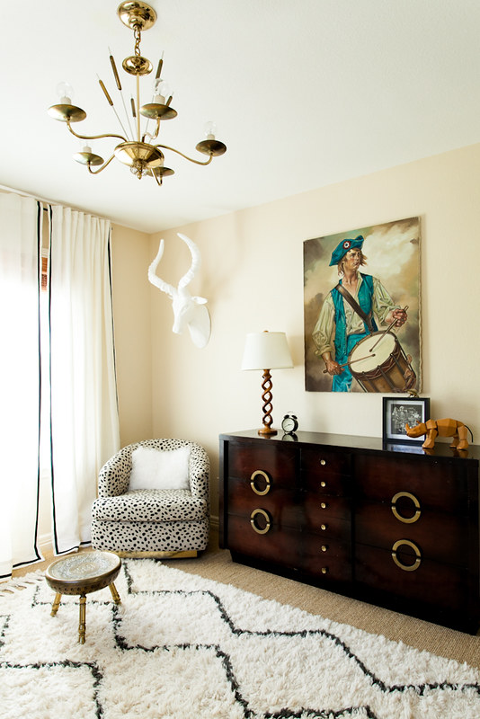
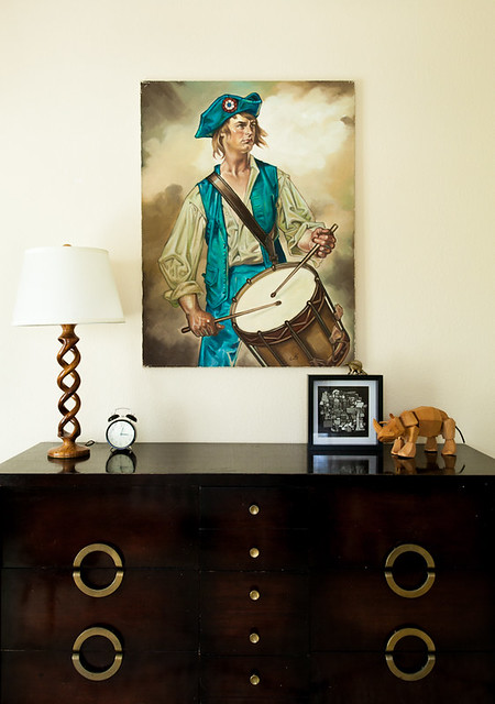
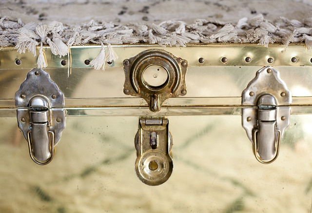
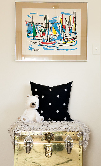
Plus I doubt very much that Luke will appreciate the brass overload that's going on in here as much as I do.

untitled (6 of 19)

Brassssssssss.

untitled (8 of 19)

But I'm betting he will totally love the vintage Dufy screenprint I snagged for him at a thrift shop.

untitled (15 of 19)

He's probably not my kid if he doesn't.

That was a joke since I vividly recall squeezing him out of my lady center.

Some things stick with you.

untitled (19 of 19)

Things like this guy.

Speaking of sticky important things, do you remember The Great Rug Debate of 2012?

Solved.

untitled (2 of 2)

I hemmed and hawed over a handful of 8x10 rugs until I stumbled upon the West Elm Souk at the outlets for $70.

Score one for poverty.

It's cute, but it's also a mess. I do not recommend it for high traffic areas unless you like to hoard leaves.

Detailz.

details

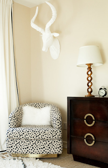
I have to say, I love designing kid rooms. There are so many fun details, like this totally crazy chair I had sitting around forever. New upholstery made him a mega comfy scene stealer.

untitled (1 of 1)-5

untitled (1 of 1)-3

Almost as cute as the dude who lives here. Or sort of lives here. Or will live here someday.

I hope.

Thanks for hanging out for Luke's grand tour! Sorry the writing is so sleepy, but I am whipped. I'm so tired I'm going to lazily paste the source list from a previous sneak peek I posted.

Paint color is Benjamin Moore Frappe, courtesy of the amazing Sanders.

Chair is vintage Milo Baughman that I had recovered in Togo fabric. This was the big splurge for this room — about $450 total.

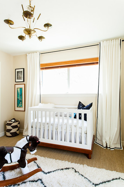
Curtains are super cheap Ikea Ritva onto which my sweet MIL spent two nights sewing ribbon trim… LOVE THEM! Four panels cost $65 plus time. Can’t beat that.

Mongolian fur pillow came from the West Elm outlet for $5.

Light fixture came from Ebay.

Vintage Raoul Dufy screenprint came from Room Service for $28. I cut a new mat for it.

Bookshelf is Ikea Expedit.

Sheepskin rug is old news.

Everything else is thrifted. I really tried to reuse as much stuff as possible to keep the cost down.

And that's it!

I hate to be a ho, but if you want to see another tour please please please let me know. Because in my house, the menu of options goes something like dinner OR shower.  So I'm hungry and dirty. But I wrote a post.

Yay, me!

Until next week.

[all images copyright ERIN WILLIAMSON]