Ask Sanders: Kristin's Blue Bathroom

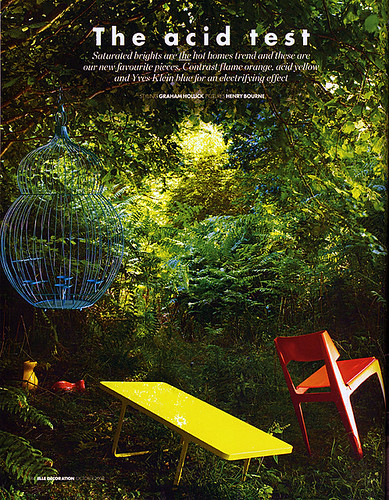
Here at Design Crisis, we're a little obsessed with paint. What else can completely transform a room for just a few bucks and some elbow grease? Sadly, adventures in painting can go horribly awry -- the golden yellow you hoped for goes macaroni and cheese, the perfect shade of crimson you envisioned turns into a bloody nightmare, or the warm gray you yearned for reads as icy blue instead. These domestic disasters happen everyday, but our resident Paint Guru, Sander Gibbs, is here to provide all the expert help you need to ditch the heartache and pick the perfect shade the first time around.

sanders

For our first installment of the Ask Sanders column, DC reader Kristin writes with an urgent dilemma -- what shade of blue to paint the bathroom in her rental apartment? Since Kristin is planning to cover her existing flooring with peel and stick white tiles (I've seen these in action, and they're not a bad option for renters), she could choose from a multitude of colors. She says:

"I'm looking for a super-saturated shade of blue. I had originally hoped for a Vermeer/Dutch blue... Anywho, my perfect shade would be not too deep, and very refreshing. Let me know what you think! I'd also move over towards something more tropical and punchy."

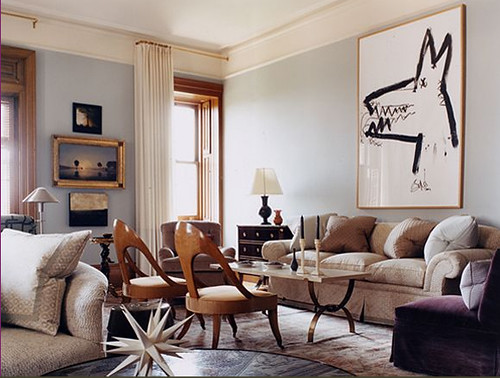
The particular shade on the walls of this room in the Gramercy Park Hotel is what inspired her to ask for a color match in the first place, so I sent the image over to Sanders for inspiration:

gramercy hotel

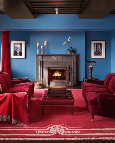
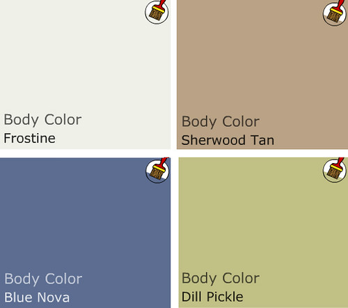
Judging by the image and his own experience with blues that woo the eye, Sanders put together this saturated blue palette for Kristin:

sanders color palette

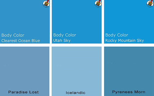
While the top colors are Benjamin Moore shades, the bottom pics are from Pratt and Lambert. Sanders informed me that P&L is actually a Sherwin Williams brand, but SW doesn't carry it in their stores. In Austin, Benjamin Moore is the only store that carries P&L, so if Kristin (or you) would like to try one of the P&L shades, check out the nearest Benjamin Moore for their selection.

Sanders picks look pretty close to the top picture to me, especially Clearest Ocean Blue and Paradise Lost, but as Sanders always says, "Buy a sample and make sure you paint on two coats! Two coats!" Paint shades can look totally different depending on lighting conditions, so even though you might think you're wasting your money on a sample, you could be wasting a lot more on unwanted gallons of paint. Always sample first!

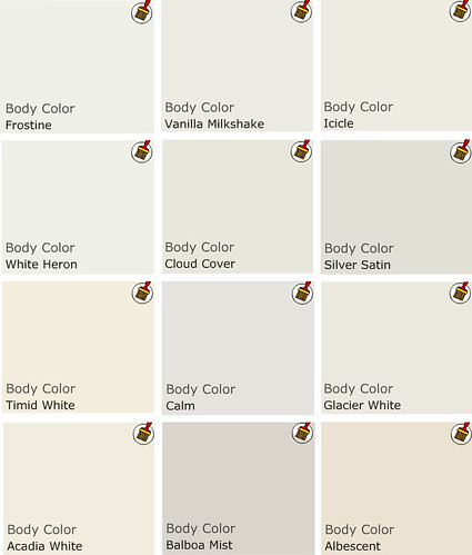
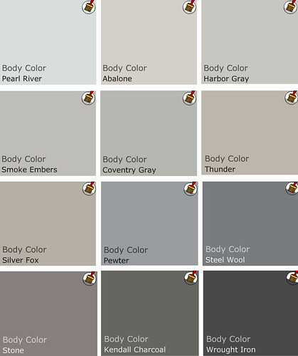
I also asked Sanders to put together a palette of blues he likes, just in case his color matches don't quite hit the spot. Many of his picks are more muted, but still punchy yet versatile:

sanders color palette

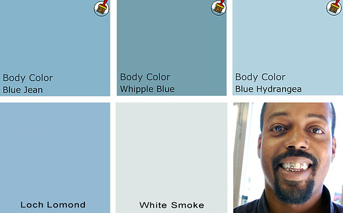
Top choices are Benjamin Moore colors, bottom row is from Pratt and Lambert's palette (and Sanders' cute lil' face).

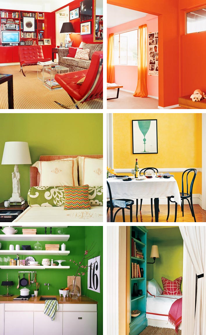
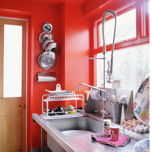
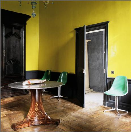
And now I think we need some eye candy to see how fresh the ever popular blue really can be when paired with the right environment. For Kristin's sake, many of my picks feature shades of blue in bathrooms, but blue is a flexible shade for many rooms (except kitchens, in my opinion).

living etc blue

Living Etc

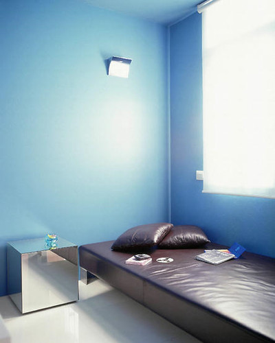
Blue gets paired with glossy chocolate leather and a sleek mirrored cube in this minimalist treatment.

blue annie schlecter

Annie Schlecter

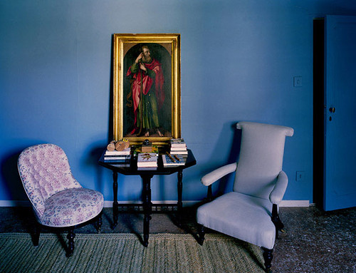
In the olden days, blue was a highly prized, very expensive pigment due to its relative instability and difficulty to manufacture, so it was only seen in special circumstances, like the Virgin Mary's robes. These cool blue walls and door highlight the red and green robes of a saint who must have been a little low on the totem pole.

domino blue bathroom

Domino

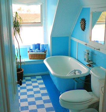
Multiple shades of blue work together in this eclectic bathroom. I'm really thinking someone should make colorful toilets...

blue tile

Per Ranung

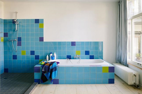
Sky blue tile mixes with chartreuse, indigo and royal purple, in this otherwise spare bathroom. A healthy dose of white keeps things from going utterly schizophrenic.

blue tiles

Living Etc

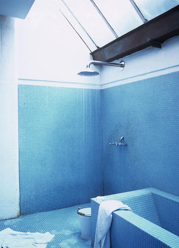
Monochromatic tile makes this bathroom feel spacious. Sexy skylights and minimal fixtures don't hurt, either.

paul costello

Paul Costello

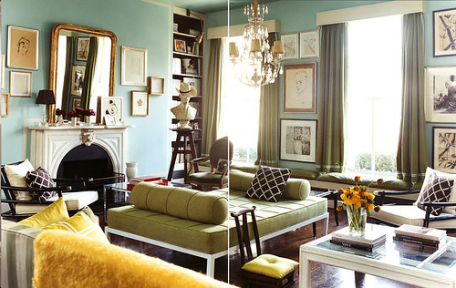
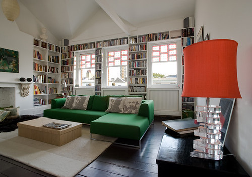
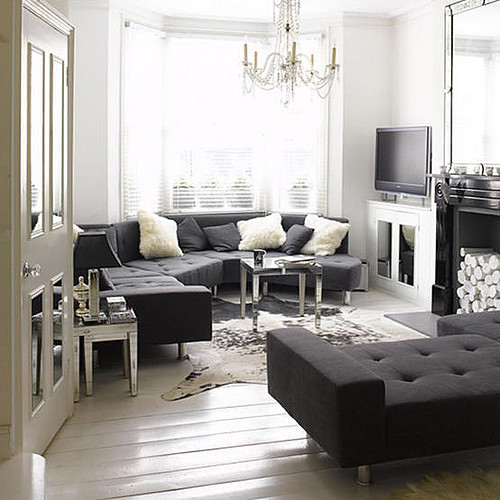
A sun filled living room mixes aqua with oregano and mimosa yellow for a fun, but sophisticated palette. Chocolate, white and gold, keep the color from getting out of control.

marie claire maison

Marie Claire Maison

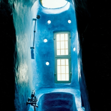
I have no freaking clue how this bathroom is constructed, but I'd love to have a cerulean aquatic labyrinth of my very own. The green window frames add subtle contrast to an otherwise all over color scheme where form and texture rule.

living etc

Living Etc

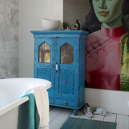
If that much color scares the Scandi pants off you, paint can always freshen up an old treasure and add a jolt of unexpected color. I myself wouldn't be unhappy with this bathroom in the least.

domino

Domino

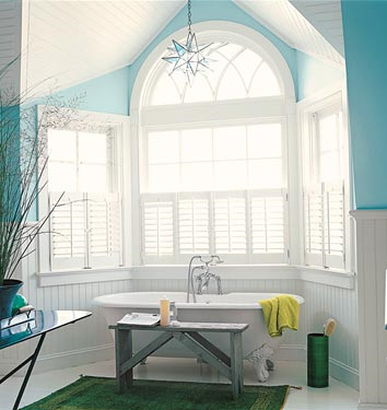
A soft, green based blue highlights the architecture of this traditional bathroom, bringing a little piece of the sky indoors.

moody blue

Annie Schlecter

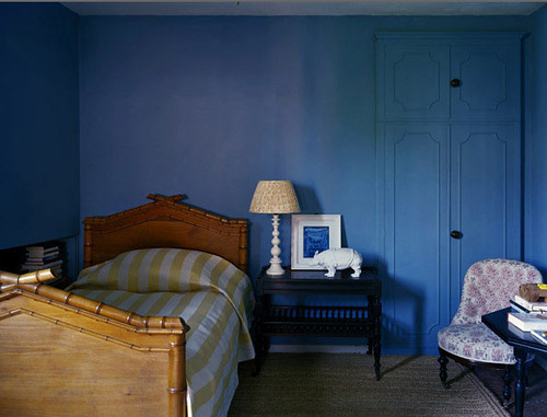
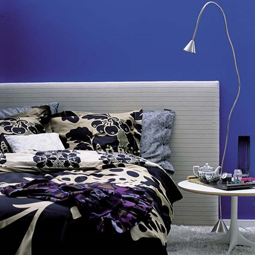
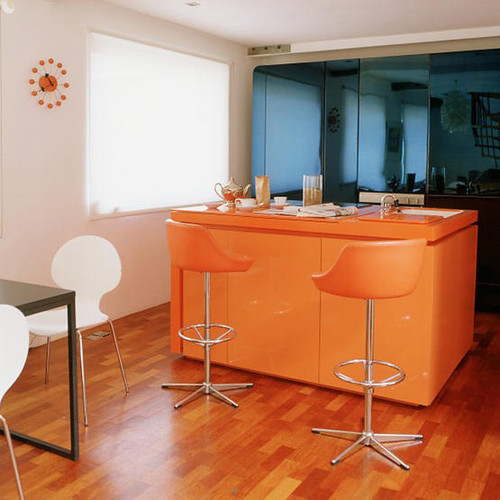
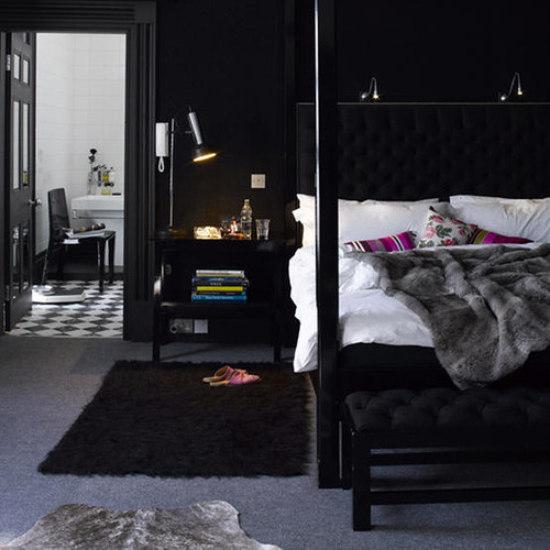
Moody blue covers wall and woodwork in this spare but funky bedroom. I love the little punches of yellow and pink.

blue bathroom

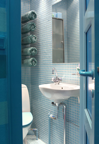
Blues of varying intensity and sheen create depth in this tiny bathroom. Blue toilet set: yes or no?

Kristin, we'd love to feature before and after pictures of your bathroom here on DC, so I really hope that Sanders' suggestions inspired you to take the plunge and get to painting! I myself am feeling so serene and relaxed from this azure haze that I think I'll present Part II of this (very special, of course) inaugural Ask Sanders column next Monday. Tune in Monday and see Sanders' expert advice for Kristin's bedroom: To kelly green, or not to kelly green? That is the question.

In the meantime, feel free to send your own paint queries for Sanders to our email address: hollback@design-crisis.com. Depending on demand, we'd like to feature picks from Sanders on a monthly basis, so don't go sending us any problems that need to be solved yesterday! Sanders is good, but he can't turn back time. Not even Cher can do that.

The Future's So Bright, I Gotta Wear Shades

As promised, today I am presenting Sanders the Paint Guru's picks for the hottest upcoming trends in color, and when I say "color," I mean COLOR. If the gray days of fall are getting you down, then this palette is sure to jump start your morning. When I asked Sanders what the most popular colors for next year would be, he immediately said "electric blue, bright orange, acid green, red, yellow." As usual, Sanders was on the money. Check out what the October issue of Elle Decor UK said would be the "Hot Trend For Homes":

elle decor uk

Versus the color palette Sanders put together during our interview:

sanders color palette

I told you that Sanders was good! If you ever had a crush on Roy G Biv in school, then these rooms are for you. Witness the power of dramatic paint to completely transform a space. (All photos courtesy of Domino)

domino colors

Don't you feel more cheerful, well rested and motivated, already? Maybe you won't even need that extra cup of coffee. Perhaps you should start a new exercise routine... Who's up for climbing Mount Everest???! Ok, let's take it one step at a time, shall we?

Since I've asked for help from you dear readers at least twice, you probably all know by now that I have a red dining room and kitchen, and I've been worrying that maybe it's a twee bit overblown. Perhaps instead of taking it down a notch, instead I should pump it up with a steroid injection of brighter, orangier, funkier, red:

red kitchen

(Photo courtesy of Living Etc.)

Or maybe, like Karly, you've been craving some sunshine in your space. Why not go for a zany shade of yellow on the walls?

yellow room

(Photo via A Mad Tea Party With Alis, who also has some great posts on color)

I love the super bright funkadelic yellow paired with dark dark trim and subdued, weathered floors. Shall we just say that the dead fish on the table adds to the rustic charm? Yes, we shall. Those chairs are pretty boss, too.

For those of you who love color but want something a little more sober, why not a bold, cobalt blue?

cobalt bedroom

(Photo via Living Etc)

It's much more unexpected than the usual aqua tinged walls, but still restful enough to catch some much needed Zzzzzz's at night. A silver leafed ceiling could be a magical complement (and gold is always fab).

Or perhaps you prefer to just scramble the whole color palette together and have a delicious rainbow omelette?

m interiors

This whole house decorated by M. Design Interiors is a madcap acid trip fantasyland, and I really want to live there. The sleek furnishings and square lines have an awesome 70's vibe, so perhaps we should throw a hip blogger's disco party? I think I'd have to ditch the tulips, though.

If you're not into all out color, maybe just a peep of bright paint would do the trick.

m interiors

I love the use of primary shades in this super white space, courtesy once again of the fabulous M. Design Interiors.

Ok, I know that lots of you out there love color, but would prefer to confine it to accessories and furnishings for a splash of bright something something against a neutral background without the commitment of paint. Here are some renter friendly solutions that will still give your pad some punch.

colorful accessories

(Photo credits for each row, left to right: Living Etc, Living Etc. Domino, Living Etc. Terramia, Andrew Suvalsky. Living Etc, Domino)

Why not reupholster a vintage couch or chair in a shockingly bright fabric to create a substantial focal point in your otherwise neutral room? Or you could always do some super mod pillows for a cheap and easy burst of color (bonus points for resourcefulness if you can sew your own). Also, I kind of want a lime green clawfoot tub now... If only I had a bathroom big enough for one!

Anyone want a cush headboard fit for a princess in a color that won't make your prince cringe?

m interiors

(Photo via M. Design Interiors)

Yeah, baby, I can dig it. Now how about a red green combo that's miles away from Christmas?

flux interiors

(Flux Interiors)

That is one delicious lampshade, and I love the repeat of the color on the window frames. Is that an Ikea couch? If not, they have a very similar version that comes with a zillion different slipcovers, so you can redecorate annually without breaking the bank. I am voting for new pillows though. How about a row of Obama heads instead of Mao and Marx? Yes we can.

If you already have great bones, highlight them.

yellow couch

(Photo via A Mad Tea Party With Alis)

A burst of sunny yellow makes this old school stunner look fresh, clean and modern. How much do you love the charcoal piping? Fabulous.

Even bold color can be subtly softened by its surroundings.

lampshade

(via If the Lampshade Fits)

Purpley gray walls set this versatile tomato red couch afire, but an otherwise subdued color palette keeps things cool and sophisticated.

If you're feeling more daring, go for the gold:

orange kitchen

(Photo via Living Etc)

I really hate barstools, but at least these are camoflaged by a similarly hued tangerine kitchen bar with matching countertops. I love the harmony with the orangey wooden floors, as well as the contrast with the blue mirrored glass in the background.

And last but not least, some gorgeous shades of green and blue that are fresh but not overwhelming:

fawn galli

If you've never checked out the Brooklyn home of Fawn Galli, go there now. Her house is a gorgeous reminder that color is fun and doesn't have to be opressive or vulgar. And she has a giant deer sculpture. My hero.

That's it for this Sanders-inspired roundup of ultra ultra brights. What do you think? Could you live with these acid hues, or are you planning to stick to neutral basics? Tell us all about it.

King of Paint: Interview With Sanders P. Gibbs III

I am officially a paint snob, and it's all Sanders' fault. When we first started painting our house, I giddily skipped around the corner to Home Depot and completely denuded their paint sample wall. I mean, I took every. single. sample. While I ended up choosing one of their colors for my bathroom (which was a HIDEOUS and GLOSSY macaroni yellow mistake that got painted over not once, but twice), I couldn't find a color for my kitchen or bedroom to save my life. I must have bought 30 samples (no lie!) and every one of them skewed red or blue or looked muddy or garish -- I'm sure many of you have had the same frustrating experience with paint. Dragging my heels in defeat, I drove the extra two whole miles to Benjamin Moore after reading countless blogs' shining praise of their paint and color selections. That's where I met Sanders.

sanders

Sanders has this crazy encyclopedic knowledge of color that he started accruing way back in 1997 while working for Benjamin Moore, and he's now the manager of South Austin's Hill Country Paint. If you tell him a color name, that man can give you the number. He helped me pick several different shades for my house, and remembers every color I've even chosen. In short, even though Benjamin Moore's paint is more expensive than Home Depot's, Sanders has saved me a lot of money and time. He even talked my cheap behind (and Karly's) into buying the $50 a gallon Aura paint, and I will never buy another paint again. It covers like a dream, and it even smells delicious (low VOC rocks!). Do I sound like I get my paint for free? I don't. It's just good paint.

The power of paint to transform a space is divine, and since I first met Sanders I've painted almost every room in this house, so we've seen each other relatively frequently. When Karly and I started this blog, we told him about it and Sanders is now one of our oldest readers. He still reads it every night, and can recite all of our adventures in detail (which is slightly unnerving, and reminds me that I need to be more careful about what I write). So I promised Sanders that as soon as we had more than 5 readers, I would make him TOTALLY FAMOUS by interviewing him.

When the day finally comes, I walk in and ask if he's ready, and he says he's so nervous he couldn't sleep last night. I laugh because I'm pretty used to Sanders telling me what's what in his kingdom, and it's mildly entertaining to see his swagger a little diminished. But as soon as we sit down to talk paint, he's all cool, calm and collected business again. I tell him that a lot of interior designers are currently painting spaces black and ask him what he thinks about that. (photo via Living etc.)

black room

He looks a little bemused, pointing at himself in his black shirt, and stutters slightly, "W-w-wellllll...." It's pretty clear he doesn't like the idea, but to say so goes against his first priority, which is to give the customer what he or she wants. He goes on to say that he wouldn't personally paint his home black, and certainly not black black, but maybe a "shade of black. It's a personal choice." I ask him if he thinks dark colors make small spaces look smaller, and he says, "Dark colors are fine for small spaces. The right tone of color works for a certain unique space. You don't have to stick to whites and pastels. Dark colors can lend masculinity and power to a room." He does say that natural light is helpful for a small, dark space, "because light is your ally," and also to stick to "small scale, sleek furnishings" so that the room doesn't feel too heavy and oppressive. I ask him to pick a black color palette, and this is what he chooses.

black color palette

I then ask him about white, since it seems overwhelmingly to be the most popular paint color in all the decor magazines. (photo via Living etc.)

whites

He frowns a little and hesitates. Nope, not white, either -- although he is careful not to say that explicitly. He says that if you have great architecture and lots of light, white can be good, but again, not pure white. "Off white is rich and soft." I ask for his favorite whites, and this is the palette he chooses:

whites

By the way, if you buy the Aura paint and you're painting a light color over a light color, you can probably get away with only one coat if you're a good painter. It worked for me in several rooms, it looks good, and I saved a lot of time and paint. But sssshhhhhh, don't tell Sanders, ok?! His favorite thing to say is "Two coats! two coats!"

Alright, I say, how about gray? His face lights up. A string of happy expletives tumble out. Mothereffing yes! Yes, gray is good! In fact, Sanders knows many of them by heart, including the ones I have chosen for my house (Abalone and Silver Fox, as well as Karly's Harbor Gray). "Gray is neutral, but not boring. It's versatile." (photo courtesy of Jeffrey Bilhuber)

jeffrey bilhuber

If you've ever tried to pick a shade of gray paint, you know how hard it is. Nothing is quite pure gray. Sanders points to all the undertones in the different shades, and stresses the importance of choosing a gray that looks good in your personal space. "The biggest mistake people make is not buying samples. Everyone's light is different and paint changes in the environment it's in." I ask him if people often come in complaining about their paint selections and he says, "No. It's 'cause I make sure they get a sample." That and Sanders is a color matching wizard, capable of choosing something great to match the rest of your house, or custom mixing the shade of your dreams. Here are his picks for grays:

sanders' gray picks

As we chat, Sanders eats his lunch and we reminisce about how we became friends. For some reason, early on he asked me where I was from and when I told him it was Texarkana (a tiny town at the corner of Texas, Arkansas, and Louisiana), he said he had lived there for several years, too. We spent the better part of an hour laughing about how craptacular T-town can be, and we've been pals ever since. There's nothing like bonding over harrowing times, to be sure. I ask him about his son, who is now three months old, and his face is downright beatific. "He's growing and changing and adapting to his new world." It's obvious that his son is the apple of his eye, and I ask him what colors he painted the nursery. He tells me that he has light wood floors and this is his household color palette:

sander's house

And I imagine that his house looks something like this, with a shot of lime in the baby's room:

sanders

(photo via The Style Files) Very cozy, right?

Since so many people are pretty clueless about the nuances of color, I ask him how he might help a person who has no idea what they want. "I would ask them about their favorite foods, you know, places where they might go to vacation, what their interests are." What about the whole psychology of color theory, where red is hungry, blue is soothing, etc? Sanders shakes his head and says, "Different strokes for different folks. People should have unique colors. The Dewey Decimal System of color is not the way to go. It's an outdated idea." What about the idea that you choose colors that look good on you, so you always look good in your environment? He shakes his head again. Another string of verrrrrry funny expletives, and I start giggling. A browsing customer looks my way and I try to take it down a notch. "You don't need to choose colors that look good on you, but clothing choices may reveal fondness for colors. You don't have to keep the staus quo, though."

I go on to quiz Sanders on some technical stuff and things, so here is Sanders' Wisdom, from him to you:

For walls, matte or glossy: MATTE. Definitely.

Even for bathrooms: Yes.

What about for trim: Glossy, and oil will give it that extra kapow ZING. (insert hand motions here)

What kind of paint do you use for concrete floors: For low sheen, use paint grade concrete stain, which is not a true acid stain. For an opaque paint, use latex Porch and Floor paint (also good for wood floors). For a glossy finish, use an oil base paint.

Can you paint tile: Yes, but you MUST use a 100% acrylic primer. Then you can cover with any paint, but the primer is the key.

How about a bathtub: No. You need an epoxy paint for that.

As we finish up, I thank Sanders for his time and expertise, and he gets all nervous again. "Don't bash me, ok?" Don't worry, Sanders. There's nothing to bash!

sanders

THANKS SANDERS!

This write up is running long, so tune in on Thursday to see Sanders' picks for the hottest new color trends. His palette is so on point, Elle Decor UK is currently running some of the same picks. I promise it will be the super antidote to fall and winter's dreary, gray days.