My New Apartment

Whew, it has been a loooong weekend, full of tools and gardening and yet ANOTHER trip to Ikea. Seriously, what is wrong with me? Anyway, apparently my actual life is staging an intervention, so I'm going to attempt to make this blog post short and sweet. Or should I say quick and dirty? How about short and dirty? Awww, yeah. That's me. So, what do you get when you put an photographer responsible for some of the greatest interiors shots ever:

annie schlectner

Together with an architect who's got style to spare:

joe serrins

And add a dash of bookmaker husband?

russel maret

Answer: a droolworthy renovated prewar apartment in New York City that serves as home to photographer Annie Schlecter and bookbinder husband Russel Maret.

top hat residence

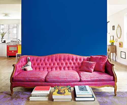
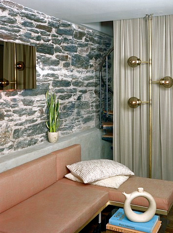
Oh, and guess what color they decided to paint the back wall that used to separate two independent studio apartments? That's right -- Yves Klein Blue, which Schlecter identified as KT Color 03.001 Ultramarin Blau paint. Long time readers of DC will remember my obsession with YKB almost a year back, but all you new friends can check out the links here and here.

Now for some reason, NY Mag reported this story but got totally stingy with the pictures, so I put on my internet sleuthing hat and managed to dig up more shots from architect Joe Serrins' site (expect to see a post on his awesome homes later this week...).

top hat residence

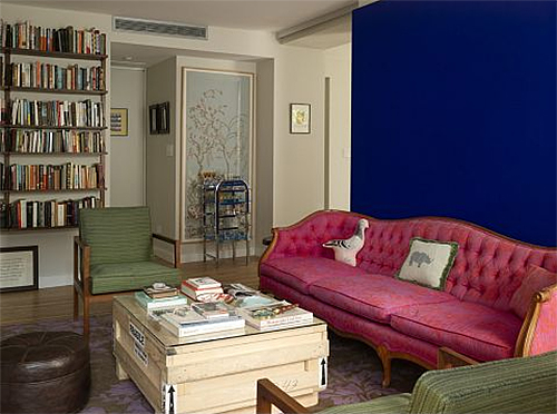
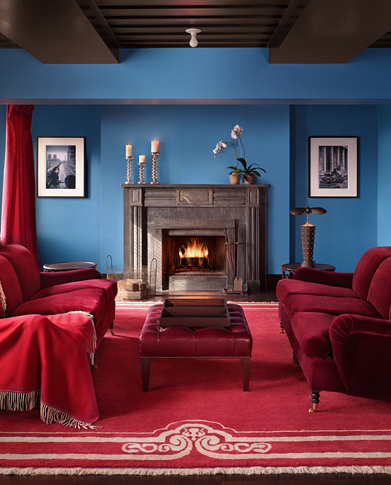
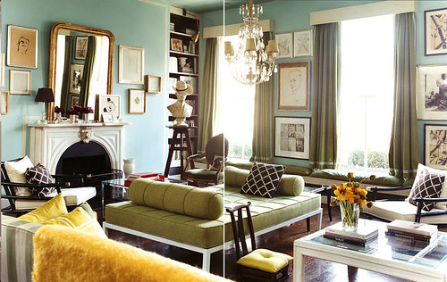
Here's another shot of the living room that shows a toned down living space designed to highlight the blue wall/pink couch focal point.

top hat residence

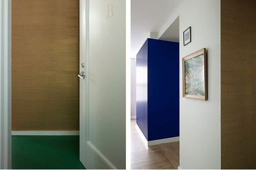
The entryway is papered in gold grasscloth which is a current OBSESSION of mine. I want to paper everything in its textural glitziness.

top hat residence

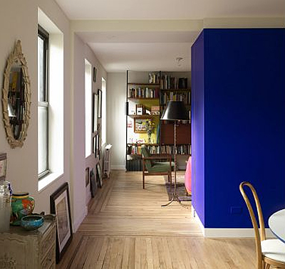
As I mentioned before, two separate apartments in two separate buildings were merged to form one larger apartment. One of the commenters on the NYMag site said, "This is the desecration a beautiful pre-war apartment. The original architects are rolling in their graves." When will flamers learn that grammatical errors render their silly, baseless insults flaccid? Plus this is a sweet apartment and that asshat is just flat wrong.

top hat residence

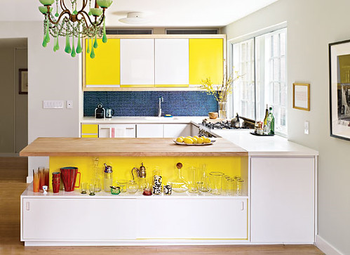
I love that the homeowners built the cabinets from plywood and formica, and used blue penny tile and yellow paint to add some kapow zing. Kitchen renovations don't have to cost a fortune, and as an added bonus, no granite was harmed in the making of this space.

top hat residence

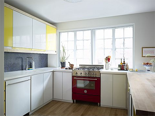
These people don't even have stainless appliances... wtf?! Confession: Ok, I have stainless appliances, but if I could afford that red lacquered beauty, she'd have a place of honor in my kitchen. Or maybe a turquoise stove would be more unexpected?

top hat residence

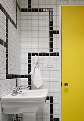
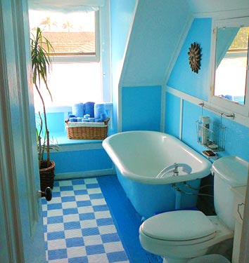
The bathroom continues the Roy Lichtenstein/Piet Mondrian primary palette, and I suddenly have the urge to paint a door -- any door -- canary yellow.

top hat residence

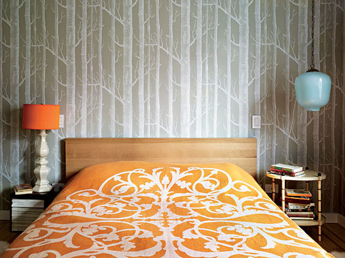
Last but not least, the bedroom -- which I know will be hated by my special super friends because it features the ubiquitous Cole and Son Woods wallpaper, but I have to say I love it. It has just the right amount of layering, pattern, and asymmetry to make it interesting.

So, I just spent months purging color from my house, and then Annie Schlecter comes along and combines pink, red, yellow, blue and orange, with abandon, and it looks GOOD. Le Sigh. I'm tired of renovating and want to move into her house.

Nevertheless, I shall power on with said renovations, and hopefully I can give you all a state of the union address very soon. In the meantime, rest assured that it contains no mention of the "pandemic" swine flu, because I am sick of hearing about that ridiculous fear mongering nonsense. (But don't judge if I just stay right here and nest up a storm in my nice, germ free house for a while, ok?)

Happy flu free Monday!

Ask Sanders: Kristin's Blue Bathroom

Here at Design Crisis, we're a little obsessed with paint. What else can completely transform a room for just a few bucks and some elbow grease? Sadly, adventures in painting can go horribly awry -- the golden yellow you hoped for goes macaroni and cheese, the perfect shade of crimson you envisioned turns into a bloody nightmare, or the warm gray you yearned for reads as icy blue instead. These domestic disasters happen everyday, but our resident Paint Guru, Sander Gibbs, is here to provide all the expert help you need to ditch the heartache and pick the perfect shade the first time around.

sanders

For our first installment of the Ask Sanders column, DC reader Kristin writes with an urgent dilemma -- what shade of blue to paint the bathroom in her rental apartment? Since Kristin is planning to cover her existing flooring with peel and stick white tiles (I've seen these in action, and they're not a bad option for renters), she could choose from a multitude of colors. She says:

"I'm looking for a super-saturated shade of blue. I had originally hoped for a Vermeer/Dutch blue... Anywho, my perfect shade would be not too deep, and very refreshing. Let me know what you think! I'd also move over towards something more tropical and punchy."

The particular shade on the walls of this room in the Gramercy Park Hotel is what inspired her to ask for a color match in the first place, so I sent the image over to Sanders for inspiration:

gramercy hotel

Judging by the image and his own experience with blues that woo the eye, Sanders put together this saturated blue palette for Kristin:

sanders color palette

While the top colors are Benjamin Moore shades, the bottom pics are from Pratt and Lambert. Sanders informed me that P&L is actually a Sherwin Williams brand, but SW doesn't carry it in their stores. In Austin, Benjamin Moore is the only store that carries P&L, so if Kristin (or you) would like to try one of the P&L shades, check out the nearest Benjamin Moore for their selection.

Sanders picks look pretty close to the top picture to me, especially Clearest Ocean Blue and Paradise Lost, but as Sanders always says, "Buy a sample and make sure you paint on two coats! Two coats!" Paint shades can look totally different depending on lighting conditions, so even though you might think you're wasting your money on a sample, you could be wasting a lot more on unwanted gallons of paint. Always sample first!

I also asked Sanders to put together a palette of blues he likes, just in case his color matches don't quite hit the spot. Many of his picks are more muted, but still punchy yet versatile:

sanders color palette

Top choices are Benjamin Moore colors, bottom row is from Pratt and Lambert's palette (and Sanders' cute lil' face).

And now I think we need some eye candy to see how fresh the ever popular blue really can be when paired with the right environment. For Kristin's sake, many of my picks feature shades of blue in bathrooms, but blue is a flexible shade for many rooms (except kitchens, in my opinion).

living etc blue

Living Etc

Blue gets paired with glossy chocolate leather and a sleek mirrored cube in this minimalist treatment.

blue annie schlecter

Annie Schlecter

In the olden days, blue was a highly prized, very expensive pigment due to its relative instability and difficulty to manufacture, so it was only seen in special circumstances, like the Virgin Mary's robes. These cool blue walls and door highlight the red and green robes of a saint who must have been a little low on the totem pole.

domino blue bathroom

Domino

Multiple shades of blue work together in this eclectic bathroom. I'm really thinking someone should make colorful toilets...

blue tile

Per Ranung

Sky blue tile mixes with chartreuse, indigo and royal purple, in this otherwise spare bathroom. A healthy dose of white keeps things from going utterly schizophrenic.

blue tiles

Living Etc

Monochromatic tile makes this bathroom feel spacious. Sexy skylights and minimal fixtures don't hurt, either.

paul costello

Paul Costello

A sun filled living room mixes aqua with oregano and mimosa yellow for a fun, but sophisticated palette. Chocolate, white and gold, keep the color from getting out of control.

marie claire maison

Marie Claire Maison

I have no freaking clue how this bathroom is constructed, but I'd love to have a cerulean aquatic labyrinth of my very own. The green window frames add subtle contrast to an otherwise all over color scheme where form and texture rule.

living etc

Living Etc

If that much color scares the Scandi pants off you, paint can always freshen up an old treasure and add a jolt of unexpected color. I myself wouldn't be unhappy with this bathroom in the least.

domino

Domino

A soft, green based blue highlights the architecture of this traditional bathroom, bringing a little piece of the sky indoors.

moody blue

Annie Schlecter

Moody blue covers wall and woodwork in this spare but funky bedroom. I love the little punches of yellow and pink.

blue bathroom

Blues of varying intensity and sheen create depth in this tiny bathroom. Blue toilet set: yes or no?

Kristin, we'd love to feature before and after pictures of your bathroom here on DC, so I really hope that Sanders' suggestions inspired you to take the plunge and get to painting! I myself am feeling so serene and relaxed from this azure haze that I think I'll present Part II of this (very special, of course) inaugural Ask Sanders column next Monday. Tune in Monday and see Sanders' expert advice for Kristin's bedroom: To kelly green, or not to kelly green? That is the question.

In the meantime, feel free to send your own paint queries for Sanders to our email address: hollback@design-crisis.com. Depending on demand, we'd like to feature picks from Sanders on a monthly basis, so don't go sending us any problems that need to be solved yesterday! Sanders is good, but he can't turn back time. Not even Cher can do that.

Picture Pages

Back, way back, in ye olde nineteen and eighties, my snaggle-toothed little brother and I would go stay with my dad at his swinging bachelor pad on the weekends. It was a modest home, furnished with wicker barrel chairs and those weird fake feathered plumes that inexplicably still pop up in homes of the design challenged across America, but it was redeemed by two wonderful things: bunk beds, and the most kickin' jungle themed mural wallpaper you have ever seen. I remember having the best conversations with my brother and dad set against the backdrop of that wonderful mural... Dad: If you could meet anyone, anyone, who would it be?

Eight-year-old Me: Michael Jackson! Michael Jackson!

Thankfully, some things have changed, but I still want that wallpaper. To assuage the bittersweet pinprick pain of my nostalgia, today's post is bringing back the retro photo mural. Michael Jackson thankfully not included.

apartment therapy

(via Apartment Therapy)

Although not junglerrific, my dad would certainly approve of this wildlife encrusted mural from Cabela's -- one of his favorite stores. At $80, it's kind of an amazing bargain, and it doesn't scream banjos and rifles as long as the furnishings and accessories are kept clean and simple.

living etc murals

A recent issue of the British Living Etc featured this woodland sanctuary. I wish my office was swathed in this paper so I could pretend I wasn't working...

apartment therapy

These homes featured in Apartment Therapy follow suit with a woodsy atmosphere. The panels on the right are disguising a closet, which is pretty freaking genius, if you ask me.

murals

The quirky home of Shauna Alterio & Stephen Loidolt, owners of small business Something's Hiding in Here, outfitted their loft with tons of whimsical details, not the least of which is this virtual forest in the kitchen. If you haven't seen the rest of their home, check it out here at Design Sponge. It's pretty inspiring!

wary meyers

Sorry about the tiny pictures, but I just had to show this room designed by superheroes Wary Meyers, which I think uses the exact same wallpaper!

If you're not so much into the forest scenes, never fear. A host of other options await you...

murals

Please Sir featured this incredible image on her blog, and I've been mildly obsessed ever since. I LOVE the theatrical red curtains, which make the mural look like a painted backdrop, and the coverlet is bold without overpowering the space. Photograph by Annie Schlecter.

murals per ranung

per ranung

There's a similar sense of icy optimism in these images shot at a Swedish home by Per Ranung. Those crazy bursts of color look fabulous amid the acres of white. They have a zillion (gorgeous, tow-headed) kids, though, so don't ask me how they keep that place clean!

Hate the great outdoors? You do have other options...

maps

I blogged about this rad kid's room decorated by Flickr user kbreenbo eons ago, but it's awesomeness bears repeating. That child is going to grow up knowing where Qatar and Easter Island are, and that's more than I know, already.

living etc

Want to look book smart without actually reading? Living Etc shows you how it's done. No dusting or alphabetizing required. (And it would be helpful if the furniture were also included).

studio ilse

Karly blogged about this gorgeous room in Studio Ilse's portfolio a couple of weeks ago, so hopefully you won't hate me for recycling, but who doesn't want to dream of wild, wild horses?

surface view murals

And then there's this INSANE mural by British company, Surface View. Photo courtesy of Retro to Go. Surface View has access to a lot of historical and retro images, so if you check out their site, you'll notice that you aren't restricted to the same old stock photos featured on every other mural site. They also have this widget that allows viewers to create rooms based on chosen images. I might have gone a little lot crazy with da widget...

murals

Wouldn't this be a charming girl's room if paired with some really sleek, colorful furniture and accessories?

Oh, and I made these, too... Sorry about the dingy pop-ups in the corner.

murals

I linked it to the full size version in case you want to scrutinize the pictures, but I am sure you can tell that there is a wide variety of selections available, some of which I covet. Badly. Unfortunately, as expected Surface View's murals aren't exactly cheap. Shipping alone is $150, and the price per square yard is $160. Ouch.

Meanwhile, murals available through Cabela's, Target and the Mural Superstore (super cheap!) are in the $80 - $200 range. Of course, if you want something totally custom, you could have your own image blown up into a mural sized panorama (provided it's not a copyrighted image) through Design Your Wall.

So what do you think? Do these murals leave you with a lovin' feeling, or does the purist in you revile the very idea? Tell me all about it.