That Seventies Series: Paint the Trim Fantastic

So, I have this secret interior decorating weapon called Living Spaces. I bought the book for a buck at a Goodwill a while ago, and was amazed to find that its 1978 goodness is perfectly aligned with current interior trends, and maybe even a few upcoming trends that I will attempt to predict a la Miss Cleo. This bad boy was produced by the Whitney Library of Design, so you know it's good. Anyhoodles, I'm starting a series based on inspiring images from the book, so let's see if I can get this sweet puppy to fly.
living spaces

living spaces

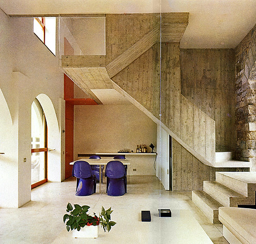
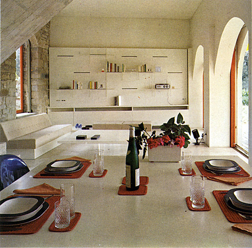
Clean lines, natural surfaces, neutral backdrops -- this ain't your momma's carpet infested house. Actually it's a fat villa in Florence, and what I'm really digging is the colored trim against the pale background (please ignore the hideous table setting... yikes!). So I've done my very bestest to find some contemporary examples of trim that are not painted white or blended into the wall color. Why should all the other surfaces have all the fun, anyway?
pink window trim

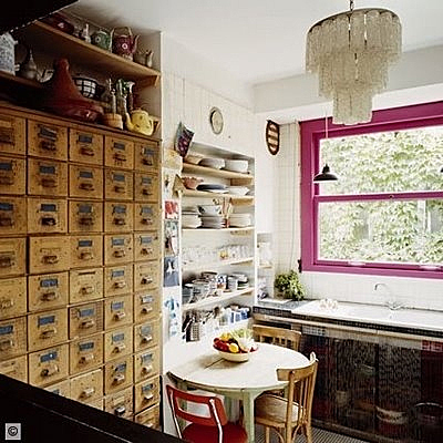
Sorry, not sure where this picture came from, but let me just say that it takes some pretty powerful trim to distract me from the vintage card catalog in all its sexified glory.
pink trim

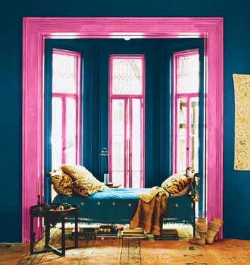
If you're really brave, you can dispense with the white altogether and bathe the entire room in saturated hues, like this pic from Domino. (By the way, has anyone received their January copy via mail yet? Anyone? Anyone?)
yellow window trim

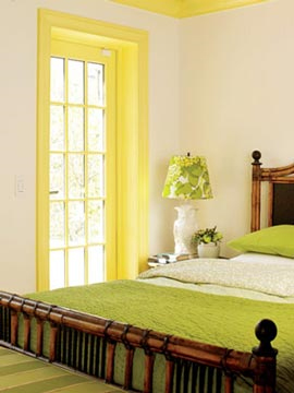
Sad story: this is NOT the picture I wanted to include. Months ago, I saw this gorgeous image of a very spare room with pale walls and maybe pale concrete floors, and the only color in the room came from the citron yellow window trim. I cannot for the life of me find the picture... I swear, I went all Captain Insano and searched for HOURS for it, and I'm really tired now. OCD sucks. If you know which picture I'm talking about, please send me the link and I'll swap pics. Until one of you superfantastic readers can bail me out, you'll have to make do with this pic from Apartment Therapy.

So maybe you like the idea of having non-white trim, but are looking for a little less contrast in value:
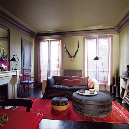
lavendar and green room

Even if you choose color for your walls, you don't have to paint the trim white. Thoughts on this color scheme? Photo courtesy of Marie Claire Maison.
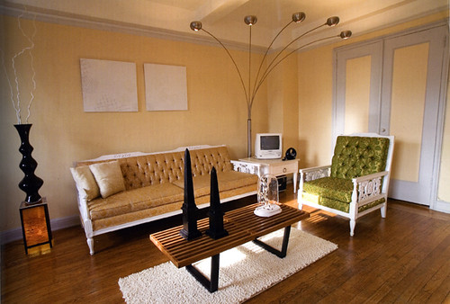
blue trim

A more subdued palette of butter yellow and a pale purplish blue, courtesy of Apartment Therapy.
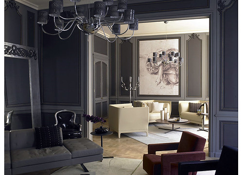
gray walls

This twist on traditional features dark gray walls with medium gray molding, which reads as understated and sophisticated rather than cartoonish. Photo by Richard Powers.
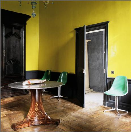
black trim yellow walls

Or perhaps you'd like to keep your Sanders-approved color on the walls, but still want to funk up the trim? Once you go black, you'll never go back. Like, seriously -- it would be a pain in the ass to paint over.

But, no pain, no gain, right?
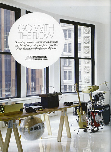
black trim white walls

Elle Decor UK reminds us to "Go With the Flow." With gorgeously framed windows like those, (and a disco ball!) I'm feeling a lot more fluid.
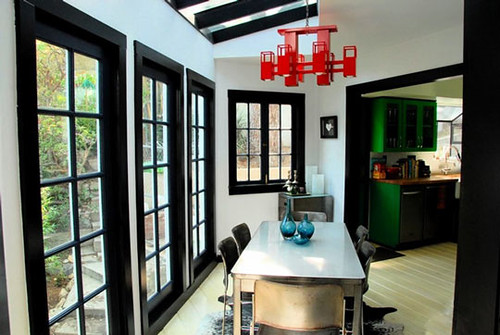
black trim

This quirky room from Apartment Therapy might be enough to make me take the plunge. I love the Roy Lichtenstein look:
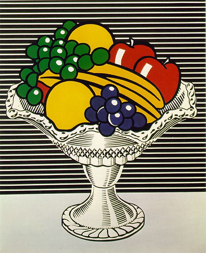
lichtenstein

Color is fun, but there's certainly nothing wrong with classic, clean and simple:
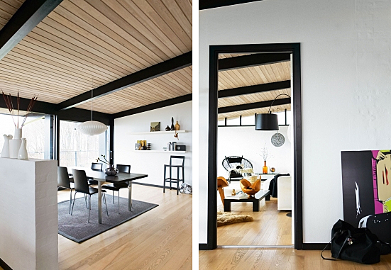
bo bedre

In these images from Bo Bedre, straight black trim sets off the crispness of the architecture and decor choices.
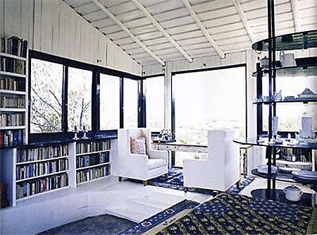
black trim windows

I love the simple black trimmed windows in this otherwise light and bright space. Image via the awesome decor blog, Roseland Greene.
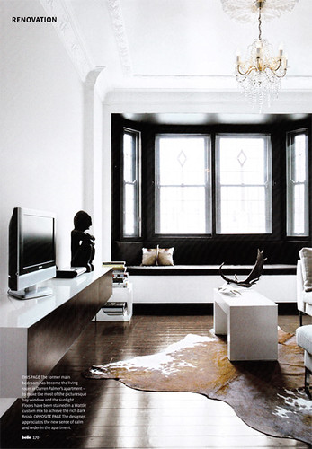
black window wall

Finally, I've been crushing over this gorgeous room since the always fabulous Door Sixteen first posted it. It's the perfect mix of drama and breathing space, and the stunning architecture doesn't hurt. I loooove the way the black draws attention to the windows, framing them like pictures.

White trim, eat your pale, listless heart out (but don't worry, I still love you).
The Future's So Bright, I Gotta Wear Shades

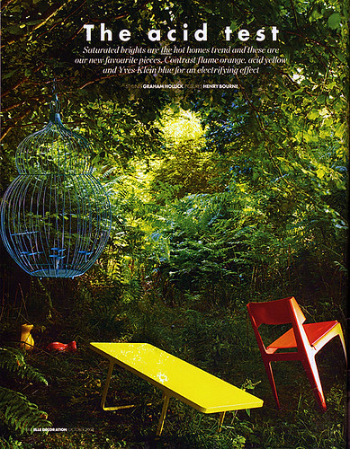
As promised, today I am presenting Sanders the Paint Guru's picks for the hottest upcoming trends in color, and when I say "color," I mean COLOR. If the gray days of fall are getting you down, then this palette is sure to jump start your morning. When I asked Sanders what the most popular colors for next year would be, he immediately said "electric blue, bright orange, acid green, red, yellow." As usual, Sanders was on the money. Check out what the October issue of Elle Decor UK said would be the "Hot Trend For Homes":

elle decor uk

Versus the color palette Sanders put together during our interview:

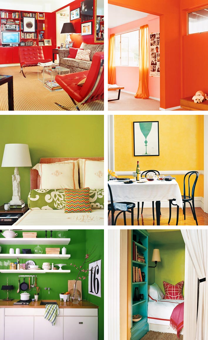
sanders color palette

I told you that Sanders was good! If you ever had a crush on Roy G Biv in school, then these rooms are for you. Witness the power of dramatic paint to completely transform a space. (All photos courtesy of Domino)

domino colors

Don't you feel more cheerful, well rested and motivated, already? Maybe you won't even need that extra cup of coffee. Perhaps you should start a new exercise routine... Who's up for climbing Mount Everest???! Ok, let's take it one step at a time, shall we?

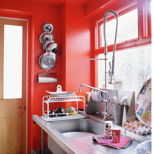
Since I've asked for help from you dear readers at least twice, you probably all know by now that I have a red dining room and kitchen, and I've been worrying that maybe it's a twee bit overblown. Perhaps instead of taking it down a notch, instead I should pump it up with a steroid injection of brighter, orangier, funkier, red:

red kitchen

(Photo courtesy of Living Etc.)

Or maybe, like Karly, you've been craving some sunshine in your space. Why not go for a zany shade of yellow on the walls?

yellow room

(Photo via A Mad Tea Party With Alis, who also has some great posts on color)

I love the super bright funkadelic yellow paired with dark dark trim and subdued, weathered floors. Shall we just say that the dead fish on the table adds to the rustic charm? Yes, we shall. Those chairs are pretty boss, too.

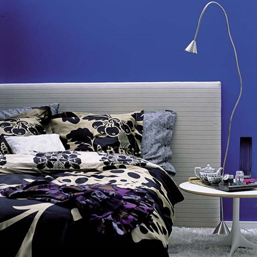
For those of you who love color but want something a little more sober, why not a bold, cobalt blue?

cobalt bedroom

(Photo via Living Etc)

It's much more unexpected than the usual aqua tinged walls, but still restful enough to catch some much needed Zzzzzz's at night. A silver leafed ceiling could be a magical complement (and gold is always fab).

Or perhaps you prefer to just scramble the whole color palette together and have a delicious rainbow omelette?

m interiors

This whole house decorated by M. Design Interiors is a madcap acid trip fantasyland, and I really want to live there. The sleek furnishings and square lines have an awesome 70's vibe, so perhaps we should throw a hip blogger's disco party? I think I'd have to ditch the tulips, though.

If you're not into all out color, maybe just a peep of bright paint would do the trick.

m interiors

I love the use of primary shades in this super white space, courtesy once again of the fabulous M. Design Interiors.

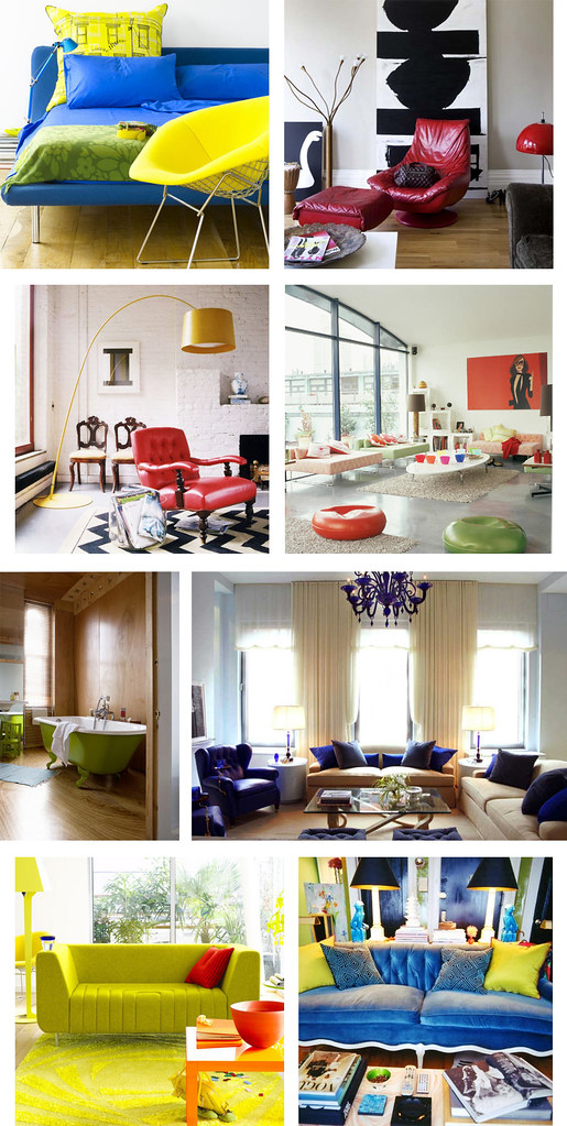
Ok, I know that lots of you out there love color, but would prefer to confine it to accessories and furnishings for a splash of bright something something against a neutral background without the commitment of paint. Here are some renter friendly solutions that will still give your pad some punch.

colorful accessories

(Photo credits for each row, left to right: Living Etc, Living Etc. Domino, Living Etc. Terramia, Andrew Suvalsky. Living Etc, Domino)

Why not reupholster a vintage couch or chair in a shockingly bright fabric to create a substantial focal point in your otherwise neutral room? Or you could always do some super mod pillows for a cheap and easy burst of color (bonus points for resourcefulness if you can sew your own). Also, I kind of want a lime green clawfoot tub now... If only I had a bathroom big enough for one!

Anyone want a cush headboard fit for a princess in a color that won't make your prince cringe?

m interiors

(Photo via M. Design Interiors)

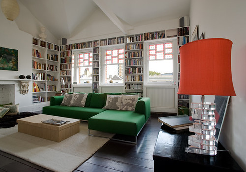
Yeah, baby, I can dig it. Now how about a red green combo that's miles away from Christmas?

flux interiors

(Flux Interiors)

That is one delicious lampshade, and I love the repeat of the color on the window frames. Is that an Ikea couch? If not, they have a very similar version that comes with a zillion different slipcovers, so you can redecorate annually without breaking the bank. I am voting for new pillows though. How about a row of Obama heads instead of Mao and Marx? Yes we can.

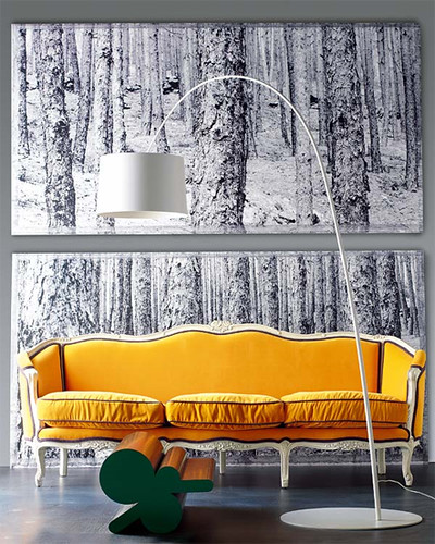
If you already have great bones, highlight them.

yellow couch

(Photo via A Mad Tea Party With Alis)

A burst of sunny yellow makes this old school stunner look fresh, clean and modern. How much do you love the charcoal piping? Fabulous.

Even bold color can be subtly softened by its surroundings.

lampshade

(via If the Lampshade Fits)

Purpley gray walls set this versatile tomato red couch afire, but an otherwise subdued color palette keeps things cool and sophisticated.

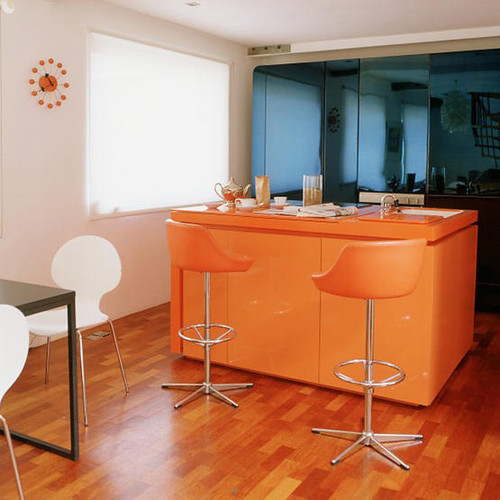
If you're feeling more daring, go for the gold:

orange kitchen

(Photo via Living Etc)

I really hate barstools, but at least these are camoflaged by a similarly hued tangerine kitchen bar with matching countertops. I love the harmony with the orangey wooden floors, as well as the contrast with the blue mirrored glass in the background.

And last but not least, some gorgeous shades of green and blue that are fresh but not overwhelming:

fawn galli

If you've never checked out the Brooklyn home of Fawn Galli, go there now. Her house is a gorgeous reminder that color is fun and doesn't have to be opressive or vulgar. And she has a giant deer sculpture. My hero.

That's it for this Sanders-inspired roundup of ultra ultra brights. What do you think? Could you live with these acid hues, or are you planning to stick to neutral basics? Tell us all about it.