Mural Mural on the Wall

Matt and I are finally going to break ground on our bedroom this weekend, which has me frantically sifting through my magazines and bookmarks fueling up with last minute inspiration.  While I am dying for a large-scale piece of original art, my bank account looks at me with a big frown and says:  yeah right. Thank god I have a projector that hooks up to my computer.  With this fancy device and my two-can-of-paint-budget, I can easily knockoff duplicate almost any one-color wall mural.  A few of the following are vying for my attention:
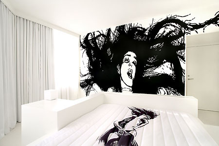
Room 206, Hotel Fox, by WK Interact

This beauty has been siren-songing my name for a while.  Matt likes her too (of course) but Erin says it will look like a big porn threw up on my wall - or something to that effect.  I wouldn't copy her exactly, but I am taken by the stark black and white of this room.

The Hotel Fox boasts several other murals, none of which are right for my room, but they are fun to look at nonetheless:

Room 106, Hotel Fox, by Geneviève Gauckler

GRRRRR, I steal children's souls while they sleep!!!

Note to self:  put this in your baby's room

I was really in love with the porn lady until I got wind of this kitty cat:

Larry the Cat at Portland, Oregon's Ace Hotel

Yes, I have written about Larry before, but really, can anyone ever get enough of this lovely feline?  I didn't think so.  Seems as though my love for animal decor will never die.

Specifically, my Love for Horses in Houses, yum:

Studio Ilse

I really really really want my entire house to be horse themed.  Horse couches, horse art, horse murals, horse dishes.  I mean seriously horse themed.  Screw one wall covered in horse art, I't talking top-to-bottom.  How's that for en masse?  I think I just felt a tear rolling down my cheak.

If I can't have wall-to-wall horses, pictures of people I don't know will work as well:

Hotel Particulier, room by Natacha Lesueur

The wall behind my bed is about 3 times the size of this one with the photos, so if I can score 6 giant head prints, then I'll be in business.

It seems as though I'm running to catch up with the band-wagon, as giant heads are all the rage:

Sixty Hotel designed by Studio 63

More big heads:

Interior by Concepts Interior Design

And just to drive the point home:

(L) Suite 5, The Lute Suites, Marcel Wanders Studio; (R) unknown, found on Studio Picaso's flickr photostream

Perhaps the heads are too much for you and you'd prefer to zero-in on the window to the soul:

Offices of Neogamma / BBH, via This Ain't No Disco

This mural in the offices of Neogamma BBH is certainly swoonworthy.  The fact that they have a second proves that these dudes know how to party:

I'm pretty sure they were able to zero-in on exactly what sheeps think about: "blurb. color. exclamation mark. splash."  sort of like me when I write blog posts.

In other animal mural news (I told you I couldn't get enough):

Unknown from Digital Picaso's flickr photostream

I never thought I'd say this but, that tromp i'oil chandelier is almost overshadowing those lovely animals.  

If, like me, you're diggin the faux furniture wall mural, and would like to leave the artwork creation to those who actually know what they're doing, perhaps you could try one of these wallpapers:
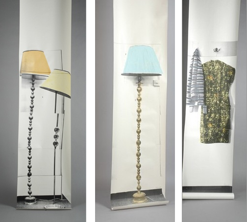
Semi-Drum, Semi Drum x 2, and Stripy Jumper available via the collection

Want something bigger?  That's my girl:

Wall murals by Surface View

There's those darn animals again.  Here are some wallpaper murals that don't belong to the creepy phyllum:

Femme Fatal available via walnut wallpaper

oops, that was only one non-animal image, now I'm getting back to my roots with this animal-house mural:

Home Made Restaurant

Yum, if the food at this restaurant is 1/4 as good as their design, then they shall be serving the people for eternity.  Great.  Now I'm hungry.

And finally, an image that is neither animal or silhouette:

Interior Shot by Gabby Zimmermann

Ok, so maybe this wall doesn't really fit in, but it sure is pretty and I would hang the hell out of that wallpaper given the right opportunity.

So, what do you guys think?  Should I go for a gigantic wall mural (please don't suggest a wall sticker!) or should I play it safe and do something that actually says "real people sleep here?" 
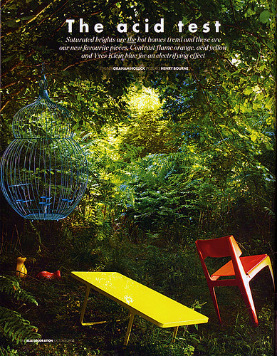
 

The Future's So Bright, I Gotta Wear Shades

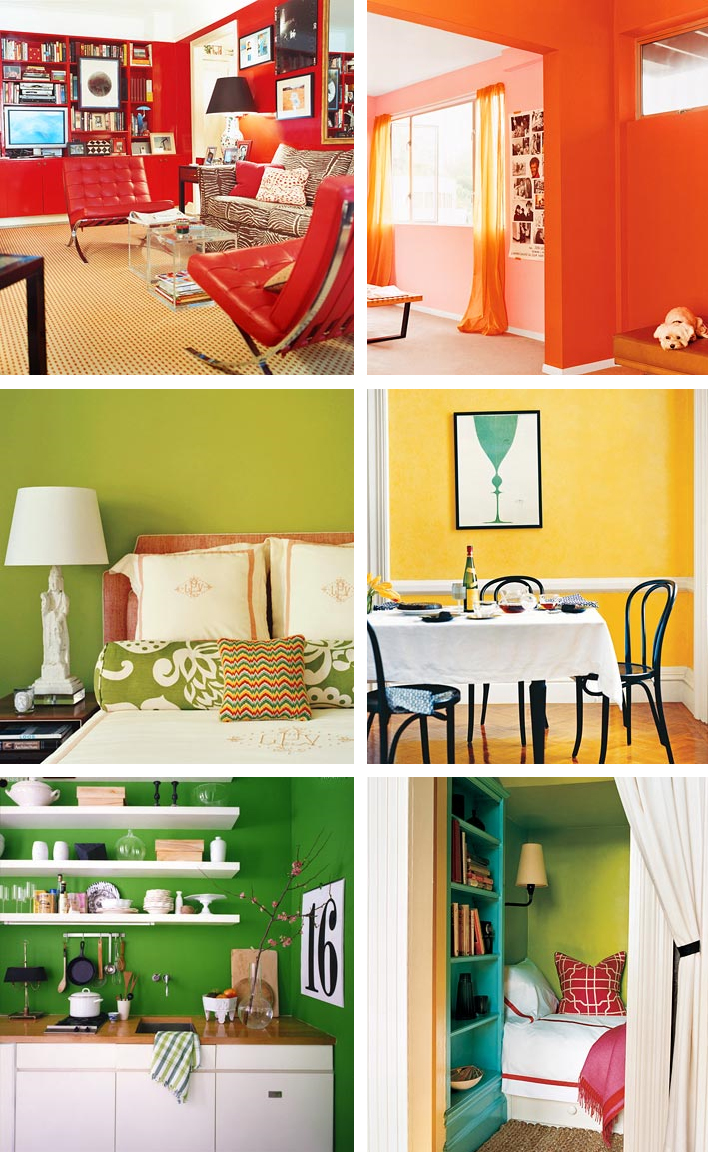
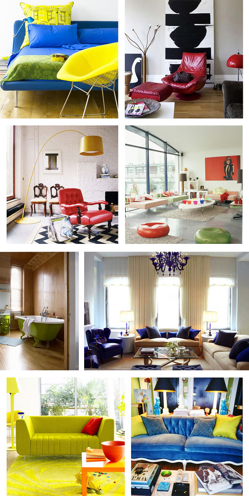
As promised, today I am presenting Sanders the Paint Guru's picks for the hottest upcoming trends in color, and when I say "color," I mean COLOR. If the gray days of fall are getting you down, then this palette is sure to jump start your morning. When I asked Sanders what the most popular colors for next year would be, he immediately said "electric blue, bright orange, acid green, red, yellow." As usual, Sanders was on the money. Check out what the October issue of Elle Decor UK said would be the "Hot Trend For Homes":

elle decor uk

Versus the color palette Sanders put together during our interview:

sanders color palette

I told you that Sanders was good! If you ever had a crush on Roy G Biv in school, then these rooms are for you. Witness the power of dramatic paint to completely transform a space. (All photos courtesy of Domino)

domino colors

Don't you feel more cheerful, well rested and motivated, already? Maybe you won't even need that extra cup of coffee. Perhaps you should start a new exercise routine... Who's up for climbing Mount Everest???! Ok, let's take it one step at a time, shall we?

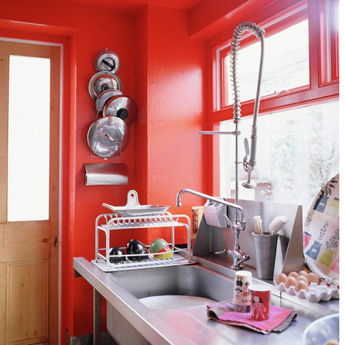
Since I've asked for help from you dear readers at least twice, you probably all know by now that I have a red dining room and kitchen, and I've been worrying that maybe it's a twee bit overblown. Perhaps instead of taking it down a notch, instead I should pump it up with a steroid injection of brighter, orangier, funkier, red:

red kitchen

(Photo courtesy of Living Etc.)

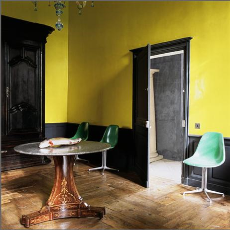
Or maybe, like Karly, you've been craving some sunshine in your space. Why not go for a zany shade of yellow on the walls?

yellow room

(Photo via A Mad Tea Party With Alis, who also has some great posts on color)

I love the super bright funkadelic yellow paired with dark dark trim and subdued, weathered floors. Shall we just say that the dead fish on the table adds to the rustic charm? Yes, we shall. Those chairs are pretty boss, too.

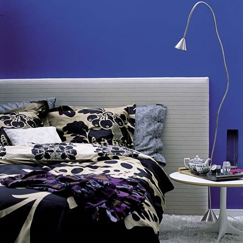
For those of you who love color but want something a little more sober, why not a bold, cobalt blue?

cobalt bedroom

(Photo via Living Etc)

It's much more unexpected than the usual aqua tinged walls, but still restful enough to catch some much needed Zzzzzz's at night. A silver leafed ceiling could be a magical complement (and gold is always fab).

Or perhaps you prefer to just scramble the whole color palette together and have a delicious rainbow omelette?

m interiors

This whole house decorated by M. Design Interiors is a madcap acid trip fantasyland, and I really want to live there. The sleek furnishings and square lines have an awesome 70's vibe, so perhaps we should throw a hip blogger's disco party? I think I'd have to ditch the tulips, though.

If you're not into all out color, maybe just a peep of bright paint would do the trick.

m interiors

I love the use of primary shades in this super white space, courtesy once again of the fabulous M. Design Interiors.

Ok, I know that lots of you out there love color, but would prefer to confine it to accessories and furnishings for a splash of bright something something against a neutral background without the commitment of paint. Here are some renter friendly solutions that will still give your pad some punch.

colorful accessories

(Photo credits for each row, left to right: Living Etc, Living Etc. Domino, Living Etc. Terramia, Andrew Suvalsky. Living Etc, Domino)

Why not reupholster a vintage couch or chair in a shockingly bright fabric to create a substantial focal point in your otherwise neutral room? Or you could always do some super mod pillows for a cheap and easy burst of color (bonus points for resourcefulness if you can sew your own). Also, I kind of want a lime green clawfoot tub now... If only I had a bathroom big enough for one!

Anyone want a cush headboard fit for a princess in a color that won't make your prince cringe?

m interiors

(Photo via M. Design Interiors)

Yeah, baby, I can dig it. Now how about a red green combo that's miles away from Christmas?

flux interiors

(Flux Interiors)

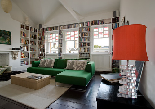
That is one delicious lampshade, and I love the repeat of the color on the window frames. Is that an Ikea couch? If not, they have a very similar version that comes with a zillion different slipcovers, so you can redecorate annually without breaking the bank. I am voting for new pillows though. How about a row of Obama heads instead of Mao and Marx? Yes we can.

If you already have great bones, highlight them.

yellow couch

(Photo via A Mad Tea Party With Alis)

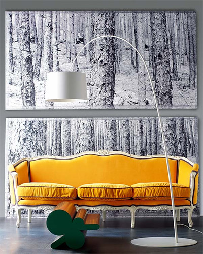
A burst of sunny yellow makes this old school stunner look fresh, clean and modern. How much do you love the charcoal piping? Fabulous.

Even bold color can be subtly softened by its surroundings.

lampshade

(via If the Lampshade Fits)

Purpley gray walls set this versatile tomato red couch afire, but an otherwise subdued color palette keeps things cool and sophisticated.

If you're feeling more daring, go for the gold:

orange kitchen

(Photo via Living Etc)

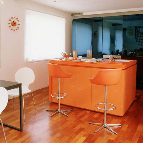
I really hate barstools, but at least these are camoflaged by a similarly hued tangerine kitchen bar with matching countertops. I love the harmony with the orangey wooden floors, as well as the contrast with the blue mirrored glass in the background.

And last but not least, some gorgeous shades of green and blue that are fresh but not overwhelming:

fawn galli

If you've never checked out the Brooklyn home of Fawn Galli, go there now. Her house is a gorgeous reminder that color is fun and doesn't have to be opressive or vulgar. And she has a giant deer sculpture. My hero.

That's it for this Sanders-inspired roundup of ultra ultra brights. What do you think? Could you live with these acid hues, or are you planning to stick to neutral basics? Tell us all about it.

Supersize Me

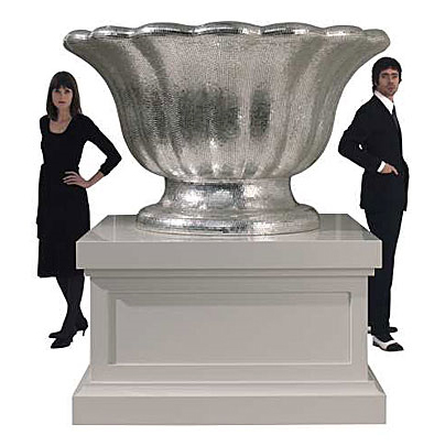
When Karly and I went to the Round Top antiques fair last month, the most common sentences uttered between us were either, "If only it was a tenth of the price!" or "I just wish it was bigger." At that moment I realized I had developed a severe case of megalomania, although (silly me!) I should have seen it coming a year ago. Sometimes I feel like I'm just stumbling around aimlessly in the world of design, being as I am just a lowly artist type, and it so often happens that I'm a bit slow to catch onto the latest trends. But methinks this one caught me unawares because I mistook it for art. But it's not art. I don't think. Take, for instance, the work of Dutch design duo Studio Job:

studio job

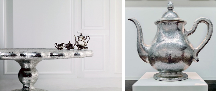
Their dazzling white gold, mosaic-covered, Silver Ware series for Bisazza featured traditional tabletop pieces in monstrous proportions; the teapot alone is six feet tall (photos courtesy of Dezeen and The LA Times).

studio job

Yet, only a few years ago, according to the International Herald Tribune:

Studio Job was condemned by Dutch design critics for its disdain for function and for its self-indulgent symbolism. "It was horrible," recalled [co-designer] Smeets. "We were accused of making bad art by the art world, and bad design by the design world." Today they are being lauded, for exactly the same reasons, as the poster boy and girl of the new expressionism in design.

So caught between art and design -- or let's say concept and function -- Studio Job occupies a nether region of functionless and lack of concept, wrapped up in a shiny package with a (very) high price tag.

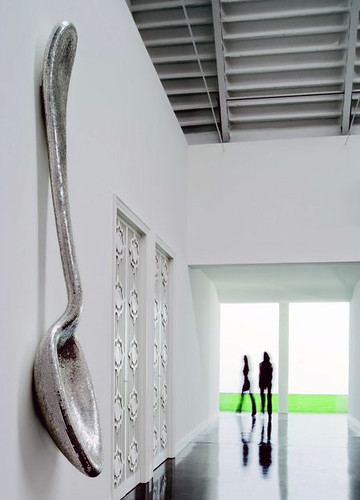
But what's the difference between Studio Job's giant spoon:

studio job

And Claes Oldenburg's giant spoon (photo from Minneapolis Sculpture Garden):

claes oldenburg

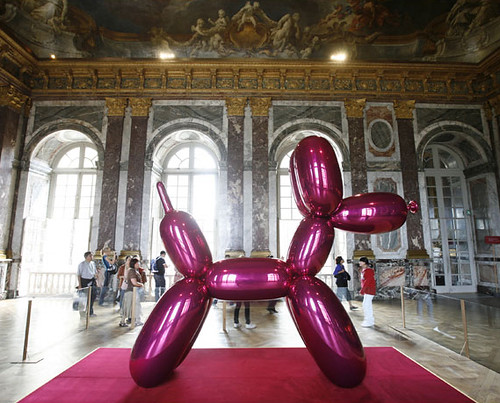
No, I don't think the only difference is the cherry on top, but seriously no one disputes Oldenburg's status as a "real" artist. Is it only because he thought of making things that are usually small really big first? (This sculpture was made in the mid 80's, but he started making gigantical sculptures in the 60's.) And he's certainly not the only artist to make giant sculptures. Take the always colorful artist Jeff Koons, for example (via If It's Hip, It's Here):

jeff koons

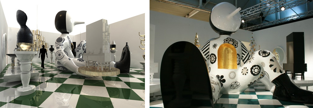
I'm extremely distracted by the gorgeous background, but how is this giant balloon dog different from, say, designer Jaime Hayon's giant creepy doll thing (other than the difference in zeros on the respective price tags. Hint: artist Jeff Koons' is exponentially more expensive):

jaime hayon

Both sculptures are big and shiny, but could we say that Jeff Koons' includes some kind of cultural critique of society, whereas Jaime Hayon's does not? Maybe. I'd be interested to hear some of you super smart readers argue either side of that point.

What is it about epic proportions on everyday objects that make them so interesting, anyway?

robber duckie

Is there anyone who is not transfixed by this ridiculously ginormous rubber duckie? I didn't think so. And no, it's not photoshopped.

The design world definitely seems to have picked up on the "Bigger is Better" aspect of our culture, because big is REALLY BIG right now.

marcel wanders

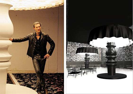
Marcel Wanders certainly looks pleased with his gargantuan "table" lamps. Of course, there's no table in the world they could fit on... except maybe one of the silver "tea platters" by Studio Job, featured near the top of the post.

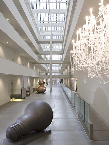
Perhaps he was just trying to one-up Philipe Starck's design for the Parris Landing Condominiums?

philipe starck

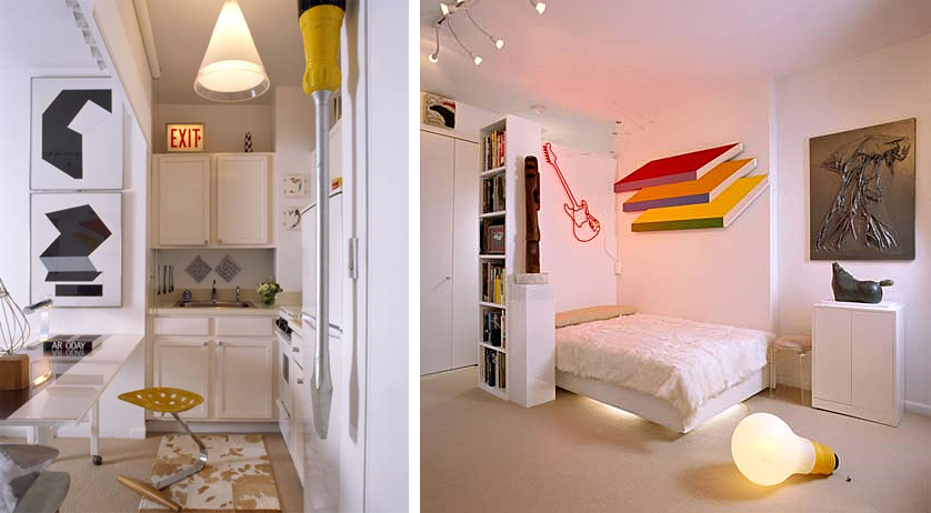
Whatever the case, a relatively scaled down megalomania is wending its way through the homes of middle class consumers everywhere, as evidenced by this popular pad on Apartment Therapy:

apartment therapy

How much do you love that giant screwdriver on the left??? It looks dangerous, which I am quite sure is the appeal for me. And check out the Mini-Me version of Starck's giant light bulb. The surge of supersized objects doesn't end there, though:

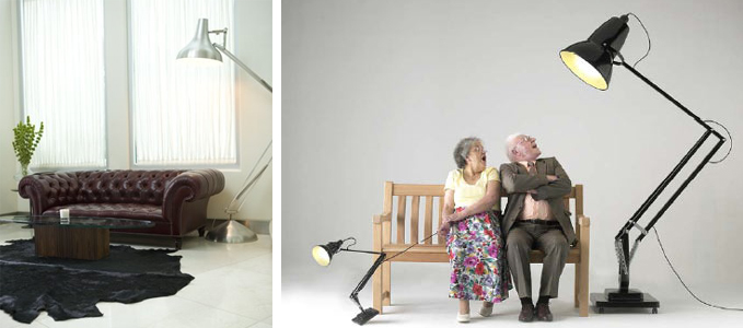
anglepoise lamps

Even the typically refined anglepoise lamp -- designed in the 40's with smaller scaled homes in mind -- has been pumped up by massive steroid injections. Unlike a scintillating six foot tall teapot, this lamp could fit right in to today's McMansions. (photo on left via Desire to Inspire, photo on right via Apartment Therapy)

Another example of Design/Art's (Des'Art?) trickle down economics:

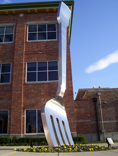
giant fork

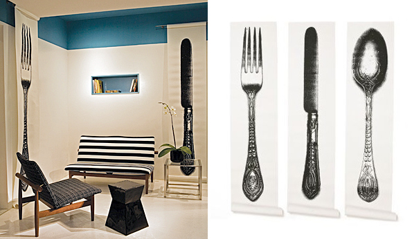
Giant fork sculpture in Missouri via some guy's Myspace evolves into giant fork wallpaper from Anthroplogie (pictures via Apartment Therapy):

anthroplogie wallpaper

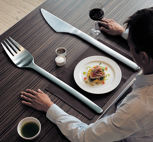
Becomes giant fork in Mads Lauritzen's surrealist photograph. Because improper proportions are surreal.

mads lauritzen

For some reason giant cutlery is really popular right now, and that brings back painful memories of those huge wooden forks and spoons that everyone's Mom had on the kitchen wall. Whatever you do people, please don't go there.

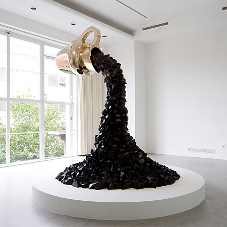
I have to admit that I like some of the more practical supersized designs. There's a big difference between Studio Jobs's giant golden coffeepot dumping a stylized brown river of what I can only hope is coffee:

studio job

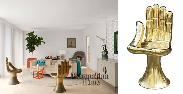
And these nifty giant golden hand chairs seen in the sweetly elfin Jonathan Adler and adorably scathing Simon Doonan's house, which was featured in Met Home:

jonathan adler

By the way, I'm sure Adler got his chairs from super chic antiques dealer Todd Merrill, but I've seen them in hideous colors for as little as $30 on Craigslist and Ebay. Gold spray paint anyone? Or white, even?

Whew, I'm tired from thinking so much today, and I really hope I haven't worn you out too much to discuss exciting things like: art versus design, or the decline of western civilization, or whether all design will simply grind to a halt in the face of a deepening recession. Is megalomania bound to shrink in direct proportion to our shrinking economy?

In case the real question you want to answer is, "Why do I have to read this crap? I'm not in school anymore," I have a present for you:

supersized bunny

It's a super cute, supersized bunny! And if you like it, you won't click on this link to find out what happened to it.