Someone Threw My Mirror Under The Bus: A Top Design Story

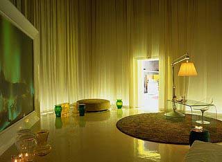
Sorry for the day late / 12 dollars short Top Design write up, like I said, Erin and I had art to look at.  But I was sooooo excited to get up yesterday morning to flip on my DVR to watch la TopD and write you all a review A-sap. Like most of you, I LOVE me some project runway, no matter how bad a season or how contrived a designer (I'm talking to you, Suede, current season) I will eat it up with a cliched spoon.  The best season BY FAR was season 2, hands down, no diggety, no doubt.  So when I saw that not one, not two but THREE of my season 2 PR alums were going to be rocking their bossy socks off on schlop design, my heart skipped several beats.  I'm revived and typing now. Woe is me.  First of, there was not nearly enough SANTINO.  Like SANTINO, I would have liked the show to have been completely about him and for his room to look like this:
santino wallpaper

well, maybe with a better picture, but you get the point.  That man is one self absorbed mess, you need to feed that people, feed it.  Instead Eddie and the non-de-script entity he was paired with gave him this:
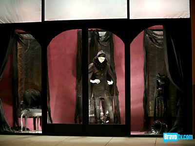
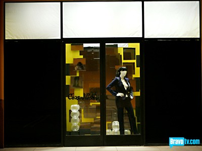
santino window

ironically, the only room without a mirror.  And why is the mannequin RIGHT in front of the door frame, you couldn't even see her if you stood in front of the window.

I spent the last week on my vary hands and knees begging for a big PR reunion orgy / bitch-fest, apparently I must have spit in some orphan's soup because I pissed off the big guy so much that instead, I got a lesson in how not to use mirrors in a window display, over, and over, and over again.

let's, ahem, reflect:

mirror 1

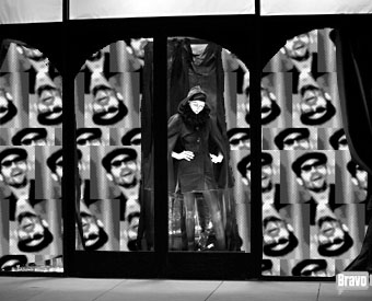
Lesson 1.  Do not use mirrors to explain how much Pakistan is in the news or why Andre finally got a chance to be on TV again and only bothered to bring his D game.  I think this dress is a perfect parable for how sad it is to loose your favorite denim outfit
Lesson 2:  Staggered mirrors does not a David Hockney painting make.

Let's digress a moment:  First, Jeffrey noted that his line was inspired by Blade Runner, which I think is a little passe at this point.  Wasn't blade Runner sort of the fashion inspiration rage like 5 years ago? I guess he was taping Project Runway then and missed the bus (which is quite different from being thrown UNDER the bus, a common reality show phenom).  BUT even worse, Wisit and Kelly had NO idea what blade runner was.  Blasphamy!  Had they known, they could have made their window look EXACTLY LIKE THIS:
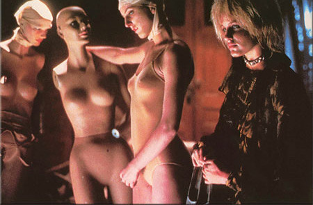
blade runner

But I'm still not sure if his royal highness Jeffrey would have gotten it, as he *specifically* asked for "clean lines and minimalism, you know, like in Blade Runner"  Ahem, Mr. Sabella:
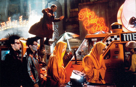
Jeffrey, meet blade runner, blade runner, meet jeffrey.  That shit ain't clean or minimal, yo.

Oh my how I've strayed, back to mirrors:
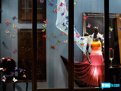
Lesson 3:  If you get in your time machine, travel back to 1998 and hold up a school bus of pre-teen girls then combine your stolen bounty with some awkwardly placed mirrors and a framed piece of wallpaper, congratulations, you have the top design. The win goes to Ondine and Natalie, care of sweet pea's kinda boring design.  But oh, I DO STILL LOVE YOU SWEET PEA.  Promise.

And finally, we have the last, and best, but kinda boring room:
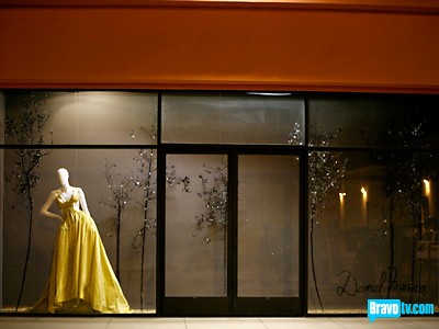
Ok, can we talk about the fact that this room was based on A POEM.  Ahhhhhh!!!  Daniel you are so blissed out I want to pee my pants.  My ears vomited when you read that nonsense about golden sand and black branches and your mother's biscuits.  How is it that you 1.  Had the best dress by far and 2. The best window?  You are living in a fog created by your own imagined glowing aura.  I guess you didn't spit in any orphan's soup this week.

Usually, on design shows, I like to think about what I would do if I were given $2 and a box of macaroni (thanks Eddie for the only funny moment) and, of course, like any self indulgent and deluded designer, I'm sure my idea is superior to any being shown on screen.  This week, however, I knew that there was no way on God's green earth that I could possibly top the best window display of our time:
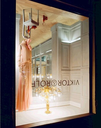
Congratulations, Viktor & Rolf, you have the top design.

Final Thoughts:

1.  Episode 3 Mrs. Schroder count = zero.  Great job, um, blondie.

2.  Is argyle a shade of green?  Nathan held up his GREEN color card and said "I have argyle"  did I miss something at the color summet?

3.  Nathan, Wisit, Eddie & Shazia all say they are 30.  Discuss

4.  Kelly wore this:
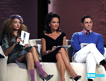
5.  Jeffery gawked at Wisit's idea of graffitti and rococo, proclaiming how low end it was. Jefferey, please follow this link:  You're a dumbass

6. Wisit really would not drop the Rococo thing, it was kinda sad and funny

7. The phrase "threw me under the bus" should be given the You Can't Do That On Television treatment

8. I'm sorry I don't have a picture of this, but did anyone notice that Preston's grass green tie matched Andrea's green dress at elimination?  That was easily the cutest moment of the show.  Good job, kids.

Junk in the Bunk: A Top Design Story

I have an insanely high capacity for crappy reality television.  Specifically, any reality show in which something is created, designed, made over, or otherwise made prettier by a group of self indulgent "designers" who are then pitted against each other, leading to an inevitable finale anchored by dramatic lighting, threatening music and the sweet, sweet promise of immunity.  Presumably, Top Design would rock my decor-loving life, but instead it is putting me in a zombi-like trance otherwise known as sleep. This week the "designers" were asked to decorate a bunker (all preempted by Todd showing a kitchy 1950's build your own bunker for when the bomb comes video.  It was a waste of my time.) Theoretically, we were all to spend the next 50 years in said bunker waiting for death's sweet release.  Surprisingly, none of the designers chose to outfit their new dwelling with a noose, so as to escape this nonsense:

ugly

I don't even remember this room and I just watched the episode 30 minutes ago.  According to bravo it was decorated by Kerry and Shazia.  Would anyone like to discuss the fabric folded along the bedframes?  It reminds me of those cheap, round wooden decorator tables that are sold at wal-mart and are made for the sole purpose of putting a ruffled tablecloth on.  If it's sooo ugly that it needs to be covered up, why is it even made?  I understand that with this show they were given these ugly beds, I just HATE draping fabric as a cop-out.  I'm going to call this room hobby-lobby chic.

Next immemorable room:

another room

Ondine and Preston (Erin's Gay BF) Got in trouble for this room, apparently it was too "real."  As in, they had THOUGHT OUT WHAT THEY MIGHT DO IN THERE AND DESIGNED THE ROOM TO FULFILL THOSE NEEDS, how dare they?!  Please pack all personal belongings and proceed to a properly decorated bunker immediately:

winning

The winning Bunker designed by she whom shall not be identified as Mrs. Schroder and Eddie.  Look it's got cows and trees, just like outside!  We'll forget we're locked down here for the rest of our natural born lives!

PS. Is that a trash bag at the end of the right sofa?

And the runners up:

another room

Sleepy-town by Nathan and Wisit.  I have to admit that my knee-jerk reaction to this challenge was to cover the walls and ceiling in fabric, so Wisit did tug at my heart strings with his suggestion.  However, I was picturing something a little more along the lines of, oh, I don't know, something a top designer would produce, something, say, like this:

dream curtains

Yes, I know I posted this last Friday, but you know you loved it and want to see it again.  A+ Philippe Starck, you have the top design.

Trying to end the misery as quickly as possible:

losing room

Jennifer and Robert's losing room, so bad it sent both of them home.  I think it's really funny that they both threw temper-tantrums and drew a line in the proverbial sand.  ha ha.  babies.

BTW, Bravo, thanks for tipping us off on the ending:  When the designers were shopping Mrs. Schroder got mad at Jennifer and said karma would come back to her, which the producers awkwardly fit in to the production schedule, presumably to make the viewers, retroactively, at the end of the episode, realize that Mrs. S is more than Ricky's wife, she's freakin psychic!  Amazing!  Go home Jennifer and Robert!

Last room, promise:

room

I think it's the warmest room of the bunch, and I don't hate that thing on the back wall.  The slipper chair is hurting me a bit, though.  And, like (also psychic!) Todd Oldham predicted, Natalie and Theresa needed to edit, there's just too much junk in that bunk. 

Digression:  Wouldn't it have been funny if someone had put a weight-lifting bench and some free weights into their room?  I mean, if you're really going to be there for 50 years, you don't want your muscles to atrophy.  A potty would be nice too.  And a mess kit.  I think the judges really missed the mark this time.

Here are some other highlights from the episode (I dug deep)

kelly wearstler

1. Kelly Wearstler's outfit was EASILY the most interesting thing on the show last night.  A bit overly dramatic and costumey, but I was still hypnotized by the lovely striped scarf and all those gold brooches.

2. I spy anthropologie's wallpaper in the designer's apartment

3. We learned that contestant Natalie!!! has a very sophisticated world view:  apparently, the Chinese are building a transformer that will force us all underground when they seek vengeance for that Hiroshima bomb thingy

4. Jonathan, please stop saying j'adorable.  Your new catch phrase is not.

5. Hanging the models out of a hot air balloon made for a really cute photo shoot.  Wait, that was from the entertaining show that was on last night.

6. I'm sick of team challenges.  

7. I remember where I was the first time I found out that Andrea was Rick Schroder's wife.  I was reading Elle Decor in my living room with my cat and an ice cold diet coke.  

8. I CAN'T WAIT to watch Jeffrey Sebelia become overly dramatic and serious about the store our designers are making for him next week.  Because, you know, the store is totally real and he has to live with their design.  Forever.

slop design

Oh. My. God.  It happened.  Tonight was the apex:  everything that is right with television all came to a catty, designy peak right here in my living room.  PR. TD. ANTM.  Who is waging war against my psyche and trying to send me into overload?  Because this is a design blog, I'm only going to bother you with Top Design.  Erin already did a brazzilliant post, which I encourage you to read.  NOW  (see below).  This show is like an enigma wrapped in a riddle wrapped in a train wreck.  And, sadly, there are only a few sad pictures online.  Now, I've just recently moved out from under the rock I used to live beneath (read:  I've only had cable for 6 months) so I never saw TD1 in it's entirety but I do remember a hobgob of crappy rooms and piss poor construction, I justified this by limited time and budget, but PR designers bust out some bangin' stuff under similar conditions so really, there's no excuse for stuff like this:

ugly

could you honestly imagine standing in front of Kelly Wearstler  trying to justify a shadow box filled with peanut butter and beer?  According to Adler:  "Breaking the rules is fine, but first you have to know the rules"  Truer words were never spoken JA, never.  (frankly, that quote was the highlight of the episode)

Now, for our friends down under (I'm talking to you Raina) who don't get to cringe in embarrassment from week to week I will summarize another shadow box that I couldn't find a picture of:  It was filled with apples.  yes, apples.  In my humble opinion, shadow boxes are to be used on four specific occasions:

1. to display something sentimental

2. to display something stunningly beautiful

3. to draw attention to an everyday object that could be considered unconventionally beautiful

4. to start a small fire (my preference)

please note, an apple display did not fit into in any of the above bullet points.

Seriously?  These kids are the best of the best?  They all cried like a bunch of babies when given a budget of $2,000.  I thought, $2,000 + craigslist = my dream home.  There were a couple of small glimpses of brilliance (by comparison) but otherwise I was unimpressed, and, therefore, totally ready to snarkily enjoy the next few weeks.  My head is spinning.  

More disasters:

a shadow box with (oh la la) a new years theme.  

world's ugliest bedroom.  If I had a worst enemy, I would rescue them from this room.

how much pee do you think is on this sad couch?  Don't you just love how it's disproportionately paired with the original work of "art"?

To summarize, here are my love / hates:

Eddie:  emerges from the pack with his adorable traveling butlers pantry.  

India: familial coat tails?  Should I know her?  This really could be a me problem, educate me.

Preston:  You ain't foolin me with that first year art school shadow box.  Save the sad stories about personal tragedy for the kleenex endorsement you'll get after the show ends.

Jonathan: Wise and true

Natalie: b'bye nat I give you 2 more episodes, MAX

Santino:  SANTINO!!!!!  I can't wait!!!  I want to decorate a room for you, I promise to use Santino-face wallpaper just like you would want

Andrea:  how many times did you put your hubbie's name on your application miss "i'm going to make it on my own terms?"

Serge: It really wasn't your time to go, even with the crappy shadow box

Wisit: ixnay on the ingingsay.

The rest: no solid opinion.  

Stay tuned, so much more to come all season long

PS. remember to read erin's post, below.  I love her!