Alas, the moment we have been dreaming about for months has arrived. After much nail biting and speculation, the question was answered: would America be able to elect it's first female Top Designer? Apparently not. Wednesday, November 5th, 2008 will forever be known as the day that subversive Nathan spray painted his way to victory. Did you get your copy of the newspaper? By way of Nathan's win, America stood up and collectively shouted "No!!! we can not take one more season of traditional design, Preston":
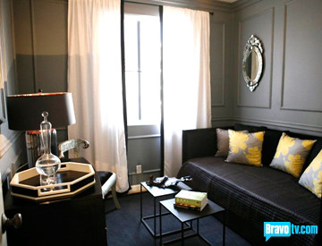
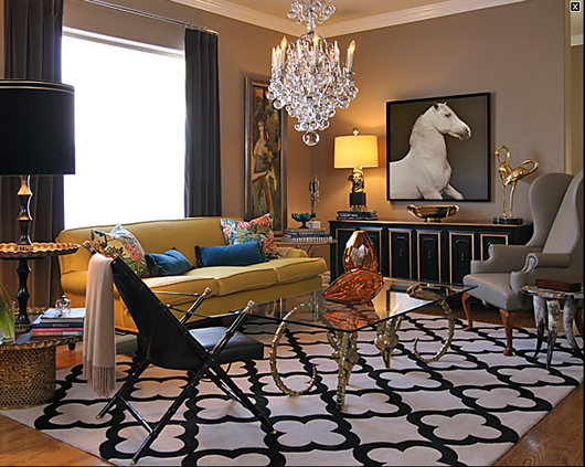
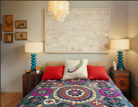
The better of Preston's dull rooms. Note the Target pillows
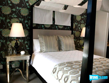
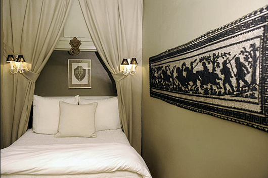
The master bedroom that is absolutely, 100% made for sleeping
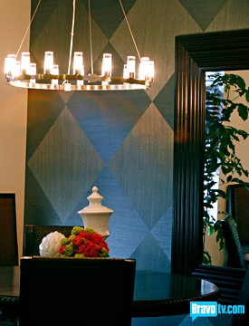
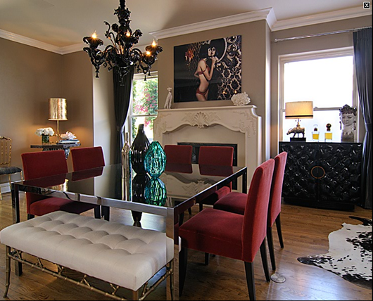
portfolio shot for job position at Rooms to Go the dining room
Ondine fell just short of victory, which may or may not mean that she now has to take Andrea to dinner and buy her a nice outfit at a posh New York store:
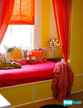
the actually cute girls room that (DRAMA!) almost didn't happen.
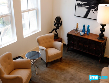
It's a shame that they have some intern with a point-and-shoot take these photos, they've managed to completely cut out the largest, and most interesting part, of this space: the art work which stretched all the way to the ceiling.
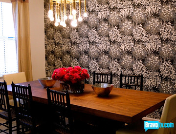
Don't you guys feel like we would all like these rooms much more if we had seen them months ago when they were designed? The time-lapse makes them all seem so passe now. Oh, and I hate that light paired with the table (too small) and the wallpaper (too underwhelming).
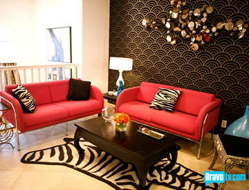
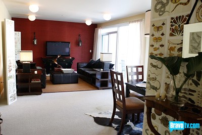
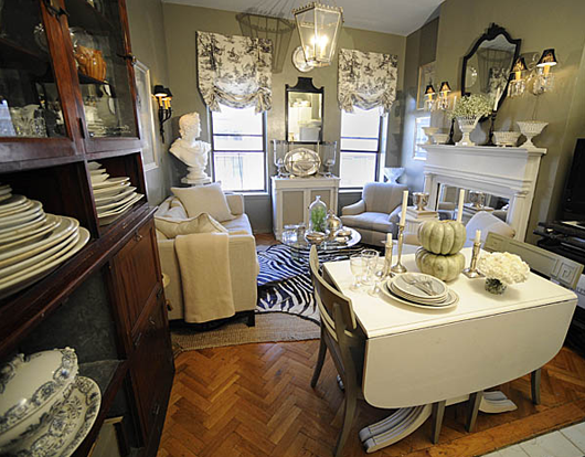
The living room, minus the zebra rug, not so bad
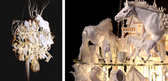
Nathan and stole the show with, ahem, this:
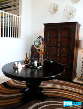
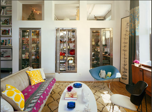
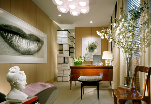
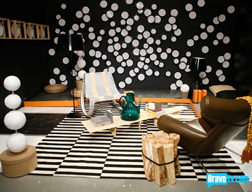
The judges could not stop flipping out about this space and, aside from the groovy sculpture, I don't get it. Maybe if I were actually IN the space? I dunno. I do appreciate that he skipped the formal living room and made a pretty, albeit useless, entryway.
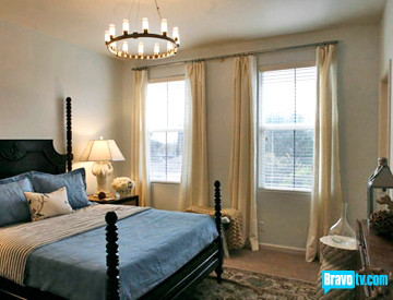
boring bedroom 2.0: now with white curtains!
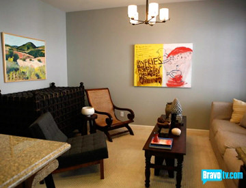
Nathan almost lost due to the criminally large sarcophagus in the family room. He did pull at my heart strings a little by recognizing the flaw and not wanting to ask the movers to carry it back outside. But then again, who carried it out after production was complete?
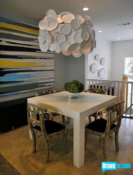
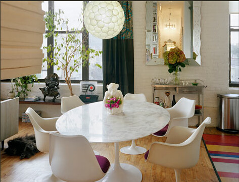
Clearly the best space in the house (and possibly throughout the entire season of the show) Nathan's dining area. LOOK! It's my table! In white! Despite how much I enjoy this space, I really can't stand that PAPER PLATE chandelier. I'm all for DIY, it's the reason my broke-ass has a nice home, but really, could you imagine presenting Margaret Russell with a chicken-wire-and-paper-plate chandelier? You'd have to have ballz (or a ballsack shaped swarovski light) to try to pull that off. Nathan, you had 80Gs to spend on this house, c'mon.
And finally, the centerpiece of this episode:
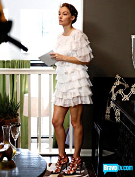
Kelly adds 10 years to her age while, ironically, trying to look like a little girl. I actually like the dress, it's the braids, Kelly. The braids!
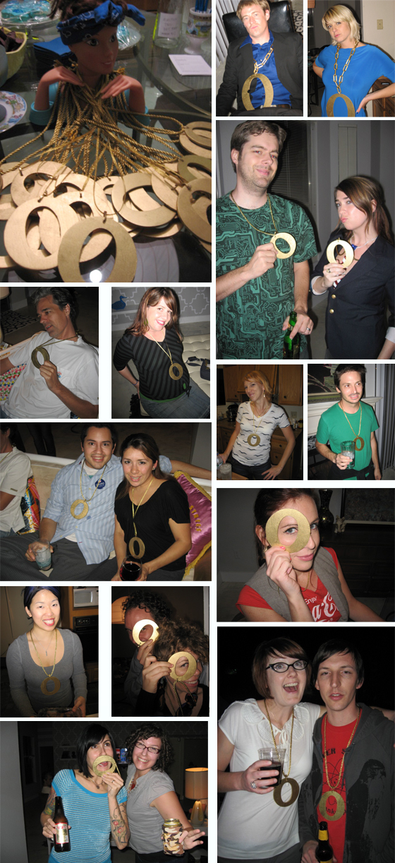
We here at DC headquarters were so excited about this historic event, we even threw a party. Here are some pictures*
*Election party photos substituted for photos of non-existent Top Design Party
So, there you have it. Nathan won. Eddie was mean. Kelly was crazy pants. Jonathan's marriage is no longer valid and, praise jesus, I don't have to write about this crap anymore.
editors note: the part about Jonathan is bologna, get it together California.
