Ask Sanders: Kristin's Green Bedroom

In Thursday's installment of Ask Sanders, I promised help for Kristin's bedroom. She asked our opinion on Kelly Green as a choice for bedroom paint, and Sanders was more than happy to oblige with a paint palette of greens in hues that range from shocking to sophisticated:

sanders green paint palette

And a few darker, more traditional greens:
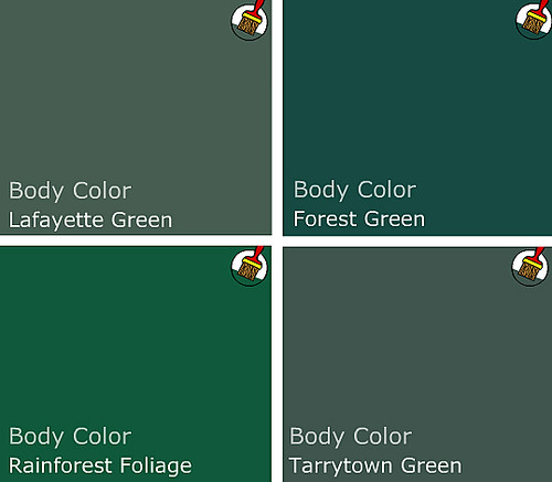
greens

Personally, I have found that green can be a difficult color to work with, because it requires a sense of confidence that many more soothing shades do not. But when done right, green really sings. And I love the idea of using green and blue (blue in Kristin's bathroom) as a base for a household palette, since blue and green can mix and match in so many interesting ways.
john paul urizar

John Paul Urizar

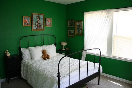
green bedroom

You'll need a pair to go all out kelly green on four walls, floor to ceiling. But this spare little bedroom courtesy of The Sweet Line gets it right with simple furnishings and accents. In a small room with strong color, paint is the star and everything else plays a supporting role.

kelly wearstler

I'm thinking that Kelly Wearstler may have kicked off the kelly green movement in a moment of vanity (hello, kelly - kelly?), but love her or hate her, the lady is not afraid of color. This bathroom shows how slick classic green (looks like Rainforest Foliage to me), black, white and chrome can be.
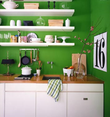
domino green kitchen

This tiny kelly green kitchen from Domino can cook. A very restricted palette with lots of white keeps the color from overwhelming.
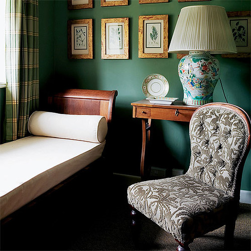
green room

In this room from House to Home, forest green goes a little too country for my taste, but with more streamlined shapes, the color could be fresh. Imagine Danish teak instead of these tradtional furnishings. Throw in lots of white linens and a black pillow or two and you've got modern classic.

If all out green seems too heavy for you, you can break the color up in several ways.

green wallpaper

Hidden in France

Patterned kelly green and gold wallpaper keeps the color light. If wallpaper isn't an option (renters, I'm talking to you), try stretching fabric over a a wooden frame, or wallpaper a large piece of masonite and frame with cheap, painted quarter round. Beep beep, beep beep, yeah.

green living room

House to Home

Homes with lots of molding and windows can handle the color because it covers less surface area. With deep greens, black, white and brown rocks.

per ranung

Per Ranung

If you don't have glorious architecture and the bones to prove it, consider painting a feature wall in deep green; keep the rest of the room bright and light.
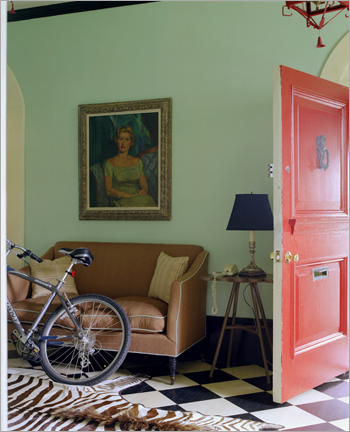
james merrell

James Merrell

Maybe kelly green isn't for you, but Stokes Forest Green is looking mighty fine. Pair it with lots of neutrals and blood orange for a pop of unexpected color. Lighter colors need less white to balance them out.
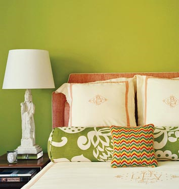
chartreuse domino

Brave souls may spring for chartreuse, like this Benjamin Moore Pear Green featured in Domino.
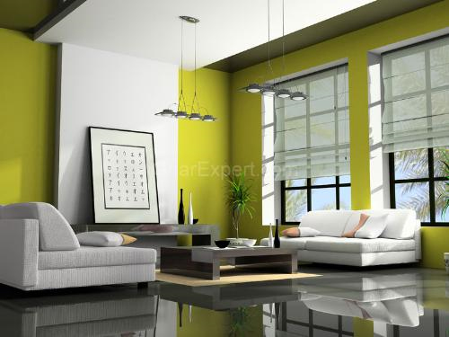
chartreuse

Boring picture, but the color is divine. And Designer's Brew shows how blue and chartreuse make magic. For a bedroom, maybe just a feature wall or nook would do.

Fear of commitment? No problem -- we all get cold feet sometimes. Consider green accents or furnishings instead.
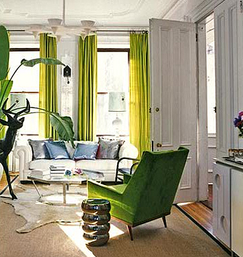
fawn galli

Fawn Galli's boho-glam apartment uses bright green curtains and upholstery to funk up her space.
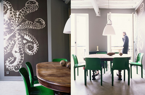
gaelle boulicaut

Gaelle le Boulicaut

Use that kelly green paint to spiff up a set of chairs in an otherwise neutral room. The wall paint in the photo looks a lot like my office paint -- Silver Fox by BM. It's a lovely, medium deep neutral.
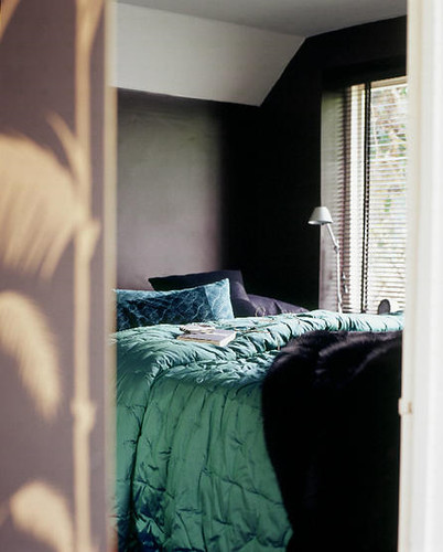
living etc

Living Etc.

Even a simple emerald throw adds depth to this dark and cozy bedroom.

Or maybe instead of feeling green at the gills by all this color, you're green with envy. If you're feeling emboldened by the power of green, don't hold back.
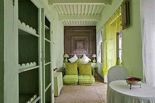
apartment therapy greens

Apartment Therapy

Try mixing and matching several shades in one room, like this Moroccan guest house. Lots of white space helps forest green, stokes forest green, and a pear green, go together like peas and... peas.

That's it for this installment of Ask Sanders. Hopefully you and Kristin got some new ideas and inspiration on ways to green up your space. For me, suddenly chartreuse is sounding like a fabulous nursery color...

If you would like to have your home featured on Ask Sanders, need help matching colors you may have spied in magazines, or just want advice on what paint colors could possibly make those peach wall tiles in your bathroom look like you MEANT to do that, email us at hollaback@design-crisis.com to ask Sanders, our resident Paint Guru, for help.

sanders

Thanks, Sanders!

Ask Sanders: Kristin's Blue Bathroom

Here at Design Crisis, we're a little obsessed with paint. What else can completely transform a room for just a few bucks and some elbow grease? Sadly, adventures in painting can go horribly awry -- the golden yellow you hoped for goes macaroni and cheese, the perfect shade of crimson you envisioned turns into a bloody nightmare, or the warm gray you yearned for reads as icy blue instead. These domestic disasters happen everyday, but our resident Paint Guru, Sander Gibbs, is here to provide all the expert help you need to ditch the heartache and pick the perfect shade the first time around.

sanders

For our first installment of the Ask Sanders column, DC reader Kristin writes with an urgent dilemma -- what shade of blue to paint the bathroom in her rental apartment? Since Kristin is planning to cover her existing flooring with peel and stick white tiles (I've seen these in action, and they're not a bad option for renters), she could choose from a multitude of colors. She says:

"I'm looking for a super-saturated shade of blue. I had originally hoped for a Vermeer/Dutch blue... Anywho, my perfect shade would be not too deep, and very refreshing. Let me know what you think! I'd also move over towards something more tropical and punchy."

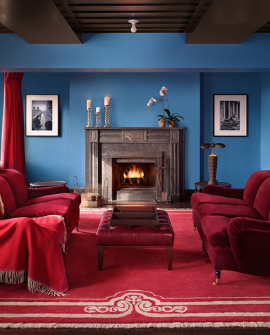
The particular shade on the walls of this room in the Gramercy Park Hotel is what inspired her to ask for a color match in the first place, so I sent the image over to Sanders for inspiration:

gramercy hotel

Judging by the image and his own experience with blues that woo the eye, Sanders put together this saturated blue palette for Kristin:

sanders color palette

While the top colors are Benjamin Moore shades, the bottom pics are from Pratt and Lambert. Sanders informed me that P&L is actually a Sherwin Williams brand, but SW doesn't carry it in their stores. In Austin, Benjamin Moore is the only store that carries P&L, so if Kristin (or you) would like to try one of the P&L shades, check out the nearest Benjamin Moore for their selection.

Sanders picks look pretty close to the top picture to me, especially Clearest Ocean Blue and Paradise Lost, but as Sanders always says, "Buy a sample and make sure you paint on two coats! Two coats!" Paint shades can look totally different depending on lighting conditions, so even though you might think you're wasting your money on a sample, you could be wasting a lot more on unwanted gallons of paint. Always sample first!

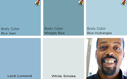
I also asked Sanders to put together a palette of blues he likes, just in case his color matches don't quite hit the spot. Many of his picks are more muted, but still punchy yet versatile:

sanders color palette

Top choices are Benjamin Moore colors, bottom row is from Pratt and Lambert's palette (and Sanders' cute lil' face).

And now I think we need some eye candy to see how fresh the ever popular blue really can be when paired with the right environment. For Kristin's sake, many of my picks feature shades of blue in bathrooms, but blue is a flexible shade for many rooms (except kitchens, in my opinion).

living etc blue

Living Etc

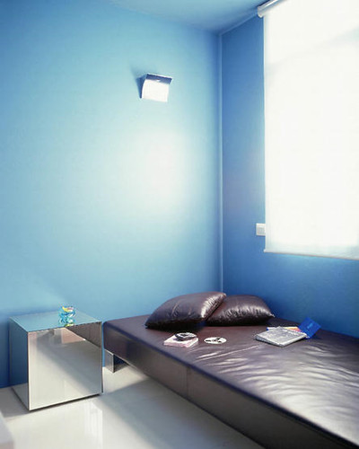
Blue gets paired with glossy chocolate leather and a sleek mirrored cube in this minimalist treatment.

blue annie schlecter

Annie Schlecter

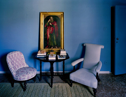
In the olden days, blue was a highly prized, very expensive pigment due to its relative instability and difficulty to manufacture, so it was only seen in special circumstances, like the Virgin Mary's robes. These cool blue walls and door highlight the red and green robes of a saint who must have been a little low on the totem pole.

domino blue bathroom

Domino

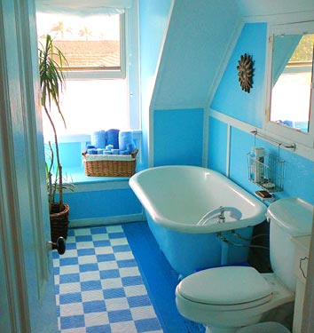
Multiple shades of blue work together in this eclectic bathroom. I'm really thinking someone should make colorful toilets...

blue tile

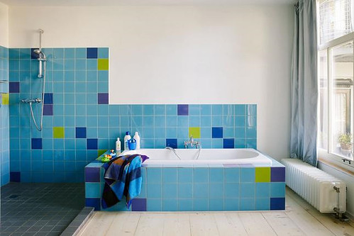
Per Ranung

Sky blue tile mixes with chartreuse, indigo and royal purple, in this otherwise spare bathroom. A healthy dose of white keeps things from going utterly schizophrenic.

blue tiles

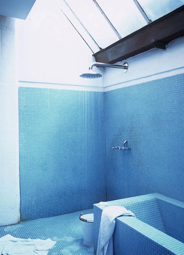
Living Etc

Monochromatic tile makes this bathroom feel spacious. Sexy skylights and minimal fixtures don't hurt, either.

paul costello

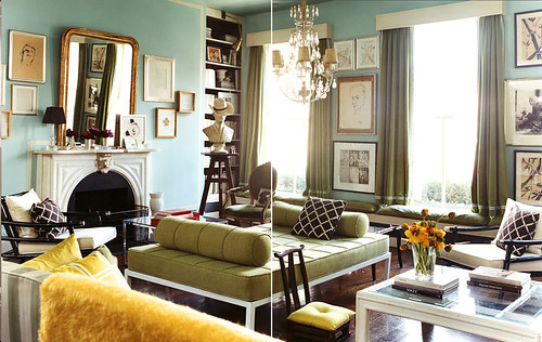
Paul Costello

A sun filled living room mixes aqua with oregano and mimosa yellow for a fun, but sophisticated palette. Chocolate, white and gold, keep the color from getting out of control.

marie claire maison

Marie Claire Maison

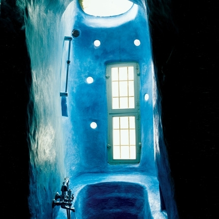
I have no freaking clue how this bathroom is constructed, but I'd love to have a cerulean aquatic labyrinth of my very own. The green window frames add subtle contrast to an otherwise all over color scheme where form and texture rule.

living etc

Living Etc

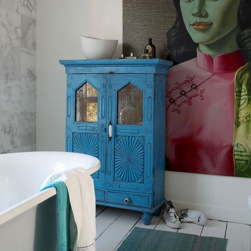
If that much color scares the Scandi pants off you, paint can always freshen up an old treasure and add a jolt of unexpected color. I myself wouldn't be unhappy with this bathroom in the least.

domino

Domino

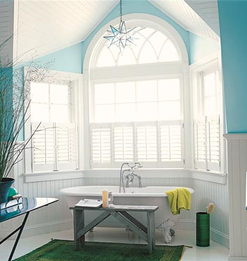
A soft, green based blue highlights the architecture of this traditional bathroom, bringing a little piece of the sky indoors.

moody blue

Annie Schlecter

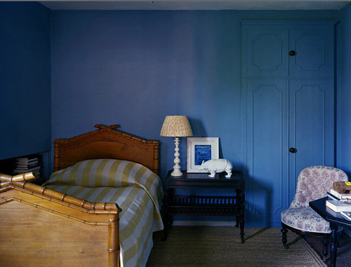
Moody blue covers wall and woodwork in this spare but funky bedroom. I love the little punches of yellow and pink.

blue bathroom

Blues of varying intensity and sheen create depth in this tiny bathroom. Blue toilet set: yes or no?

Kristin, we'd love to feature before and after pictures of your bathroom here on DC, so I really hope that Sanders' suggestions inspired you to take the plunge and get to painting! I myself am feeling so serene and relaxed from this azure haze that I think I'll present Part II of this (very special, of course) inaugural Ask Sanders column next Monday. Tune in Monday and see Sanders' expert advice for Kristin's bedroom: To kelly green, or not to kelly green? That is the question.

In the meantime, feel free to send your own paint queries for Sanders to our email address: hollback@design-crisis.com. Depending on demand, we'd like to feature picks from Sanders on a monthly basis, so don't go sending us any problems that need to be solved yesterday! Sanders is good, but he can't turn back time. Not even Cher can do that.

That Seventies Series: Supergraphics

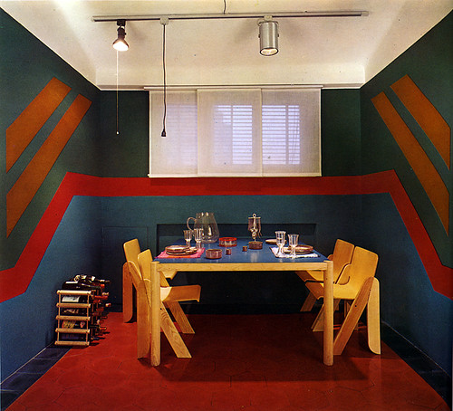
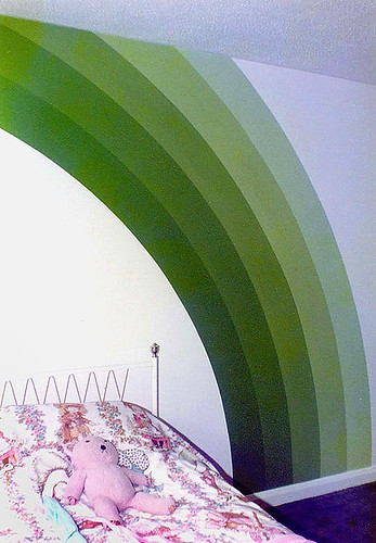
According to my vintage decor bible, Living Spaces, back in the seventies you couldn't walk into a house without bumping into a supergraphic mural. Somehow my superhip mom must have missed the memo, but that's ok because I'm on a mission to fill in the gaps of my obviously deprived childhood. So, hot on the heels of Karly's post about those supertalented Austinites, Redstart, I'm bringing you another day of supersized mural goodness. No wallpaper required.

My obsession all started about a year ago with this image by design superheroes, Wary Meyers:

wary meyers

I really couldn't stop myself from painting my own hall ceiling a glamorous golden in homage to WM's greatness (read all about it here), and now I'm thinking the baby's nursery needs a supergraphic of its own. I mean, if you were a baby, doomed by evolution to months of nothing but cooing and an unfortunate inability to flip over on your own, wouldn't you want to spend your spare time staring at walls like these?

supergraphics

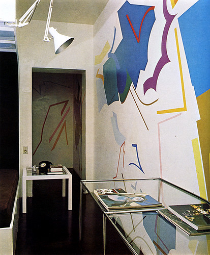
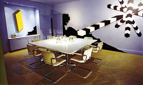
Living Spaces was going all avant garde with this one, eschewing the biomorphic for something a bit more Kazimir Malevich or Henri Matisse. But don't worry -- they have a few other tricks up the old book sleeve:

supergraphics

supergraphics

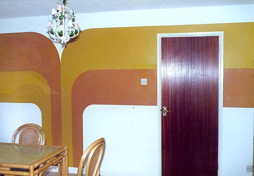
Ok, so the colors are a little... pukey in the bottom pic, but you get the idea. Some zany homeowners or decorators got hold of 1) tape 2) paint 3) rollers, and went to town all over those walls. Taking a cue from artists of the 60's and 70's, the supergraphic is an eminently attainable artwork.

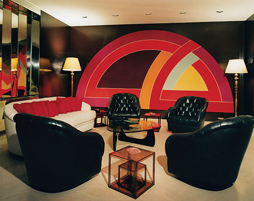
frank stella mural

Frank Stella, minimalist artist of the 60s, designed this vintage graphic for the homeowners, but the simple lines mean you can do it yourself. Also, much of the art that inspired the supergraphic movement was meant to be wall sized, so the designs are already properly scaled.

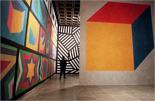
sol lewitt

sol lewitt

OG artist Sol Lewitt started his Wall Drawings series in the 50s and kept it up almost until his death in 2007.

bridget riley

Not to be outplayed by the playas, Bridget Riley revolutionized the Op Art movement of the 60s, and contributed enormously to the supergraphic aesthetic. Plus she was a lot hotter than Lewitt and Stella.

Although superpopular in the 60s and especially the 70s (check out this Supergraphics Kit you could buy back in the day), the surge of huge, colorful wall graphics died down in the spartan 80s and traditionalist 90s. In recent years there has been an upswing in painted murals as an alternative to expensive and difficult to remove wallpaper, but until recently many mural patterns have been naturalistic rather than truly abstract forms.

For everyone tired of trees, birds and flowers, check it, yo:

robert coxon

robert coxon

robert coxon

Decorative painter Robert Coxon's murals may look vintage, but they're totally modern. And how much do you love the 70s aesthetic of the actual photographs?

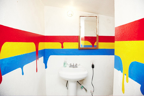
Perhaps you've got a boring old bathroom that needs a splish splash of pizazz? Supergraphics to the rescue!

supergraphic bathroom

Clothing designer Brian Lichtenberg's home is just as colorful as his cloth. Love this drippy take on the bold, primary horizontal lines, and this would be so easy to DIY. Just embrace your mistakes.

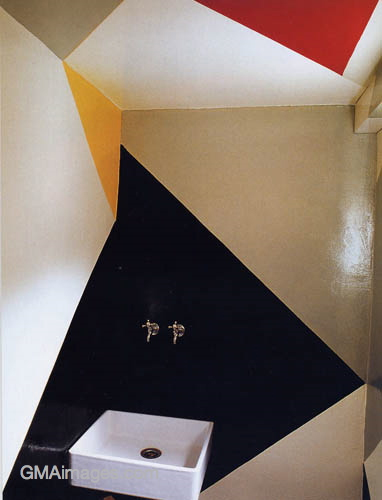
supergraphic bathroom

This faceted bathroom turns the sink and faucet into floating works of art. I suddenly feel the urge to rip out my own bathroom and start over, cubist style.

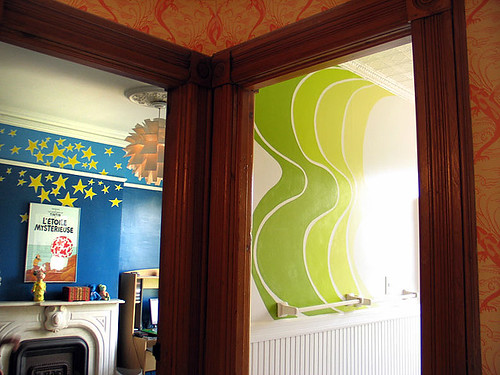
supergraphic bathroom

Wary Meyers are masters of all things painted, including this groovy lime mural in a vintage bathroom, complimented by a matching green painted radiator. Sweet!

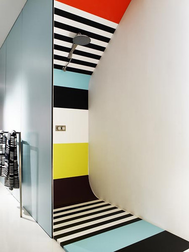
missoni shower

And who wouldn't want a shower painted in a bright Missoni pattern? I'm not sure how it works, but it sure is pretty.

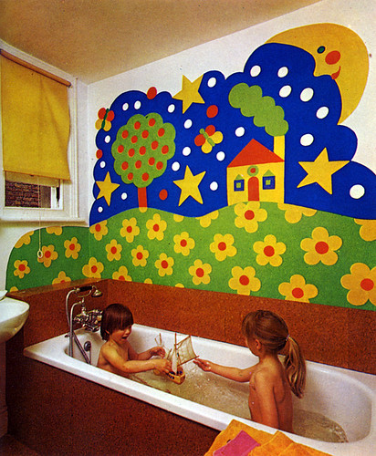
living space bathroom

Just don't do this to your bathroom. Or photograph your half grown children naked together in the tub, and then PUBLISH it in a book! Were these parents TRYING to traumatize their kids for life?! Since Living Spaces was published in the late 70s, these "kids" must be almost 40, now. Hopefully they do not read this blog.

Let's put the horror behind us and move on, shall we?

wary meyers

Wary Meyers give us supergraphic as headboard. Supersmart, and supercheap!

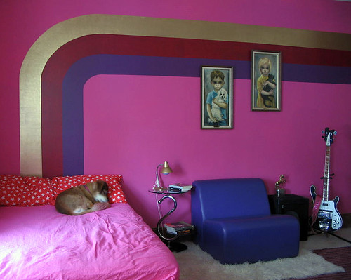
supergraphics

Awww, a sweetly sleeping puppy, a guitar, and pink with purple supergraphics. What more could a girl want? (Found here.)

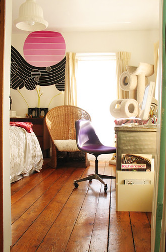
m interiors

A view of M. Design Interiors' room with attitude. I've blogged this house before, but its awesomeness can't be denied.

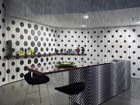
missoni home

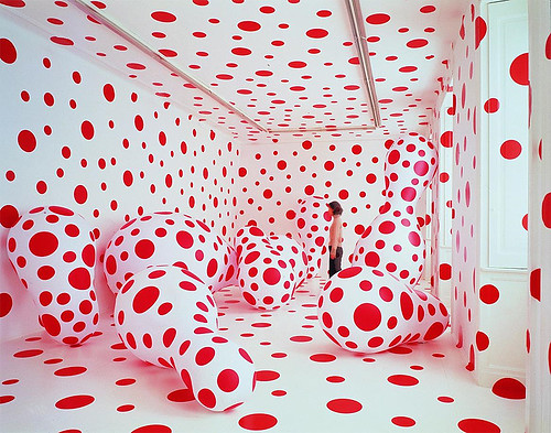
The overscale polka dot wall in this Missoni showroom recalls the above mentioned Bridget Riley's work, as well as that of crazy but brilliant artist, Yayoi Kusama:

yayoi kusama

When I say that she's "crazy," I mean that she's been institutionalized for much of her life. So if you're seeing spots where there aren't any, be very afraid. Or, hey, become a famous artist!

supergraphics

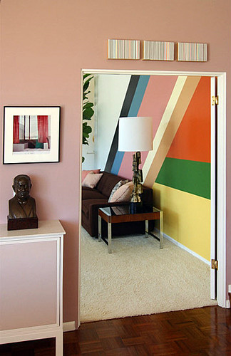
No post on supergraphics would be complete without this GORGEOUS image found over at If the Lampshade Fits. Sista knows a thing or two about supergraphics, and has great taste to boot.

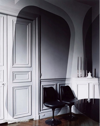
supergraphics

If you're on a small budget and need big art, a supergraphic just might fit the bill. There are so many DIY friendly shape and color combinations that there's something to fit just about any space. I was considering a black, all over paint job for the nursery (yep), but I think a wall mural might be more interesting and kid friendly -- although I do love me some black! What do you all think?

elliot smith

Finally, I'm leaving you with a great picture of the wall where the cover for Elliot Smith's Figure 8 was shot. Bless his groovy, little pea pickin' heart. Woudn't Mama Be Proud?