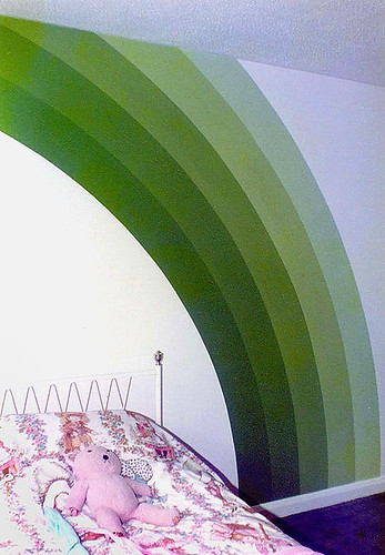
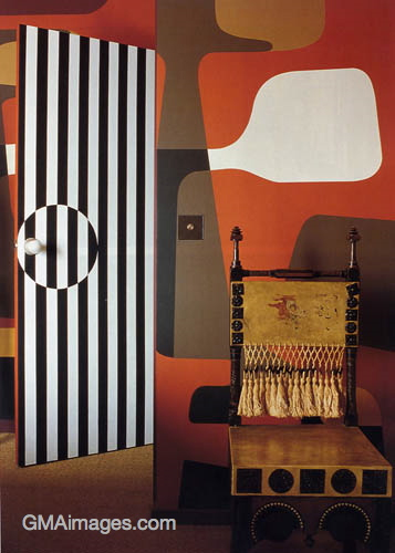
According to my vintage decor bible, Living Spaces, back in the seventies you couldn't walk into a house without bumping into a supergraphic mural. Somehow my superhip mom must have missed the memo, but that's ok because I'm on a mission to fill in the gaps of my obviously deprived childhood. So, hot on the heels of Karly's post about those supertalented Austinites, Redstart, I'm bringing you another day of supersized mural goodness. No wallpaper required.
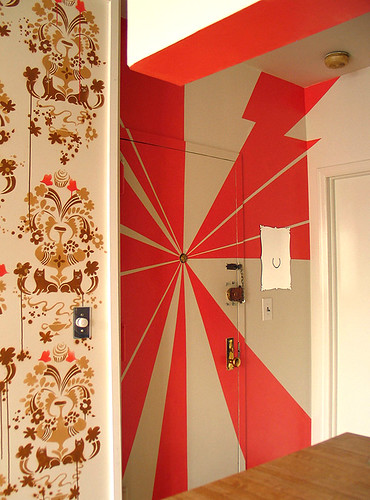
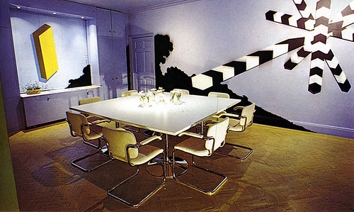
My obsession all started about a year ago with this image by design superheroes, Wary Meyers:

I really couldn't stop myself from painting my own hall ceiling a glamorous golden in homage to WM's greatness (read all about it here), and now I'm thinking the baby's nursery needs a supergraphic of its own. I mean, if you were a baby, doomed by evolution to months of nothing but cooing and an unfortunate inability to flip over on your own, wouldn't you want to spend your spare time staring at walls like these?

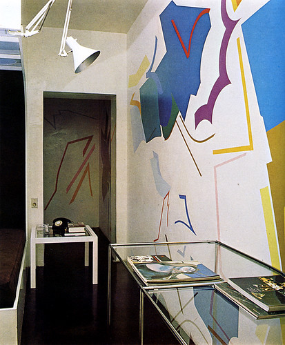
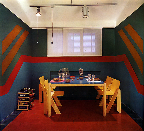
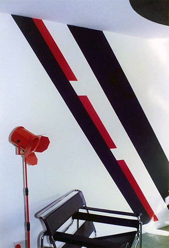
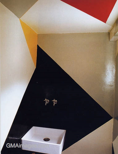
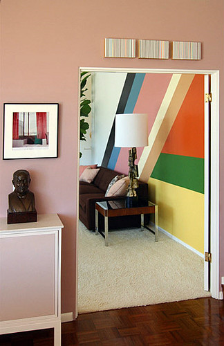
Living Spaces was going all avant garde with this one, eschewing the biomorphic for something a bit more Kazimir Malevich or Henri Matisse. But don't worry -- they have a few other tricks up the old book sleeve:


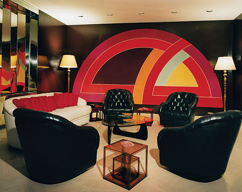
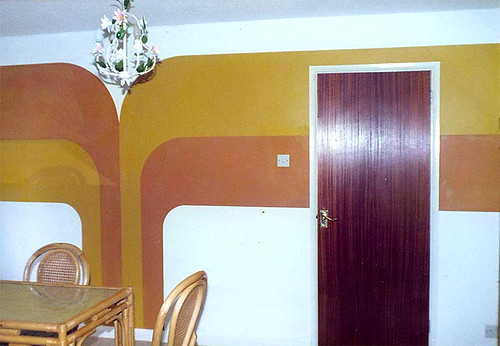
Ok, so the colors are a little... pukey in the bottom pic, but you get the idea. Some zany homeowners or decorators got hold of 1) tape 2) paint 3) rollers, and went to town all over those walls. Taking a cue from artists of the 60's and 70's, the supergraphic is an eminently attainable artwork.

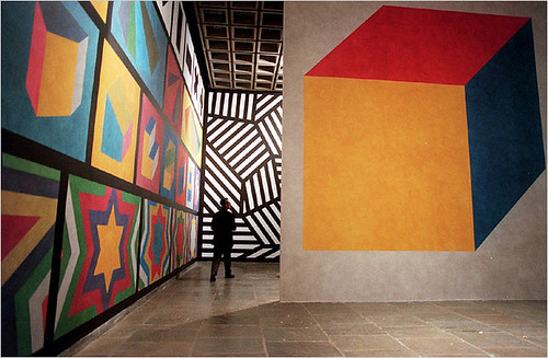
Frank Stella, minimalist artist of the 60s, designed this vintage graphic for the homeowners, but the simple lines mean you can do it yourself. Also, much of the art that inspired the supergraphic movement was meant to be wall sized, so the designs are already properly scaled.


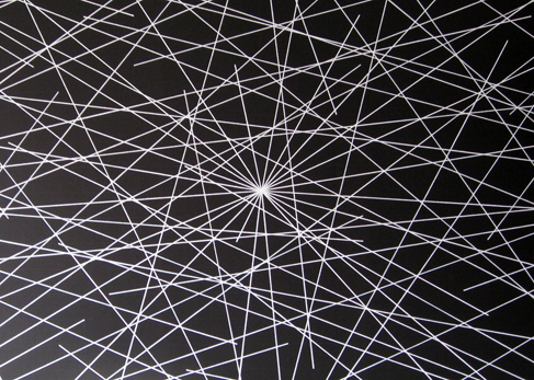
OG artist Sol Lewitt started his Wall Drawings series in the 50s and kept it up almost until his death in 2007.

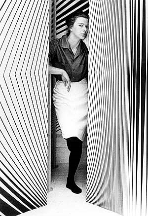
Not to be outplayed by the playas, Bridget Riley revolutionized the Op Art movement of the 60s, and contributed enormously to the supergraphic aesthetic. Plus she was a lot hotter than Lewitt and Stella.
Although superpopular in the 60s and especially the 70s (check out this Supergraphics Kit you could buy back in the day), the surge of huge, colorful wall graphics died down in the spartan 80s and traditionalist 90s. In recent years there has been an upswing in painted murals as an alternative to expensive and difficult to remove wallpaper, but until recently many mural patterns have been naturalistic rather than truly abstract forms.
For everyone tired of trees, birds and flowers, check it, yo:


Decorative painter Robert Coxon's murals may look vintage, but they're totally modern. And how much do you love the 70s aesthetic of the actual photographs?
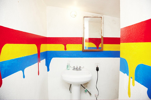
Perhaps you've got a boring old bathroom that needs a splish splash of pizazz? Supergraphics to the rescue!

Clothing designer Brian Lichtenberg's home is just as colorful as his cloth. Love this drippy take on the bold, primary horizontal lines, and this would be so easy to DIY. Just embrace your mistakes.

This faceted bathroom turns the sink and faucet into floating works of art. I suddenly feel the urge to rip out my own bathroom and start over, cubist style.

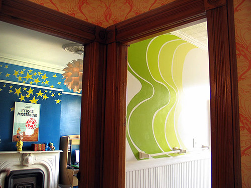
Wary Meyers are masters of all things painted, including this groovy lime mural in a vintage bathroom, complimented by a matching green painted radiator. Sweet!

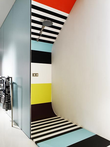
And who wouldn't want a shower painted in a bright Missoni pattern? I'm not sure how it works, but it sure is pretty.

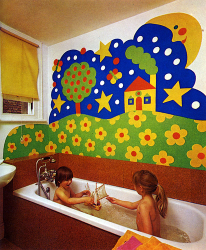
Just don't do this to your bathroom. Or photograph your half grown children naked together in the tub, and then PUBLISH it in a book! Were these parents TRYING to traumatize their kids for life?! Since Living Spaces was published in the late 70s, these "kids" must be almost 40, now. Hopefully they do not read this blog.
Let's put the horror behind us and move on, shall we?

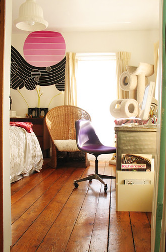
Wary Meyers give us supergraphic as headboard. Supersmart, and supercheap!

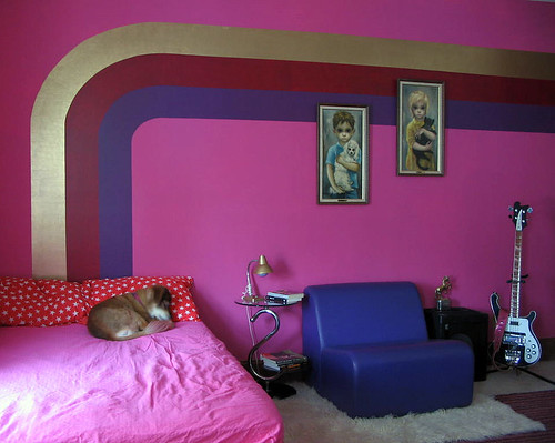
Awww, a sweetly sleeping puppy, a guitar, and pink with purple supergraphics. What more could a girl want? (Found here.)

A view of M. Design Interiors' room with attitude. I've blogged this house before, but its awesomeness can't be denied.

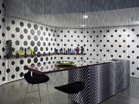
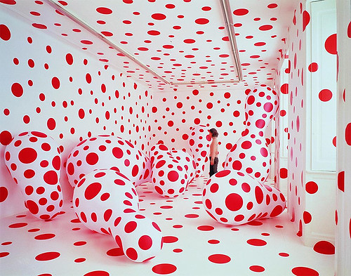
The overscale polka dot wall in this Missoni showroom recalls the above mentioned Bridget Riley's work, as well as that of crazy but brilliant artist, Yayoi Kusama:

When I say that she's "crazy," I mean that she's been institutionalized for much of her life. So if you're seeing spots where there aren't any, be very afraid. Or, hey, become a famous artist!

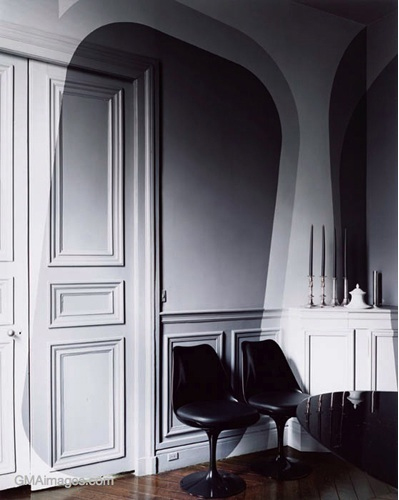
No post on supergraphics would be complete without this GORGEOUS image found over at If the Lampshade Fits. Sista knows a thing or two about supergraphics, and has great taste to boot.

If you're on a small budget and need big art, a supergraphic just might fit the bill. There are so many DIY friendly shape and color combinations that there's something to fit just about any space. I was considering a black, all over paint job for the nursery (yep), but I think a wall mural might be more interesting and kid friendly -- although I do love me some black! What do you all think?

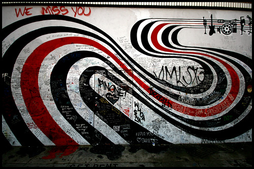
Finally, I'm leaving you with a great picture of the wall where the cover for Elliot Smith's Figure 8 was shot. Bless his groovy, little pea pickin' heart. Woudn't Mama Be Proud?
