Globamarama

Oh, it's a beautiful day, filled with glitter and puppies and warm apple pie with sparkly sprinkles on top!

inauguration day

At Obama's inauguration, I expect there will be unicorns and rainbows, with pink cheeked babies and parades of fairy princesses. (If you're a boy, I guess there will be... trucks? Sports? What DO men like, anyway?) Unisex fireworks will light the sky and the grime of dark ages shall be swept away by the glow of a truthy new Renaissance (insert angel's trumpets here).

So in honor of this special day, I am passing on pedestrian red, white and blue, and instead I am going straight for da dazzle. Only happy objects shall grace these pages, only glowing bastions of brightness. But I'm omitting already obvious lamps and chandeliers, for the aura and glow of better days to come must be shared by all.
aladdin table

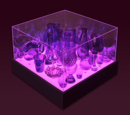
Stuart Haygarth's Aladdin Table is designed to act as a museum showcase for precious, sentimental objects. Let's say we stuff this sucker full of a better economy, peace in the Middle East, and a brighter, more purple future for our children.
suck uk coffee table

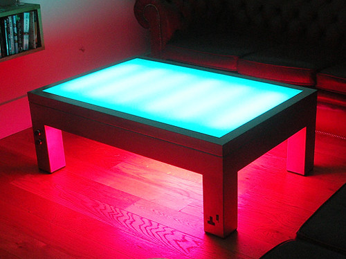
Have a seat around this Illuminating Coffee Table and develop your plans for a new world order. Item one on the manifesto: There must be more hot pink. Everywhere.
birgit ostengaard

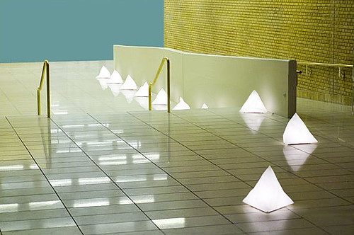
If you're feeling a little lost in transition, perhaps these Top of the Iceberg lights by Birgit Ostergaard can help you find your way through the darkness. They might also remind you that after Obama conquers the economy, war, education and healthcare, he probably should deal with that dastardly global warming.
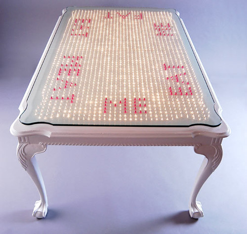
refined sugar studio

In the new world, no one shall go hungry, and this thousand-points-of-light table by Refined Sugar Studio will help to remind you that you are fortunate to have oh so many choices for foodstuffs: you could eat meat, eat fat, or even eat me. I am really hoping the Eat Me option is meant to evoke the slang, and not meant in a Soilent Green kind of way. That is not a vision of the future I want to embrace.
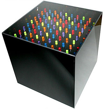
lite brite table

Of course, you could configure your own destiny with this Lite Brite Table. So turn on the magical shining light and make a steamboat, a chicken, a tropical fish -- a lemonade sign or whatever you wish! Aren't you loving the shape of things to come?

In this new shining era, everything will require you to wear your sunglasses at night, so you can -- so you can -- see the light that's right before your eyes.
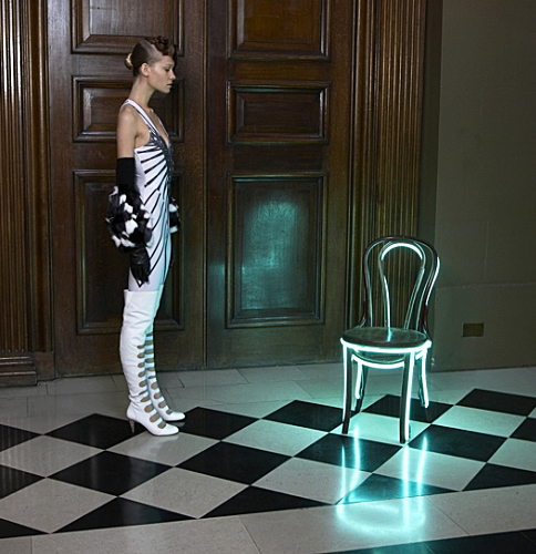
lee broom

See what I mean? She's obviously blinded by the light, hence the outfit. In her defense, Lee Broom's manipulated furnishings are pretty effing cool despite possessing potentially damaging effects to one's retinas.
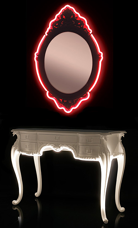
lee broom

On the other hand, a little extra illumination never hurt anyone. Unless you enjoy wearing clown makeup.
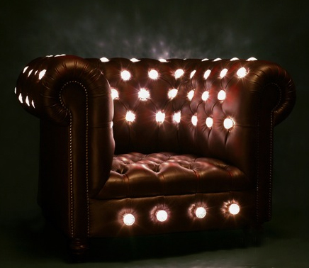
lee broom

I'm suddenly considering getting crafty with my Chesterfield couch... This just looks so darn comfortable!
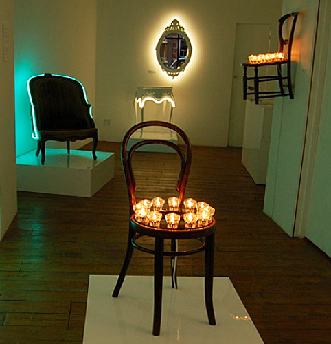
lee broom

Oh, weird circus Thonet, you light up my life.
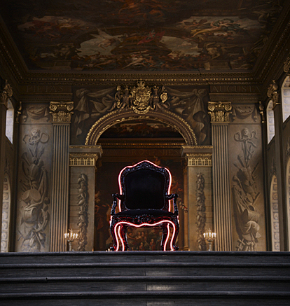
lee broom

This is where I would sit and consider the first day of the rest of your lives... ooops! I mean, that's where Obama would sit.
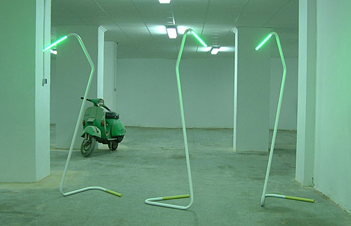
yonoh coatracks

After a long hard day of plotting, planning and designing, take a break and hang your hat on these groovy glowing coat racks by Yonoh Design. Enjoy the lovely, wholesome glow of sunny days that are sweeping the clouds away... Yes, friends, we are on our way to where the air is sweet!

But, can you tell me how to get a ride to the inauguration street?
Erin's Kitchen Nightmares

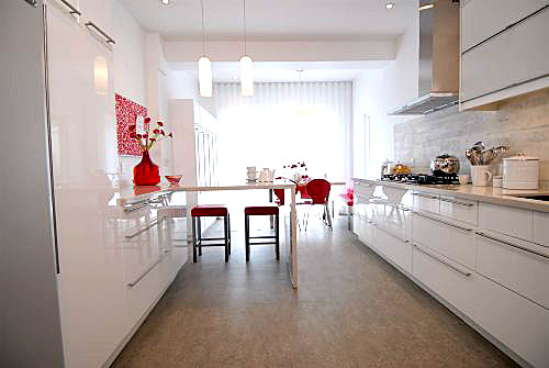
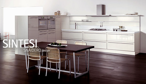
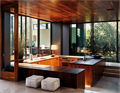
Thanks, guys. Thanks a lot. Because of you, we're planning to rip out our kitchen and replace it with this:

gorgeous kitchen

Sigh. Not really. I love this kitchen, but we'd pretty much have to raze the entire house and rebuild to get it, and Momma don't have that kind of cash (who does, these days?). But in all seriousness, because of your helpful comments on our first kitchen post, we expanded our $1000 kitchen "refurbishing" budget into... well, a hell of a lot more. I'll let you know the total damage when we do, and don't worry -- I plan to keep you updated every step of the way. Let's get started!

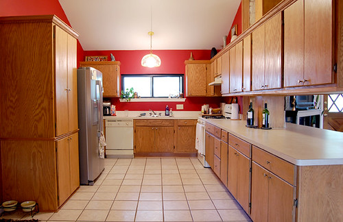
Here's a refresher picture for those of you who are scratching your heads in earnestness, trying desperately to remember what our hideous kitchen looks like:

our ugly kitchen

Mmmm, the beautiful tile, the gorgeous plywood grain, the overhanging cabinets that bash your head in when you attempt to look into the living room, the hulking pantry, the cracked and stained formica... Yes, it was hard to decide what you hated most, so we're ripping it all out. All of it. Oh, and trust me, the cabinets are WAY UGLIER in real life. Paint ain't gonna hide the janky drawers, the gaps in between the ill-fitted doors that may or may not open all the way, or the weird filler pieces sprinkled here and there like plywood twinkies.

First thing was first: get rid of those overhanging cabinets that blocked the view to the living room (for more detailed pics, refer to the original post here).

kitchen remodeling

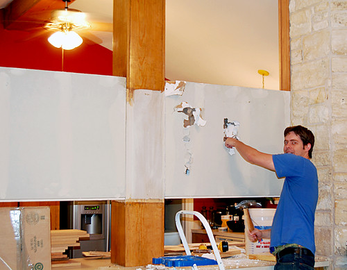
Hunny Bunny to the rescue: the Berlin Wall is coming down, bitches! Ich bin ein Berliner, schweinehunds!

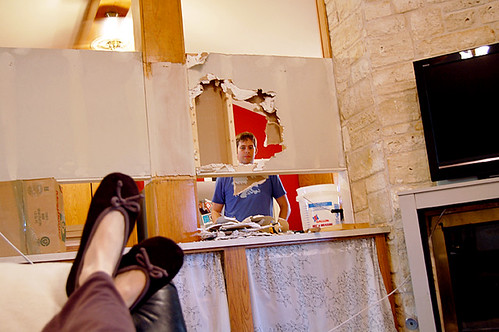
In case you were wondering, I was an integral part of the demo process:

erin is lazy

Almost done...

ben demolishing the wall

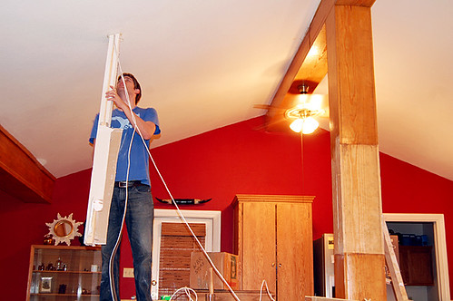
Awww... isn't he precious? So, let me tell you -- tearing watching Ben tear that wall up was the most liberating thing, ever. The ugly pine post is still unfinished, but I love the new sense of openness already, and I don't miss the cabinet space in the least.

living room

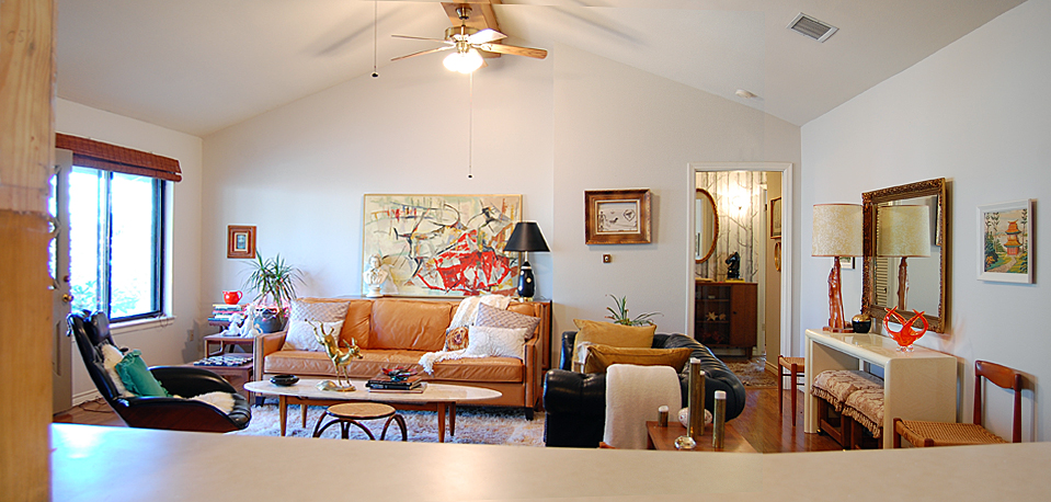
Yep, that's the (not actually that cluttered in real life) living room. Notice the post sans ugly cabinets on the left. Now if I could just get that back wall settled... oh well. One thing at a time.

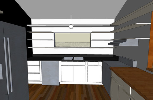
Ok, back to the kitchen. So here are some Google Sketchups that the Hunny da Vinci'd up for me:

kitchen sketchup

Yes, we will be repainting. The window and stove walls will be the same pale gray as the living room, and the back wall will be black or some kind of a dark charcoalish color. Also, the post will be stripped of its hideous pine shell and dry walled to a (hopefully) smaller size. We will probably paint it white.

Unfortunately, as you can see above, Hunny Bunny went rogue a la Sarah Palin and added some wrap around beam that overhangs the bar area, and me no likey, especially because it makes the window area look cluttered:

kitchen shelves

Ugh. I really need three shelves for my dishes, and HB just can't understand why that extra shelf up top that is totally unreachable to 5' tall moi creates an ugly number. Can you help me out? So, here's the rest of our kitchen plan:

1) Rip out the fugly tile and run the same hardwood from the adjacent dining room into the kitchen. This is going to be a big nasty job full of sanding (our wood is unfinished and must be stained to match the old wood), but it's already scheduled for the end of the month, and the estimate is not too bad. Never fear, I shall blog the process and let you know how it goes and what it costs.

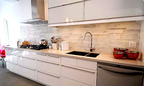
2) Rip the cabinet sea out and replace it with Ikea Abstrakt White lower cabinets that look like this:

ikea abstrakt white

ikea white abstrakt

Oooh, shiny! I know there are some Ikea haters out there that will tell me I'm crazy for trading in my wonky plywood cabinets for particle board, but I did my research and I'm not concerned. Consumer Reports gives them a pretty stellar rating (not even considering the cost!), and I love that they come with swank Blum and Ferrari hardware. I have NO hardware except for pulls and outside mounted hinges on my current cabinets, and there's currently so much wasted storage it's pathetic. Also, there's a rumor circulating that Ikea's more contemporary cabinets are manufactured by super duper expensive maker Snaidero:

snaidero

Like I said, it's just a rumor, but they sure look similar to me...

3) Karly's hubby Matt will help us build in another level to the peninsula so that we can have space to eat on the living room side. We're planning to use butcher block for the countertops on the peninsula since there aren't too many moisture issues in that area. Plus butcher block is cheap and pretty.

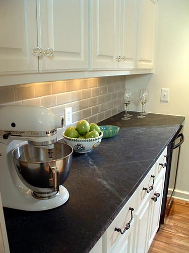
4) Soapstone for the counters on the sink side. Not sure if we're going to use tiles or slabs yet, but here's a picture of what a soapstone slab on a white cabinet with wood floors looks like:

soapstone counter

Obviously our cabinets will be sleeker, but I think the soapstone is clean and minimal with a natural "grain" to it, and I like that it's matte and non porous. If we decide to do tiles instead, there's an awesome DIY post that will hopefully guide us through the process. The results look pretty amazing.

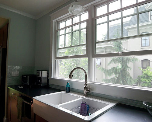
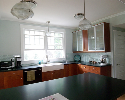
5) Replace the sink. Um, not sure what's happening here. We were looking at this farmhouse sink, seen in Jillian Frances' beautiful kitchen remodel:

dosjo sink

domsjo sink

Hers looks really pretty with dark wood cabinets, but I'm not sure it's the right style for the cabinets we've chosen. Also, will it chip and stain? Should we just go stainless instead???????? Help!

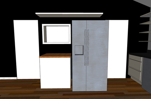
6) Deal with the wall of pain.

fridge wall

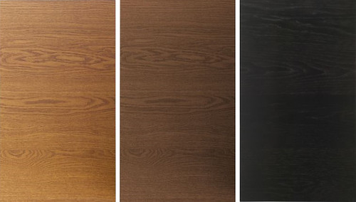
This was our plan, but I had an epiphany that we need a built-in pantry wall of cabinets between the two doorways that the fridge will fit snugly inside. I'm just not sure if I should use the same white cabinets on this wall... will it be too stark against the black? My other choices are wood slab Nexus doors from Ikea that range from light brown, medium brown to brown black.

ikea doors

If I weren't putting in wood floors, I would probably choose the lightest wood color, but I think it's way too close to my floor color. What do you think about the darkest wood color? Would it be strange with a black wall behind it, and gray/black soapstone counters? Should I just go with a monolithic white wall of cabinets, instead? Double help! It's super important since we stare at this wall all the time while sitting in the living room, now that our upper cabinets are gone.

Designer friends and readers with fabulous taste who first pushed me to accept that I need to tear my kitchen up and paint it black, you know who you are. As you can see I'm about to spend a crapload of money and I want to get this right. Help a girl out with the details, will you? You'll have my undying love, unless this kitchen renovation kills me first.

That Seventies Series: Paint the Trim Fantastic

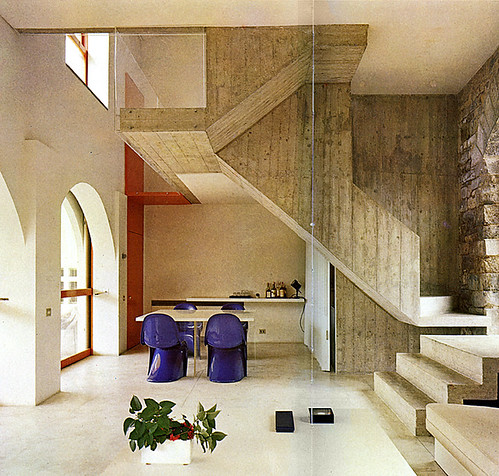
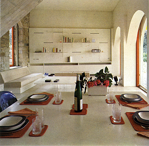
So, I have this secret interior decorating weapon called Living Spaces. I bought the book for a buck at a Goodwill a while ago, and was amazed to find that its 1978 goodness is perfectly aligned with current interior trends, and maybe even a few upcoming trends that I will attempt to predict a la Miss Cleo. This bad boy was produced by the Whitney Library of Design, so you know it's good. Anyhoodles, I'm starting a series based on inspiring images from the book, so let's see if I can get this sweet puppy to fly.

living spaces

living spaces

Clean lines, natural surfaces, neutral backdrops -- this ain't your momma's carpet infested house. Actually it's a fat villa in Florence, and what I'm really digging is the colored trim against the pale background (please ignore the hideous table setting... yikes!). So I've done my very bestest to find some contemporary examples of trim that are not painted white or blended into the wall color. Why should all the other surfaces have all the fun, anyway?

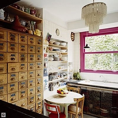
pink window trim

Sorry, not sure where this picture came from, but let me just say that it takes some pretty powerful trim to distract me from the vintage card catalog in all its sexified glory.

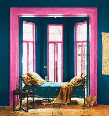
pink trim

If you're really brave, you can dispense with the white altogether and bathe the entire room in saturated hues, like this pic from Domino. (By the way, has anyone received their January copy via mail yet? Anyone? Anyone?)

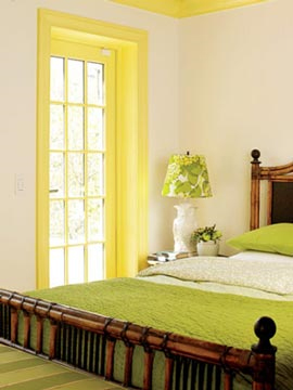
yellow window trim

Sad story: this is NOT the picture I wanted to include. Months ago, I saw this gorgeous image of a very spare room with pale walls and maybe pale concrete floors, and the only color in the room came from the citron yellow window trim. I cannot for the life of me find the picture... I swear, I went all Captain Insano and searched for HOURS for it, and I'm really tired now. OCD sucks. If you know which picture I'm talking about, please send me the link and I'll swap pics. Until one of you superfantastic readers can bail me out, you'll have to make do with this pic from Apartment Therapy.

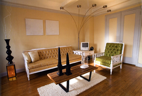
So maybe you like the idea of having non-white trim, but are looking for a little less contrast in value:

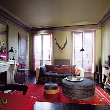
lavendar and green room

Even if you choose color for your walls, you don't have to paint the trim white. Thoughts on this color scheme? Photo courtesy of Marie Claire Maison.

blue trim

A more subdued palette of butter yellow and a pale purplish blue, courtesy of Apartment Therapy.

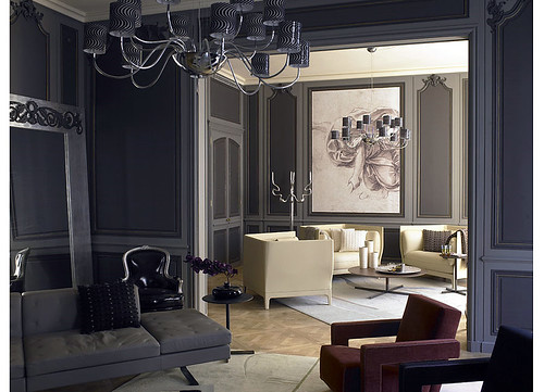
gray walls

This twist on traditional features dark gray walls with medium gray molding, which reads as understated and sophisticated rather than cartoonish. Photo by Richard Powers.

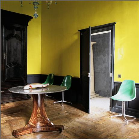
black trim yellow walls

Or perhaps you'd like to keep your Sanders-approved color on the walls, but still want to funk up the trim? Once you go black, you'll never go back. Like, seriously -- it would be a pain in the ass to paint over.

But, no pain, no gain, right?

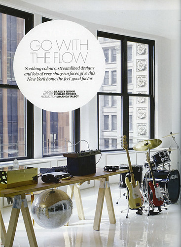
black trim white walls

Elle Decor UK reminds us to "Go With the Flow." With gorgeously framed windows like those, (and a disco ball!) I'm feeling a lot more fluid.

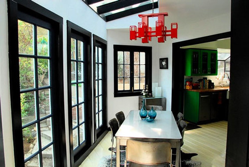
black trim

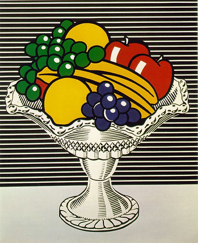
This quirky room from Apartment Therapy might be enough to make me take the plunge. I love the Roy Lichtenstein look:

lichtenstein

Color is fun, but there's certainly nothing wrong with classic, clean and simple:

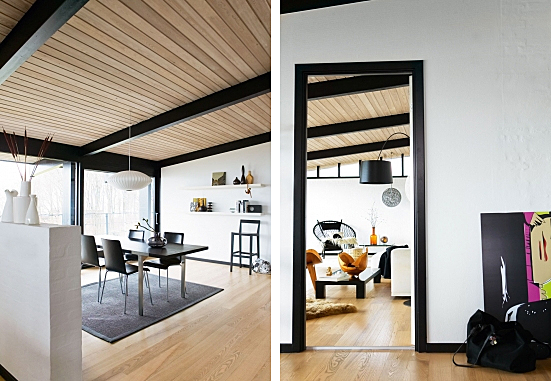
bo bedre

In these images from Bo Bedre, straight black trim sets off the crispness of the architecture and decor choices.

black trim windows

I love the simple black trimmed windows in this otherwise light and bright space. Image via the awesome decor blog, Roseland Greene.

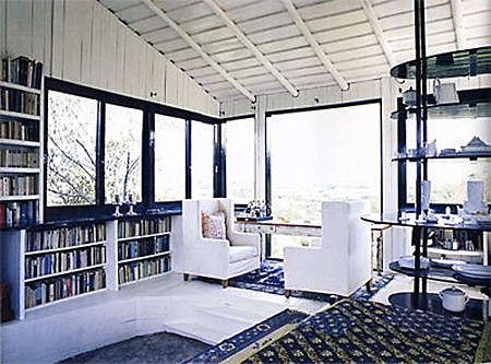
black window wall

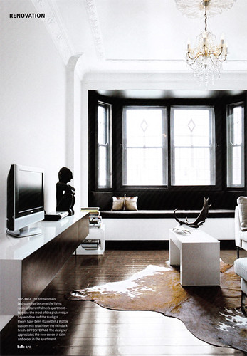
Finally, I've been crushing over this gorgeous room since the always fabulous Door Sixteen first posted it. It's the perfect mix of drama and breathing space, and the stunning architecture doesn't hurt. I loooove the way the black draws attention to the windows, framing them like pictures.

White trim, eat your pale, listless heart out (but don't worry, I still love you).