In my last post I extolled the virtues of all things Yves Klein and therefore, by the transitive property A=B and B=C, also all things blue, and also all things crazy but awesome. I'm a little weary of the robin's egg blue that was so popular for the last few years, and I just painted over my tequila blue living room (so I think you can gather how I feel about that), but this blue is all neon excitement -- more sapphire than powder, more sexy than sentimental, and definitely not for the faint of heart.
This girl gets it:
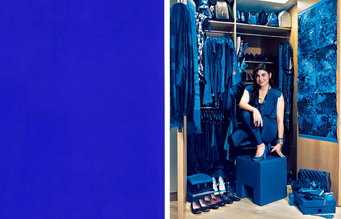
Comparing her wardrobe to a swatch of Klein's patented Blue, you can see that she's not entirely on the money, but her claim to wear nothing but IYKB is not without merit. And frankly, I think it does a lot for her complexion. And it's certainly better than the guy who looks like Paul Giamatti but isn't and only wears brown. Really? Brown? Do I even need to go into the associations there? It's too early in the morning.
Of course, this is an interior design blog (for lack of a better category), so I would be remiss in my duties if I didn't shower you with some home decor porn, and you know I live to serve you, my ladyfriends (and gay BFFs??? hellll-ooo? Are you there???).
Without further ado:
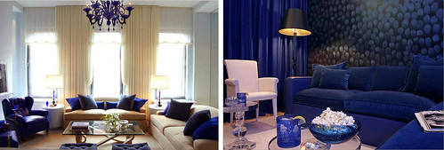
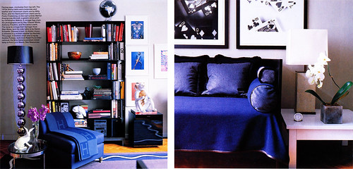
Starting it off with a bang are these gorgeous rooms designed by Andrew Suvlasky. Is it getting hot in here, or is it just me? I love the gender neutrality of this color. Not so masculine as to say, "I like hunting and tweed" and not so feminine as to say "I like birds and twee pastels, thank you very much." And when it's blue on blue on blue -- par example, the right picture -- it just feels saturated instead of hyperactive. Try that with any other pop color.
And, of course, Klein Blue does work beautifully as an accent color, too:
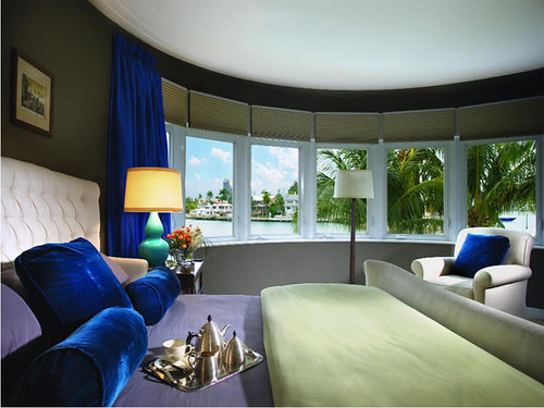
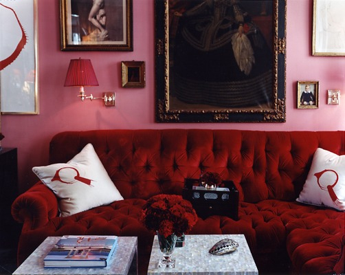
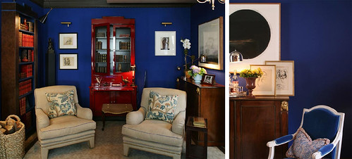
That IS a pornoramic view in this bedroom designed by Brown and Davis, but those seductive pillows and drapes almost outsexify it. Plus whoever photographed this interior did an amazing job. The double gourd lamp in turquoise is a bit strange, though...
Another room that strikes a blue note:
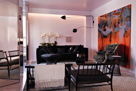
John Demsey's bachelor pad designed by Bibi Monnahan, via Habitually Chic. Check out the whole tour on her site because the guy has a great photography collection (as well as some chairs that Miss Karly would lurve). Again, there is some weird lamp action going on here, but I still think this is such a livable apartment, much more accessible than something done up all in beige like my uptight BF Patrick Bateman and his super sterile bachelor pad.
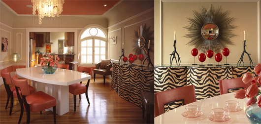
Of course, if you need some extra stimulation, you could go all the way, like this room designed for the Kip's Bay Showhouse by Christpher Maya:
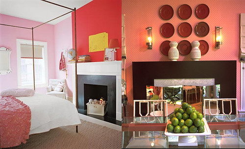
Yes, it's a little patriotic for my taste, but I like the wall color and blue chair. I think it could lighten up and take itself a little less seriously, though, like this bubbly kitchen spied in Domino's quirky kitchen gallery:
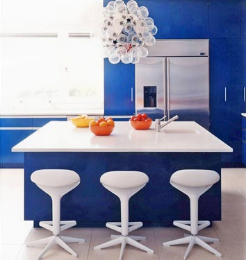
All those balls make me giggle and the barstools are kind of killing me (anyone else offended by those ubiquitous pseudo-futuristic stools? Probably just me... as usual), but I do like the light 'n' freshness of the entire ensemble.
And finally, after the slew of blue and chrome combos, a reminder that electric blue looks fantastically sultry when paired with gold:
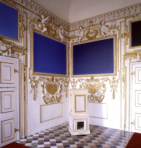
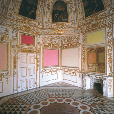
Ok, what would not look good in Italy's amazing Palazzo Ducale di Sassuolo? But these modern works by Winston Roeth are spectacular in juxtaposition with cherubic white and gold. (via, once again, Habitually Chic)
Funny, those paintings look familar, don't they? After all, Roeth wasn't the first artist to paint a monochrome canvas in what is essentially, ahem, Yves Klein Blue. But I suppose if you're in the business of painting monochromes, then you must be aware that what you're selling is not talent, but a concept, and Klein understood marketing better than anyone.
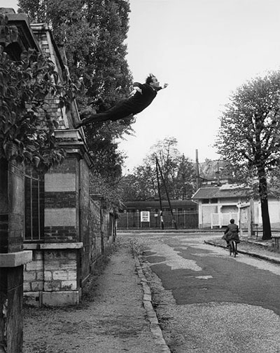
Yves Klein was always good at anticipating trends (pretentiously called "movements" in art, but the great cultural critic Walter Benjamin realized early on that art is inevitably bound up in fashion), and he was always good at creating something out of nothing. Witness his "Leap Into the Void," where he markets his greatest product, ever: himself.
Oh, hell, whatever. Enough art history. I like blue. Not to go Seussian, but take the leap. You might, too.