Finally! It seems there's a home design trend that matches my unwanted yet rapidly growing Fisher Price menagerie (note to Kartell: please make stylish baby toys. Hurry). Collectors and art enthusiasts have long appreciated the pop paintings of heavyweight Roy Lichtenstein, but now it seems that Lichtenstein's style is increasingly interpreted through textiles, patterns and paint. Yep. Primary colors are back in funky fresh force, along with a cartoonish panoply of stripes, ben-day dots and blocky solids.

Lichtenstein himself did a series of interiors in his trademark style, hinting at the shape of things to come. Funny that he even anticipated the avalanche of Warhol's Mao paintings that covered the walls of bazillions of featured homes this past year.
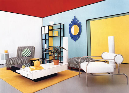
This room styled by Jeffrey Miller owes more than a wink and a nod to the piece above. But you don't have to be so literal to reference the look.
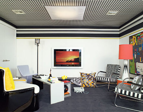
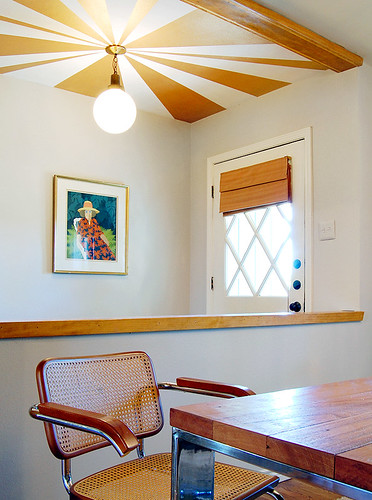
Of course, having a polka dotted ceiling like this room designed by Christopher Coleman helps.
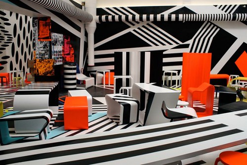
And a glut of seizure inducing stripes can't hurt, right? Cafeteria designed by Tobias Rehberger.
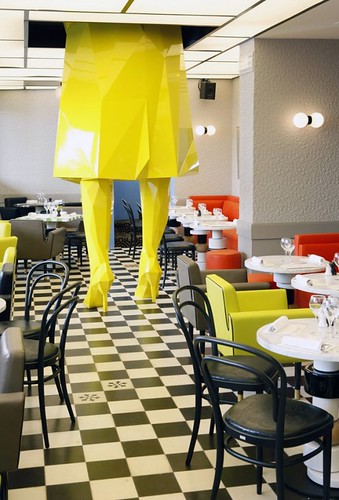
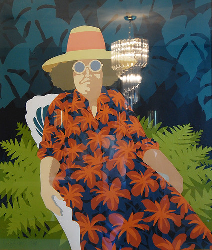
Obviously, what you really need is a giant stylized glamazon in the manner of Lichtenstein's famously blond heroines.
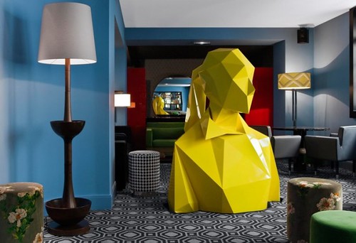
The top half of this India Mahdavi designed restaurant is no less comic book chic.
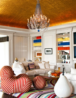
Not to worry -- you don't have to have a towering Barbie in your house (but what girl doesn't secretly want one?). Playful elements scattered here and there create major impact, as in this room in fashion designer Max Azria's home.
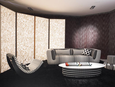
Just try and stop me from swathing my next couch in these Lichtenstein inspired Missoni prints.
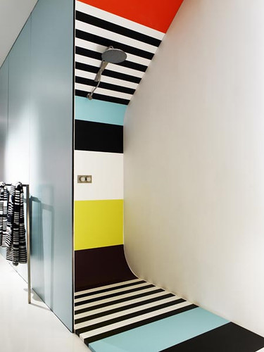
And I wouldn't be mad if my next house had a Missoni colorblock shower in it, either.
If you're feeling a bit overstimulated by all this crazy bizness, consider limiting the look to a simple painting by the man himself.
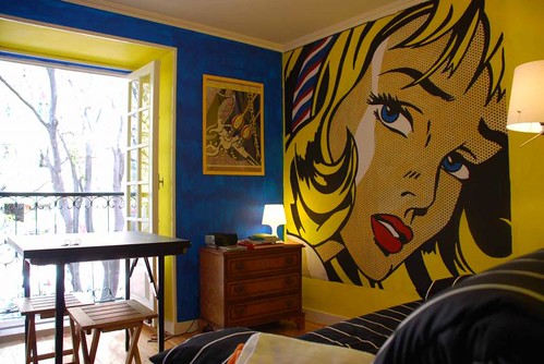
No, not like this hostel, which feels more tragic than comic. Although, note how easy it would be to paint a simple, similar mural in chic black and white...
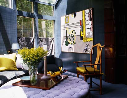
I was thinking more like this room designed by Vicente Wolf, where traditional furnishings are seriously lightened up by the addition of one of Lichtenstein's mod paintings.
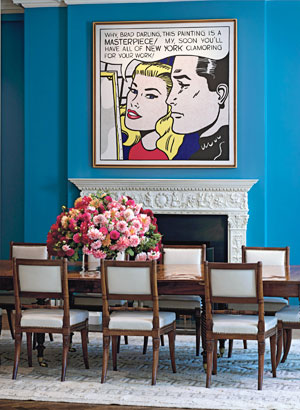
The flowers are killing me, but you get the idea.
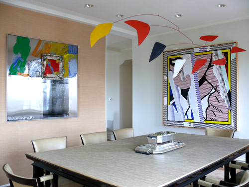
Personally, I like the pop look best when it's paired with contrasting elements. The Calder mobile in similar style and colors competes with the painting in Patsy Tarr's home.
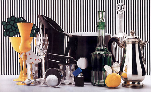
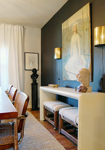
On the other hand, there's nothing wrong with going full frontal on a small space, like this quirky vignette styled by Jeffrey Miller.
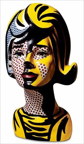
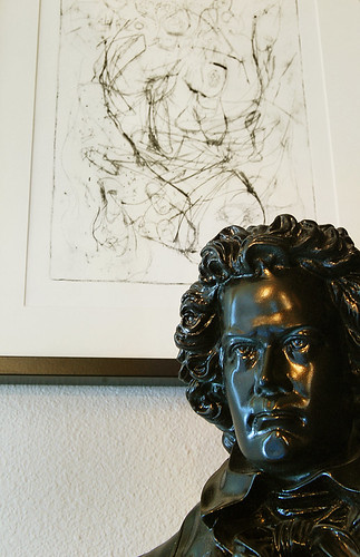
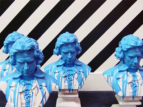
And what better than a Lichtenstein bust to make a popping fresh statement. Yet another idea for the reinvention of Beethoven?
