Designer Spotlight: Redstart Design

Last Sunday, just after watching back to back episodes of my two favorite shows:  Rock of Love Bus and Tool Academy, I was ripped from the comfort of my bed by a prior obligation.  I had promised a few of my favorite ladies that I would join them for drinks.  Of course, I made said promise at 11 a.m., and was remiss to fulfill said promise at 11 p.m..  Yes, 11 p.m., on a Sunday.  What had I been thinking?  Well, anyway, I'm quite glad that I pulled myself together and scooted out the door because, not only did I have a great time with the favorite ladies, but I also met Michelle Marchesseault of Redstart Design.  
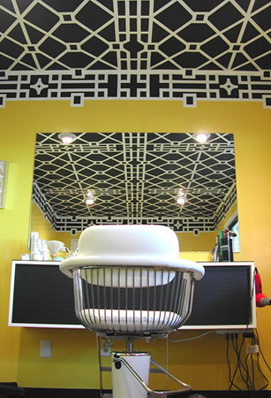
Michelle and her business partner, Rachel Shannon are notorious in Austin for their Op Art commercial and residential murals.   Using nothing but tape (only sometimes) hand painting, and a lot of math, these ladies put together the freshest non-wallpapered backdrops in town. 
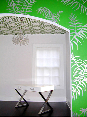
The residential mural above was achieved using silver leaf.  Do any of you know how tedious that is?  The painting I did in my living room (by hand-cut stencil and latex paint) took a week and a half, I can't even imagine how long this takes the ladies:
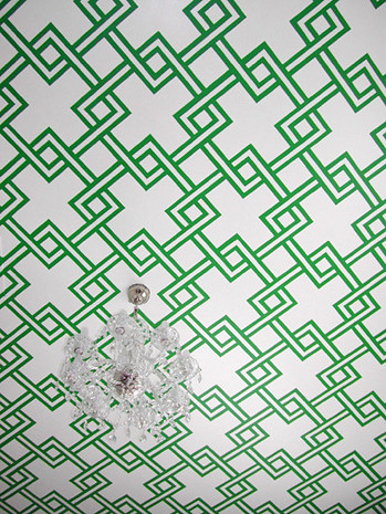
Perhaps if I had conducted an interview (per our Sunday discussion) I would have learned the answer.  But I was busy working so you dudes get pretty pictures and lots of unanswered questions.

This photo of former partner, Jason, does provide some insight on what a bitch this job must be.  But I have to say, that finished ceiling is out-of-control amazing, and totally worth the effort. 

Clearly, these ladies like ceilings.  Writing this post is only heightening my ever-present craving to scrape all of the popcorn off my ceiling so that I, too, can have the Redstart treatment.
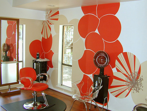
The Vivid Walls of Austin's Viva Salon

One of the many bedrooms for, ahem, the Real World Austin set
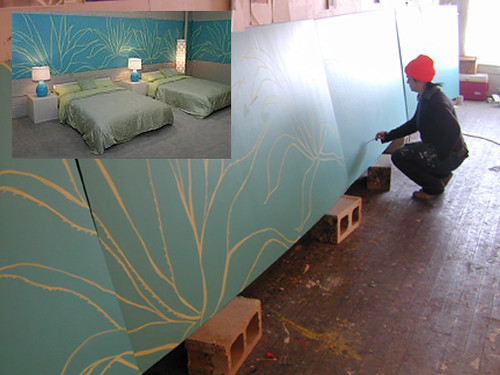
I love when artists and designers post pictures of their process.   Same with set building on DVD extras.  I could probably skip most of the movies I watch and just enjoy all the behind-the-scenes design goodness alone.  Ok, actually, I have done that before, it was pretty damn awesome.
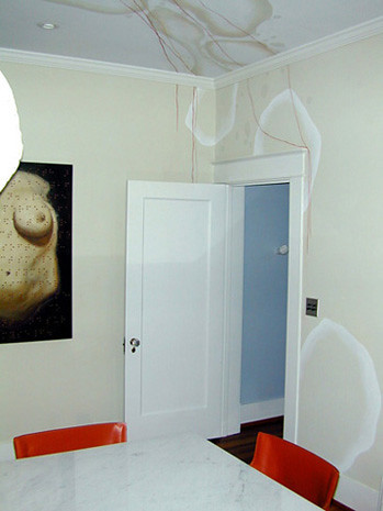
This freeform latex and GOLD LEAF(!!!!!!!!!) residential mural Speaks directly to my heart.  Shhhh... can you hear it?

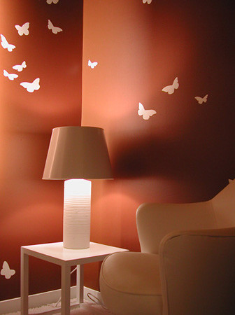
And I know that I was just getting all mad at Elle Decor the other day about their piss-poor butterfly trend prediction, but I really like the space above.  I'm 100% sure it's the palette, and the fact that the butterflies aren't all lame and colorful.

Speaking of animals I love:

This lovely horse is snugly nestled in at one of my favorite bars in town, the Red House.  There are plastic and painted horse heads everywhere, and that, my friends, is a motif I can get behind.
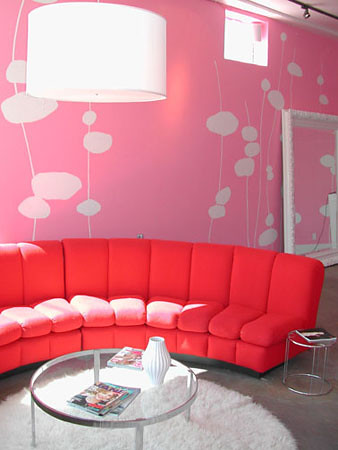
The mural at Frou Frou always caught my eye when I lived a couple of blocks away.  Somehow taking things I don't generally like on their own:  red and pink, and putting them together, really does it for me.

The ladies of Redstart don't just sit around contemplating repeating pattern and huffing paint all day, they also get their exercise on by participating in Austin's own synchronized swimming troupe, The H2Hos.  

So, looking back on my Sunday night on the town, I have to admit, it wasn't so bad after all, almost as good as Rock of Love Bus, almost.

I Want: Michael Zavros

Lovely readers, I am bone tired -- and by that, I mean my butt bones are literally bruised from hours of sitting on hard floors while painting trim -- so today I'm going to keep the writing short and the pictures sweet. Anytime I start a major decor shakedown, new art always tops the list of Things I Really Wish I Had to Complete My Fantasy Room. I'm pretty sure any of these paintings by Michael Zavros would be just fine.

michael zavros

Gucci/Black

Zavros' statement from his recent Trophy Hunter exhibition at the Philip Bacon Galleries sums it up like so:

"In more physical than cerebral times, trophy hunting was a life or death journey requiring craft, cunning, timing and strength... This exhibition of new work by Michael Zavros describes trophy hunting as an end in its own right, with the trophy more likely a painting by an A-list artist, a coveted prestige vehicle, a strange or exotic orchid found only in the forests of northern Borneo, narwhal tusks or other natural curiosities, or creatures such as the Onogadori chicken, a bird bred for exhibition, which can barely move without human intervention."

Chickens that can't move without human intervention?! Huh, I never knew I liked roosters before.

michael zavros

Black Breasted Silver Onagadori Twins

As his statement implies, Zavros doesn't restrict himself to animals as trophies, instead referencing iconographic fashion and even design.

michael zavros

Zavros/Hood/Le Corbusier

Zavros critiques or pokes fun at the senseless acquisition of objects and trophies as vapid status symbols, yet he makes his comments from an interior point of view; as a child he rode horses competitively, bred chickens, and is currently an A-list artist himself. So either he has a mammoth ego or a silly sense of humor when he includes one of his own works (the tiny bronze horse head) alongside his own Corbusier lounge.

michael zavros

Love Me

Or maybe he just has a very keen understanding of the status symbol/trophy as a smokescreen that diverts attention from insecurity and self doubt.

michael zavros

Debaser/Gaultier

"The sensibility in all of these works is a discomforting glory in beauty, detail and objects, one that may be doomed to emptiness." His debased faces of fashion revel in sheer technique while detailing the beauty and unattainability of fashion, but they also refer to that "emptiness" that comes from admiration of beauty for its own sake, or as Ralph Waldo Emerson said, "Beauty is its own excuse for being."

As an artist, I always argued against that idea, yet it is easy to be seduced by the glamor of Zavros' paintings.

michael zavros

I Heart Versailles

michael zavros

La Fontaine de Sang (The Fountain of Blood)

michael zavros

Spring/Fall

michael zavros

An Elk

There is a melancholy air of sadness in the most beautiful of the paintings, and a sense of airless desire in other, more pointed images.

michael zavros

Starck/Bawden/Zavros/Nell/Starck

The title certainly reads as a stilted catalog for the affluent. Maybe I'm not so fond of those Starck status symbols, after all.

michael zavros

Rush

Reminiscent of Robert Longo's stockbrokers series from the 80's, Rush serves as a reminder that such a lifestyle does not come without a certain price. Wall Street may be coming to the same conclusion.

michael zavros

Milano Interior/ Moneti Emporium/ I Do Not Want What I Haven't Got

One can only assume Zavros acknowledges that such excess is truly excessive. I wonder if men think the same thing when they see a closet full of women's shoes? Surely there is nothing as uniform and interchangeable as a man's suit? (can't wait for someone to argue here...)

michael zavros

1820s Regency Leather Sofa/ Favela Chair/ Champion Dachsund "Windkiedach Wiggle"/ a Dale Frank

In the end I find myself a victim of my own desires and wants. I will never be able to afford this $20,000 painting or any of the contents found within it (although the taxidermied dachsund is certainly an object of lust!), but I like it. I admire its technical virtuosity and I enjoy its sense of humor. So when I close my eyes and imagine my finished fantasy room, there will be a Zavros on the wall.

But for now the only paint I can afford comes in a can. So it's back on the old hands and knees for me, begging the gods of baseboard painting to bless me with a hand half as steady as Michael Zavros'.

Trend Alert: Cross Sections & Topography

Well, well, well, what will they think of next?  Certainly not butterflies, Mrs. Russell.  Sometimes it seems like just about anything could be a new trend, think of something you haven't seen in awhile:  telephone books for example, when was the last time you saw them?  An item needs to be absent before it can be reborn with to a new perspective and adored.  Let's explore this phonebook thing for a while, I'll apply my scientifically formulated trend-worthy questions: Are they hovering on the verge of being nostalgic? check.  Easily recognized with bold colors?  check.  Firmly planted in the depths of the universal subconscious?  And Check.  hmmm, in my babbling I think I may be on to something:  phone books will be next season's new black.  For now, I'm feeling something equally arbitrary:  cross sections and topography.  Totally random, right?  But still, somehow, it's everywhere.

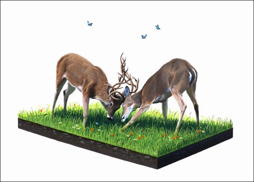
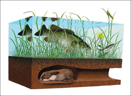
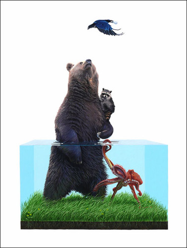
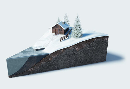
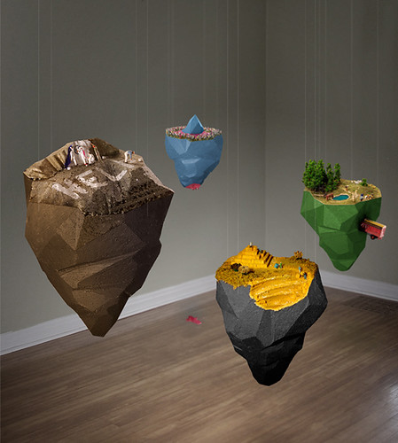
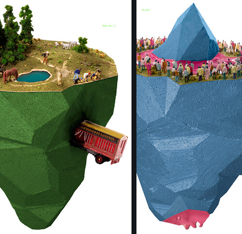
I caught my first glimpse of some trend-worthy cross sections when I purchased this Josh Keyes print from Tiny Showcase (ps, if you happen to know where the hell I put it, I will totally give you a dollar).  I instantly fell in love with the small sections of land Keyes meticulously slices off for his animals to live on.  His work speaks to the ever-growing human population and their encroachment upon natures little creatures, so it's a bit sad, but man if it isn't pretty.  Let's see more:

I've been drooling over Keyes's work for ages and skipping the starbucks in hopes to one day save enough dough for a real painting, not just a print.  I had never seen anything like it.  So imagine my surprise when I saw this ad campaign for a Ukrainian Travel Agency:

So similar to Keyes's work, just without all that we're stealing the sweet cute baby animal land stuff.  I have to admit, while these works are lovely,  Keyes is still my fave.  

If I wanted a real-honest-to-god cross section hanging around my house, I'd most certainly hunt down the work of Rainbow Monkey:

let's play archeologist and get a closer look at this bit of earth we've discovered

I have blue rocks in my backyard, too, what a coincidence!  

With 3 confirmed artists creating cross section art, I started to keep my eyes peeled.  I began to notice cross sections popping up everywhere, from realistic shots of actual earth, to meticulous topographical paper carvings: 

Silver Lake Operations #1, Lake Lefroy, Western Australia, 2008 3/10

Isn't it funny that, after looking at several fake cross sections, this real one seems like a bit of a bummer?  If you pull Edward Burtynsky's Australian Minescape out of the context of this post, however the photographs become epic, and even mirror the work of Keyes:  documenting human destruction of the land.  Ok, on to something less depressing:  Birthday Cards, yay! 

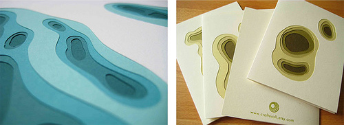
Etsy Artist, Crafterall carves topographic wading pools and ravines into her notecards, combining enough color and texture to make the blank cards speak for themselves.  This is perfect for me because I never really know what to write in those anyway.  Thank you for the gift......you're awesome?  (But don't worry, I'm from the south and therefore have manners and, yes, I always send thank you notes, just not very interesting ones)

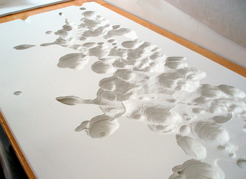
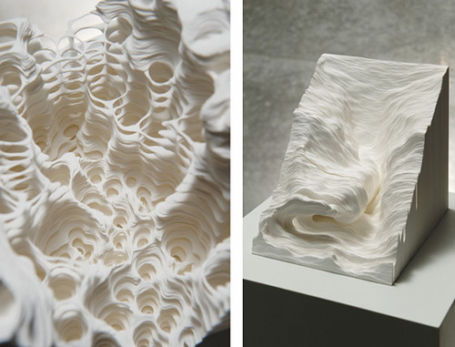
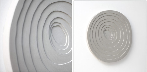
Noriko Ambe takes the whole paper-carving thing to a whole new level, carving entire landscapes into her works

Crazy-insane?  Right?  But so amazingly beautiful

Incase you designophiles were worried that I was missing the decor section of today's post:  fear not!  I managed to find two home goods companies that are buckled in tight on the cross section-trend-bandwagon:

Forsberg has created a line of silver topographic plates.  I, of course, am waiting for them to come out in gold.  

And Gore Design Co. has a line of STUNNING concrete topographical sinks:

I usually lean towards the very simple when it comes to things like basins and tubs, shying away from anything as outrageous as, say, a pedestal sink but these topographic sinks really get my heart racing.  I strongly urge you to stop by their site to check out more of their lovely works.

So, next time you're cruising along a ravine and see a big piece of exposed earth, remember who told you about it first.

Peace Out Homies!