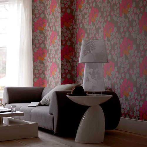
Ok, how good would these paintings look
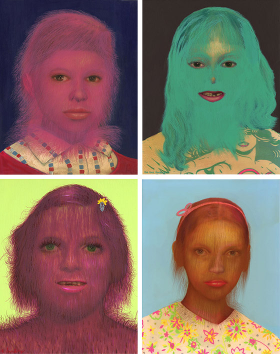
in this room:
especially this one

or this one

right?
Paintings by Erik Mark Sandberg, awesome wallpapered room from Living Etc, via If the Lamp Shade Fits
Your Custom Text Here
Ok, how good would these paintings look

in this room:

especially this one

or this one

right?
Paintings by Erik Mark Sandberg, awesome wallpapered room from Living Etc, via If the Lamp Shade Fits
Whew, it has been a loooong weekend, full of tools and gardening and yet ANOTHER trip to Ikea. Seriously, what is wrong with me? Anyway, apparently my actual life is staging an intervention, so I'm going to attempt to make this blog post short and sweet. Or should I say quick and dirty? How about short and dirty? Awww, yeah. That's me. So, what do you get when you put an photographer responsible for some of the greatest interiors shots ever:
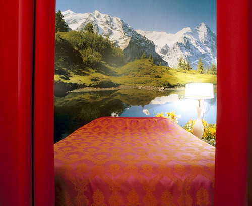
Together with an architect who's got style to spare:
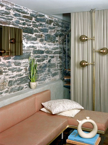
And add a dash of bookmaker husband?
Answer: a droolworthy renovated prewar apartment in New York City that serves as home to photographer Annie Schlecter and bookbinder husband Russel Maret.
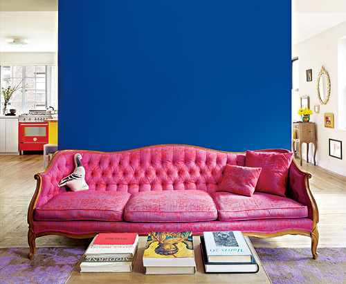
Oh, and guess what color they decided to paint the back wall that used to separate two independent studio apartments? That's right -- Yves Klein Blue, which Schlecter identified as KT Color 03.001 Ultramarin Blau paint. Long time readers of DC will remember my obsession with YKB almost a year back, but all you new friends can check out the links here and here.
Now for some reason, NY Mag reported this story but got totally stingy with the pictures, so I put on my internet sleuthing hat and managed to dig up more shots from architect Joe Serrins' site (expect to see a post on his awesome homes later this week...).
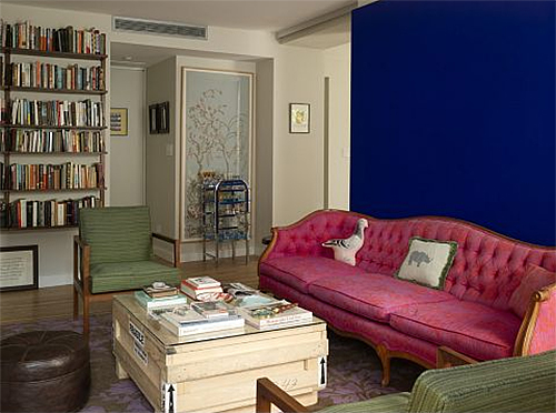
Here's another shot of the living room that shows a toned down living space designed to highlight the blue wall/pink couch focal point.
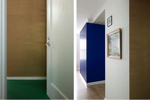
The entryway is papered in gold grasscloth which is a current OBSESSION of mine. I want to paper everything in its textural glitziness.
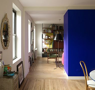
As I mentioned before, two separate apartments in two separate buildings were merged to form one larger apartment. One of the commenters on the NYMag site said, "This is the desecration a beautiful pre-war apartment. The original architects are rolling in their graves." When will flamers learn that grammatical errors render their silly, baseless insults flaccid? Plus this is a sweet apartment and that asshat is just flat wrong.
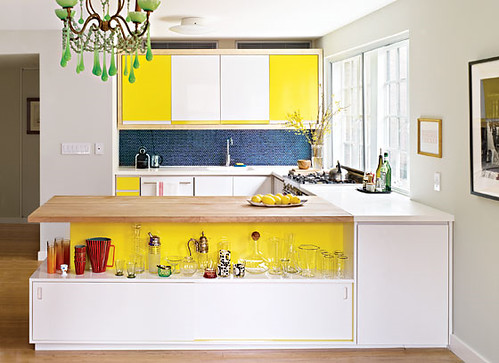
I love that the homeowners built the cabinets from plywood and formica, and used blue penny tile and yellow paint to add some kapow zing. Kitchen renovations don't have to cost a fortune, and as an added bonus, no granite was harmed in the making of this space.
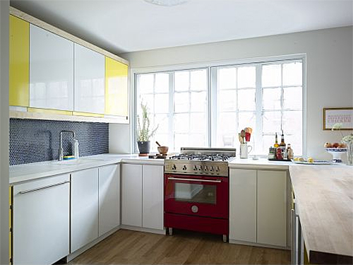
These people don't even have stainless appliances... wtf?! Confession: Ok, I have stainless appliances, but if I could afford that red lacquered beauty, she'd have a place of honor in my kitchen. Or maybe a turquoise stove would be more unexpected?
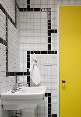
The bathroom continues the Roy Lichtenstein/Piet Mondrian primary palette, and I suddenly have the urge to paint a door -- any door -- canary yellow.
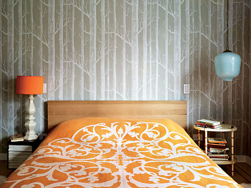
Last but not least, the bedroom -- which I know will be hated by my special super friends because it features the ubiquitous Cole and Son Woods wallpaper, but I have to say I love it. It has just the right amount of layering, pattern, and asymmetry to make it interesting.
So, I just spent months purging color from my house, and then Annie Schlecter comes along and combines pink, red, yellow, blue and orange, with abandon, and it looks GOOD. Le Sigh. I'm tired of renovating and want to move into her house.
Nevertheless, I shall power on with said renovations, and hopefully I can give you all a state of the union address very soon. In the meantime, rest assured that it contains no mention of the "pandemic" swine flu, because I am sick of hearing about that ridiculous fear mongering nonsense. (But don't judge if I just stay right here and nest up a storm in my nice, germ free house for a while, ok?)
Happy flu free Monday!
8 million years ago I wrote a post on my map fixation, and you all seemed to agree that maps rule the world. Well, don't spend too much time fixating on how I brilliantly used language and the internets to write something long before the Big Bang, because part deux is coming at all you map lovers bright and early this morning. Set your international time clocks to awesome and let's get this globe trotting. Now I could do my usual patter that goes something like: maps... globalization... maps... economy... maps... self deprecating political joke. But in my own little latitude x longitudinal coordinate, pollen is dripping from the trees in our canopied neighborhood and making my life a living hell, so I'll settle for maps... pretty. That works, right?
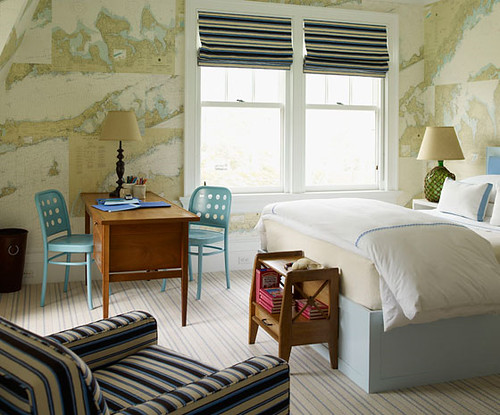
Interior designer, S. R. Gambrel goes nautical in this room decoupaged with maps. I'm a thinking this look can move beyond the solely sea worthy, though. Industrial glam would work equally well.
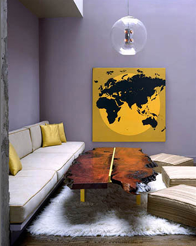
Annie Schlecter makes this map retro fresh by adding a dash of Mimosa yellow to cool gray, dropping in a sprig of shiny pendant goodness, pouring in a heaping helping of shaggy delight, and garnishing with a burl wood cross section that acts like nature's own growth chart. Delicious.
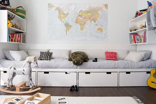
This humble little map pirouettes on center stage like a prima ballerina in this... boy's (?) room. Whatever. I'm keeping the metaphor. Boys can dance, too, right?
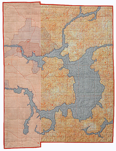
At night, little Billy Elliot in training could cover up with an amazing map quilt by Leah Evans. This beauty is already sold, but you should check out her other work which walks the line between symbol and abstraction with stunning intricacy.
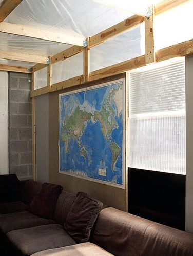
This Belgian architect couple spends six months out of the year traveling around Europe in a very swank mobile home, and the other six living in a garage they've tricked out with various and sundry creature comforts. A map is a must for planning future journeys.
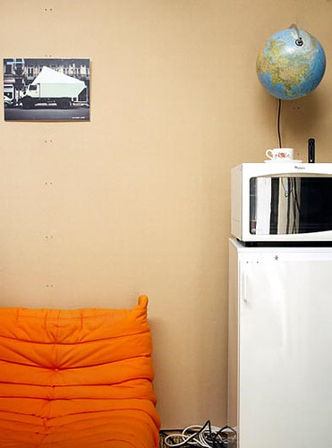
Here they show off their essentials: Ligne Roset's Togo sofa, kitchen appliances, a picture of their beloved camper, and the ever popular globe.
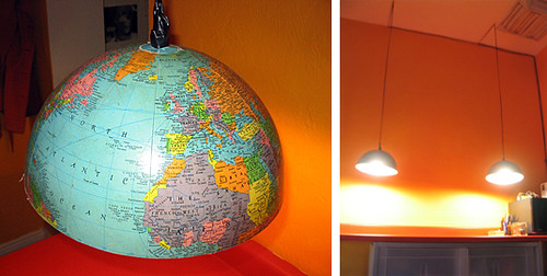
Speaking of globes, check out what this crafty chica did to hers. One whole makes two halves (and a very cool pair of pendant lights).
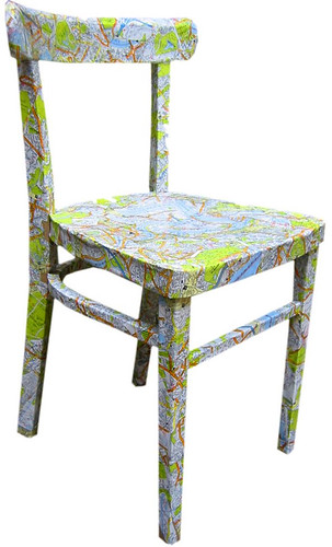
Here's another nifty idea for all your peeps unafraid of a little glue, courtesy of The Bedlam of Beefy's funny blog. Based in the UK, online retailer All Things Original stocks their virtual shop with tons of cute and quirky selctions. Good thing the interweb makes hopping across the pond nothing more than a skip and a jump.
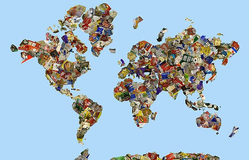
This incredible TEXTILE by Young British Artist (YBA) Gavin Turk hits all those political notes I alluded to but am too lazy to actually cover in this post. The map is fashioned from bits of commercial packaging that reflect the increasingly global nature of consumerism. What's most important is that Coca Cola is available in Uzbekistan, right? Insert your own analysis here.

Nope. Not the same house as the first image, but just goes to show that great minds think alike. Courtesy of the now defunct Domino, via Alicia B. Designs.

Say hello to my current obsession: maps of Tokyo designed by cartographer extraordinaire, Hajime Ishikawa. This little gem is even conveniently featured in chartreuse and turquoise, a hot color combo discussed here and here. Its veiny rivers and jagged arteries set my heart to double pump!
Mmmmm... topolicious.