Pink Dinette + Sciolari Chandelier = Girlytown

Well, I'm not really sure why I decided to paint the dinette and kitchen peachy pink. But I done did.
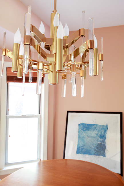
erin williamson art sciolari

There she blows -- Benjamin Moore Terra Bella. Many thanks to Sanders, who thinks that Karly and I are crazy for suddenly wanting to paint everything pink and peach and coral. He still went way above and beyond to help me pick a lovely shade.

I have to say that lucite and brass was not where I thought I would take this house, but Mr Sciolari was in the right place at the right time for the right price. Plus he reminds me of Superman's Fortress of Solitude, and that's a good thing.

I still have a lot of work to do, but I think we've already improved the situation we moved into:

Have you ever seen so much brown in your life?!
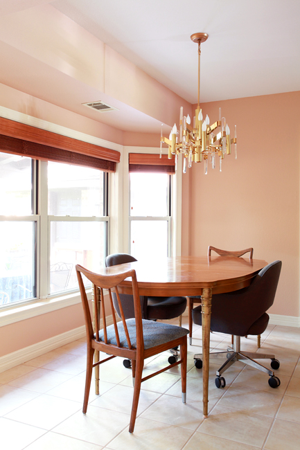
erin williamson terra bella

Although the (TEMPORARY) table and chairs are clawing my eyes out, I'd still say it's far less offensive than it was.

Now, all I need is a new table and chairs and window treatments and maybe a rug and some art... I'm liking indigo as an accent color, which I'm largely drawing from the front room scenario:

erin williamson

Dark Harbor and Terra Bella are so happy together.

Anyway, this calls for some mockups. I'm so predictable.
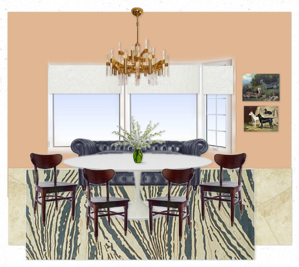
#1 has a dreamy Thom Filicia rug that costs way too much, integrates the navy chesterfield I already own, supposes that I will buy a new tulip dining table (and I am -- really). Then I threw in schoolhouse chairs and country club art to give it some old skool flava.

#2 is a little more modern regency, with an affordable kilim rug and some very affordable cafe chairs. I took Chester out just to see how that would open up the space. Still buying the table. Awesome leopard painting will be available at Minty soon.

What elements do you prefer?

I really don't know what to do about window treatments in any case... I was crushing on Naomi's curtain idea, but now that the color is so fussy I'm thinking that simple and tailored is the way to go.
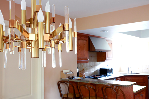
erin williamson sciolari

Tune in tomorrow to discuss ways in which my new paint and chandelier are making the shabby brown kitchen look even browner and shabbier.

Something must be done to rectify the situation.

Hint: paint will be involved.

Until then please help me buy cheap amazing things to finish out my dinette space.

Thank you.
Ding Dong the Desk is Dead

I've been debating whether or not I should post a pic of the painted kitchen because it's storming and dark as pitch in here, and there is no way on earth I can get an accurate image of the paint color. BUT I did promise to reveal something today, and I am a woman of my word (when I want to be). So here we go, yo:

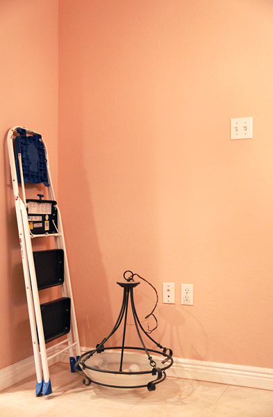
I'm so excited that our built in desk is gone that I don't even care about the other junk in the picture. LOOK at the magnificent tile job Matt did. BEHOLD the glut of space where once there was this:

My eyes!!!

Anyhow, I'll post pictures of the fully pink panorama as soon as the sun comes out.

Oh, and P to the S: my chandelier came and it is a thing of beauty.

Unfortunately it is also eye pokingly long...

Details to follow.

Mockup Madness: Ike's New Room

Thanks again for indulging all my hemming and hawing about the office. I think I've fully vetted the possibilities and have a pretty good idea of what to do for Plan A and Plan B. I've also come to the scary realization that we need to get some doors on that room or it's not going to matter how pretty it looks -- it won't be functional for an office. So decor for "the office" is tabled for the time being until we solve that problem, and I'm moving on to one of the many other rooms that need attention before baby gets here: Ike's room.

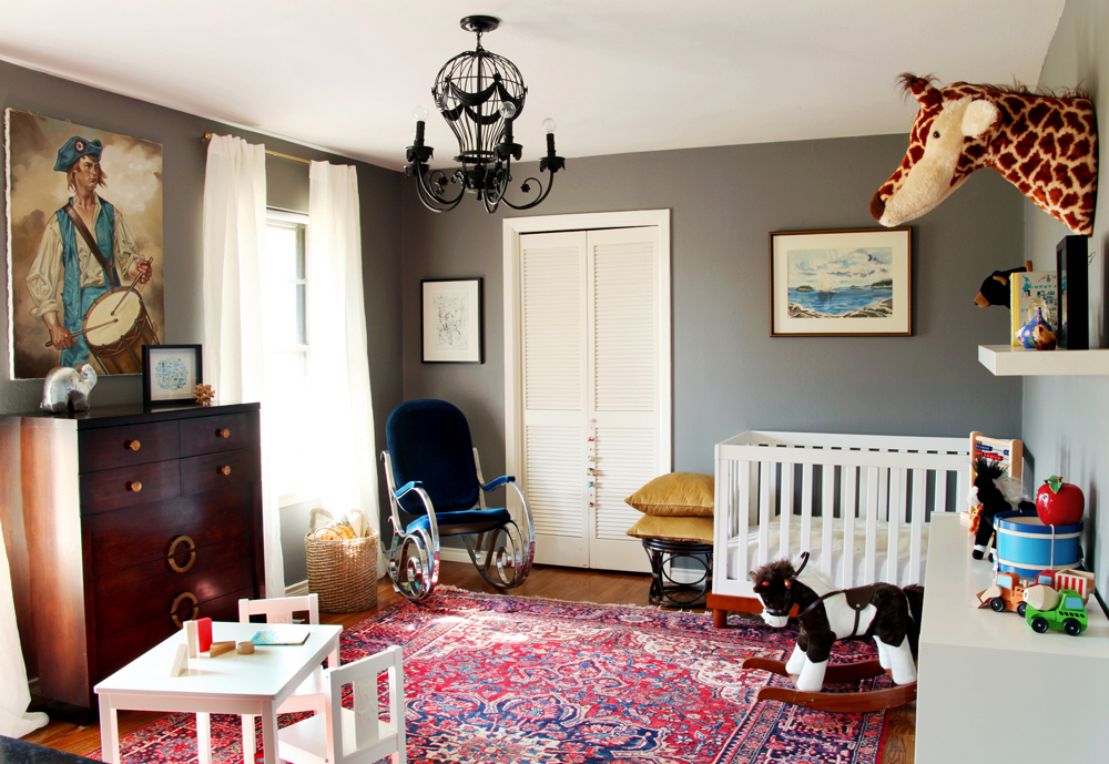
If you don't recall, here's what his room in the old house looked like:

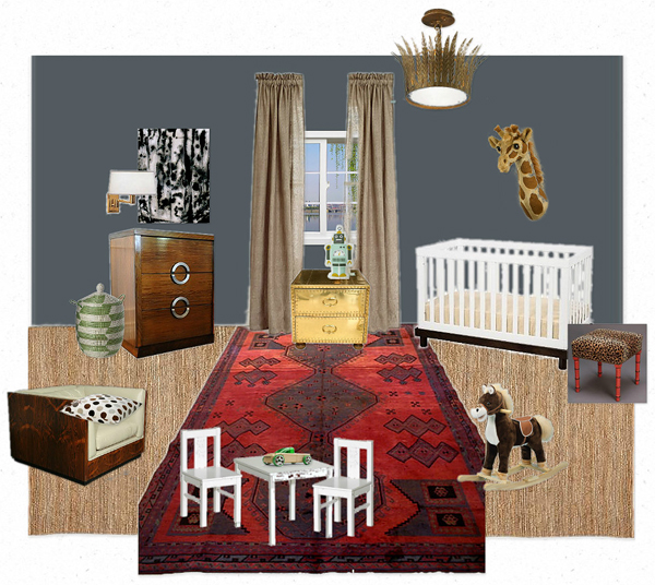
Now for this room I really wanted to give him something different, but I also want to reuse as many things as humanly possible. I have so much stuff to buy for this house that I need to make SOMETHING easy on myself (ha! as if). So, without further ado:

erin willamson designs

Hmmmm, yeah. Maybe not that different. Let's discuss the room itself. It's long and narrow and has zero architectural interest -- not even the pair of large windows the other room had. The one small window faces west, so it's dark during the day and then gets a burst of sun in the evening. There's no way a light color would work in here, so Sanders helped me pick Deep Secret, a kind of gray/navy that I think will look nice with the sisal carpet and also have some kid appeal (I foresee some hubble telescope posters in here someday soon... Ike is obsessed with space).

I don't love the white furniture, but I tried very hard to use what I already had, and Ike still sleeps in his crib... IT'S A MIRACLE. Like, he climbs in himself, but we have convinced him that climbing out is dangerous. It's kind of hilarious. Anyway, when we he outgrows it I'll get a cute antique twin bed and paint the white table set, or more likely just pass it on to #2.

So the only things here that need purchasing are the curtains, light fixture (hot air balloon fixture is going in baby's room), a colorful basket, and that leopard stool -- which is only $1400. Just kidding, suckers! I'm going to paint the old ottoman and add a cute cushion. Donezo.

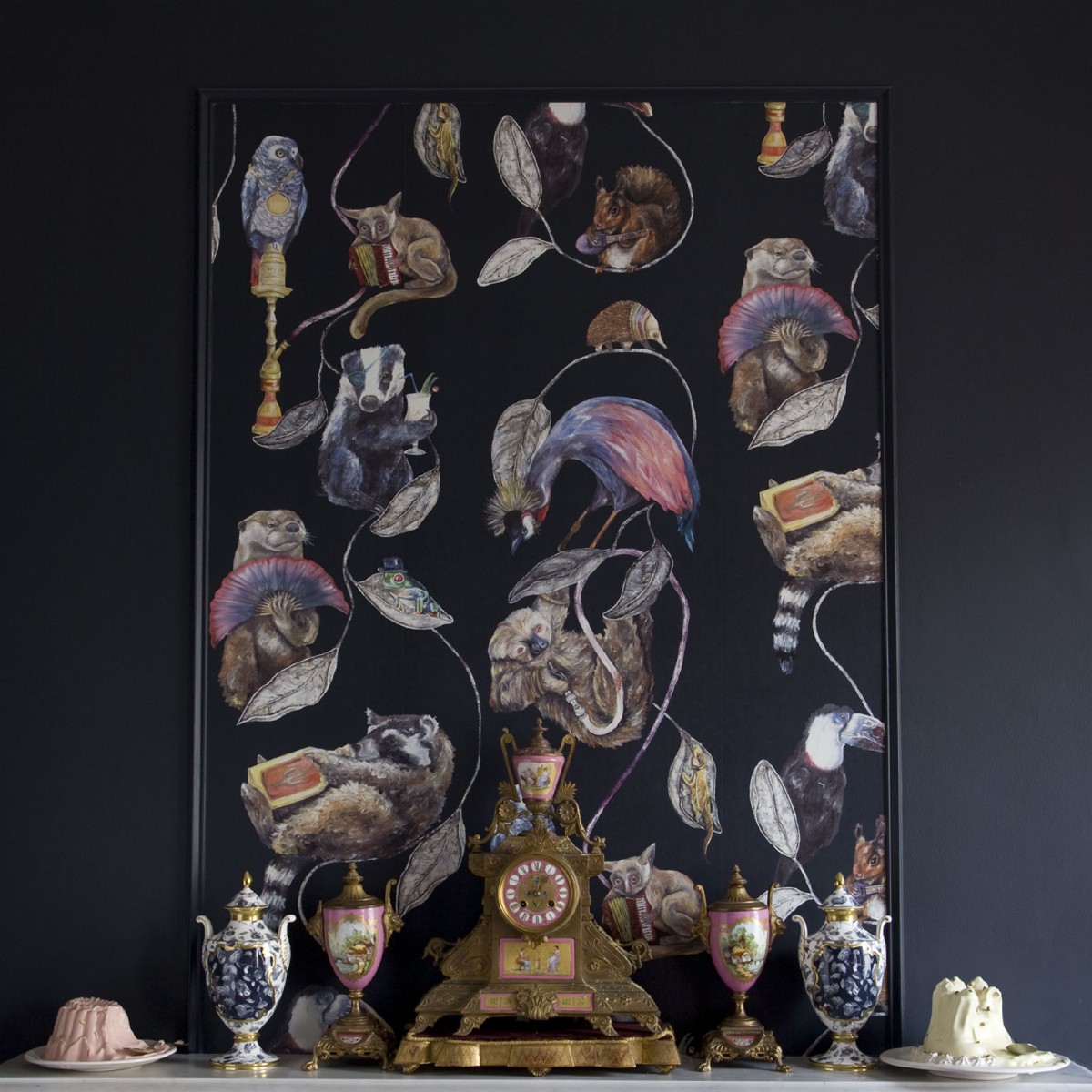
I think the basics are here, but it's missing the wow factor. Does it need wackier pillows and bedding? Or maybe I have a big piece of art I forgot about... Or perhaps I should spend $400 on a roll of this wallpaper and frame a few panels:

But $400/roll?!... I'm thinking no.

Ok, enough of what I think. What do you think?