One Room Challenge: Week Four -- Art Show

Hi friends, welcome back to Design Crisis for my latest installment in the One Room Challenge! If you'd like to catch up on previous weeks, please click HERE. If you're already caught up, then you know that last week hammered nails into the coffin of my marble Saarinen dinette dreams. Keywords: fire, brimstone, inferno. I was pretty bummed, but you fine people left so many kind comments and suggestions that I just want to thank you from the bottom of tired and overwhelmed heart. Know that I am cooking up multiple scenarios and basically decorating three rooms simultaneously until I know for sure what will work out in time, but rest assured that the finale will include a table... or perhaps just a Moroccan style pile of floor cushions. I kid, I kid. Or do I??? Let's not talk about my dumb table, or lack thereof. Let's talk about art. Let's talk about how I have 26 pictures worth of stuff to show you, and that's AFTER I edited the selections down. I need to edit again, and obviously I really need to clean out my garage.

erin-williamson-arsenic-1

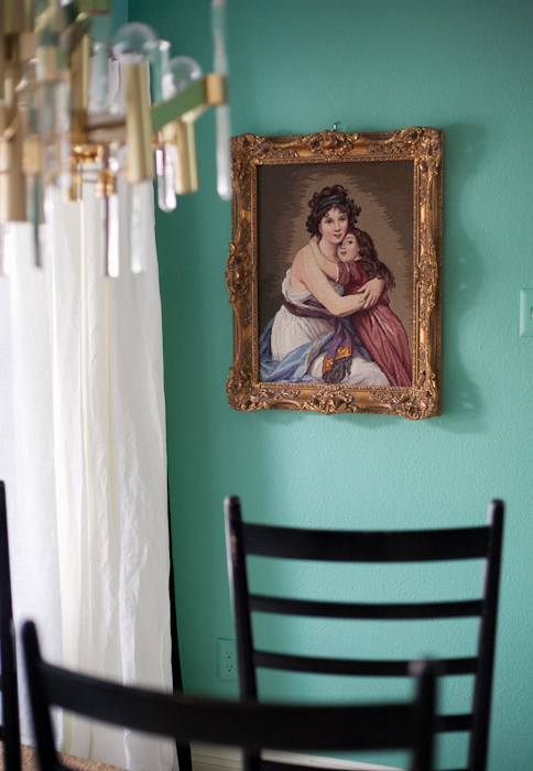
While other things are busy falling into place (I hope), I decided to browse my ginormous collection of art to find the best and brightest selections for the room. This lady is one of my favorites. The frame weighs at least 500 pounds and the vintage needlepoint is magical in its softness and coloring.

erin-williamson-arsenic-6-2

I just wish it were bigger... It doesn't fill the space as well as I'd like, but the mix of old and dirty with new and crisp does it for me.

erin-williamson-arsenic-21

So pretty. So sweet. I so do not have a daughter, and I bet my two sons are jealous of this beatific mother who does not look the least bit haggard or unkempt. I suspect she dares not feed her child cereal for dinner, either. There are words for moms like this.

erin-williamson-arsenic-4-2

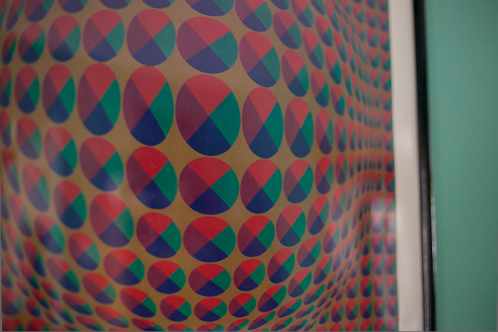
At the opposite end of the spectrum, I have this vintage Vasarely poster in dire need of reframing. Acid trip acid wasp, for sure.

erin-williamson-arsenic-17

Yeah, baby. I can feel my brain getting all swirly and I like it.

erin-williamson-arsenic-5-2

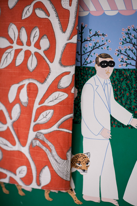
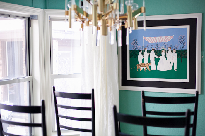
Meanwhile, how j'adorable is my vintage Mark Sabin print with that nutty Robert Allen fabric?

erin-williamson-arsenic-19

I think at the very least I need to reframe so it doesn't infringe on the curtains... also not loving the horizontal on a vertical wall.

erin-williamson-arsenic-3

Then again, I'm not loving this vertical abstract painting either. It veers a little too Palm Beach against that wall color.

erin-williamson-arsenic-2

Old dirty prints. I'm down with ODP (yeah, you know me), but maybe these are a trifle too old and dirty to command such a central space.

erin-williamson-arsenic-2-2

These on the other hand... these are cray. I bought a set of vintage Alan Davie lithographs off ebay for a song, and they're pretty awesome. The framing would be tricky, though.

erin-williamson-arsenic-3-2

But are they too cray? Will that flying, ahem, object disturb the digestion of my more delicate dinner guests?

erin-williamson-arsenic-6

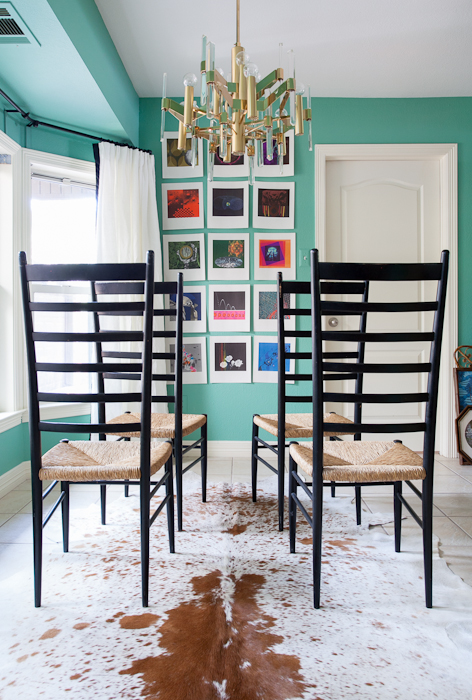
Speaking of, is this too much? I do think that a grouping of small pieces provides a nice foil to the low hanging blobbiness of the chandelier.

erin-williamson-arsenic-1-2

 erin-williamson-arsenic-10

 Another random ebay purchase, this portfolio of prints from the 1962 Seattle World's Fair shows depicts the evolution of science over the ages. These prints are WEIRD. The print quality is superb, though.

erin-williamson-arsenic-26

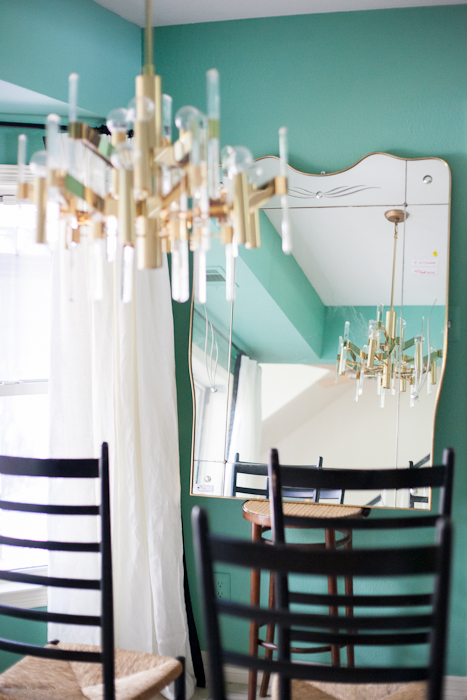
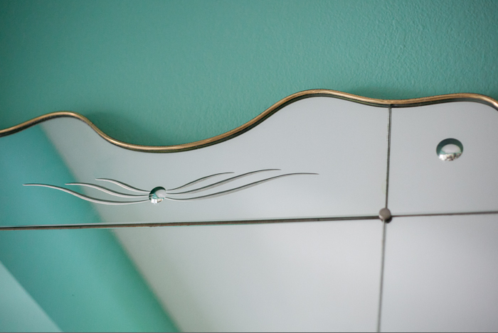
And finally, I have this behemoth of a mirror designed by Gio Ponti. It goes with my Italian Sciolari chandelier and Italian chairs, but is it too... Italian?

erin-williamson-arsenic-25

erin-williamson-arsenic-24

That's not even possible, right? This sucker is very large and very heavy, though. Securing it to the wall would be a challenge. And is a mirror the best way to finish the space? Do I go for more light or more color? Does the pretty arched panel of the mirror look weird with the ugly arched panel of the door?

Also, I have two other stellar mirrors (LaBarge!) and tons more art. Anything could happen, and everything is dependent on the dreaded table and seating and fabric choices. It's the decorating domino effect.

Out of curiosity I'd love to know your thoughts, but please don't be offended if I don't take your advice. If our government is any indication of speed and efficacy, then decorating should not be a democratic sport. I aim to run something more of a benevolent dictatorship. It's for the greater good.

So that's what I've been working on for the week. Please stop by my fellow challengers to see where their projects stand. There are only two more weeks left to go...

one room challenge

 Calling it Home

Pink Dinette + Sciolari Chandelier = Girlytown

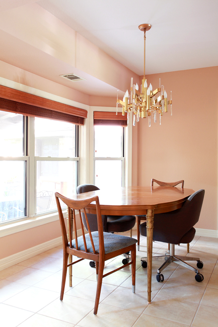
Well, I'm not really sure why I decided to paint the dinette and kitchen peachy pink. But I done did.

erin williamson art sciolari

There she blows -- Benjamin Moore Terra Bella. Many thanks to Sanders, who thinks that Karly and I are crazy for suddenly wanting to paint everything pink and peach and coral. He still went way above and beyond to help me pick a lovely shade.

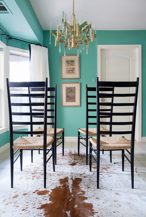
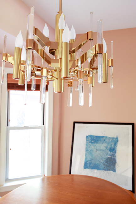
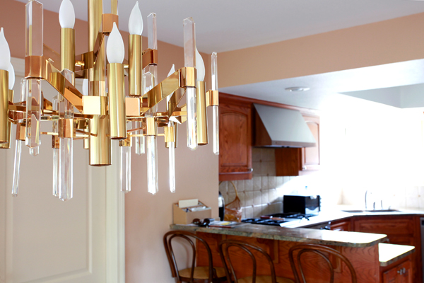
I have to say that lucite and brass was not where I thought I would take this house, but Mr Sciolari was in the right place at the right time for the right price. Plus he reminds me of Superman's Fortress of Solitude, and that's a good thing.

I still have a lot of work to do, but I think we've already improved the situation we moved into:

Have you ever seen so much brown in your life?!

erin williamson terra bella

Although the (TEMPORARY) table and chairs are clawing my eyes out, I'd still say it's far less offensive than it was.

Now, all I need is a new table and chairs and window treatments and maybe a rug and some art... I'm liking indigo as an accent color, which I'm largely drawing from the front room scenario:

erin williamson

Dark Harbor and Terra Bella are so happy together.

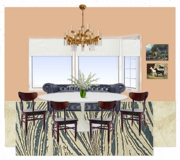
Anyway, this calls for some mockups. I'm so predictable.

#1 has a dreamy Thom Filicia rug that costs way too much, integrates the navy chesterfield I already own, supposes that I will buy a new tulip dining table (and I am -- really). Then I threw in schoolhouse chairs and country club art to give it some old skool flava.

#2 is a little more modern regency, with an affordable kilim rug and some very affordable cafe chairs. I took Chester out just to see how that would open up the space. Still buying the table. Awesome leopard painting will be available at Minty soon.

What elements do you prefer?

I really don't know what to do about window treatments in any case... I was crushing on Naomi's curtain idea, but now that the color is so fussy I'm thinking that simple and tailored is the way to go.

erin williamson sciolari

Tune in tomorrow to discuss ways in which my new paint and chandelier are making the shabby brown kitchen look even browner and shabbier.

Something must be done to rectify the situation.

Hint: paint will be involved.

Until then please help me buy cheap amazing things to finish out my dinette space.

Thank you.

Ebay Score and More

Sorry for the radio silence yesterday, but I have been alternating between hustling and hibernating for the past 48 hours. Anyhow, part of the hustle was this fancy Sciolari fixture I won on ebay for a song:

Yes, that's a 1st Dibs picture, because it's the SAME FREAKING FIXTURE. Somebody had no idea what they were listing, which always makes me kind of sad -- like I'm taking advantage. On the other hand, I really needed a pick me up right about now. So I'll take it.

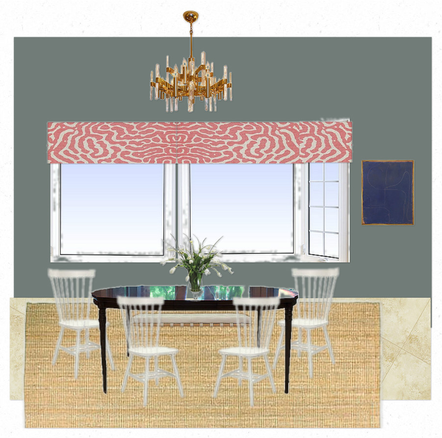
I'm going to put it in the dinette, and it's not exactly what I had planned (maybe a little too predictable?), but I think it will work ok:

After much conferencing with Sanders about paint colors, this is the current situation. It's not knocking my socks off, but it's a small space so it can't handle too much insanity. Plus, this is what I can reasonably do with my budget in a non-glacier time frame. I'm not loving the chairs, but I need something simple and cheap. I added a leather bench against the window because the sills sit too low to build a banquette.

Also I'm not super hot on the window fabric, but I don't see anything else that I love for a reasonable price. Any hints out there?

Also also, I tried about 50000000 different paint colors, and it's a really tough space. Peach is no bueno, but perhaps I should go more muted...?

Obviously the chandelier is going to have to carry the space.

Maybe the chandelier can pick out some paint colors and chairs and window treatments while he's at it.

You can do it, chandelier. I believe in you.

Have a super swell weekend, peeps!