Teal Room Tour

I know it sounds like I think I'm a rock star or something, but I am pretty excited about this tour. I mean, I only finished this room seven months ago, but back then I was carrying a 700 lb baby in my belly and couldn't muster the strength to really show you around the place. I also couldn't tie my own shoes, however that's another story.

Fast forward half a year and I'm down to my pre pregnancy weight, we just did sleep training and the dude is not keeping me up all night (don't judge -- he's still keeping me up most of the night), and occasionally I even leave the house to do photoshoots and decorating consults. Like a regular person. By myself. I'd say I pretty much own the world. Let's celebrate in living color.
untitled (1 of 1)

This teeny tiny room was used as the formal dining room by the previous owners. Behold:

Yes, it is the same room. Scary indeed. As you can see a full size oval dining table doesn't even fit lengthwise, so we decided to repurpose this room and use the dinette as our primary dining space. That space is fraught with its own issues, but we'll deal with them another time since I promised no kitchen talk today... (but look, you can see the kitchen from here).
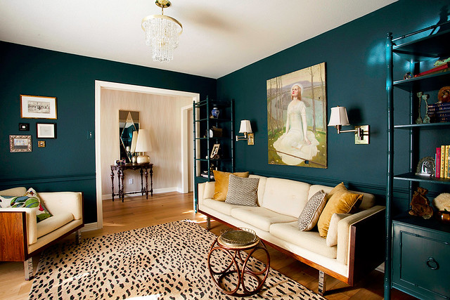
Ultimately we would like this room to function as an office, but for now it's actually a playroom. I moved the big wheels out of the picture just for you.

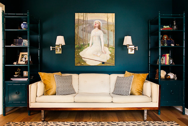
I was kind of going for an old school library look, so Sanders helped me choose some mega dark paint (Benjamin Moore Dark Harbor). Then I added flanking shelves in matching glossy paint, swing arm sconces, and of course my crazy lady painting.
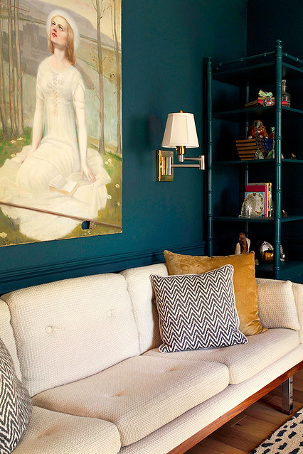
I love her.
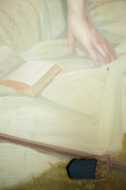
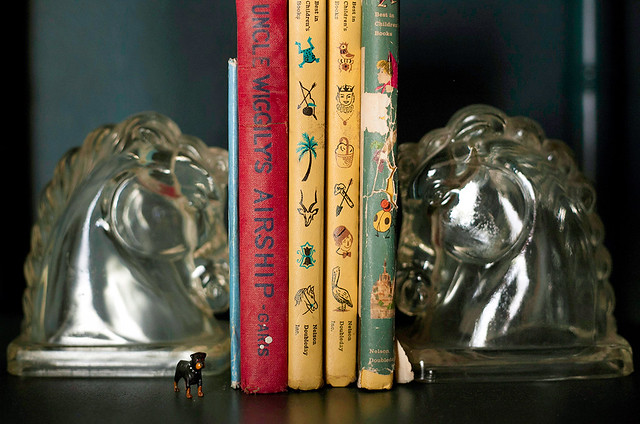
Somehow this room has become the repository for all the weird antique things I own. Grab a drink and get cozy, because for some reason I thought you might want to see every single item on my shelves.

On the other side of the room you can maybe kinda almost see my new hall wallpaper...
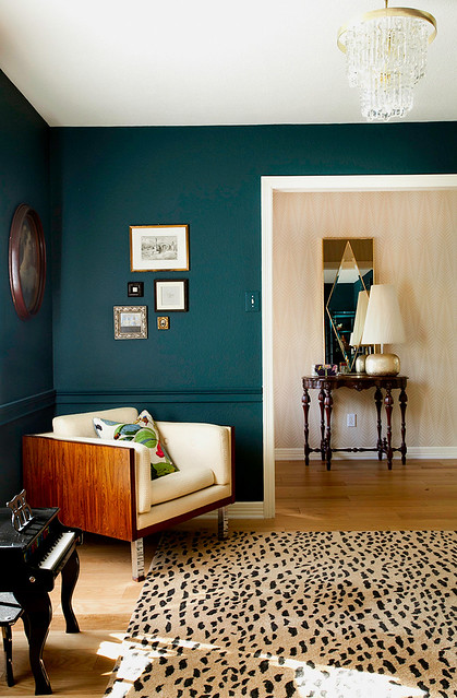
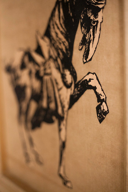
The styling looks like a dirt sandwich because I'm too afraid to hang anything on the paper. Maybe my new print?

My cat is obsessed with that chair, therefore it is always littered with leaves. I would love to reupholster our vintage rosewood couch and chair someday, but I will probably let the kids and pets totally destroy it first.
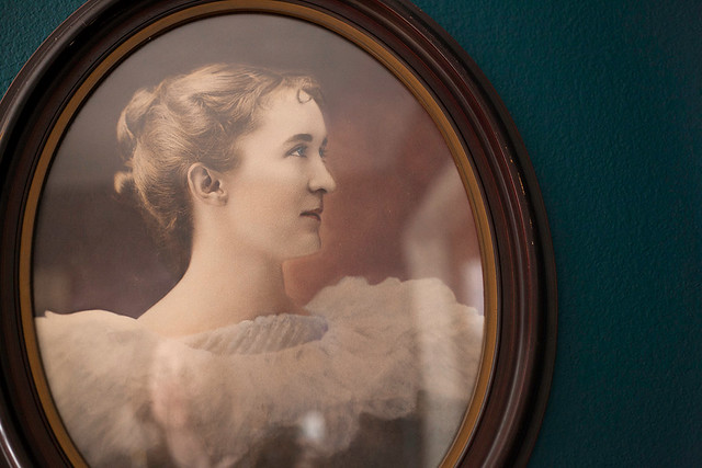
This room is great grandmother approved. I hope you enjoyed it, too.

What do you say: should I post more tours?

They take a long time to work up so pretty please leave a comment if you want to see more of this kind of stuff.

Or maybe you just want to talk kitchens?

I just want you to love me. Let me make you happy.

[all images copyright ERIN WILLIAMSON]

Finished Project Sneak Peeks!

Hi guys -- no baby yet, but my mama sense (and my doctor) say evacuation is imminent. I really wanted to bust out mega shoots of the rooms I've finished up, but I'm just too tired and uncoordinated. Like, I am physically unable to bend my body into the positions necessary to photograph small spaces.

So instead of trying to make some House Beautiful spreads happen (I wish), I told myself I could shoot just one sneak peek shot of each room. And I did. And now I feel all crampy and I'm racing just to type this before a baby shoots out of my bajingo...

In other words, this is going to be my last post until I show up with a bunch of sappy photos of a newborn baby. Let's jam.

erin williamson

The front room/playroom is finally finished... mostly. Is anything really ever finished? Anyway, here's my source list:

Paint color is Benjamin Moore Dark Harbor.

Couch is vintage Danish rosewood and wool boucle. You do remember Alexis, right?

Painting was thrifted long ago in California.

Rug came from Overstock, but the price has gone up since I bought it.

Chinoiserie etageres were purchased from Room Service and custom painted to match the walls by Matt. These were by far my biggest splurge -- about $550 for the pair.

Sconces were $2.99 each at a thrift store, but I had to buy harps and scored some ultra fancy shades at TJ Maxx for $15 each.

Bengal Bazaar pillows came from Etsy.

Everything else is vintage thrift.

erin williamson

I was kinda convinced I would have the baby before I could even move a crib into the nursery, but we actually got a lot further on this room than I thought we would. It's still missing some art and bedding, but it's 90% there. Source list:

Paint color is Benjamin Moore Frappe.

Chair is vintage Milo Baughman that I had recovered in Togo fabric. This was the big splurge for this room -- about $450 total.

Curtains are super cheap Ikea Ritva onto which my sweet MIL spent two nights sewing ribbon trim... LOVE THEM! Four panels cost $65 plus time. Can't beat that.

Mongolian fur pillow came from the West Elm outlet for $5.

Light fixture came from Ebay.

Vintage Raoul Dufy screenprint came from Room Service for $28. I cut a new mat for it.

Bookshelf is Ikea Expedit.

Sheepskin rug is old news.

Everything else is thrifted.

erin williamson

And last but not least is Ike's room. I think that I complain every time about how hard it is to shoot rooms in this house, but this room really is tough. I can't wait to shoot it with proper lights, but not now. Mama is tired. Source list:

Paint color is Benjamin Moore Deep Secret.

The big boy bed was the major splurge here. I got it off craigslist plus I paid Matt to paint it, so about $450 total.

Light fixture and rocker are both vintage and appeared in Ike's old room.

Rug is vintage and used to live in our old dining room.

Curtains are Ikea Aina.

Bedding is a super cute Ikea seersucker stripe that didn't photograph well.

Blue velvet pillows are Ikea.

Sheepskin is Ikea.

Leopard pillow is TJ Maxx.

And that's what I've been working on.

I'm not really sure when the baby will come out -- I'm not actually due for another week. But I think I need a few days to myself before the main event, so I'm signing off for now.

Please add DC to your google/RSS feed so you'll know when I'm back with baby pictures and more room reveals. Or you could just come and visit the archives. I used to write some pretty sweet posts before I got knocked up and my brain turned into jello.

It won't be too long before my triumphant return... pinky swear.

Until then, I'll miss you guys.

Be awesome.


Pink Dinette + Sciolari Chandelier = Girlytown

Well, I'm not really sure why I decided to paint the dinette and kitchen peachy pink. But I done did.

erin williamson art sciolari

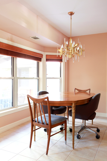
There she blows -- Benjamin Moore Terra Bella. Many thanks to Sanders, who thinks that Karly and I are crazy for suddenly wanting to paint everything pink and peach and coral. He still went way above and beyond to help me pick a lovely shade.

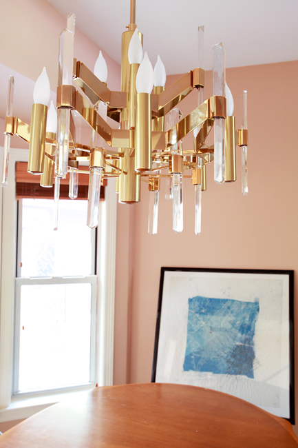
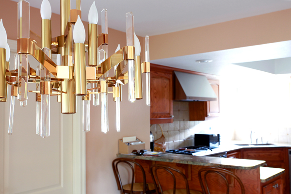
I have to say that lucite and brass was not where I thought I would take this house, but Mr Sciolari was in the right place at the right time for the right price. Plus he reminds me of Superman's Fortress of Solitude, and that's a good thing.

I still have a lot of work to do, but I think we've already improved the situation we moved into:

Have you ever seen so much brown in your life?!

erin williamson terra bella

Although the (TEMPORARY) table and chairs are clawing my eyes out, I'd still say it's far less offensive than it was.

Now, all I need is a new table and chairs and window treatments and maybe a rug and some art... I'm liking indigo as an accent color, which I'm largely drawing from the front room scenario:

erin williamson

Dark Harbor and Terra Bella are so happy together.

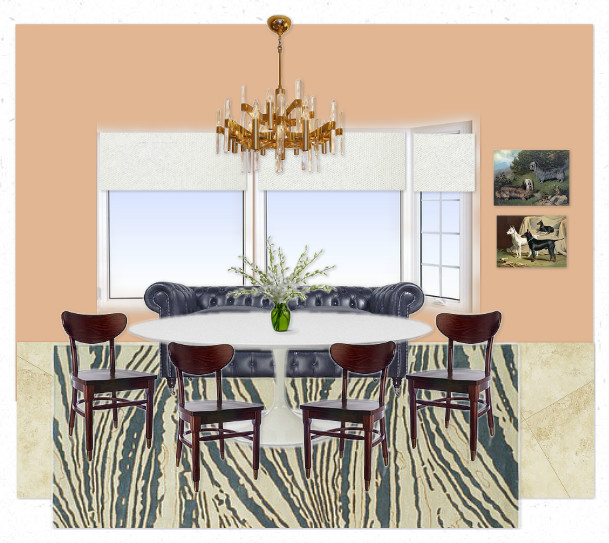
Anyway, this calls for some mockups. I'm so predictable.

#1 has a dreamy Thom Filicia rug that costs way too much, integrates the navy chesterfield I already own, supposes that I will buy a new tulip dining table (and I am -- really). Then I threw in schoolhouse chairs and country club art to give it some old skool flava.

#2 is a little more modern regency, with an affordable kilim rug and some very affordable cafe chairs. I took Chester out just to see how that would open up the space. Still buying the table. Awesome leopard painting will be available at Minty soon.

What elements do you prefer?

I really don't know what to do about window treatments in any case... I was crushing on Naomi's curtain idea, but now that the color is so fussy I'm thinking that simple and tailored is the way to go.

erin williamson sciolari

Tune in tomorrow to discuss ways in which my new paint and chandelier are making the shabby brown kitchen look even browner and shabbier.

Something must be done to rectify the situation.

Hint: paint will be involved.

Until then please help me buy cheap amazing things to finish out my dinette space.

Thank you.