Start Measuring the Drapes!

It's FINALLY over and ____________ won! Hooray! So, can you tell that I write my posts in advance? I haven't the slightest clue who won the election, but I'm hoping his name rhymes with "Yo Mama." If so, then I heard he started measuring the drapes in the White House months ago (according to the Republican pundits, anyway). I certainly hope so, because The White House is looking tired from the wear and tear of the last eight looooooooooooong and harrowing years. Don't you think a little facelift for our nation's treasure, first inhabited by John Adams some 500 billion years ago, would bring a spring to the step of Americans everywhere? Shall we not cast off the grime and stench of fear and oppression (and an overwhelming use of floral chintz) and usher in a new era of class and dignity? Hellz yes, I say. Come with me and follow this sad tale of covering up perfectly good decor with schmaltzy crap just to make your mark in The White House. Hmm. Sounds like a metaphor for the story of this country. The next president has definitely got his work cut out for him.

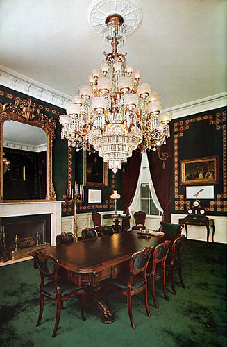
Before George HW Bush, the historic Treaty Room remained unmolested since Jackie Kennedy's renovation of it from random parlor back to its original 19th century roots. Apparently a bunch of treaties were signed in the the Treaty Room. Go figure.
treaty room

The green carpet is not my favorite, but it looks all presidential and stuff, whereas George the Senior's iteration of the Treaty Room looks like someone's half blind grandma decorated it (complete with a bunch of half blind grandpas).

treaty room

The curtains are particularly bilious, and when combined with the medallion carpet, the overall impression sets my stomach to roiling. Also, why must they fill the room with a bunch of dark and patterned stuff, and then leave the walls naked?

The Treaty Room in the Clinton years, while still fussy, at least looked balanced. Dramatic paint helped a lot.
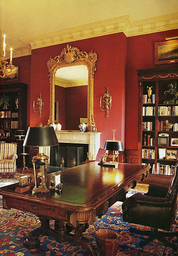
treaty room

And it was definitely better than Bush the Current's version of this room, which painted over the Clinton red and went back to daddy's unstyle (Can't have the stink of good Clinton decisions hanging about, can we?).
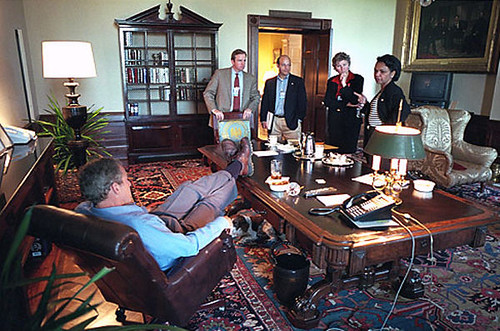
treaty room

Golly, aren't you going to miss this zany cast of characters?! But I bet you won't miss the crappy decor. Verdict: democrats are better decorators than republicans. Further evidence to be presented below.
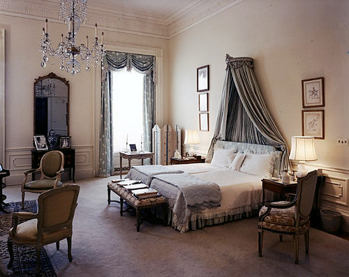
jackie o bedroom

Jackie Kennedy's master bedroom could easily grace the pages of decor glossies today. Contrast it with the Reagan's Ted Graber decorated version.
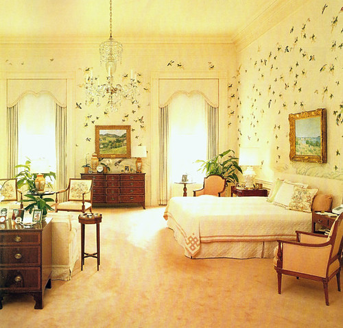
reagan bedroom

Dear Jeebus, it looks like a plague of locusts flew in, perhaps planning to carry that wimpy bed out the window with them. Horrid!

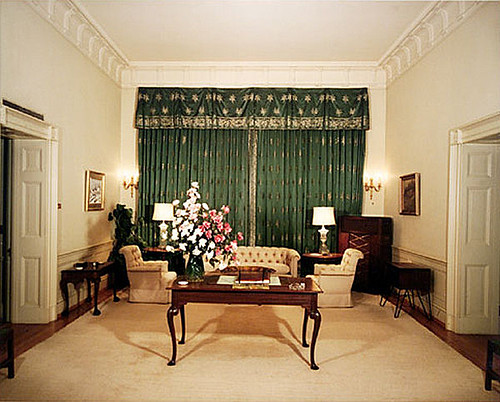
And then there's the sad transformation of this sitting room:
sitting room

In the 50s, Eisenhower stuffed it full of bland furniture crammed into dark corners, and covered the best asset of the room with ugly curtains that pop out like a jack in the box
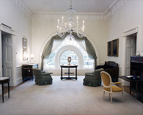
sitting room

Would you ever have guessed that this gorgeous window lurked beneath those putrid curtains? Jackie Kennedy and decorator Stephane Boudin opened up the space with light and a color palette that feels fresh and contemporary, even today. Things went downhill from there.
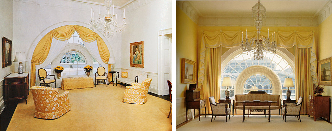
sitting room

In 1975, someone went a little hog wild with the yellow and flower prints, and by 2000, the transition from classic to stuffy was almost (but not quite) complete.
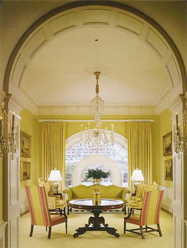
sitting room

2006, yet ripped from the pages of a 1987 back issue of Southern Living, this room is out of scale and out of whack.

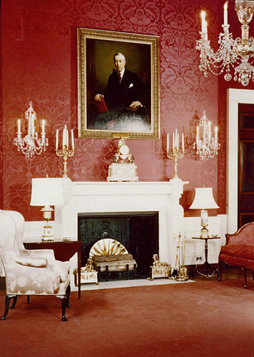
Sometimes the changes are more subtle, but equally ill advised. For example, the Red Room.
red room

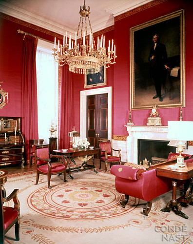
Here it is in the 50's, looking much like a bordello with that red damask wallpaper and the double entendre candelabras. Jackie took the hooker vibe down a notch while still preserving the red hot drama.
red room

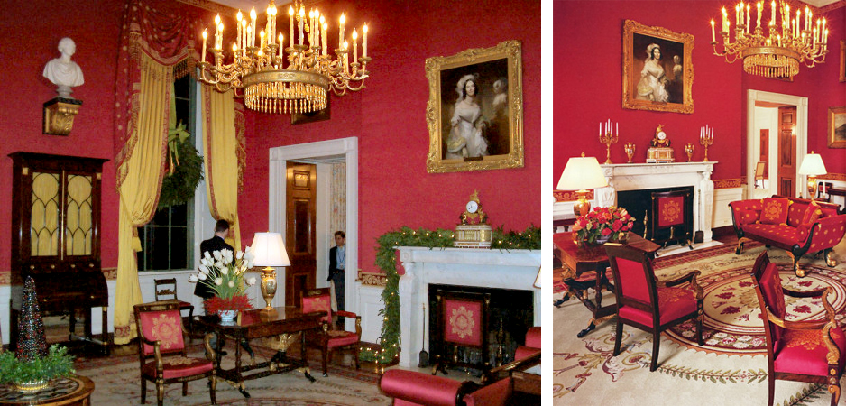
Jackie knew something about scale, fo sho. That painting looks so much better there, and I like that the curtains blend with the walls, because there's a lot going on in here. The chandelier is less fussy than above and I'm glad that nasty red carpet is gone, but I'm not super keen on its replacement. But wait!
red room

Let's redecorate and keep the carpet, but eff everything else up!!! That painting is WAY too wee, and the curtains are so overblown that I have to stop myself from making more sex jokes. I wonder what Jackie must have thought about all this "sprucing up" of her much improved decor. Yes, these are current pictures.

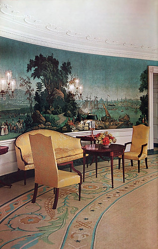
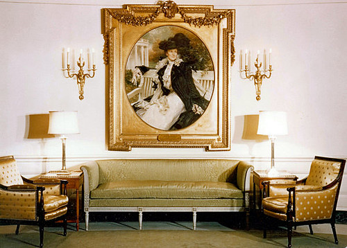
At least a few of the improvements she made were so undeniably good that they could not be touched. She redid the Diplomatic room from this:
diplomatic room

To this:

diplomatic room

And it still looks the same today. I loooove the crazy mural wallpaper that stretches all the way around the room, and her use of yellow is surprising. Here's another yellow room she did:
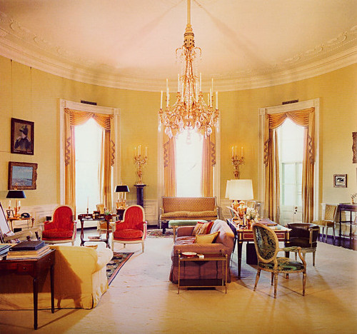
yellow room

Lots of color -- love the red chairs! -- and simple shapes, very little pattern. Cut to today:
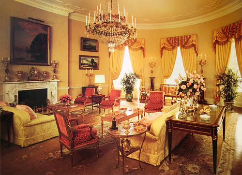
yellow room

Ewwwwww! The shapes got curvier and pouffier and everything got barfed on by pattern. And those drapes!!! The story of the White House seems to be one of terrifying fabric choices and completely overwhelming drapery. Hate it.

Just look at this hideous sitting room used by Ron and Nancy:
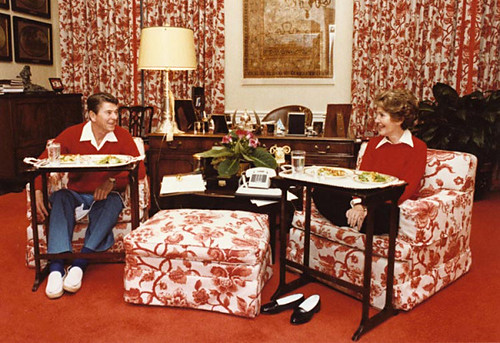
sitting room

Need I say anything about this lovechild of Charlotte Moss and Mario Buatta? No. I need not. But to be nonpartisanish, the room wasn't much better when it served as JFK's bedroom.
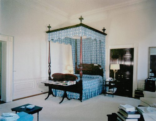
jfk bedroom

Maybe Jackie decorated it little boy style so JFK would feel embarrassed about screwing around on her in here. Could you picture Marilyn in this bed? Keep your mental images to yourself, please.

Still, Laura Bush redid the Lincoln bedroom, and I think it actually looks better than Jackie's version.
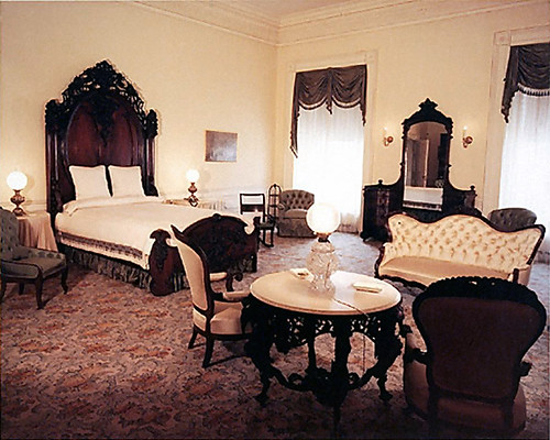
lincoln bedroom

Jackie's looks unfinished to me. I don't like all that dark stuff floating on white walls. Laura did fill out the space a bit, if not in the same way I would have done it:
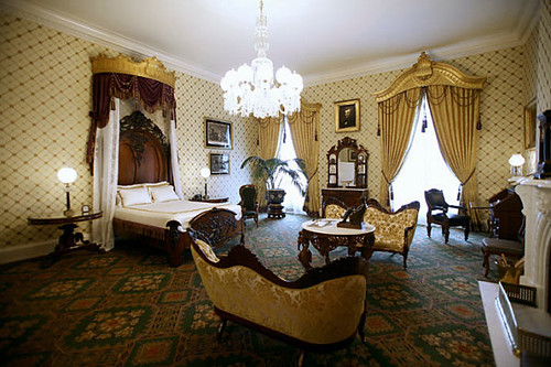
lincoln bedroom

Although I probably could have done it for less than $530,000. No wonder our country is in debt!

Laura Bush may not have the style of Jackie O, but she's still a nice and classy lady. Very unlike Cindy McCain, who spent the cost of the Lincoln Bedroom on one outfit. You can't buy taste. And Laura's certainly classier than Sarah Palin, who would probably turn the White House into a trailer park full of broken snowmobiles, moth eaten bear hides, and crabs.

Of course, I am hoping for none of the above to freshen up the White House. Yes, Michelle Obama has loads of style, and doesn't need to spend a lot of money to get it. I'm looking forward to some smart, restrained choices in The White House, both on the drapes and otherwise.

Discussion, for all two of you who finished reading this entire novel: What designer would you like to see work with Michelle (or Barack... who knows? Maybe he really cares about fabric?) to redecorate the White House? What would you like to see them do?
Maybe Navy?

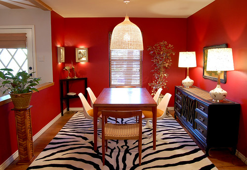
I have a red dining room. With orange chairs. And a sleazy velvet painting of a tiger. And a zebra rug. It might be -- maybe -- a little much. Now I love me some drama, but I don't want my house to look like a psychotic palm beach housewife took acid and decided to spruce things up a bit. So, dear readers, I am enlisting your help today. I am offering up my dining room like a wee sacrificial lamb for your entertainment. You know how it's really easy to go to a friend's house and rearrange furniture and pick paint colors and choose a new couch (all within the span of an hour), but sometimes it's nigh IMPOSSIBLE to make decisions at your own home? Well, sometimes is now. Yes, I'm asking for advice, and I know that several of you are interior designers, so come out, come out, wherever you are. Your mission -- if you choose to accept it -- is the first room I decorated in our first house. So it's feeling a bit 2007:

dining room

Now don't wuss out on me, ok? Before you start formulating strategies, let me say that I know the plant stand needs to get painted black and the pot is fugly, so just pretend I already fixed those things. That's what I usually do.

Here are main the issues at hand: Should I keep the red and get a new rug? I'm considering this relatively inexpensive hemp and white leather flat weave rug from Overstock (it's reversible! Yaaaaaay!):

overstock rug

Or should I paint the walls navy blue instead? Somehow, I feel like I could keep the rug if I painted the walls navy, even though zebra is officially double dead. Sadly, the rug, at $350 buckaroos, is far and away the most expensive thing in that room. What have I learned from this experience? I will never buy a patterned rug again.  Also, I will never buy an expensive white rug again, because my cat LOVES to puke on rugs. (In case you're wondering, Folex is the best carpet cleaner ever.)

The suspect in question:

hina

Hina Hina thinks she's modeling for Cat Fancy magazine. She's so vain that I had to turn on the vacuum cleaner to get her off the table and out of my photo shoot. But I digress (surprising, right?). Other possible points of contention include the always popular orange chairs with red walls combo. Yep. And an orange tiger painting to boot (but he's such a handsome fellow).

tiger

Obviously blue and orange would look better together... but maybe I shouldn't have the tulip chairs with that table, anyway? I actually have 6 of the Danish ropecord chairs, but 3 of them need repairs. Two are currently in the living room, to be used when we pull the leaves out of the table. Also, I used to have the tulip table in the dining room, but it was too small for company, so it's now my office desk. That's pretty much the catalog of available furniture, and I'm definitely not buying any more. (Have you checked the Dow today? Wowsers).

And what do you think about the lamps? I'm kind of on the hunt for new shades at the very least, but I only buy secondhand stuff, so that has limited my options severely (that, and my $50 budget).

One last teensy consideration:

kitchen

My humble kitchen, as viewed from the laundry room. (Don't worry -- it doesn't actually look like a cubist painting in real life. It's just the camera lens.) The kitchen shares a wall (along the right side) as well as a clear line of sight with the dining area, so it has to be the same color as the dining room, and I think the kitchen is really cute in red. We're planning to knock all the upper cabinets out and install shelves (can you see from the upper right hand corner that the cabinets float over our bar? It's WEIRD. There's like, 8 million of them, too. We have 75 gargantuan square feet of countertops, all with cabinets hovering overhead. They must have cut down an entire forest to make those stupid cabinets. But, alas, this tragic story is way too big to be contained within this little post). Anyway, the point is that navy would have to look good in here, too.

So, I'm not sold on the navy, but I'm definitely considering it. I have a lot of black furniture, and most people surveyed say that blue and black together looks bruised, but I'm thinking the right color of blue would be ok. Kind of like the color on this crazy rocking chair that doesn't go anywhere in my house

rocking chair:

And here are some navy rooms to help you further visualize the possibilities. I spotted several of them at Alicia B Designs, where she did this fantastic post on dark rooms... Worth a look.

Romano

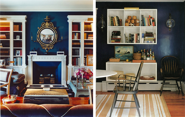
This one is from Todd Alexander Romano Designs, and honestly, I'm not even sure if this color is navy. Or purple. Or charcoal. But it's pretty, and my couch in the living room (visible from the kitchen and dining room) is the same color leather as those chairs.

domino

These are from Domino, and I like the one on the right, but lefty is a little too blue for my purposes... I think?

drake design

Navy grasscloth from Drake Design Associates. That desk is Ohmigod gorgeous. Drool. Drool. Drool.

kristi lei

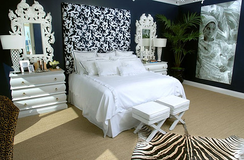
Somehow navy and zebra is a popular combination... I guess it's slightly less obvious than red and zebra. Courtesy of Kristi Lei Interiors, this is a trifle froof and poof for my taste, but the paint color is nice.

I am a little worried that navy will feel stuffy and too... federal. We don't have an eat in kitchen, so I'd like to keep my dining room fun and convivial. Not like these rooms:

scheerer roberts

It's not that I don't like these rooms from Markham Roberts and Tom Scheerer, but they're just not for me.

I think if I do navy, I will definitely have to do some punchy accents, sort of like this vignette from Domino:

domino

Ok, friends, I'm ready. What do you think? tell me what to do. Don't be shy. Do your worst best. If I like you advice I might even take it...

Can't See the Forest For the Trees

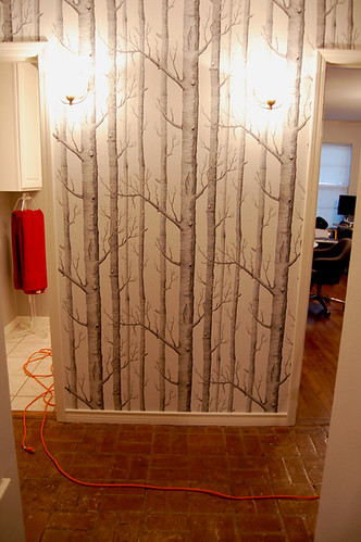
Sorry for the late post this morning, but I'm a little tired and under the weather from some of my weekend adventures, one of which involved a first foray into the world of wallpaper. Yes, my Cole and Son Trees wallpaper finally arrived from Merry Old England, and Hunny Bunny and I wasted little time in slapping it up on the wall. Which is kind of scary, honestly, when you're dealing with a $100 roll of paper, and, uh, you don't really know what you're doing. Ok, I've assisted my domestic diva of a mother with wallpapering a time or two, but this wallpaper is abnormal.

wallpaper

Here's a blurry picture of Hunny Bunny wrestling with wrapping the paper around a corner in the dorrway. If you've ever hung tradtional vinyl paper before, you know that you usually paste the paper, book the paper, hang it, then paste the top again. But this paper is super duper stiff, and you paste the wall instead of the paper, which is kind of awesome, but also kind of painful. It's really hard to keep the paste from touching the top of the paper, and it's hard to get the paper into corners because it's not very flexible.

wallpaper

The new breed of nonwoven papers are supposedly removable in one piece, and that was definitely a deciding factor in my choice of papers. I don't think I'll be pulling it off the wall anytime soon because it was a lot of work, and also because the band aid beige wall underneath is nauseating.

wallpaper

Drill, baby, drill! Light fixtures, that is. I have two sconces wired into the wall, and it was kind of heartbreaking to cut into the paper and screw them in. Actually, I couldn't watch at all. It looked like some kind of creepy surgical procedure.

sconces

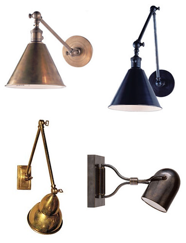
Sconces are implanted installed. Don't worry. I already have 800 pairs of better ones that I'm watching in Ebay. What I really want is something like this, though:

sconces

All these beauties are from Circa Lighting, and if I had $500 burning a hole in my pocket, I'd already have a pair ordered for the hall. Alas, I am agonizing about spending $50 for a pair. The real world is crappy.

Anyway, here's a bad picture of the finished hall:

hallway

(Sorry about the lighting... no natural light in the hallway, and I'm too lazy to drag out my light kit. And, no, my bathroom is not actually poo brown). All things considered, I like the paper a lot. I know, I KNOW. It's so overused. But it's nice and quiet, and in real life it feels very naturalistic, with quite a bit of depth.

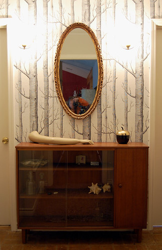
So, I dragged all the stuff I used to have in the hall back into their respective places.

hallway

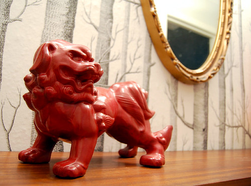
Hunny Bunny and Karly hate it. "It's too much stuff... it's covering up the trees... blah, blah, blah." In my weakened state, I have to admit that I'm beginning to agree. I hate it when they're right. Or maybe they are just objecting to my cheesy foo dog?

food dog

I did try restyling, though, because I have a stupid attachment to that display case. Don't ask me why.

hallway

Everyone likes mannequin arms, right? Sigh. Oh, and I forgot to duck when I took that picture...

chair

Wish I could put my sexy Milo Baughman chair there, but it's too darn deep. Or my hallway is too darn narrow. Gosh darn it, doggone it, you betcha it sucks.

Ok, how about this?

hallway

This is just a wee art deco mirror top table. I guess I could drop the mirror down lower and paint the table...

Are you sick of looking at bad pictures of my hallway yet? Only one more to go, because I'm running out of small furniture pieces.

mirrored chest

The mirror is a no go here. I could maybe hang some spiffy artwork? Something VERY simple and graphic?

Help, people. I don't feel well, I'm tired of moving furniture around, I'm indecisive and I can't let Karly and Hunny Bunny be the only bosses of me. You do want to get in on the action, right? Here's your chance. Tell little Erin what to do.