Our Horrid Room: A Design Confession

For the last six months I have been boldly waving the banner of good design across your computer monitors as though I were sent down from the very heavens with a design vision gifted by God himself.  Turns out that my horse just isn't so high and my ivory tower is a really really dingy shade of beige.  Since moving into our new pad in May, our bedroom decor has fallen somewhere on the design scale between squatter chic and dorm room contemporary.  We do have heat, but we are missing the sweet black-light posters, so I'd classify our joint as single dude minimalism.  The tides are turning and it's time for a revamp.  Don't you guys want to give me your advice and opinions?  Of course you do.   You may want to squint or grab a nearby blanket, this is scarier than freddy kruger wrapped in a poltergeist:

Alright.  There it is.  Ok, the hardest part is over.  Now, let's dissect:  Yes, that is my brand new, and oh-so-comfortable, king-sized mattress on the floor. Note the distinguished layer of plastic surrounding it underneath and on all four sides as to keep the mattress clean.  How about those sexy ceiling fans?  I'll sleep with one eye open because I know you all would just kill to have them for yourself.  (yuck!)  And, yes, those are freshly painted paint samples on the wall.  Let's take a gander at the floor plan so you can get a better grasp of the task at hand:
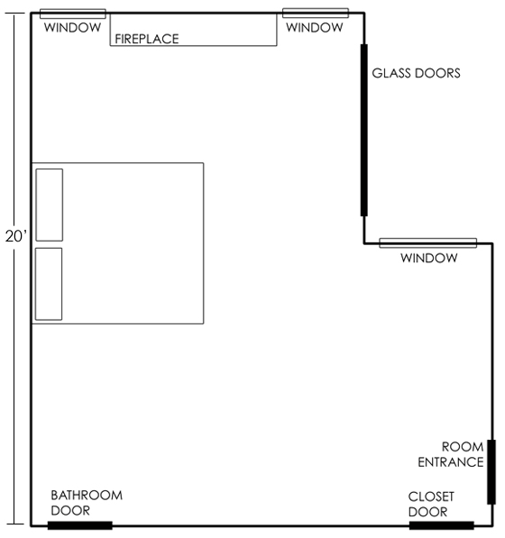
You can see that the room is HUGE.  The longest wall is 20 feet, the width is 18.  The ceilings vary from 10 feet to 14 feet.  We have a fireplace (with a disastrous tile job), a sliding glass door, and 3 windows.  Here are some close-ups.  (please don't leave me!!)

view from the bathroom door

view from fireplace, closet door: left; bathroom door: right

a second view from the fireplace, left door is entrance from living room

So.  Here's the plan:  EVERYTHING in the room is going.  Except the mattress, which is getting a-real-live-big-girl bed frame (more on that later).  All of the walls are being painted white, with the exception of the fireplace wall, it's going to be black.  Sanders helped first hand with the colors, so I'm feeling really solid about my choices:
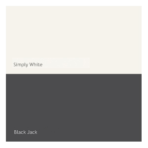
In my room, the simply white is fresh and crisp, the black jack is a perfect, rich, deep black.

While I have a mental image for my room, I haven't found any others online that portray it perfectly, but here are a couple of inspiration rooms:

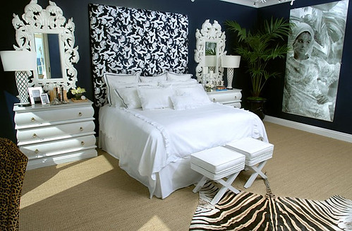
I love the mixture of solid black and black pattern in this room with the big pop of color on the bed.  I also like how the print on the bedspread mimics the pattern on the wall without matching perfectly.  Oh, and I LOVE that this room is virtually empty other than a sleeping spot.  I will have night stands and a chair or two but NO DRESSERS.

I also like the feel of this room:

Ok, actually, it's the big disco ball in the right corner that rocks my world.  I have designs for a singular gigantic tacky sequined throw pillow that will mimic this sort of trashy-glam look.

Matt is making us a simple white bed frame (sorry, no photo).  It is simple.  It is white.  It is perfect.  Oh, and it doesn't have those shin-destroyers running around the edges.  And it looks like it is hovering 6 inches above ground.  

My headboard will not be this color, but it will be this scale:
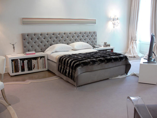
Stay tuned for instructions on how to make your own tufted headboard.  Matt will be making us night stands not-unlike the ones in the picture above.

Picture the headboard above in this fabric:

YES!  That is high-gloss white vinyl.  The perfect marriage of tackiness and sophistication.

Do you feel like our room is missing some bling?  Me too.  Let's try this:

My grandmother's mirror, currently residing in my mother's guest bedroom.  le plan is to hang it over the fireplace.  Seriously, don't you all just want to die?

What about fabrics?  Ok, I picked the world's ugliest fabric for my bedspread and I LOVE IT SO MUCH:

Need a close up? You're the boss:

Awww, it's a sweet little castle scene.  Isn't that kinda perfect for me?  And look! Hot pink!  Lime green! Electric blue!  Expect to see those colors popping up in little spots throughout the finished space.

But what about curtains?  Don't worry, dudes, I've got that covered:
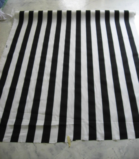
I'll be using Thanksgiving break to construct myself 3 roman shades out of this lovely striped fabric. While you're chowing down on Turkey and treating the mall like it's the last place to buy water during Armageddon, remember to pour one out for me as I work my little fingers to the nub on my sewing machine.  If I manage to avoid carpel tunnel, I'll also be making one gigantic white curtain to hang over the sliding glass doors.

Finally, the room is going to need some finishing touches:

I will continue the 6" high baseboards that currently run throughout the house and will be mounting all of the doors on barn door tracks.  (The ones I have look a little different, but you get the picture).  Oh, and all the doors will be painted black.

That's the plan so far.  I still have a big-fat dead space over by the room entrance, just below the big window as that couch is hitting the road.  I want to put a small sitting area near the fireplace, so it seems strange to have a second sitting area there.  Any suggestions?

Some other things I'm still wrestling with:  bed-side lighting.  Hanging lamps or wall mounted?  Don't say table!!!  I also need to pick out an area rug, but I want to get everything in the room first.

So, that's that.  Give the gift of joy and hope this holiday season:  I would LOVE some input and ideas before cracking open the first can of paint.
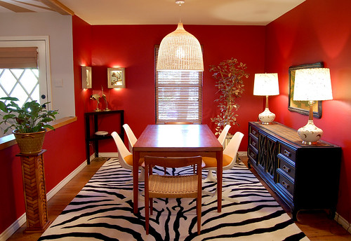
Maybe Navy?

I have a red dining room. With orange chairs. And a sleazy velvet painting of a tiger. And a zebra rug. It might be -- maybe -- a little much. Now I love me some drama, but I don't want my house to look like a psychotic palm beach housewife took acid and decided to spruce things up a bit. So, dear readers, I am enlisting your help today. I am offering up my dining room like a wee sacrificial lamb for your entertainment. You know how it's really easy to go to a friend's house and rearrange furniture and pick paint colors and choose a new couch (all within the span of an hour), but sometimes it's nigh IMPOSSIBLE to make decisions at your own home? Well, sometimes is now. Yes, I'm asking for advice, and I know that several of you are interior designers, so come out, come out, wherever you are. Your mission -- if you choose to accept it -- is the first room I decorated in our first house. So it's feeling a bit 2007:

dining room

Now don't wuss out on me, ok? Before you start formulating strategies, let me say that I know the plant stand needs to get painted black and the pot is fugly, so just pretend I already fixed those things. That's what I usually do.

Here are main the issues at hand: Should I keep the red and get a new rug? I'm considering this relatively inexpensive hemp and white leather flat weave rug from Overstock (it's reversible! Yaaaaaay!):

overstock rug

Or should I paint the walls navy blue instead? Somehow, I feel like I could keep the rug if I painted the walls navy, even though zebra is officially double dead. Sadly, the rug, at $350 buckaroos, is far and away the most expensive thing in that room. What have I learned from this experience? I will never buy a patterned rug again.  Also, I will never buy an expensive white rug again, because my cat LOVES to puke on rugs. (In case you're wondering, Folex is the best carpet cleaner ever.)

The suspect in question:

hina

Hina Hina thinks she's modeling for Cat Fancy magazine. She's so vain that I had to turn on the vacuum cleaner to get her off the table and out of my photo shoot. But I digress (surprising, right?). Other possible points of contention include the always popular orange chairs with red walls combo. Yep. And an orange tiger painting to boot (but he's such a handsome fellow).

tiger

Obviously blue and orange would look better together... but maybe I shouldn't have the tulip chairs with that table, anyway? I actually have 6 of the Danish ropecord chairs, but 3 of them need repairs. Two are currently in the living room, to be used when we pull the leaves out of the table. Also, I used to have the tulip table in the dining room, but it was too small for company, so it's now my office desk. That's pretty much the catalog of available furniture, and I'm definitely not buying any more. (Have you checked the Dow today? Wowsers).

And what do you think about the lamps? I'm kind of on the hunt for new shades at the very least, but I only buy secondhand stuff, so that has limited my options severely (that, and my $50 budget).

One last teensy consideration:

kitchen

My humble kitchen, as viewed from the laundry room. (Don't worry -- it doesn't actually look like a cubist painting in real life. It's just the camera lens.) The kitchen shares a wall (along the right side) as well as a clear line of sight with the dining area, so it has to be the same color as the dining room, and I think the kitchen is really cute in red. We're planning to knock all the upper cabinets out and install shelves (can you see from the upper right hand corner that the cabinets float over our bar? It's WEIRD. There's like, 8 million of them, too. We have 75 gargantuan square feet of countertops, all with cabinets hovering overhead. They must have cut down an entire forest to make those stupid cabinets. But, alas, this tragic story is way too big to be contained within this little post). Anyway, the point is that navy would have to look good in here, too.

So, I'm not sold on the navy, but I'm definitely considering it. I have a lot of black furniture, and most people surveyed say that blue and black together looks bruised, but I'm thinking the right color of blue would be ok. Kind of like the color on this crazy rocking chair that doesn't go anywhere in my house

rocking chair:

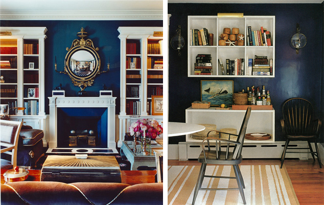
And here are some navy rooms to help you further visualize the possibilities. I spotted several of them at Alicia B Designs, where she did this fantastic post on dark rooms... Worth a look.

Romano

This one is from Todd Alexander Romano Designs, and honestly, I'm not even sure if this color is navy. Or purple. Or charcoal. But it's pretty, and my couch in the living room (visible from the kitchen and dining room) is the same color leather as those chairs.

domino

These are from Domino, and I like the one on the right, but lefty is a little too blue for my purposes... I think?

drake design

Navy grasscloth from Drake Design Associates. That desk is Ohmigod gorgeous. Drool. Drool. Drool.

kristi lei

Somehow navy and zebra is a popular combination... I guess it's slightly less obvious than red and zebra. Courtesy of Kristi Lei Interiors, this is a trifle froof and poof for my taste, but the paint color is nice.

I am a little worried that navy will feel stuffy and too... federal. We don't have an eat in kitchen, so I'd like to keep my dining room fun and convivial. Not like these rooms:

scheerer roberts

It's not that I don't like these rooms from Markham Roberts and Tom Scheerer, but they're just not for me.

I think if I do navy, I will definitely have to do some punchy accents, sort of like this vignette from Domino:

domino

Ok, friends, I'm ready. What do you think? tell me what to do. Don't be shy. Do your worst best. If I like you advice I might even take it...