Split Personality Throwdown

Hi, my name is Erin, and I'm two people. Ok, well to be perfectly literal I do in fact have another person growing inside my belly (weird!), but what I'm talking about is the other person inside my brain -- her name is Stacy. You can blame this identity crisis on my mom, who called all three of her darling children by their middle names, thereby ensuring an uphill battle to maintain a consistent persona. Mostly I have learned to answer to any name by which I'm called, but still I cringe when I hear "STACY!" barked out at the Dr's office and know the clueless registrar means none other than Yours Truly. Let me tell you about Stacy -- she's a nutcase. She thought her name was really Anastasia and someone (talking to you, Mom) made a terrible spelling error. Stacy revealed herself in high school, tired of finally fighting the good fight to just be Erin, dammit. Stacy was kinda grungy, dyed her hair purple, got a nose ring, went on to college and did, ahem, the things college kids do -- namely pull in a near 4.0 in between partying. Hard.

She likes a lot of color and for you to feel slightly uncomfortable in her presence.

Because there is a special kind of cognitive dissonance that occurs in the push/pull between organization and entropy.

She's a wild child, but the floors better be clean or she will whip your ass.

And of course you know me, little ol' Erin. My last house was pretty much black, white and gray, with a hefty dose of brown, because that is where I feel safe and comfortable. I am a rational being, and I don't need any overly decorative crap chintzing up my life.

'

That's not to say that Erin, I, whomever, doesn't have a sense of humor.

She just thinks you might feel more comfortable if the lines are clearly drawn, if things are proper and orderly.

Nothing wrong with that, right?

Now, if you can't yet tell, there's a hole in my brain and I'm struggling to balance the two personalities within. For a long time, the neutral, sensible side has been in control. But lately the crazy party ho has been yearning to break free.

Don't worry -- no part of me is actually a ho. That was just a little poetic license.

Anyway, I learned long ago that it's better to balance Jeckyll and Hyde, lest a monster break free and run rampant all up in my house, or it get so dreary and overly polite in here that no one feels free to do other than take tea and eat crumpets.

Not that I would kick a crumpet out of bed.

And there you have it, I AM a ho -- a carbohydrate ho.

At least there are some things all my personalities can count on.

Stay tuned to see how the other issues resolve themselves. My house is a battleground.

Advice (both decor and mental health related) is always appreciated.

[little blue deer, Poppytalk, Kriste Michelini Interiors, NYTThe Aestate, NYT]

Please go to my Pinterest to visit all the wonderful friends I stole these images from.

State of the Union Address

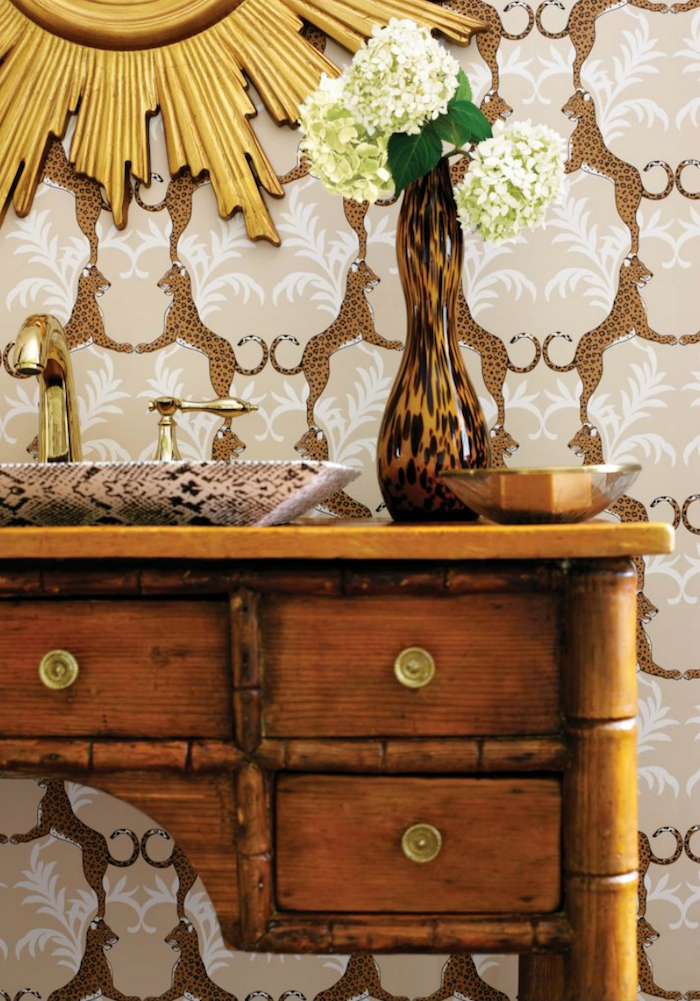
You guys really love you some Thibaut Cheetah, and who could blame you? It does feel a little Zsa Zsa Gabor on acid, which can only be a good thing. Part of me feels like I need to jump that cat and plaster it all over the place, but the other part of me is realizing how unclear my vision for this whole nutty faux Tudor house is, and how difficult it is (for me) to commit to expensive and/or permanent finishes. I have to cop to a certain fetish for the Cole and Son papers because they're easy to hang, non woven, and can be stripped from the wall in one piece -- thus saving commitment phobes like me from much hand wringing. I mean, what if I hang not-easily-removed Cheetahs all over the baby's nursery and one day the kid wakes up terrified that he/she may be mauled by rabid felines while sleeping? It could happen. On the other hand, I'm sick of decorating like a poor, itinerant loser. I'm tired of wimpy rooms that could be reshuffled into endless ho hum configurations. Isn't it nice to see a room that's dressed to the nines?

I'm trying to push myself to get crazier, and also to create more finished rooms. But that requires some serious planning.

And money.

And more wallpaper samples.

But don't discount Cheetah yet.

[via A Dreamer's Den, Head Over Heels, Jean-Louis Deniot via Material Girls, Martyn Lawrence Bullard, Barrie Benson via Head Over Heels]

Wallpaper Wallpaper on the Wall, Who's the Fairest of Them All?

I just received the first shipment of wallpaper samples I ordered from Ye Olde Englande (that's what the English themselves call it, yes?) and I'm already adrift in a sea of choices. I was pretty pumped to start taping samples all over the walls until Ike caught wind of game, and let's just say I had to take him on as my assistant. Or else. Kid is either going to be a decorator someday, or he's going to design race cars made of paisley foil wallpaper. Boys are weird. Anyway, let's check out Round One of Wallpaper Sample Throwdown 2012.

Some cutie pie black and white patterns: Feather Fan by Cole and Son and Abigail Edwards' Seascape. You may recall I was pretty set on the seascape print for the nursery, but I'm not loving any of the white white fields in this house -- I feel like the walls need to go dirtier/creamier.

These are superfly powder room options. From left to right: Cole and Son Wisteria, Osborne and Little Summer Palace, Osborne Mara (fabulous with jewel tones). Any could work in there, but I was thinking of Summer Palace. However, the old teal colorway seems to be gone, and I'm still on the fence about this delfty colorway. Maybe too formal?

It's kind of... girly, and girls are weird.

Moving on, look how I am artsy AND fartsy. Embarrassing. Anyway, on the left is Neisha Crosland's Zebra. On the right is Cole and Son's Silk, which looks like a fabulous tufted fabric with this oddly tactile quality due to the layers of ink that sit on the paper surface. It's a really sweet paper. I picked these for the entry way but I think Zebra is too dark and Silk is too light. Bummers, because Silk is the one I had in mind, but like I said -- not loving the whiteyfied look. I did reorder a sample of Zebra in the stone/beige colorway. Maybe maybe.

I like these two better for the hallway. The left is Cole and Son Malabar and the right is Cole and Son Malachite. Bonus points to C&S for making non woven papers that are supremely easy for even a village idiot to hang (see my post here). Both are popular papers, but I think the tone on tone colors give them some new life. I'm not digging anything overtly graphic for the entry since you see it from both the dark teal room and the living room -- midtone neutral with a little something something is the way to go. I'm still not so sure about the metallic aspect, as I've actually been trying to cool it on the bling blung front (yeah, who am I?), but I like the way the patterns appear and disappear.

And then there's Thibaut's Cheetah. I don't know what I had planned to do with this paper... maybe powder room? Maybe upstairs hallway? Maybe paste it to my face? It's pretty amazing.

It's also totally ridiculous. I'm trying to avoid anything over the top, but... it's talking to me. I'm just not sure what it's saying.

Stay tuned for Round Two of Wallpaper Sample Throwdown 2012, which should be arriving any day now.

In the meantime, please tell me which ones I should choose, and which I should burn. Thanks.