slop design

Oh. My. God.  It happened.  Tonight was the apex:  everything that is right with television all came to a catty, designy peak right here in my living room.  PR. TD. ANTM.  Who is waging war against my psyche and trying to send me into overload?  Because this is a design blog, I'm only going to bother you with Top Design.  Erin already did a brazzilliant post, which I encourage you to read.  NOW  (see below).  This show is like an enigma wrapped in a riddle wrapped in a train wreck.  And, sadly, there are only a few sad pictures online.  Now, I've just recently moved out from under the rock I used to live beneath (read:  I've only had cable for 6 months) so I never saw TD1 in it's entirety but I do remember a hobgob of crappy rooms and piss poor construction, I justified this by limited time and budget, but PR designers bust out some bangin' stuff under similar conditions so really, there's no excuse for stuff like this:

ugly

could you honestly imagine standing in front of Kelly Wearstler  trying to justify a shadow box filled with peanut butter and beer?  According to Adler:  "Breaking the rules is fine, but first you have to know the rules"  Truer words were never spoken JA, never.  (frankly, that quote was the highlight of the episode)

Now, for our friends down under (I'm talking to you Raina) who don't get to cringe in embarrassment from week to week I will summarize another shadow box that I couldn't find a picture of:  It was filled with apples.  yes, apples.  In my humble opinion, shadow boxes are to be used on four specific occasions:

1. to display something sentimental

2. to display something stunningly beautiful

3. to draw attention to an everyday object that could be considered unconventionally beautiful

4. to start a small fire (my preference)

please note, an apple display did not fit into in any of the above bullet points.

Seriously?  These kids are the best of the best?  They all cried like a bunch of babies when given a budget of $2,000.  I thought, $2,000 + craigslist = my dream home.  There were a couple of small glimpses of brilliance (by comparison) but otherwise I was unimpressed, and, therefore, totally ready to snarkily enjoy the next few weeks.  My head is spinning.  

More disasters:

a shadow box with (oh la la) a new years theme.  

world's ugliest bedroom.  If I had a worst enemy, I would rescue them from this room.

how much pee do you think is on this sad couch?  Don't you just love how it's disproportionately paired with the original work of "art"?

To summarize, here are my love / hates:

Eddie:  emerges from the pack with his adorable traveling butlers pantry.  

India: familial coat tails?  Should I know her?  This really could be a me problem, educate me.

Preston:  You ain't foolin me with that first year art school shadow box.  Save the sad stories about personal tragedy for the kleenex endorsement you'll get after the show ends.

Jonathan: Wise and true

Natalie: b'bye nat I give you 2 more episodes, MAX

Santino:  SANTINO!!!!!  I can't wait!!!  I want to decorate a room for you, I promise to use Santino-face wallpaper just like you would want

Andrea:  how many times did you put your hubbie's name on your application miss "i'm going to make it on my own terms?"

Serge: It really wasn't your time to go, even with the crappy shadow box

Wisit: ixnay on the ingingsay.

The rest: no solid opinion.  

Stay tuned, so much more to come all season long

PS. remember to read erin's post, below.  I love her!


Top Design Virgin

Yes, it's true. I've never done it before, but I popped my cherry tonight. Can you believe I've been holding out for so long? Don't worry -- it's not a one night stand. Karly and I will keep you covered all season long. But I've already stayed up late tonight savoring my first taste of sweet sweet bliss, so I'm just going to rattle off my first (probably clueless) impressions:

top design

1) Kelly Wearstler has some exotic...er, hair.

2) J'adore Jonathan Adler. What a doll!

3) Eddie is a kiss ass.

4) Shazia is a hot mess.

5) Wisit is annoying, but he may be a genius.

6) I think those shopping spaces are prestocked by the producers.

7) Ricky "Rick" Schroeder's wife is a ruthless competitor with boring taste.

8 ) Preston can come paint my canvas anytime. I don't care if he is gay.

9) Kelly Wearstler's apartment looked like a ripoff of a Kelly Wearstler apartment, but it was far and away the best space.

10) Robert looks like a serial killer, and he needs to go home.

11) The ladies are looking weak overall, but maybe Ondine will surprise me.

12) Holy Toledo! Jeff Lewis??? I CAN'T WAIT!

What did you all think?

The culmination of my favorite things, and some extra bonuses

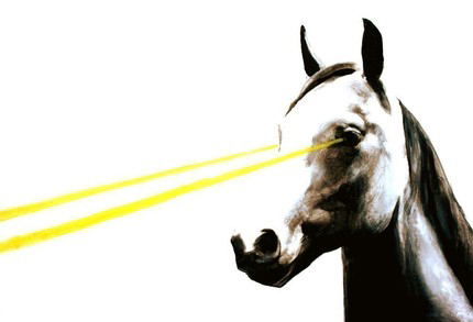
When sifting through the virtual landfill gold-mine that is my list of bookmarks I was reminded that, once upon a time I had quite a sophisticated list of etsy faves: oh what has become of you little handmade friends? I thought (quite loudly and without shame) I must go to etsy, post haste! And what did fall upon mine eyes you ask?  Well, right there (RIGHT THERE) at the top of my dang list was the material manifestation of my 2 very favorite things:  horses (yes, i am a girl, whatcha got to say about it?) and laser (say it like your purrrrrinnng: laaayyyyyyyser) yes!  Laser is my cat and I love her more than AN-Y-THING.  If laser were to mate with a horse this is what the babies would look like:

laser horse

ahhhhh!!!!!  I can't stand it, the cute is too much!!!  Ok, wait, maybe just a little more:

laser horse 2

Laser Beam Mustang (or Laser Horse as I like to call them - hey Frank Lloyd Wright chopped up masterpieces, I can bend the name a bit) by Etsy seller thecellophanes.  I know that, like me, you are probably willing to spend up to 2 million or so dollars to have your very own laser horse, BUT!!!!!!  I understand that we can't all afford $62,000 on some soup can prints so I'm keepin it trill with this print for only $20.  gangsta.

After staring lovingly at my sweet precious laser horse I thought why golly gee, what else is stored in this treasure trove of etsy favorites?  What do all my readers have in their favorites?  If I show them mine will they show me theirs?  Here's a sampling of some of my homegoods:

deer man

Deerman and Lamb and Lamb by Melabo I actually own the deerman (and another one of her's with stacked kitty heads, AAAAdorable!) but she's still one of my favorites and I want you all to go get your own deermen so we can start a club and use the figurines as secret identifiers.

graffiti lamps

I also really dig these graffiti lamps that have been floating around the web a bit lately.  Graffiti trend or no, (that's an entirely different post!) I would let them shine their brilliant light across my typewriter keyboard while I typed out our club manifesto any day.  I will also use my lamp to cast light on my stationary while I  pen resurface a thank you note for making such lovely light fixtures.

mike light

Resurface also made this clever microphone light.  While I'm not in love with it in these pictures, close your eyes and picture it somewhere REALLY CUTE.  See!  Awesome, huh?

When I was little (meaning from birth until about today) I really really wanted a twin.  Boy, girl, identical, whatever, I didn't care, any old twin would do.  I used to think about how I could go back in time and be born with a twin, then I would realize that I couldn't and I would get all mad at my parents.  So, it's no wonder that I really like these prints:

twins

I'm not usually into the wide-eyed japanamation style little girls, but the twin and creepiness factors out-weigh the doll baby faces so, yep, for $20 I'd probably be quite happy with this artandghosts print

did't believe me about the twins? (who would make that up?) well, here's more:

more twins

A Cage For Two Print by littlerobot

It should be noted that my wedding centerpieces were vintage (GOLD!!!) birdcages so this print really fills a soft little hole in my heart

Side note:  I think I might like to have a small wall covered in twin artwork.  What do we think of this?  Any great twin art out there that I should know about?

Well golly I sure have given you a lot of homework:  

1.  Show us your etsy faves

2.  Consider walls of twin artwork (bonus for links)

3.  Start secret club

Well, what did you expect, it is back to school time