You Make Life Worth Living, Etc.

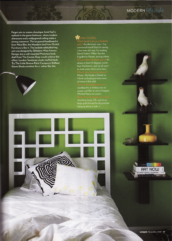
Wow, it has been quite a week here!  Between meeting Sanders, an illicit yacht party and my trip to Albuquerque, I'm just plum tuckered out.  So, what do you get out of this?  Why, my favorite thing to show you after a vaca:  select scans from my inflight reading material.  Yesterday's inbound trip kept me filled with colorful glee vis-a-vis the fine pages of Living etc.  Ici:

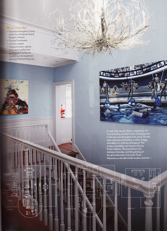
The stairwell in a Montauk Island Beach home.

Yes, yes, that blue is not nearly exciting as the shades we've been drooling over this week, but get a load of this close-up:

Pool Pushers, photograph by Anthony Goicolea

A perfect portrait for a beach home or for my dining room, whateves.  Have I ever mentioned how much I like swimming?  AND staged photography?  I really, really love staged photography.  I want to marry it.

If you execute an art heist at this Long Island home and find yourself a little weary from throwing bricks and climbing in windows, you can take a nap here:

See how that ceiling-mounted wallpaper lovingly rocks you to sleep and whisks away all your worries about pesky little things like:  "impending prison sentences" and "failing polygraphs"

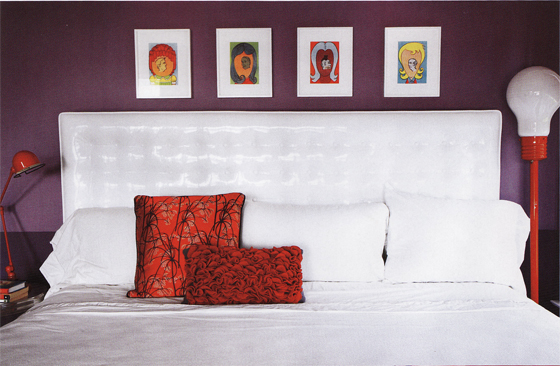
Yep, no need to worry, I'm sure the federal guards will let you decorate your cell just like this:

Are you dudes getting the full effect of that high-gloss white vinyl headboard? Dreamy, right?  It's eerily similar to the one I plan to make for my own bedroom.  I will invite you all over to drool over it once it is completed.  Through bullet-proof glass, of course.  I saw how you were eyeing the paintings in the first photo.

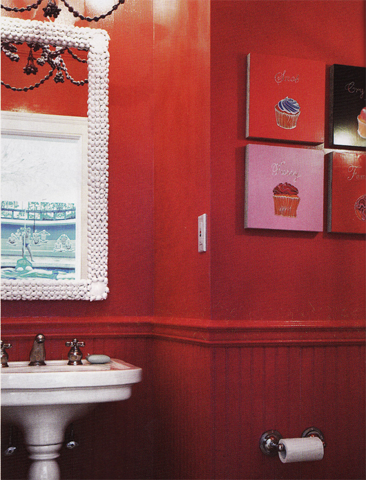
Speaking of paintings, I'll let you have these (take them!  get them away!) but I'll be keeping the mirror, thankyouverymuch:

What do we think of a red bathroom?  How do you envision the shower in this joint?  Is it tile?  Red tile?  I just don't even know.  Help me out here.

Also in this issue were a couple more scan-worthy visions from other homes:

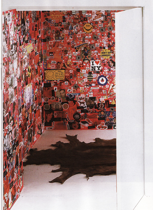
STICKER WALL!!!  It's like a car covered in bumper stickers, only not stupid and annoying.

and finally:

A nice place for me to rest over the weekend.  Schew, I'm oh so sleepy after all this hard work Erin and I have done on your behalf this week, I feel like I really do deserve this entire room all to myself.  For free.


The Future's So Bright, I Gotta Wear Shades

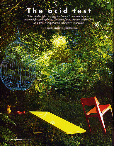
As promised, today I am presenting Sanders the Paint Guru's picks for the hottest upcoming trends in color, and when I say "color," I mean COLOR. If the gray days of fall are getting you down, then this palette is sure to jump start your morning. When I asked Sanders what the most popular colors for next year would be, he immediately said "electric blue, bright orange, acid green, red, yellow." As usual, Sanders was on the money. Check out what the October issue of Elle Decor UK said would be the "Hot Trend For Homes":
elle decor uk

Versus the color palette Sanders put together during our interview:

sanders color palette

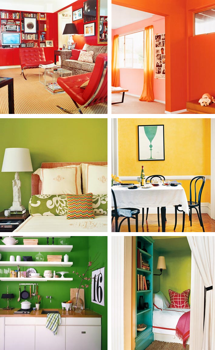
I told you that Sanders was good! If you ever had a crush on Roy G Biv in school, then these rooms are for you. Witness the power of dramatic paint to completely transform a space. (All photos courtesy of Domino)
domino colors

Don't you feel more cheerful, well rested and motivated, already? Maybe you won't even need that extra cup of coffee. Perhaps you should start a new exercise routine... Who's up for climbing Mount Everest???! Ok, let's take it one step at a time, shall we?

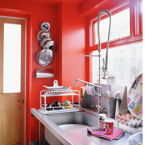
Since I've asked for help from you dear readers at least twice, you probably all know by now that I have a red dining room and kitchen, and I've been worrying that maybe it's a twee bit overblown. Perhaps instead of taking it down a notch, instead I should pump it up with a steroid injection of brighter, orangier, funkier, red:
red kitchen

(Photo courtesy of Living Etc.)

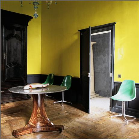
Or maybe, like Karly, you've been craving some sunshine in your space. Why not go for a zany shade of yellow on the walls?
yellow room

(Photo via A Mad Tea Party With Alis, who also has some great posts on color)

I love the super bright funkadelic yellow paired with dark dark trim and subdued, weathered floors. Shall we just say that the dead fish on the table adds to the rustic charm? Yes, we shall. Those chairs are pretty boss, too.

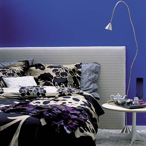
For those of you who love color but want something a little more sober, why not a bold, cobalt blue?
cobalt bedroom

(Photo via Living Etc)

It's much more unexpected than the usual aqua tinged walls, but still restful enough to catch some much needed Zzzzzz's at night. A silver leafed ceiling could be a magical complement (and gold is always fab).

Or perhaps you prefer to just scramble the whole color palette together and have a delicious rainbow omelette?

m interiors

This whole house decorated by M. Design Interiors is a madcap acid trip fantasyland, and I really want to live there. The sleek furnishings and square lines have an awesome 70's vibe, so perhaps we should throw a hip blogger's disco party? I think I'd have to ditch the tulips, though.

If you're not into all out color, maybe just a peep of bright paint would do the trick.

m interiors

I love the use of primary shades in this super white space, courtesy once again of the fabulous M. Design Interiors.

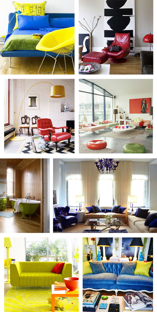
Ok, I know that lots of you out there love color, but would prefer to confine it to accessories and furnishings for a splash of bright something something against a neutral background without the commitment of paint. Here are some renter friendly solutions that will still give your pad some punch.
colorful accessories

(Photo credits for each row, left to right: Living Etc, Living Etc. Domino, Living Etc. Terramia, Andrew Suvalsky. Living Etc, Domino)

Why not reupholster a vintage couch or chair in a shockingly bright fabric to create a substantial focal point in your otherwise neutral room? Or you could always do some super mod pillows for a cheap and easy burst of color (bonus points for resourcefulness if you can sew your own). Also, I kind of want a lime green clawfoot tub now... If only I had a bathroom big enough for one!

Anyone want a cush headboard fit for a princess in a color that won't make your prince cringe?

m interiors

(Photo via M. Design Interiors)

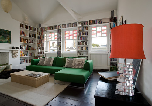
Yeah, baby, I can dig it. Now how about a red green combo that's miles away from Christmas?
flux interiors

(Flux Interiors)

That is one delicious lampshade, and I love the repeat of the color on the window frames. Is that an Ikea couch? If not, they have a very similar version that comes with a zillion different slipcovers, so you can redecorate annually without breaking the bank. I am voting for new pillows though. How about a row of Obama heads instead of Mao and Marx? Yes we can.

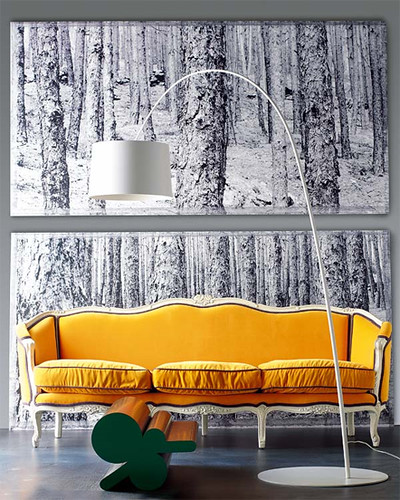
If you already have great bones, highlight them.
yellow couch

(Photo via A Mad Tea Party With Alis)

A burst of sunny yellow makes this old school stunner look fresh, clean and modern. How much do you love the charcoal piping? Fabulous.

Even bold color can be subtly softened by its surroundings.

lampshade

(via If the Lampshade Fits)

Purpley gray walls set this versatile tomato red couch afire, but an otherwise subdued color palette keeps things cool and sophisticated.

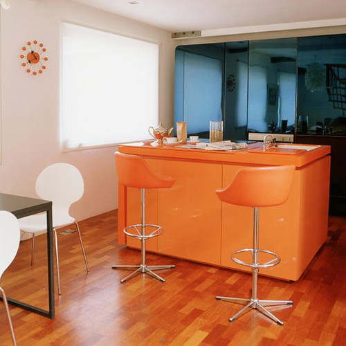
If you're feeling more daring, go for the gold:
orange kitchen

(Photo via Living Etc)

I really hate barstools, but at least these are camoflaged by a similarly hued tangerine kitchen bar with matching countertops. I love the harmony with the orangey wooden floors, as well as the contrast with the blue mirrored glass in the background.

And last but not least, some gorgeous shades of green and blue that are fresh but not overwhelming:

fawn galli

If you've never checked out the Brooklyn home of Fawn Galli, go there now. Her house is a gorgeous reminder that color is fun and doesn't have to be opressive or vulgar. And she has a giant deer sculpture. My hero.

That's it for this Sanders-inspired roundup of ultra ultra brights. What do you think? Could you live with these acid hues, or are you planning to stick to neutral basics? Tell us all about it.

The Summation of All My Wildest Dreams

Good morning, good morning!  What a wonderful Monday it is thanks to Raina who sent me this insane article from W magazine.  After months of loyal readership she has managed to pinpoint, with laser-like accuracy, exactly what mama likes:  obscene use of color?  Check. Artwork run wild?  Check.  Garish accessories, interesting use of materials and a view to boot? Check, check, and check.  Behold:

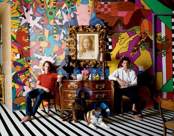
You may be wondering if I could actually wake up every morning to such a full-blown-hyper-color attack on my retinas.  The answer is: yep, you bet your sweet ass I can.  Did you get a load of those dogs?  If I thought my pets would still come snuggle up to me at night, Laser and Magnus would be in neon lampshades faster than you could say holy good lord that's hot.

Let's talk about what's going on here: Blessed owners Tobias Meyer (ahem, head of Sotheby's worldwide contemporary art) and Mark Fletcher pose in front of mural by Brazilian artist Assume Vivid Astro Focus. A John Currin oil is perched above a French 1740s kingwood commode.  Commode!  Who owns one of those?  Jeeze.

These dudes had me at hello, but I'm sure, like me, you're dying (dying!) for more:

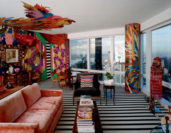
The only dream-shatterer here is the mural on the ceiling, I'm not 100% on that.  But really, don't you all just want to curl up in a little ball next to that pillar while hugging the Missoni pillow, thanking whatever god you believe in that you're alive?  Holy Crap my mind is going to explode!

Time for us all to hyperventilate in tandem:

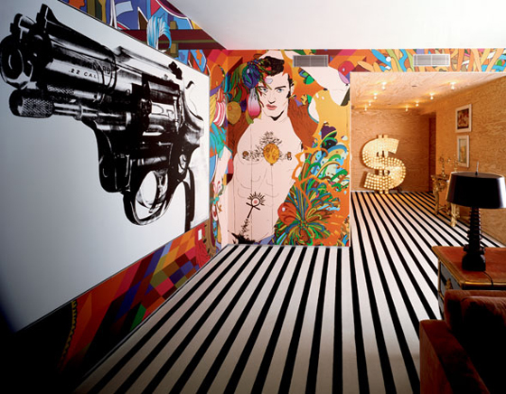
Andy Warhol gun + LIGHT UP DOLLAR SIGN + a naked man that Nagal would have painted if he'd painted men?  It's just TOO GOOD!  Here's what the owner's had to say:

Everything is about the reality of it all, about the human condition and facing death. Art right now is about desire, human nature, sexuality, power and violence.

These men are spending life inside a living, breathing piece of art.  And I want to strangle them for it.

Kleenex time!

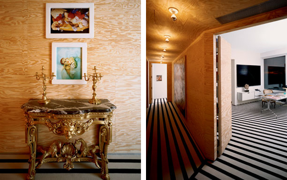
Plywood befriends the trippy Stark carpet while a diptych from Matthew Barney's Cremaster series hangs above a German 1760 gilt-wood console.  The whole kitten-kaboodle is topped by German rococo ormolu candelabra  (MATTHEW BARNEY!!! what is this?  The freakin Guggenheim?)

The owner's note that they enjoy using low-grade materials in the design as there is "a hopefullness to it's unfinished quality."  Um, right.  Keep talkin, buddy.  Now, don't get me wrong, j'adore la plywood, but if I even consider putting that moldy old board next to my plethora of craigslist finds, it will be all over.  I think it's important to note the power of context here, with a side note that I, despite my delusions of grandure, am not the head of the world's premier art auction house.

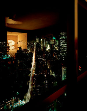
To wrap it all up, let's take a look at the window I may or may not have to jump out of:

Do you see the dollar sign reflection?  Doesn't it just make your heart sing?  You can all send your thank you notes for providing such a majestic kick off to your week to me at godsend@design-crisis.com*.

*not a real email address, but it should be, huh?