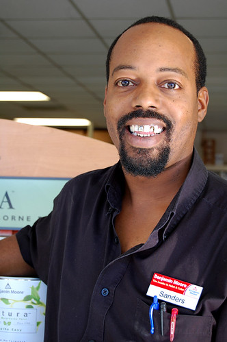
My Date With Sanders

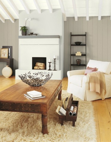
I went to visit Sanders yesterday so he could pick the perfect paint color for me, and when I told him I had a north facing, shady room with high ceilings, this is what he chose to go with my flooring sample: benjamin moore pashmina

It's called Pashmina, and it's a medium gray/brown. Pretty, but not exactly the white I was hoping for.

benjamin moore pashmina

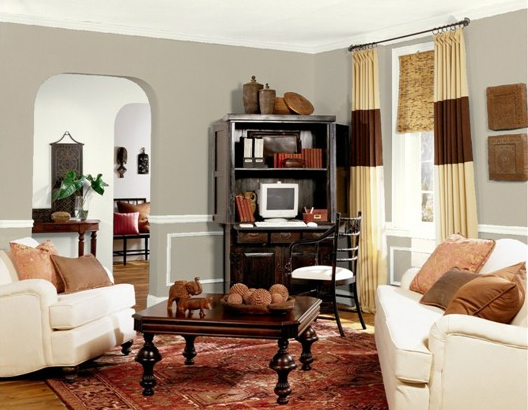
Here it is in another room I ran on the color analyzer thingamajig doohickeywopper.

It's nice, right? But maybe too dark? Maybe not?

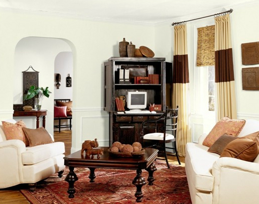
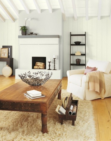
When I told Sanders I wanted white, he shook his head in the wrong direction... he did give me a few lighter samples, but they all looked like dingy shitballs when I held them up to the walls at New House. Here is the best of the light samples he gave me:

It's called Deep in Thought, and I am deeply thinking it looks better in these rooms than it will in mine.

What do you think? Whiteish or medium greige?

I'm going back to visit Sanders again today, but I'll tell you now that he's pretty much always right.

Sanders Gibbs, Superhero at Large

Up in the sky, it's a bird, it's a plane -- it's Sanders! Austinites from all over the city regularly travel down south to meet with Sanders, the super skilled, superhero of paint. Readers of this very blog have even benefited from his knowledge by taking advantage of Sanders' expertise in our Ask Sanders column. And today this interview I conducted with him near the start of our working relationship is being featured over here by Benjamin Moore. That's because Sanders is the man.

Karly and I have worked with Sanders for years, and without his super help, I'm not sure either of us would have ever painted a single wall. But just look how awesome our houses turned out:

Karly's nursery -- a symphony in Harbor Gray (and lots of other colors).

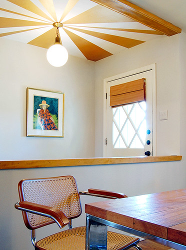
My house -- painted with Abalone gray and BM's gold metallic paint.

You can check out the rest of our houses here and here to see some of Sanders' other perfect paint choices. That's right. I said the P word.

Did I mention that Sanders is also a nice guy and fun to hang out with?

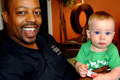
Here he is with Ike when Ike was just a little shrimp. Sanders has two kids of his own, including a six month old, so he never gets mad when Ike won't stop messing with the water dispenser at the store.

If you don't live in Austin -- well you're missing out on Sanders' charm, that's for sure. But you can still write in with your questions, which we will review for inclusion in our ongoing Ask Sanders column. Just drop us a line at hollaback@design-crisis.com and we'll see what we can do.

See? Sanders transcends space and time. He really is a superhero.

I'm Down With OCD

The paint problem has reached fever pitch. I awoke to about 500 sample swatches painted all over Ike's walls and had a major WTF?! moment this morning. Should I pick light Stonington Gray and just dewit, or should I pick a medium gray and hope that it will balance out the jumble of white and mahogany furniture I have amassed? Or should I go with the sample Sanders sent home with me yesterday, as seen in a very fancy Austin home featured in House Beautiful:

Oooooo, the dark! (and eeeeeewww, that bedskirt!)

Sanders gave me a pint of Wolf by Pratt and Lambert (they sell P&L paints over at his store) and it's gorgeous. But dark. Verrrrrrry dark. Too dark for a nursery/playroom? Too dark for what may be the best lit room in the house? Too dark for my tiny cojones? I just don't know. But I like it.

Meanwhile, Karly is all like, why are you painting over the blue? I like the blue. And I'm like... duuuurrrrr... I don't know. I'm so tired of a toddler trying to climb up the ladder behind me and rub his tiny grabby hands in paint (he has succeeded only once) that I am wondering the very same thing myself.

Except that, I don't actually like blue. The hormones made do it. The second I found out I was having a boy, I was all BLUE ROOM!!!!

Gross. Not that there's nothing actually wrong with blue, since it's the most adored color in the world -- there's something wrong with me. (it's not you, it's me. promise.)

Anyway, I need to take the day to reassess my motives. Light and kid friendly, dark and brooding, light with a dark accent wall (sounds very noncommittal at this point, which is somewhat appealing but also annoying), or some kind of medium neutral gray.

All advice and support is appreciated. You guys are the bestest support group for painting freaks ever.

Not that you are a freak or anything... but our tagline does say that Design Crisis is the fix for your creative compulsions.

So there you have it.