Sorry for the quiet around here of late. Ike's out of school again and I've been whipping us both into a frenzy of day trips and play dates. Today is dr. appt # 8million, so I don't have a lot of time but I thought I'd report on what's been going on around here.
A whole lot of painting, and none of it's good.
You're probably thinking: But, Erin -- you have Sanders! Every paint color he picks must be magical!
It is. And yet sometimes I foolishly do not listen to him. Sometimes I chicken out and second guess him. Sometimes I am an idiot.
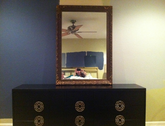
Now my bedroom looks like this:

Also Ben is pissed that I didn't just use the extra gallon of dark gray navy paint from Ike's room instead of trying to pick a new, slightly different dark blue paint.
Did I mention that I'm an idiot?
But you know, it's hard picking colors for the last rooms in the house. The first ones go up pretty easily -- limitless choices! And then the possibilities narrow into a handful of pathways... and then I get confused.
Should I repeat a color, or choose a new neutral color? Because I'm not sure I love the dark blue. And peach didn't work (promise! and I did try Jumel Peachtone, aka orange sherbet, for the person who suggested it).
I am inspired by this trio of beautiful rooms:

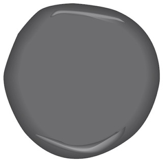
This paint looks like Ike's room color, BM Deep Secret.

This one looks like the front room paint color, Dark Harbor.

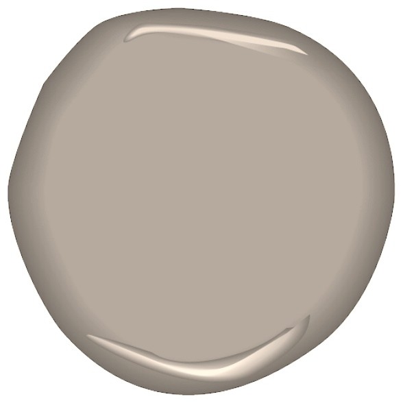
And this is the missing element. Kind of gray, kind of purple. Kind of amazing.

Could be BM Evening Gown.

Or perhaps Evening Skyline.

And my wild card pick is Arctic Seal.
So you can see I'm thinking something purpley, but not Violet Beauregardey. Something warm and enveloping or perhaps deep and mysterious.
Or maybe Sanders will tell me to do something else entirely, and I WILL LISTEN.
Details to follow.
Also, I may be getting a new rug for the bedroom. And possibly designing it and the paint color around these curtains that didn't work for the living room:

Because, when the choices narrow down I try to make things more difficult by adding another level to the equation.
I can derive a polynomial function in my head faster than I can decorate (remember the shortcut, calculus nerds?).
But I am learning.
[photos via design traveller]

