Everyone Do the Longo

Remember Wall Street in the shining chrome-plated 80's? Impeccably dressed stock brokers raked in millions through day trading while repeating the corporate mantra, "greed is good," with zombiesque vacancy. And for the privileged few, living in a pressure cooker meant a penchant for Oliver Peoples glasses, Valentino suits, Crane's calling cards, and glass walled apartments overlooking Central Park, much like Patrick Bateman, anithero of Bret Easton Ellis' brilliant satire of elegant 80's excess, American Psycho.

american psycho

(Ok, I need to get this off my chest: this is the part of the film where Christian Bale/Patrick Bateman talks about how much he likes Phil Collins, which almost (but not quite) ruined Christian Bale's uber hotness for me because I REALLY HATE PHIL COLLINS. SUSSU SUCK ON THIS, PHIL.)

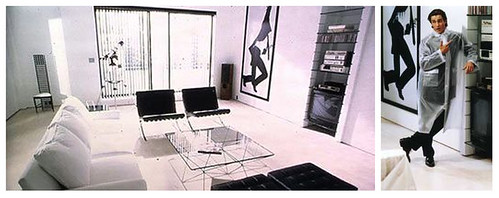
But I digress. Bateman's tastefully minimal apartment swathed in white, beige and white -- all the better to showcase the housekeeper's skills as well as his ultra luxurious accoutrements -- represents the apex of 80's wealthy urban living. That and his life-sized Robert Longo lithographs.

longo montage

Images courtesy of the artist at Artnet.

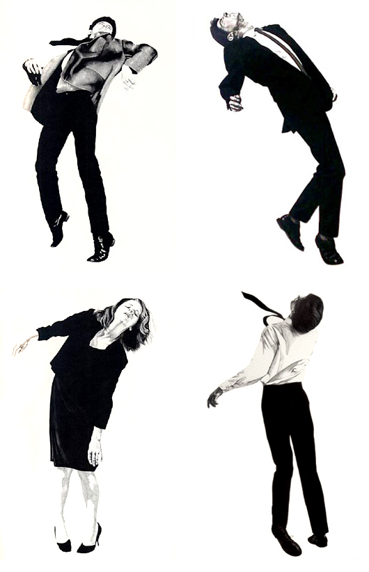
Much has already been made about the dark side of 80's greed. There's Patrick Bateman himself, a self-imagined psychotic killer, Less Than Zero's protagonist who dies of cocaine overdose in a hyperfast society driven by glamor and wealth, and then there are Longo's prints of corporate archetypes writhing against the confines of their high pressure lifestyles.

So what does it say about the state of our current society and economy that prints from Longo's Men in the Cities series have recently made a comeback on the walls of today's well-heeled homes?

longo scheerer

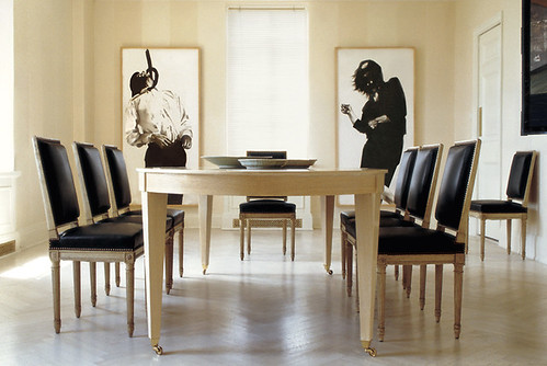
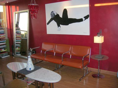
Tom Scheerer, master of all things beige and white, used two original Longo prints as focal points in this extremely tasteful dining room. Snark aside, I actually love it, possibly because I have been reprogrammed to URGENTLY NEED light light walls by the recent blitz of white washed everything, or possibly because the macabre side of me might enjoy the choking feeling that would come from looking at that print while eating. Perhaps it would help with portion control.

Moving on to more Longo sightings:

longo montage

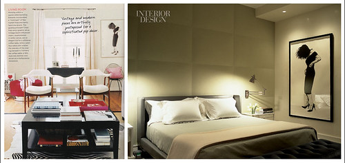
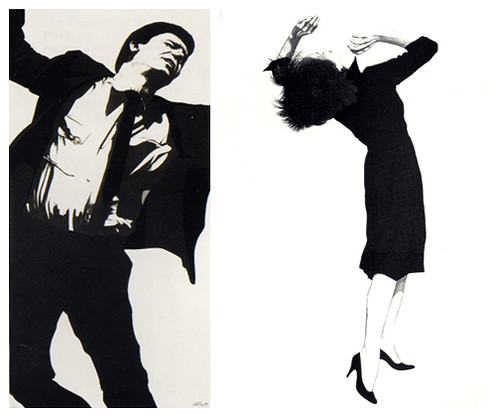
Left image from Domino, spotted on M.A. Belle's lovely blog, Right image from Interior Design.

That's Gretchen, and she's had a tough day. I think she is a popular choice because Gretchen's a little less edgy than some of the more obviously distressed people, and her black dress and heels are classic and therefore still au courant. In other words, she's pretty and I'd have her in my bedroom any day. Heh heh.

The latest sighting was over at Apartment Therapy, at least I think this is a Longo:

longo red

It sure looked better in its natural beige habitat, didn't it? Way too much contrast here. Maybe there is a point to having white walls, you know, other than to highlight my lack of obsessive cleaning and all of the imperfections in my 40 year old walls, not to mention the lower than 20 foot high ceilings and complete nonexistence of decorative woodwork. Sigh.

The good news is that Longo's prints are not completely unattainable. Well, the original 70" tall lithographs are (unless you have 5-7k earmarked for artwork, in which case, why don't you send some of that sweet sweet love my way, pretty please?), but the posters are quite affordable and while they're substantially smaller, they still have graphic impact. Lithographs and reproductions are available through Bird Fine Art, as well as through Ebay.

If you care to send me a pair of prints, I think I'd like Larry and Ellen here:

ellen larry

So tortured and ironic. What do you think? Could you find a place in your home to do the Longo?

Repurpose, Redesign

Despite an entire Monday spent extolling the many virtues of cardboard furniture (although dingy brownness was not one of them), I am still in a recycling state of mind, possibly because all the trash floating down our street is making me sick. No more Church's Chicken cups, beer cans and gross dirty band aids in my yard, please! While I haven't found a use for old band aids yet (and I'm sure I never will), I have found a veritable cornucopia of cool items designed from repurposed materials.

repurposed montage

Clockwise from top left: San Francisco Metro Map Bowl by Etsy seller picapicadesign, Recycled wool blanket purses by designer Tieneke Beunders at Ontwerpduo, Recycled aluminum pop top purse by Brazilian designers at Escama Studio, and Recycled packaging lights by Anke Weiss seen at Yanko Design.

I am obsessed with maps (look for a future post devoted solely to their geographical goodness), so I adore the bowls by Picapica, and all the purse are very cute, wearable, and environmentally friendly. Yay trashless yard! The lamp made from recycled packaging is also a nifty idea, and it just goes to show that with a simple light kit (sold at Hope Depot or Ikea), many objects can be reborn as lighted sculptures. Par example, regardez Francois Legault's amazing spoon chandeliers at Unik:

francois legault

I'm relieved that he used spoons instead of forks. I am not sure how I would feel about a million pointed tines aiming at my eyes as I gazed up at their splendor.

Meanwhile, Tineke Beunders over at at Ontwerpduo is busy building more pieces out of materials that make you wonder why anyone ever discarded them in the first place.

ontwerpduo

The chair (which, in real life, I am quite sure is NOT as large as the cupboard), is strung like Danish rope cord but with old telephone wires. Being one of the landlineless legions, I had forgotten telephone wire even existed, but then I remembered waaay back to my awesome clear Swatch phone and its colorful guts. It's a very surprising use of materials, I think. And the cupboard made of old metal file boxes really belongs in my house. I want it and its filthy industrial patina so, so badly.

If you're looking for something a little more classic, something that screams less "Hey, I am recycled!" and more "Hey, I cost a sh*tload of money!" then look no further than the Phillipe Starck designed Kong chair, modeled after the ubiquitous Ghost chair, but this time cast and welded with 88% recycled aluminum:

kong chair

I've got to say that those are some sexy chairs. Unlike the other pieces I featured today (all of which I am still in love with), the Starck chair bears no mark of its original incarnation as a thousand common cans. It must have cost a small fortune just to get the base materials into a finished state, so I'm sure the $2000 price tag is somewhat justified.

Maybe they'll get recycled one step further and show up on Craigslist. Knock a zero off and those babies are mine.

Double Dutch

Running a blog is funny business.  I've spent the last 30 20+ years practically peeing my pants over racy interiors and beautifully made furniture, I figured I would slap a bunch of pictures of well designed rooms up here and expect the whole world to swoon.  My taste is exceptional, right?  But whenever I go to put together a post I find something totally out of left field (thanks to this clunky interweb thing) and end up doing a post on the most unexpected thing ever.  I mean ever. I was all prepared to show you the latest in hot hot neon yellow home-goods (stay tuned for that tomorrow) until I saw Erin's post yesterday on the Gramercy Park Hotel. I just couldn't stop thinking about the Dutch inspired guest rooms and my very favorite Dutch artist, Jan Van Eyck.  Thankyouverymuch4yearsofarthistory.  Man that class could really bore me sometimes, but, like the guest rooms, I always remembered Giovanni Arnolfini and his Bride.  The lush colors and insane detail blew my twentieth century pot smoking* college mind.  

*long since over the pot smoking

Let us quickly review a pic from her post yesterday compared with Van Eyck's painting before moving on to some (insert fantastically witty adjective here) dutch inspired goodness for the new millenium:

comparison

hi, hello, yes, i love you. Can you believe how much those Christmas colors are rocking your world and not looking Christmasy at all?  How insane is it that the room looks EXACTLY like the painting? It does not even appear as though the people are missing, the guest room IS the couple, it IS the background.  Can I ever ever aspire to create such a grande homage if left up to my own devices?  If someone would like to give me a room, a check, and a new piece of artwork I sure as hell would love to try.  Any takers?

Since I don't have a room to layout just yet (I'm counting on you people) I spent my time cruising the net finding other modern day reincarnations of the 15th century.  I know it was easy to start with a Dutch company, but there's no denying the sexiness in holland porcelain's latest ad campaign:

pretty dutch

yep.  That pretty much says it.  So, I'm not always one for subtlety.  I also get all hot and bothered when a stodgy old company isn't scared to sex-up their image.  The nod to the dutch masters with this modern twist is such a perfect way for Holland's porcelain to rebrand their goods.  It also doesn't hurt that they invited designer at large Marcel Wanders to create a few gems for the collection.  

More images from the campaign:

more holland's porcelain

a scuba diver?  perfection.

Then there's artist Desiree Dolron who uses her camera and some mad photoshop skills to echo the masters:

desiree dolron

look, you could totally hang that on your wall, this is still an interior design blog.  Drink from those porcelain cups and stop your complaining.

anyway... no that is not a painting, yes it is photography perfection.  My husband likes to tell me that photography is not art, I like to show him images like this and laugh in his face.  Thoughts?

Here are some more:

dolron comparison

Do we even need to discuss how girl with a pearl earring this is? (or how much Scarlet Johanson is annoying us these days)  How about instead we dream about how great this will all look over my fireplace.  Right next to the yellow door I'm going to tell you all about tomorrow.