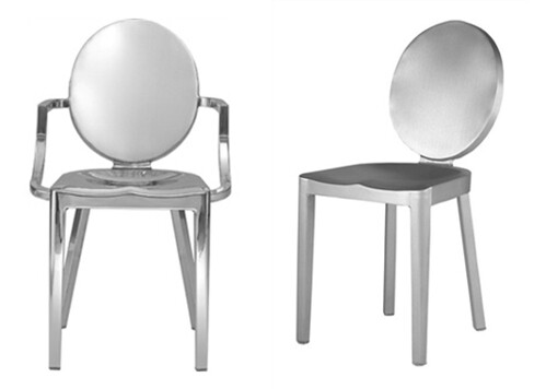
I had to usurp my previously planned post when I stumbled across the latest Philippe Stark designed hotel and realized that I. Am. A. Creative Genius. Remember these chairs that Erin posted from our Round Top trip
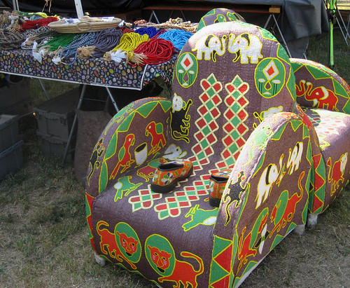
Remember how I begged Erin to take the picture and I cried my eyes out the entire car ride home because I couldn't afford the $1,500 pair. Remember how everyone else thought I was insane?
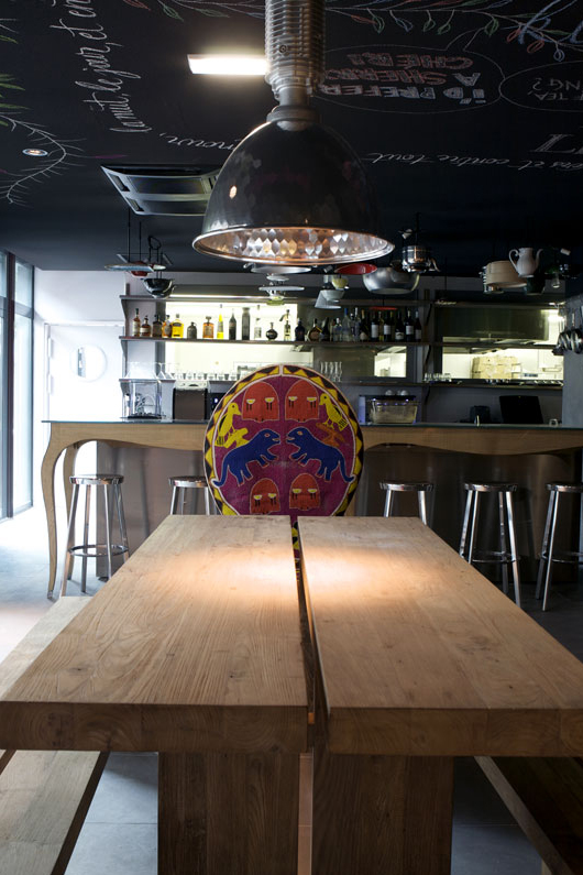
I guess Philippe will always understand me. He heard my cries and said ever so softly and sweetly, it's OK, Karly, I'll put them in the Mama Shelter hotel in Paris where you will never be able to afford to see them in person but will sleep soundly knowing that, you too, are a design prodigy.
The one thing I still can't quite understand, however, is this: why was I mentally crafting this post whilst eating peanut butter straight from the jar in my (in dire need of renovation) kitchen rather than while racing through the streets of London with an entourage of interns frantically scribbling notes about every piece of furniture I point to on their overflowing clipboards. Why? Why?! Your guess is as good as mine.
More proof that I should be the head of a global designing empire (well, other than this steadfast blog, where I technically split the power):
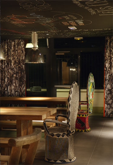
Oh the shape is so good. They didn't have this version in the cow field under the hot Texas sun. Go figure.
And here's the best chair of all, I certainly would have found the $750 for this one:
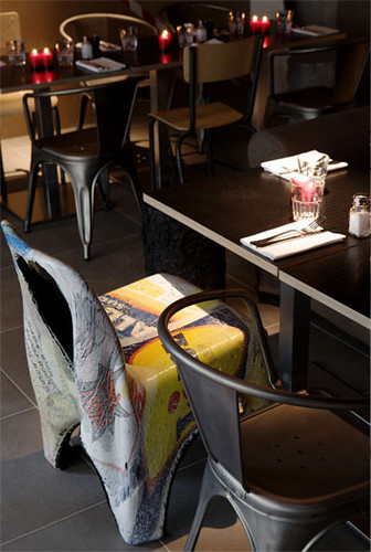
All this crap is HAND BEADED, people.
My creative genius will certainly become more convincing once you realize that I, too, would insist on a mac computer and a wookie lamp in every room:
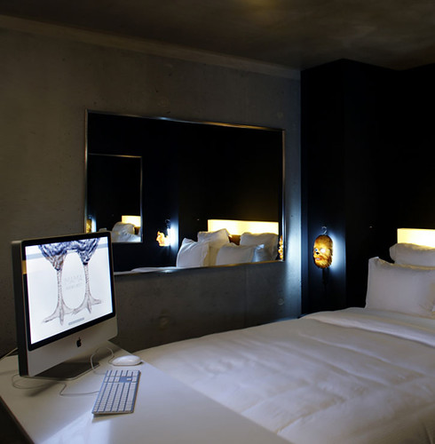
Did I tell you that I saw a concrete wall once?
Of course, this next picture shows the departure between myself and la amateur Stark:
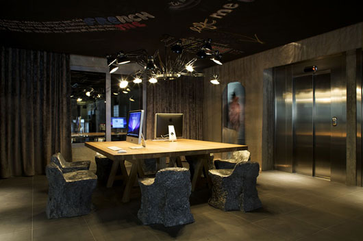
What I forgot to mention in my Tag the other day is that I'm deathly afraid of elevators. Las Vegas hotel employees LOVE me for requesting a room on the lowest possible floor. A hotel of my design would never have elevators. Well, unless, of course, they were the glass kind that really don't bother me at all. Up. Down. All day long. Look at me. Oh, I also don't know about those aluminum foil explosion mold chairs.

Black Light, Schmack Light. I really just wanted to show this picture in the hopes that Top-Design-Nathan would cruise on over and see that THIS is the proper way to display daily life artifacts from the past century. Note the lack of fussy unfinished wood cubes? Note the intentionally cluttered stacks. Congratulations bar in the Stark hotel, you have the top design. And the crowd goes wild:
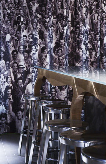
I think this is a curtain. I do not like barstools. I have nothing more to say about this picture.
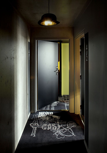
Pros: Magritte Bowler Hat Lamp; concrete walls. Cons: Overdone floor
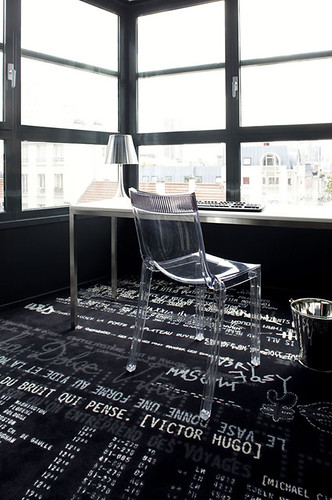
More overdone floor. Although I commend Stark for picking a carpet that will hide stains while being a little, um, are we supposed to call it edgy... this carpet just seems a couple of years out-dated.
So, to summarize, me = creative genius. Mama Shelter = not so bad. Philippe Stark = wouldn't hurt to listen to my advise.
PS. More on this hotel here
