Ok dearest darling readers, I need you to come sit down so we can have what my buddy Jen calls a little come to Jesus. A couple of years ago I was just a design obsessed web-o-file shamefully perusing the interwebs at night looking for the sexiest modern design had to offer. I found many blogs I loved and many more that I didn't love but none were completely my style and I thought it would be fun to have a space where I could post a quick pick of whatever I was currently drooling over at that minute. Fast forward 2 years later and somehow or another I've fallen down a rabbit hole of 20-picture posts and almost daily essays. This creative outlet is giving me flashbacks of grade-school homework, and who wants to do homework when they could be outside playing on the swing set... or just cruising the web and looking at OTHER blogs.
Don't worry, I'm not leaving you all behind, I love the blog and want to keep it up, but things are going to be a little different around here. The days of milk and honey are done. Mostly. Oh, don't you worry, I'll still have the urge to do a big ole round up from time to time and I'm certainly not speaking for Erin here, but I need to be able to post one or two images that I find truly amazing and inspiring and then (gasp) walk away guilt free.
Aside from the novel above, today is day one.
Earlier this evening (it's monday night right now, btw) I stumbled across Jessica Hische's blog - Jessica is an amazing typeface designer and I encourage any one with an interest in graphics to check out her website post haste - anyhoodle, Jessica just finished teaching a course to illustrators at the University of the Arts in Philadelphia.
Her students were asked to design a book cover for The Wizard of Oz. Below are my 3 favorites, to see all the works, click here
Grace Kennedy
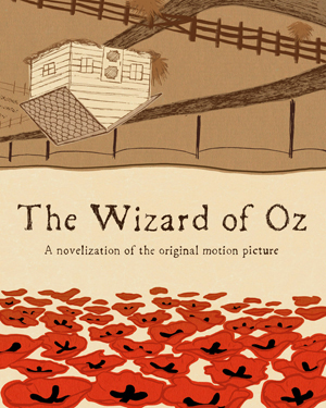
Poppies! Poppies! I just love everything about this cover. Go ahead, name something about it? Yes, I love that part.
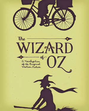
I love that Dorothy and the Witch complete each other on this cover, as though they are alternate egos within the same person... do I feel an English lit essay coming on?
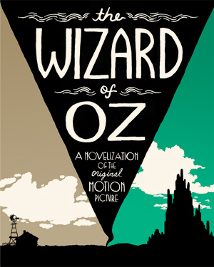
Ok, I have to admit that I'm not really crazy about the typeface here, although it does fit within the tornado nicely. However, i do think using the conical shape of the storm to split Dorothy's two worlds was clever clever smartness.
And see, this is how I'm going to be steering this ship from now on.