Grooving On DIY Graphics

In case you haven't noticed, it's high summer and things are moving at a rather leisurely pace here at DC headquarters. I'm too busy with BBQs and pool playdates to do any hard hitting entertainicles right now, but I did manage to scrounge up a few delightful tidbits for you -- our loyal readers. If you saw yesterday's post about Karly's curtain project, then you know that a little DIY graphic goodness can make a gigantinormous difference. Let's check out some other ideas for simple, punchy projects. Behold:
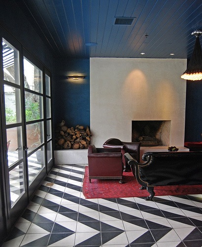
Eye Spy

While I don't really want to think about how much work it actually took to paint that floor, I am seeing some definite, cheap possibilities for radical change. Is this not the best idea ever for crapoflaging those hideous screenprinted tiles that seem to run rampant in otherwise nice homes? I am wondering how durable the finish would be, though. Does anyone have experience painting tile?
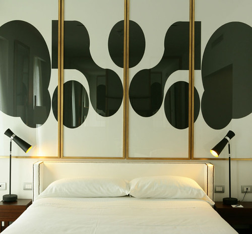
Stylehunter

Step one: find huge, cheap gold frames. Step two: paint your own shapes or cut up a big piece of fabric and frame. Step three: steal those lamps. heh.

LA Times

Sure it's a little voyeuristic, but at least you'll never be lonely in bed again. As I recall, this fabric was created with digital imaging and then sewn into a coverlet. There are so many digital service bureaus out there now that I'm sure there must be some reasonable options for printing your own fabric masterpieces.
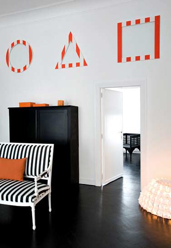
Nicolas Matheus

A couple of graphic touches can make a big impact in a neutral space. It would take three seconds to have those shapes cut out of MDF and paint them up all 80s Memphis like. The settee is a relatively easy upholstery job that could be done on the cheap with Ikea fabric, and y'all know I'm nothing if not hot for the cheap and easy.

Andrea Ferrari

Dudes, I will be knocking this idea off someday. I can't afford Fornasetti's stunning Nuvole wall mural, but I can have my own images printed by Design Your Walls. I actually flipped this image into a mirrored pattern much like the one above and then had it printed as wallpaper, which was really easy to do and relatively inexpensive. Think I might try some different images and see what I can come up with.

You know... after I finish BBQing and swimming.
The Other Side Of the Rainbow

Ok dearest darling readers, I need you to come sit down so we can have what my buddy Jen calls a little come to Jesus. A couple of years ago I was just a design obsessed web-o-file shamefully perusing the interwebs at night looking for the sexiest modern design had to offer.  I found many blogs I loved and many more that I didn't love but none were completely my style and I thought it would be fun to have a space where I could post a quick pick of whatever I was currently drooling over at that minute.  Fast forward 2 years later and somehow or another I've fallen down a rabbit hole of 20-picture posts and almost daily essays.  This creative outlet is giving me flashbacks of grade-school homework, and who wants to do homework when they could be outside playing on the swing set... or just cruising the web and looking at OTHER blogs.

Don't worry, I'm not leaving you all behind, I love the blog and want to keep it up, but things are going to be a little different around here.  The days of milk and honey are done.  Mostly.  Oh, don't you worry, I'll still have the urge to do a big ole round up from time to time and I'm certainly not speaking for Erin here, but I need to be able to post one or two images that I find truly amazing and inspiring and then (gasp) walk away guilt free.

Aside from the novel above, today is day one.

Earlier this evening (it's monday night right now, btw) I stumbled across Jessica Hische's blog - Jessica is an amazing typeface designer and I encourage any one with an interest in graphics to check out her website post haste - anyhoodle, Jessica just finished teaching a course to illustrators at the University of the Arts in Philadelphia.

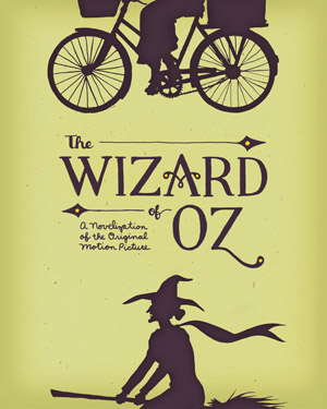
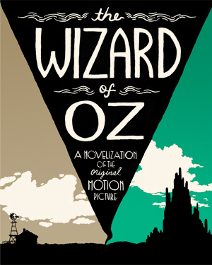
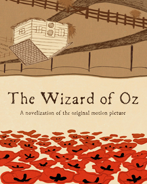
Her students were asked to design a book cover for The Wizard of Oz.  Below are my 3 favorites, to see all the works, click here

Grace Kennedy

Poppies!  Poppies!  I just love everything about this cover.  Go ahead, name something about it?  Yes, I love that part.

Sara Wood

I love that Dorothy and the Witch complete each other on this cover, as though they are alternate egos within the same person... do I feel an English lit essay coming on?

Michael Olivo

Ok, I have to admit that I'm not really crazy about the typeface here, although it does fit within the tornado nicely.  However, i do think using the conical shape of the storm to split Dorothy's two worlds was clever clever smartness.

And see, this is how I'm going to be steering this ship from now on.

Featured Artist Friday: K-Dawg

Ok, so it's no secret that I've been a bit too busy to put together spellbinding posts.  These days, Erin's posts are akin to the view one might obtain after weathering the journey to the top of Mt. Everest, while mine are more like, well, looking at swamp water.  It's not that I don't love the blog, I do, I just haven't had the time to source that which my heart doth love the mostest:  great design online Normally on Fridays I toss up a picture and bid you good weekend, but this week I thought I would mix it up a bit.  I still haven't gotten the time to find awesome works abroad but I do have access to one portfolio that I do know quite well:  my own.  Hey I'm no Alexander Girard, but I can put together a graphic or two if I have to.  Here are some of my most recent projects (and the source of la massive time suck)

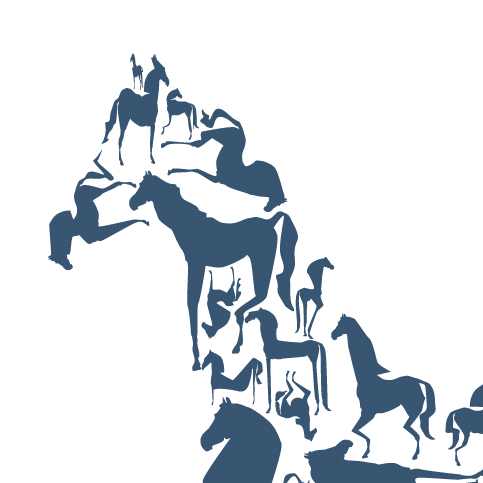
I made this horsey a while ago with the intention of painting him on a wall or screen printing him on to pillows, then the web got inundated with things made out of lots of smaller things and I couldn't decide what to do:  jump on the trend bandwagon, or admire him on my computer screen.  As of now, it's only been the latter.  This is one of the only recent personal projects I have as most of my time goes to my clients (and even this is over a year old)

I'm pretty sure I've mentioned that Birds Barbershop is one of my biggest clients.  Here are 4 of the gazzillion gig posters I've made for them over the last year or so.  Those dudes give a mean haircut, but they also love to party.

And yes, that is 100% a Nagel knock-off up there.  It was intentional, OK?

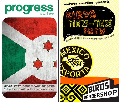
One of my other clients is Owl Tree Roasting, a fantastic organic coffee brewery here in town, on the left is a sticker for one of the coffee bags they did for Progress Coffee, on the right is a sticker for the Mexican beans they roasted up for Birds.

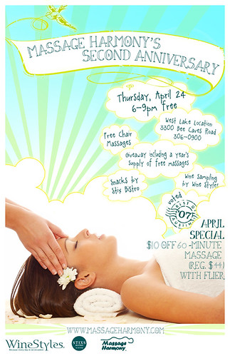
Massage Harmony keeps me busy (but I dare not complain since my back is nice and loose thanks to them).  Here's a poster I did for a recent open house they did.  Psst, if you're in Austin, I can't recommend them enough, and their prices are SO GOOD

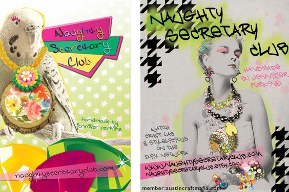
Our pal Jen of Naughty Secretary Club seeks out the K-Dawg for her design skillz every now and again.  Here are a couple of ads I did for her.  Yes, I have a thing for animals in accessories (note the zebra, dog, lamb, and duck on this site, which I also designed)

I made this gig poster for my friend Andy who is a DJ.  He's awesome.  If you show up to a party and he's playing, it's going to be the best night of your scene loving life.

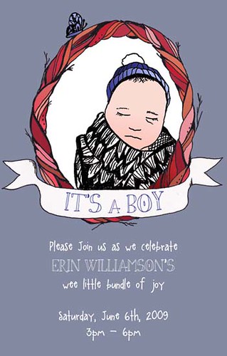
And finally, here's the baby shower invite I drew for our very own Erin Bear.  I've cropped it so you stalkers can't find my house, but, well, you get the gist.

I've got a bunch of other crap, but who wants to look at mock-ups for law firm e-newsletters or keypads for portable foot spas?  Well, maybe that's your thing.  If so, I've got 'em in spades.

Happy Weekend everyone!!!  I promise to make more time for all of you in the coming weeks