During the 70's strange and wonderful things occurred in the world of design and architecture, at least according to my 1974/75 edition of Decorative Art and Modern Interiors. Although some of the interiors are laughably dated, the strangest thing by far is how contemporary most of the work is. Take, for example, The Antidwelling Box:

They got the Dwell part right, for sure, because it looks just like all the homes featured in Dwell Magazine. So the design is pretty prescient, but the function is... well, maybe a little functionless. It is called the AntiDwelling Box, after all. The architect, Monta Mozuna, said that people who live in homes don't really know what they want but that architects do, and so he took it upon himself to subvert normal living space dualities such as public/private, or parent/child. I know that's all postmodern and stuff, but I'd be pissed if my control freak architect built me a house with the bed in the kitchen, or the communal bath attached to the master bedroom, while the master bedroom resides down the hall. At any rate, here are plans for the space, so you can see how it's laid out:

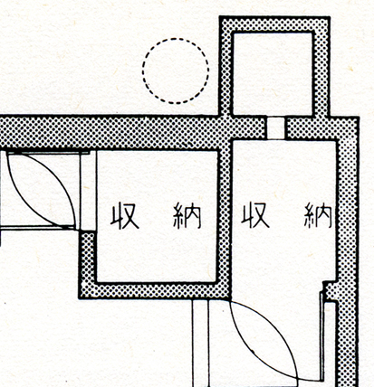
What? Too small you say? Ok, here's a close-up:

Ok, I can't read it since it's in Japanese, but isn't that a gorgeous diagram? The fact that Japanese is so visually appealing doesn't hurt, either. Obviously the guy has style (or maybe I am just obsessed with his drawings), but his ideas do make you wonder how comfortable some of the Dwell/prefab/green homes are to actually live in. Hopefully they don't follow Mozuna's theories...

But I certainly don't mind if they follow his aesthetics.