Most of the time I am perfectly happy with my quiet, perfectly neutral decor. It's harmonious! It's blendy! It's versatile! At least that's what I tell myself. It's also kind of beige. And kind of boring. I kind of have the urge to do it up righteous in a riot of color. Like Karly, I might just want to color it rad. I'm still into the crazy acid wasp idea -- psychedelic neotrad will definitely amuse me for a while -- but occasionally I yearn for some straight up crazy, old school Design Crisis style.
Kind of like this.

This feathered friend made its way around the interwebs a while ago, and recently I stumbled upon the rest of the house designed by Ghislaine Vinas (who is definitely cuckoo for cocoa puffs). Raise you hand if you want to take a tour... Yay! Let's dewit.


Subtle, no?


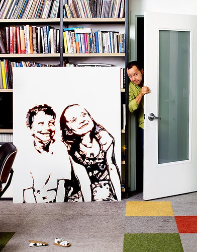
The kids' rooms are sock knockers, even if the vaguely sinister murals by Mark Mulroney may be nightmare inducing.

I think this is as restful as this place gets.

Sheep + green carpet = a trifle heavy handed?

Winning!

I declare the kids' bathroom to be 100% adorable.

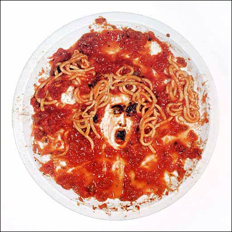
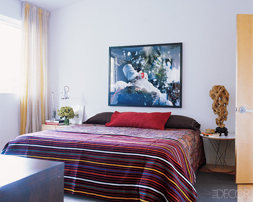
And I'm kind of a sucker for any room featuring a giant Vik Muniz photo.

But WTF is this thing??????????? I may never sleep again.
Well friends, what do we think? Good drugs/bad drugs? Maybe a little of both? Do you wish this type of design would go out like the abominable snowman, or will you always have a place in your heart for the graphic homes that boldly go where no (wo)man has gone before?
