I suppose my title is a harbinger of things to come, but I'll start out by at least trying to play nice. So, last night the remaining contestants were asked to compete in a design triathalon (desathalon?) which was nice in principle because I'm getting tired of this team based nonsense. How will we know who's capable of carrying a room by themselves if they never have an opportunity to show off individually?
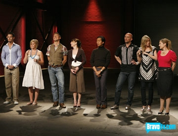
Anyhoo, the first contest was to upholster a chair. Now, I Iove me some chairs, and new upholstery is such an easy way to transform a room, so I actually enjoyed this leg of the competition. Sadly, most of the chairs were dogs, but the winning one by Nathan was pretty super awesome. I wish I could find a picture, but he painted the frame Klein blue and did white fabric with a gold painted pattern. I'd put it in my house any day. Round One: Nathan.
At this point, we already know who's going to lose by the way the interviews are being conducted. I find that to be annoyingly simplistic, and I want to throw the remote at my tv. But I love my tv, so I don't. I am also repulsed by Andrea's bad barrette action, and Hunny Bunny thinks that India Hicks' accent is fake. He's sure she's really from Ohio. I'm starting to love Nathan, because he has trained as a "smokalete." Maybe I should start smoking?
The second contest was to set a table. I will begrudgingly admit that Eddie's was pretty nice (I have no love for his snitty attitude and time nazi tic), and Nathan's was super simple and edgy. The rest were stuffy, frilly and/or overdone. Ondine went for a Lilly Pulitzer look, for goodness sake! What, are we 50 year old WASPS lunching at Martha's Vineyard? Around this time, I start cursing at Teresa and her inane design mantra of "Zen. Zen. Zen." No, no, no. Round Two: Nathan.
This is where the show totally jumps the shark. Our brave interior designers are asked to spend $1000 dollars at A GARDEN CENTER and use their finds to decorate a space. WTF??? Predictably, the results are ATROCIOUS. At least Bravo posted some pictures of this leg of the contest. From worst to best (according to moi):
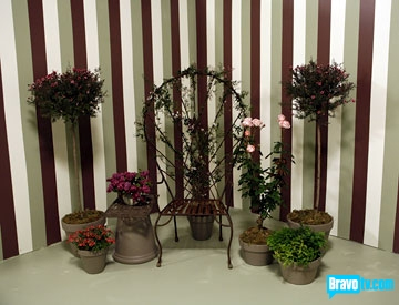
Just look at this cheap display a la Garden Ridge by Preston. Are those topiaries??? Where is the $1000 here? Preston, you're a hottie, but your design is nottie.
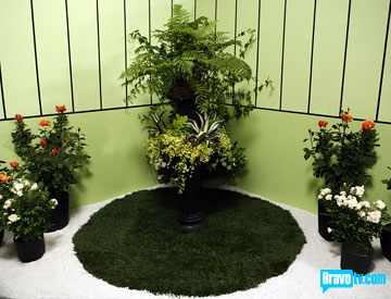
Eddie is so mean to everyone that I don't feel bad about saying that his space is tacky and unfinished. He decorates like he's a 60 year old society bitch. Roses? Really? Gross.
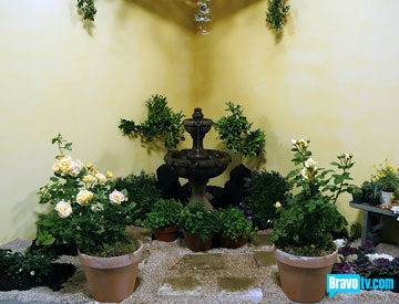
I think Andrea's is better than Eddie's, so I'm not sure why she's in the bottom two. At least there are some potential angles in here for a photo spread. Yes, her style is bland, but this space has some depth.
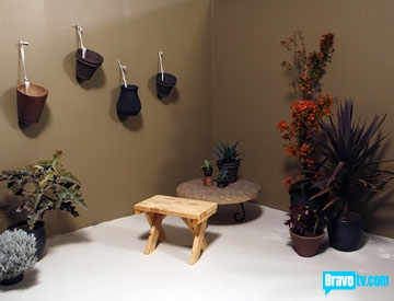
I like Nathan's color palette here, but the space looks harsh and unfinished -- not enough layers. But Nathan is emerging as my favorite.

I didn't hate on Teresa's space as much as the judges did. The ragging technique is a little old, but her plant selections blew everyone else's away. Too bad there's no hardscaping here... a bunch of plants piled in a corner is never going to look good. Maybe she should design gardens?
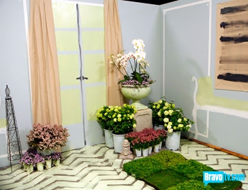
I think Wisit's space could have been great if his color palette had been less Easter egg. And are those mums? And roses? AND orchids? Barf. Sorry -- I'm a huge plant snob. Still, I like Wisit when he's not singing scary opera music.
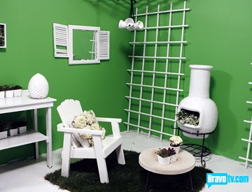
I actually liked Ondine's space quite a bit, but this particular color is very green screen, which is an unkind shade photographically (see John McCain for further evidence). But I like the idea of a punchy color in combination with tons of white. And look! Furniture. What a novel idea.
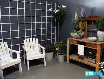
Finally we have Natalie's space, which looks very polished and layered relative to the other rooms. Still, I was irritated that I slogged through an hour of backbiting and bad design just to see a mundane country vignette. The best part was how Kelly referred to the "trellage story." Crazytown! Round Three: Natalie.
Actually, Kelly Wearstler is fast becoming the only reason to watch this show. Case in point:

It looks like she went out bar hopping, drank one too many, and then stuck her finger in a light socket. Very Bride of Frankenstein. But at least she's interesting. So far, the rest of the show is not. We all knew within the first five minutes that Teresa was going home, and where's the suspense in that? It's like all the clips and interviews were reverse engineered to support the decision to dump her, and frankly I don't necessarily think she got a fair shake.
Well, fellow TD viewers, was my analysis spot on or do I need to park the snark? Let me know what you're thinking.