Hello! Fancy meeting you here. For all you new readers, I'm Erin and I'm an Austin based interior designer and photographer. Because I can't manage to finish projects around our own house without the threat of possible public humiliation, I am once again participating in the One Room Challenge -- the adrenaline fueled event sponsored by Linda Weinstein of Calling it Home and media partner House Beautiful. Twenty designers are tasked with the daunting prospect of fully transforming a room over the course of six weeks. Let's get down to it, shall we?
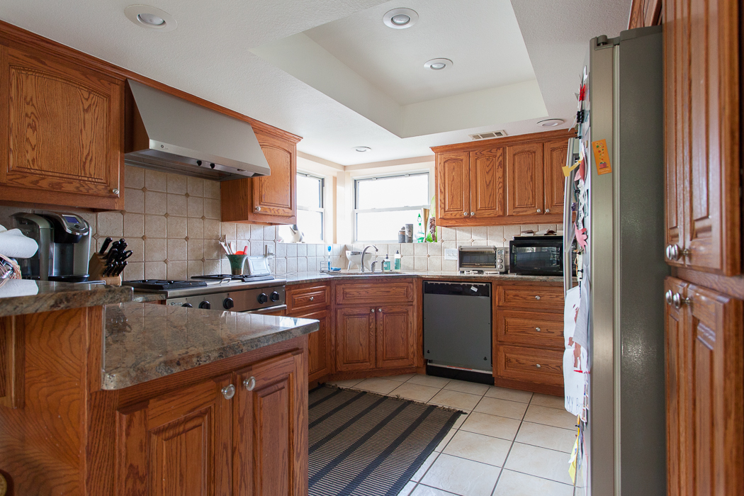
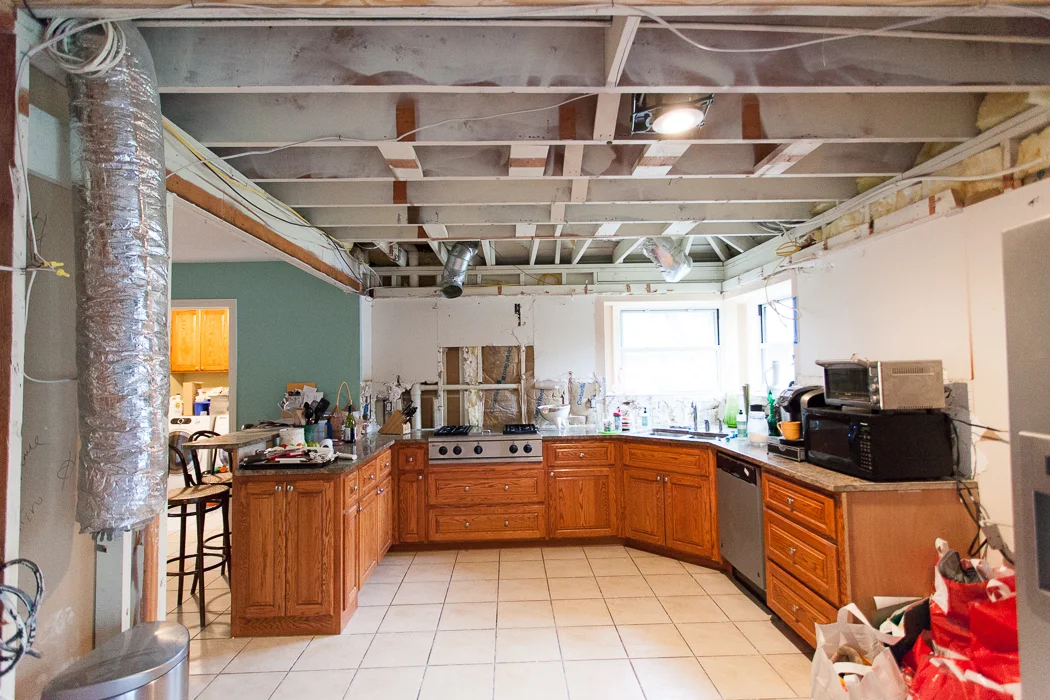
I'm redoing our cramped, Tony the Tiger orange kitchen.
I am obviously insane! In years past I have chosen the very tiniest rooms to makeover. But I think the internet will snap me in half and toss me to the wolves if I complain about our kitchen one more time. So this is going down, whether I like it or not (rollercoaster of conflicted emotions, let me tell you.)
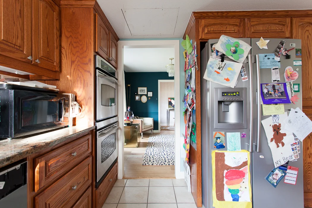
About 15 years ago the previous homeowners renovated our 70s Tudor home but didn't alter the cramped layout. And le whoa that dropped ceiling. It feels like you're cooking somewhere in the shire, minus the hobbity charm. We never use the double oven, and all the access points into this room are so tight. Have I even mentioned the dated finishes, yet?
We've lived here for five years now, and Austin real estate prices have gone through the proverbial roof. Our house appraised at 50% more than it did when we bought it, and we had to decide whether to take our new equity plus the money we planned to put into a remodel and buy a new house, or to bite the bullet and make this place work for our family.

We decided to stay. For one thing, there's nowhere else to go unless we jump multiple price points. With an extra comma and then some. Hahahaha. And we live at the back of a shady cul de sac with a neighborhood park/pool and good schools, we can walk to fancy groceries and cute restaurants, it's a 10 minute drive to downtown, etc., so it's a great area. But the house itself is not super dreamy or super large by Texas standards. I'm really just trying to justify the ENORMOUS amount of money we're spending here.
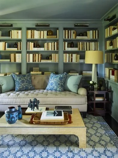
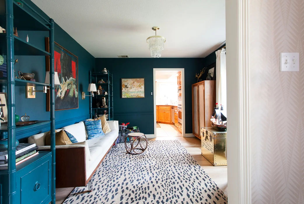
And also the fact that we tore out the teal room to combine it with the kitchen.
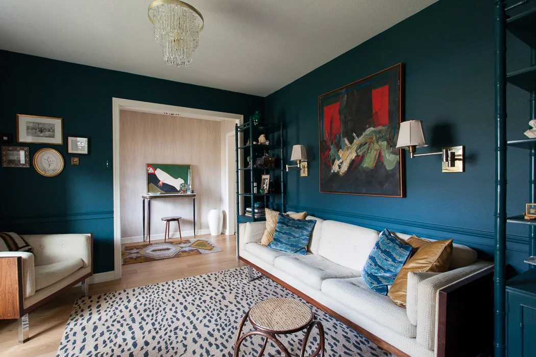
Yep, it's gone. It was sad but also liberating to say goodbye to this room that has brought me a not insignificant amount of fame and fortune. I can already feel the backlash simmering, and the pressure to bring my A+++++++++++ game is weighing mighty heavily on my shoulders. It's tough to make a kitchen as sexy as a library space, but the new setup will be ever so much more functional and I have a few aces in the hole.
Here's the plan, Stans:
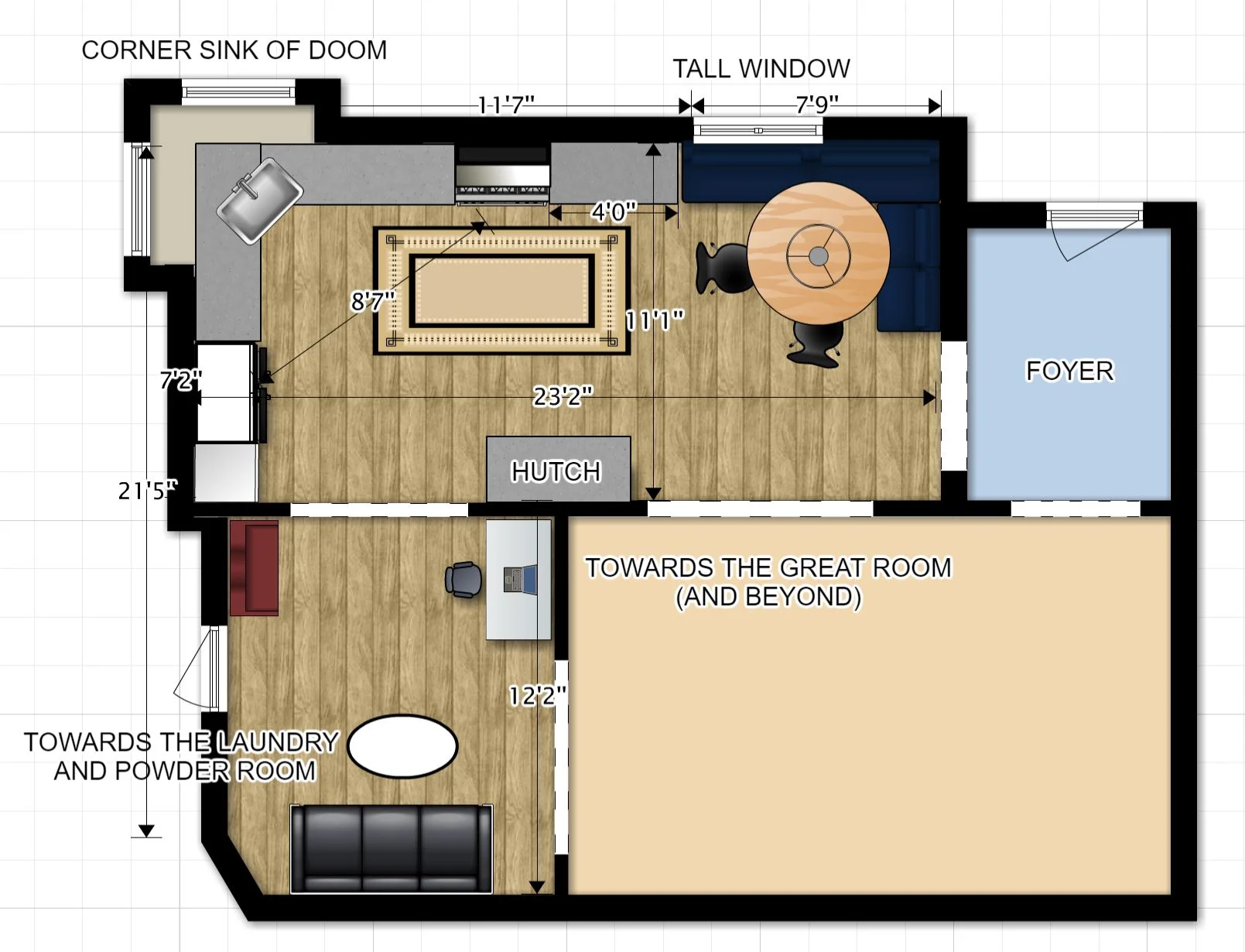
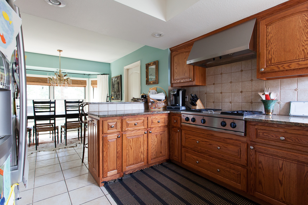
The wall between the old kitchen and teal room has been removed to create one large space. In case you are wondering, the long T-shaped wall holds our entire two story house up, so moving that intersection was not really an option. The corner sink of doom also unfortunately must stay. The wall between the old breakfast room and kitchen will be cased in to create a new study/kid zone. A new opening between the living room and old teal room will create an access point to the banquette area. And the opening from the foyer to the new eating area will... stay? Get smaller? Get closed in? Playing that decision by ear.
Fun fact: this room is much MUCH smaller than it looks. It was meant to be a formal dining room, but the previous owners staged it with a dining table wedged in catty corner... and it wasn't a big table.

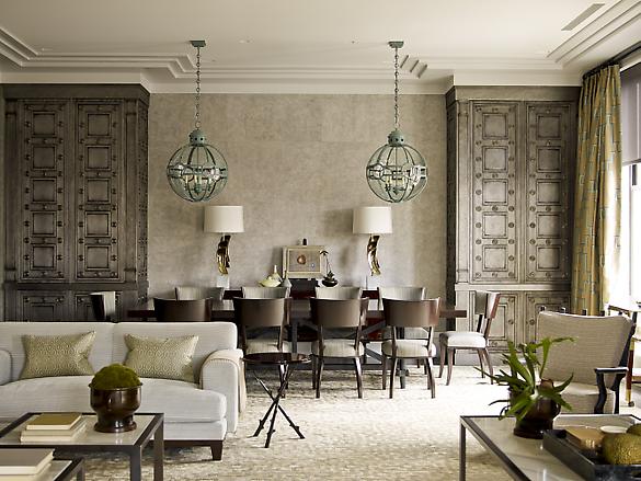
Bye, wall. PS, this crazy Victorian backdrop was built inside our great room, and it's so big it won't fit through any doorways. JOY.
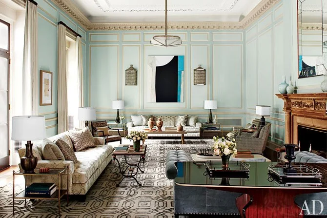
Now, I know what you're thinking: Erin, you might be the only person in America who won't have an island -- or two! An archipelago of islands, even! But what I want is space. And I was inspired by Rose Uniacke's kitchen to keep things as open as possible. I really want the luxury of volume.
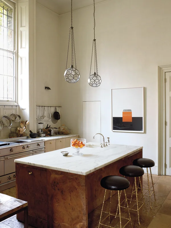
Here's the first iteration of her London kitchen. It's stunning, obviously. But then this happened:

And I think this is just so much more of what I want. Openness, sleek modern appliances that don't overwhelm my modest space, and a proper eat in area where people can face each other. It's a room that's also a kitchen. Too bad the ceilings are so low.
I am incredibly humbled to partner with some amazing vendors and craftspeople to make my dreams come true, including Fisher and Paykel. I do actually cook. A lot. Almost every night. So I nerdily searched every appliance known to humankind, because I needed an affordable integrated refrigerator and a super flush cooktop to pull off the cozy-space-you-just-happen-to-cook-in look. Fisher and Paykel makes both, including a 36x72 fully integrated fridge for under 4K, which is about half of what most companies charge. Plus these gorgeous gadgets actually have some juice under the hood.
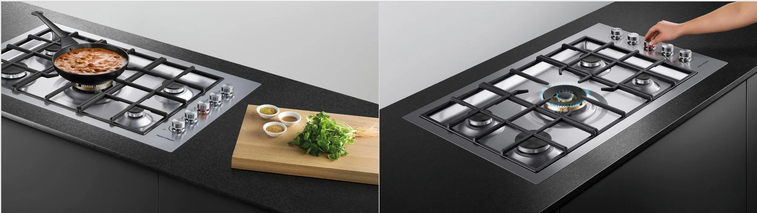
Slick! Also, I'm hungry.
I won't have acres of counters, but that's ok. We're building in a hutch opposite the range wall that will house all the microwave/toaster/blender/ipad/junque that our family collects.

That way, the counters I do have will be free and clear. And besides I have been prepping on a 4' peninsula for years and it was functional. Unfortunately the kitchen just felt super tight because of the narrow walkway between the peninsula and the old breakfast area.
Speaking of the former breakfast area, did I mention I'm also making that space over? I tackled it years ago on my One Room Challenge maiden voyage. It was better, but never truly useful in an architectural sense, and it was way too close to the powder room for civility. The current plan is to turn it into a cool kid zone with new floors, comfy seating, toy storage and a small desk for homework. Bonus plus plus, I'm going to fix that horrible interface with the soffit (there's a roof up in there) and case the opening.
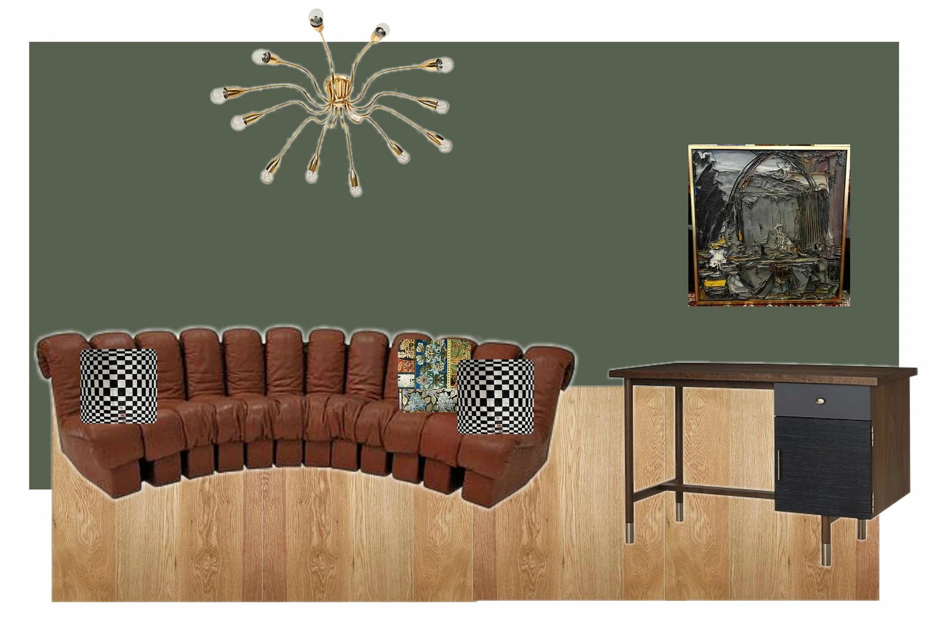
I have some wackadoodle ideas for this space that may or may not come to fruition. I am currently in possession of 80000 pieces of art plus three vintage sofa sets, and it may just take some time for this room to settle. I do know it's gonna be daaaarrrrk in here. This room adjoins a covered patio and it gets zero light, so I'm going to stop fighting it and go to the dark side. One good thing I got from painting over the teal room is some psychic space to go bolder elsewhere.
Ok, well. If you read this far into my novel you deserve a medal. But I have SO MUCH to tell you! So many things to finalize! Should I run a corner banquette in front of the tall window? Do I close the foyer opening so you can't see into the kitchen? Cabinet finish? Flooring????? Hood design?
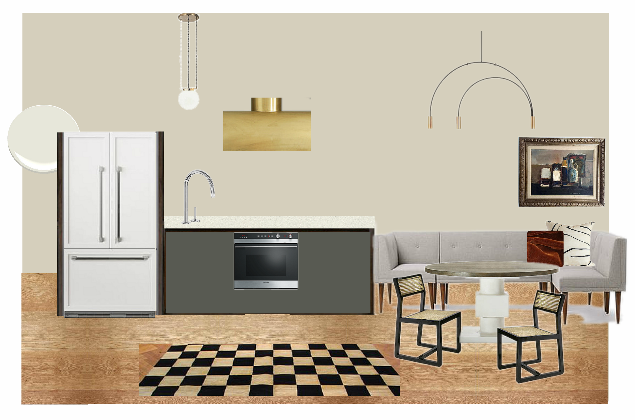
Here's my first iteration in the design process. It feels a little formulaic to me. I hope I can do better, and dang it I have always wanted nice (not orange striped) wood cabinets, but they just aren't playing well with the prefinished oak flooring I had planned to run into the kitchen. Something's gotta give. I'm talking to you, wood floors. I feel like this is my chance to do something different, and I'm not looking for a pinterest kitchen. But will I have the cojones to follow through?
Demo is well underway and there's an unforeseen pipe running in the wall that separated the old teal room from the living area. The future holds jackhammers, and that's not going to be cheap.
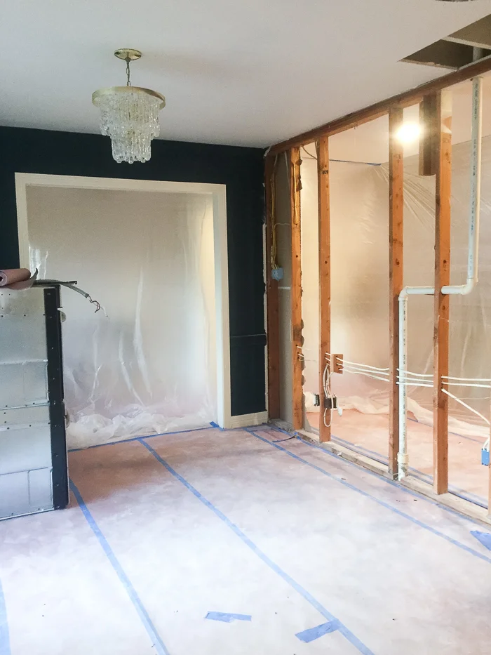
On the other hand, ding dong the wall is gone! And good riddance. Even if we screw everything else up, I know this was the right decision.
Send help and take out meals. See you next week, when I will really have to make some Sophie's Choice type decisions. I promise the next post won't be 10,000++ words. Follow along on my Instagram for updates, and don't forget to check in and see what the other fabulous designers have gotten themselves into!
Centsational Girl | Chris Loves Julia | Christine Dovey | Dwell With Dignity | The English Room
Glitter Guide | House of Brinson | House Updated | J+J Design Group | Lark & Linen | Abby Manchesky
Nesting Place | Old Brand New | Old Home Love | The Pink Pagoda | Rambling Renovators
Erica Reitman | Sketch 42 | Suburban B’s | Media Partner House Beautiful | TM by CIH