TOOLBOX: INTERIOR DESIGN BASICS

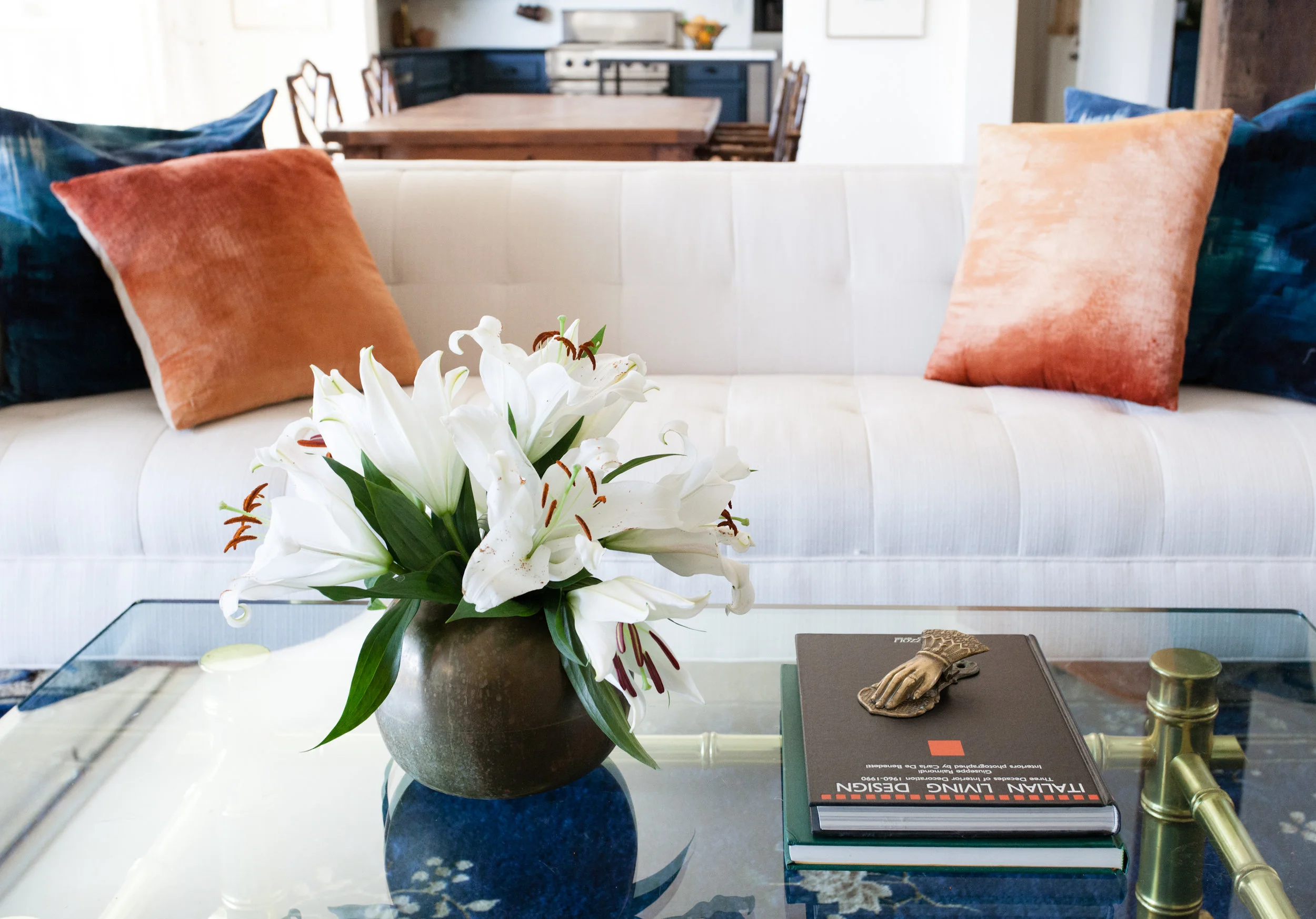
Have you ever wondered what it takes to do this crazy job? I mean, besides buckets of booze and patience? Today I'm going to give you the low down from the perspective of someone who has built a business from scratch, because sharing is caring. I started out as an artist and teacher, and slowly built a scaffolding of interior design knowledge and best practices through trial and error, meeting other design professionals, and most importantly busting my ass for nearly a decade. Here are a few shortcuts and hacks I can't live without. 

1) Olioboard

There are a lot of design programs out there and this one isn't perfect, but it allows me to to build a virtual finish board that is linked to every product, and I have thousands of products in my "warehouse." This is typically my first step in seeing things together before I order 8000 samples to look at in person. As the job evolves, I update the board to reflect current process.

erin williamson design

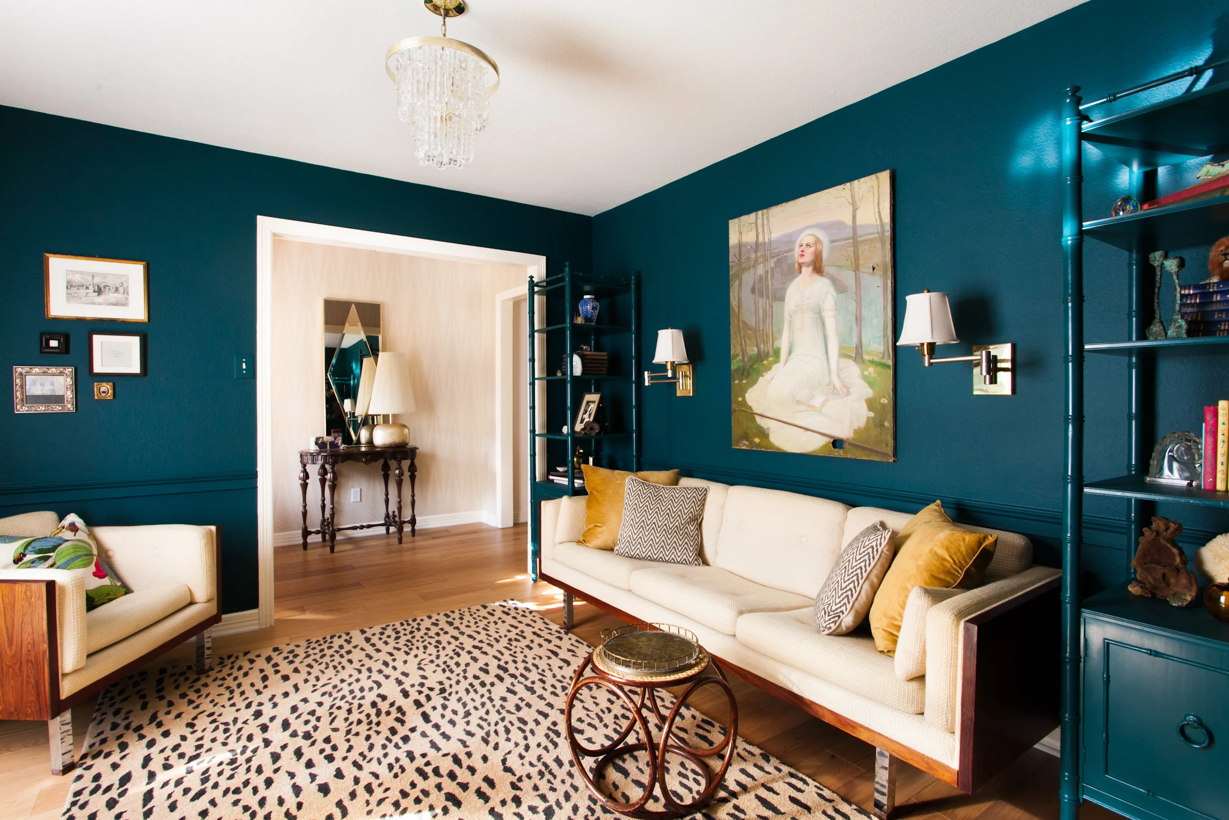
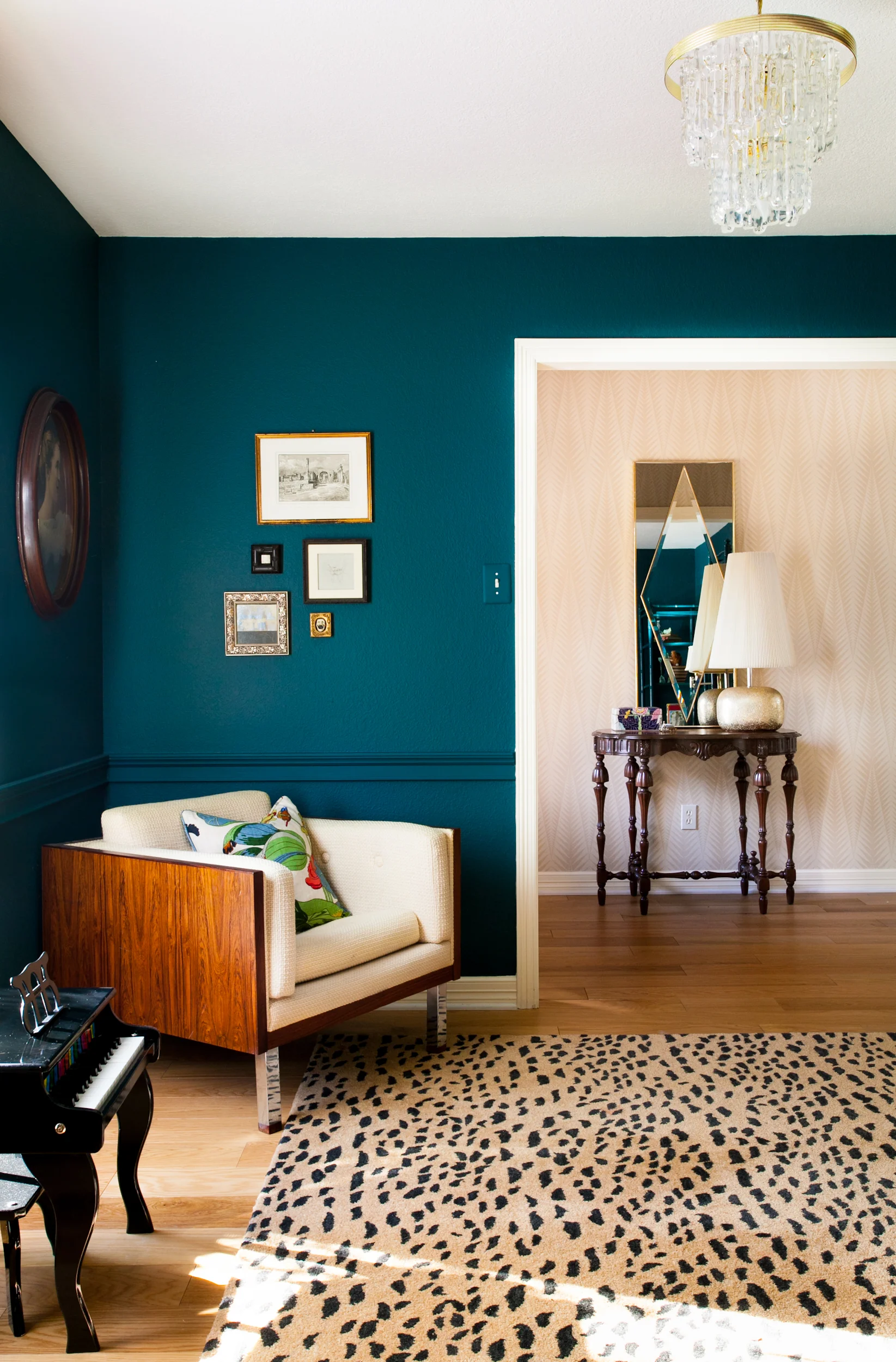
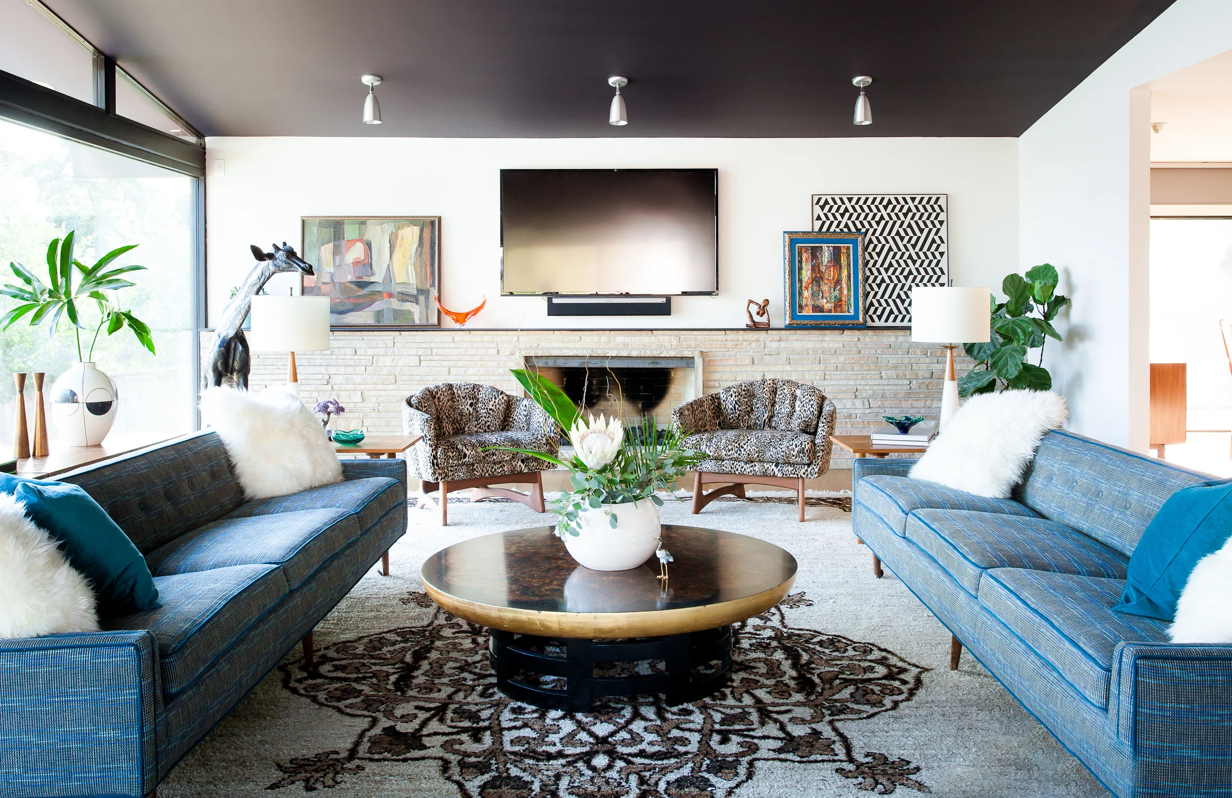
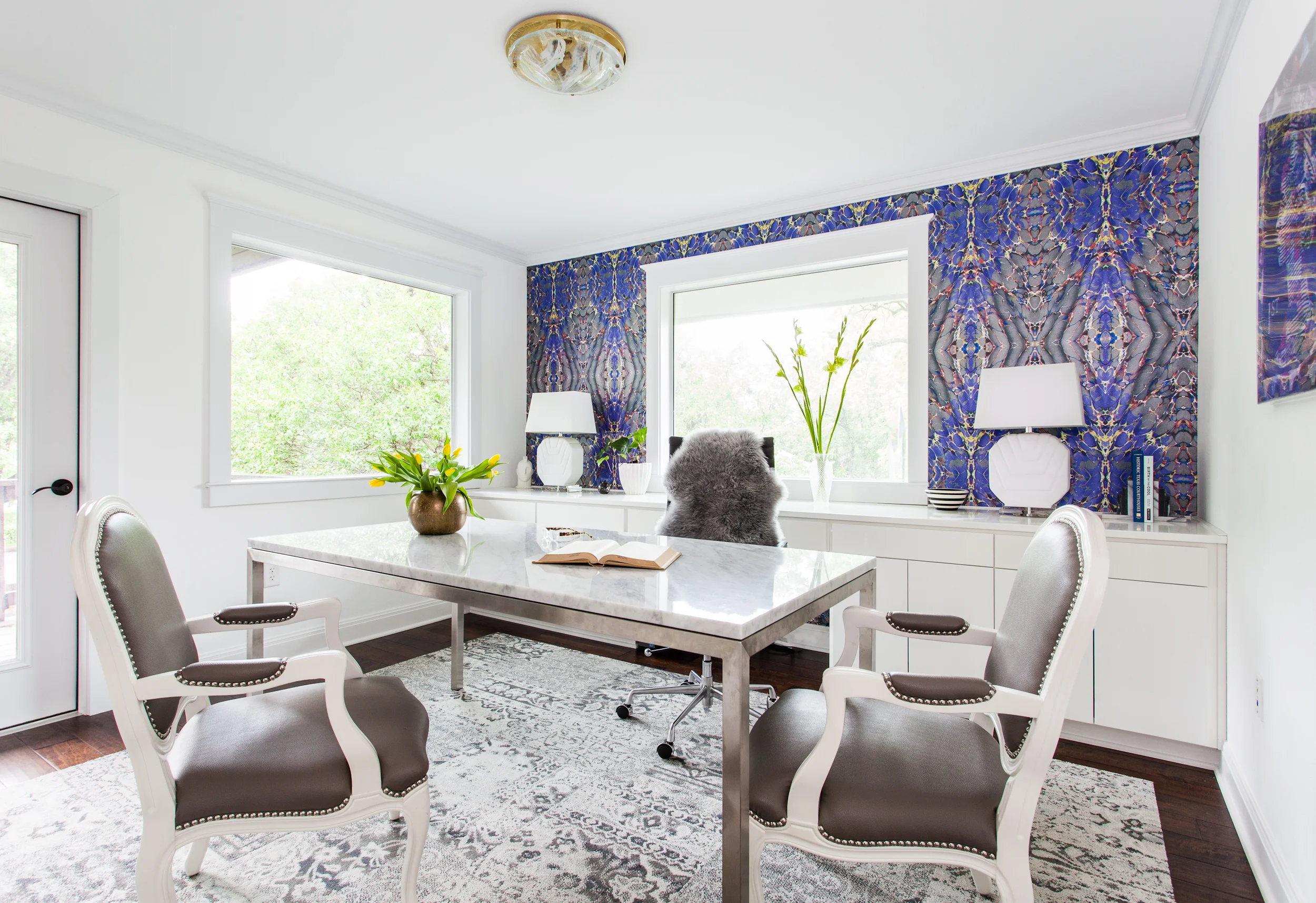
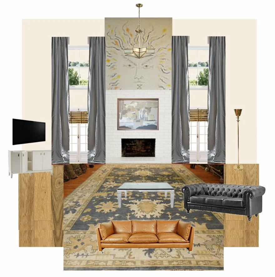
Here's a snapshot of how we arrived at the final living room design for our Mid Century project.

erin williamson design

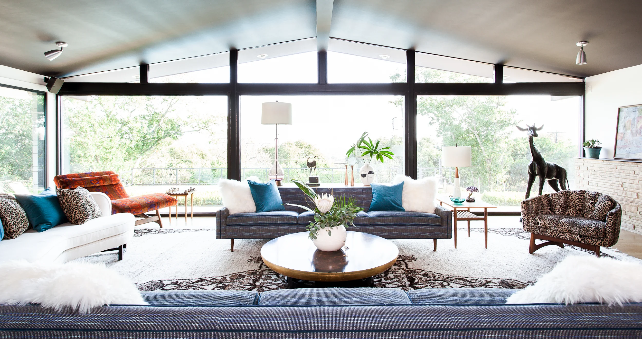
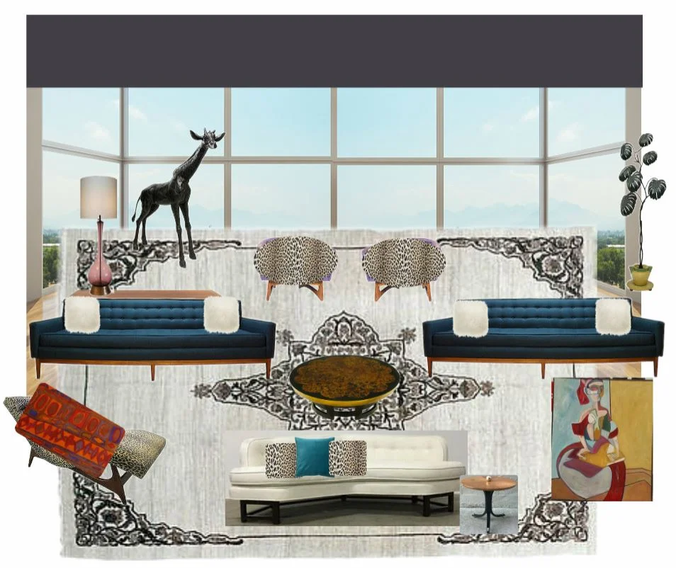
And the fully realized plan. Ta da! 

2) Floorplanner

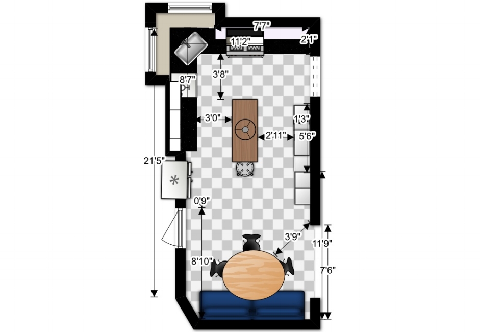
Once again, this is not a flawless program. In fact, I have spent many a day shaking my fist at the sky in agony. But if you are not a computer wizard and you just want a simple floorplan, this will do the trick. Also it will scale imported images of cad plans, which is SUPER HELPFUL. I typically use this to create a preliminary plan before our talented project manager Lindsay renders more complicated spaces in the dreaded Sketch Up (she's amazing at it, I despise it) or we have cad documents made.

first-designcopycopycopy.jpg

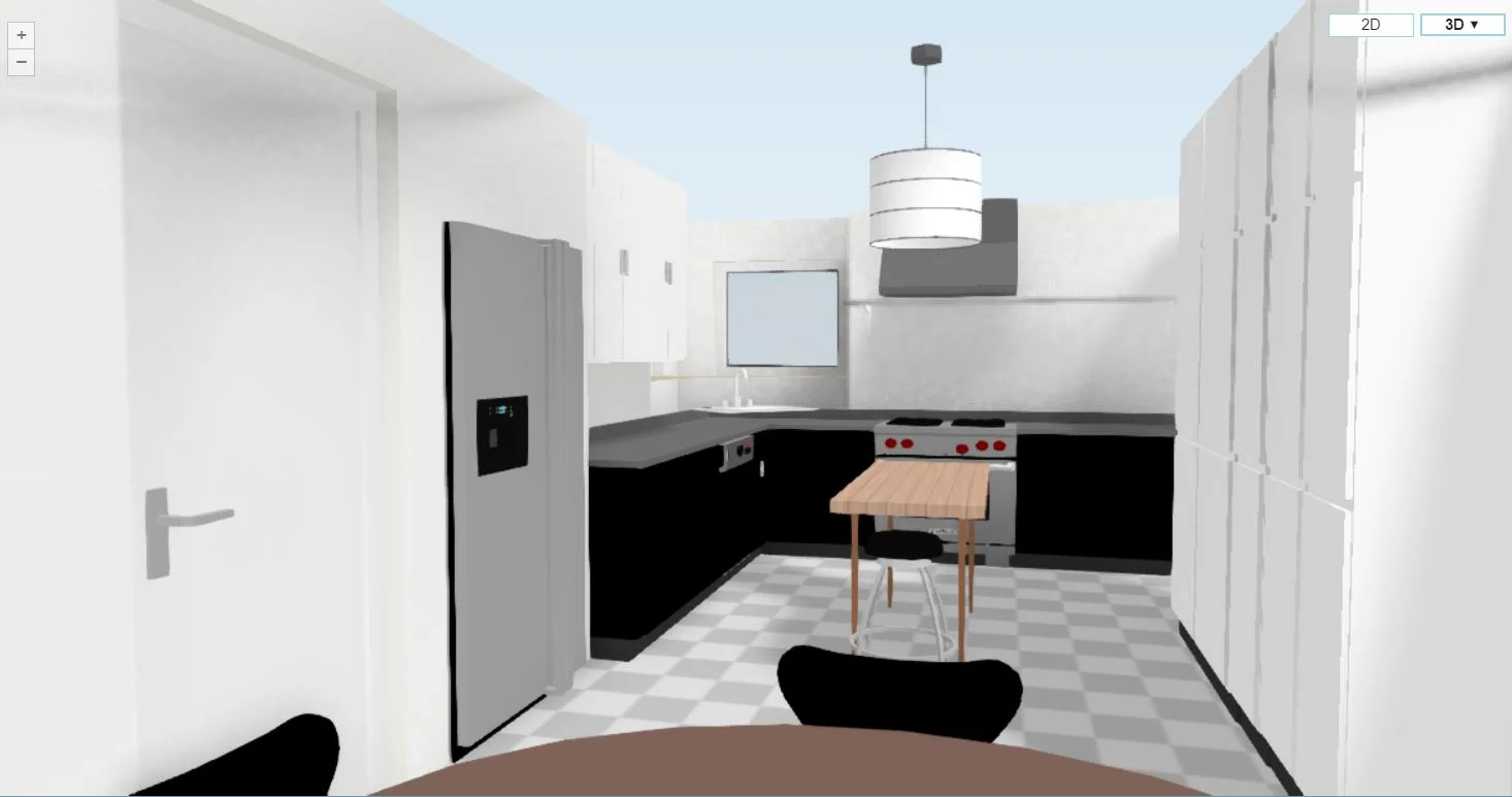
It will also create basic 3D renderings of the space, like my kitchen that I have been threatening to remodel for the last three years but can't find the time to actually blow into smithereens via sledgehammer.

erin williamson

For comparison, here is a sketch up drawing from a job in progress:

erin williamson design

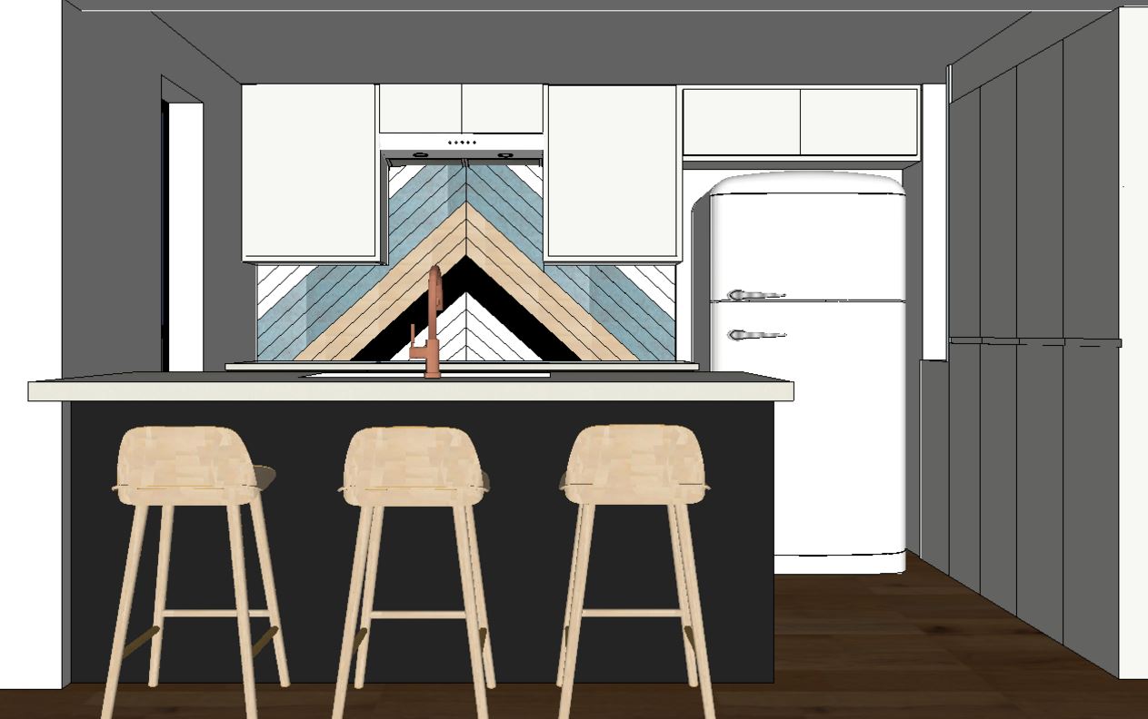
Sketch up is much more flexible in terms of materials you can apply and granularity of component sizes. If you're a smarty pants computer savant, start there. Otherwise join me at the Floorplanner meet up (should we start a support group???)

3) Farrow and Ball Color Card

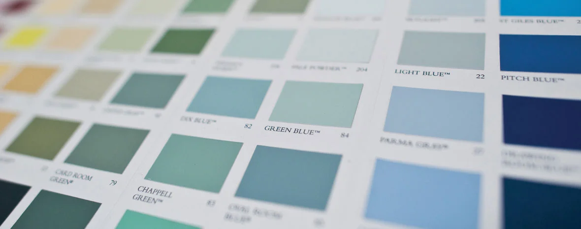
I feel naked without this handy compact card. We have suit cases upon binder files of color charts and giant swatch decks from every paint brand, but I bring this with me to every job site. It helps me narrow down initial color options quickly and efficiently, then I refine my choices with either large FB swatches or Benjamin Moore full size swatches. The other set that lives in my bag is the very tidy Benjamin Moore whites deck. 

farrow and ball

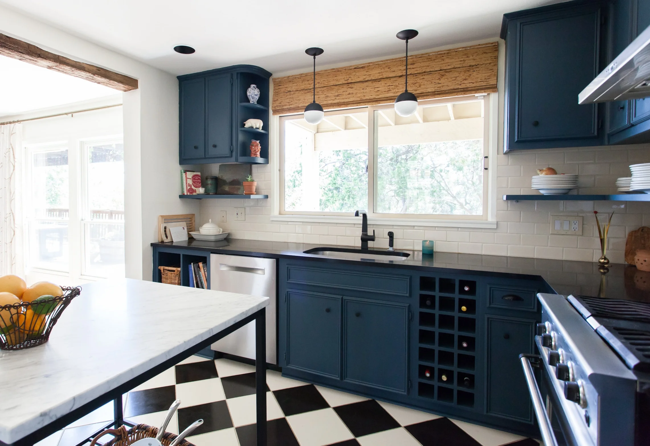
Farrow and Ball Hague Blue and Pointing, from a recently completed project I will be shooting soon:

erin williamson design

4) Math

Who knew that high school calculus would come in handy? KIDDING. Except for tipsy party tricks, it totally didn't. But I use simple math all day every day. There are lots of "rules" related to standard dimensions like seating space, walkway allowances, chandelier size, curtain height, etc., and by now I have 100s of them memorized. Also I can divide and multiply by 12 and 2.54 like nobody's business.

house beautiful secrets

I prefer a clearance of about 18" between coffee tables and sofas, but it's good to know the minimums. That House Beautiful slide show is chock full of great tips and measurements. 

erin williamson design

Design often comes down to scale, and proper proportions and ergonomics are critical to the success of an architectural space.

5) Ikea

erin-williamson-design-1.jpg

If I had a nickel for every email I received asking about the vanity from our Travis Heights project, I would be filthy rich. Ironically it's probably the least expensive thing in the room -- Ikea's Godmorgon wall hung vanity. But the drawer fronts are outfitted with SemiHandmade's walnut drawer fronts and it takes things from big box level to custom on a dime. 

6) Ebay

I should be the Ebay brand ambassador. I have had an account since 1999. I also just bought two yards of Clarence House's discontinued Velours Klee and I'm high on picker fumes.

nick olsen

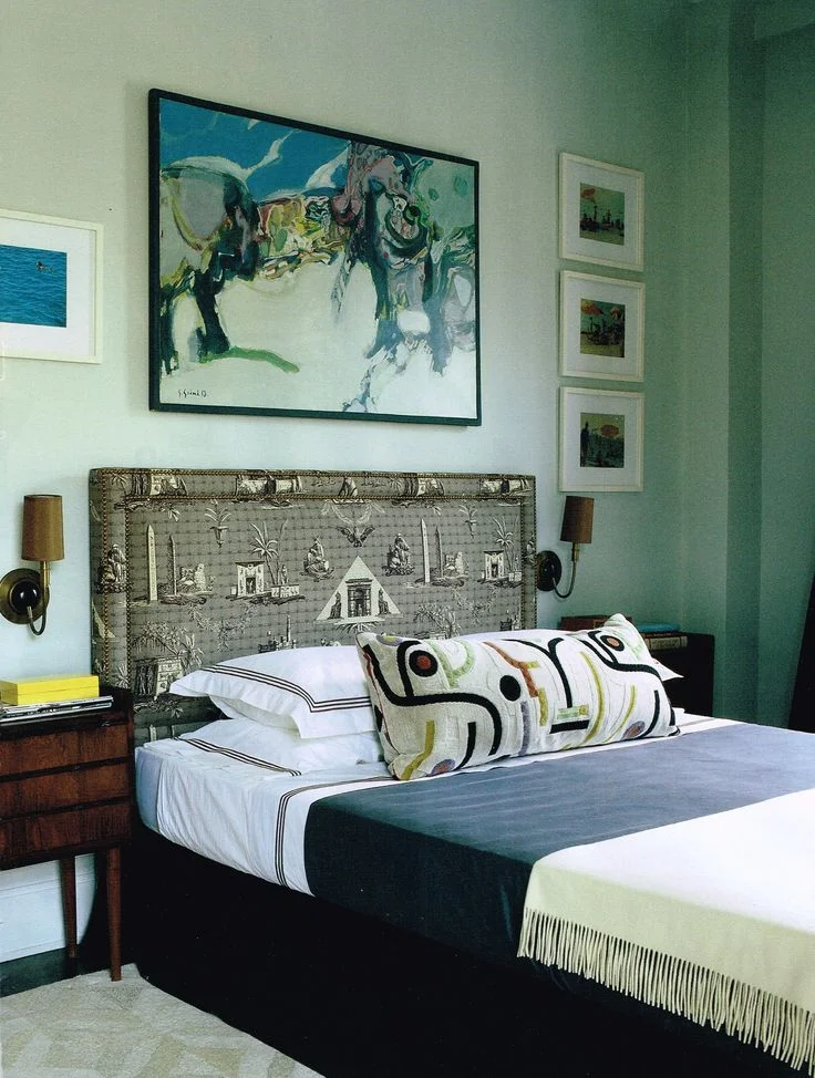
I have been hunting for this pillow fabric, seen in Nick Olsen's dreamily designed bedroom, for THREE YEARS. And thanks to Ebay I found it.

erin williamson design

And remember when I bought this giant Victorian photo backdrop off Ebay at 4am?

Some things will never change. I use Chairish, Dibs and Etsy too, but Ebay will always be my first love. 

There's definitely more to the job than a few computer programs and swatch books.  On the other hand, it's not magic. It's a ton of hard work and math checking and tire kicking and spreadsheeting and vendor quoting and waaaaay too many hours looking for unique stuff until your eyes melt down into a puddle of ooze. It's also being open to the goodness when it happens.

If you're in the biz, thinking about getting into the biz, or just like all things design related, I hope this was helpful. And if you're in Austin (or Switzerland... or Maui) and need professional services you can always contact us HERE.

HOT TO: STAGING A ROOM FOR PHOTOGRAPHS

Lists are lazy, but it's Monday morning and I have a real job now.  Gone are the days when I could write novellas about redecorating David Bowie's Labyrinth. I may be busy making other people's spaces look pretty, but I still have a few tricks I can share to help your spaces look better too.  On the internet. Where it counts.

Let's do this.

1) Back up -- with your camera.

Vignettes (tight shots/detail shots) are easy to photograph because they don't require control over the entire room, but often there is not enough visual information to have narrative or emotional value. 

erin williamson design

Magazine editors generally want an overview shot that shows most of the room and establishes a full setting to reference when they tell their story of the space.

erin williamson design

And pinterest loves a classic vertical shot that shows about 1/3 of the room, highlighting its most iconic features.

2) Build the space to suit the image.

erin williamson design

No matter how beautifully decorated the room, you need to move things around to showcase your focal point. This goes beyond adding pillows and flowers. I mean you have to muscle some furniture around so that it shows best in the image, not in real life. These chairs are completely out of plane if viewed straight on, but when viewed from at an angle they appear to be casually placed and everything leads toward the top third of the image.

Which brings me to the next tip:

3) Don't shoot directly into the back of furniture.

erin williamson design

This is huge, and occasionally you have to break this rule. But it's best to never shoot straight into the backs of furniture unless you have some super sexy back action happening. Allow your viewers to find an entry point into the frame by either standing to the side and shooting through the furniture arrangement, or moving chairs so that they are angled and do not block the field of view. 

4) Landscape the room with varying heights.

erin williamson design

You are basically constructing an architectural set, and if everything is at the same height the resulting image will read as Snoozeville USA. Make it dynamic by staggering heights of art, drapery, plants, furnishings, etc. across the room. Sometimes a change in camera angle will do the trick.

5) Get lower.

erin williamson design

Too much ceiling can kill a picture, plus don't you want to show off your swanky rug? Get used to squatting. Back up, use a wide angle lens, make sure you get enough of the floor, and then crop in when you edit the photos. Shooting to crop is not really best practice, but it's often a necessary evil unless you have a fancy perspective control lens. I don't.

6) Bookend your image.

erin williamson design

The eye travels, which is great as long as it's travelling inside your image. If you have lots of white space (like windows) at the edges of the frame, chances are eyeballs will keep on travelling... outside the frame. Try to edge the image with something slightly darker to keep the field of vision contained. It's like building a vignette around the frame, but better than using a cheesy filter. Oh, and if you have directional decor at the edge of the frame, position it so that it points inward.

7) Control your light. 

erin williamson design

For a while it was kind of in vogue to shoot with lamps on. Just don't do it. Shooting a light source is difficult and often doesn't read well. And sometimes when you are shooting into a window, it's ok to close the curtains. In fact, you can use them to filter and direct the light.

8) Flip pillows around so you don't shoot into blank fabric.

Stone Textile Design

Hide that plain white canvas you used on the backs of your $200/yd pillow fronts. If you are shooting a sofa or chair from an angle and the pillow back is showing, flip that sucker over. It will be our secret. (Design by the fabulous Stone Textile, from a shoot I did last year).

9) Clean up the clutter.

erin williamson design

Stuff multiplies X1000 under the microscopic glare of the camera. Do yourself and your viewers a favor by limiting accessories to only things that seem purposeful. 

10) Make the vignettes you shoot count.

erin williamson design

I don't shoot a lot of detail images, because frankly I think they are kind of boring and unlikely to be circulated -- for interior designers, anyway. So when I go in for a detail shot, I try to highlight something that might get lost in the bigger picture, like the pattern play between this upholstery fabric and rug.

And that, my friends, is it. We may not be solving all of the world's problems here, but it is important to show your hard work in the best light possible. Like, literally. So bust out your cameras and tripods and make that magic happen.

Please drop me a comment and let me know if this helps!

[All design work by Erin Williamson Design except image #8, all photographs by Erin Williamson ]

JEAN COCTEAU IS HOT, MY FIREPLACE IS NOT

My desk faces this wall, so I spend a lot of time staring at the abomination that is our fireplace.

erin williamson design

Ok, maybe it's not that bad. But if your job is designing interiors maybe it is. When we bought our house, I knew it would be a problem... who built this travesty? Did they just throw a dart at the wall and decide gosh golly it would be the perfect height for a fireplace? Somewhere in no man's land, a brick ledge is gathering dust and lizard tails. Plus it used to be a putrid shade of rusty brick topped by a mantel just this side of nuclear orange oak. Let no one say improvements have not been made, but still... over it.

Did you notice the vents that I carefully, obnoxiously disguised with plants? I hope not. 

In the immortal words of Ice Cube, I want to tear this mother up (that is not exactly what he said) but the firebox... Removing it would, frankly, suck. So I have considered removing some bricks or possibly adding them instead. This is doable, right?

tall fireplace | design crisis

Because the megalomanic in me is ready to build the tower of babel part deux.

fireplaces | design crisis

Or I could mayhaps go a bit more subtle. Because I am a very subtle person.

Who am I kidding? At the rate of current renovation around here (please see our master bath, sporting a lovely shade somewhere between pea and bile green), construction is years away.

In the meantime, wouldn't it be awesome if this happened?

jean cocteau |madeleine castaing

Jean Cocteau's home decorated by Madeleine Castaing has been on my radar for years... it's so inspiring. Don't like your architecture? Draw it in!

Speaking of Cocteau, I am obsessed. Did you see my scarf?

erin williamson | jean cocteau

Do you like my picture? Was I a) being arty for instagram or b) disguising pajamas and unbrushed hair? I don't want to ruin the image of my perfect life for you, so let's go with a.

Hey, did you know that Roche Bobois has a super line of embroidered Cocteau pillows?

jean cocteau roche bobois | design crisis

And I'm watching this Cocteau lith on ebay:

jean cocteau | design crisis

And I'm even following this tattoo guy David Scheisser on instagram because his work reminds me of Cocteau. Obviously line drawing is the next Twombly/Kelly Wearstler Channels/abstraction craze. Turns out David likes to draw on walls too.

david schiesser | design crisis

I feel like we've come full circle here. I should just draw on my walls. Or you know, have someone else do it.

eirn williamson design

What do we think? Crazy awesome, or crazy going to scar my children for life?

It could be cool. Think about it.