The Wow Factor

It's takes a lot to wow me on a morning when I'm coughing up a lung and still haven't had any coffee, even though it's almost 9am. Still, it can be done. But let us not mince words. Let us instead look upon some rooms that have the wow factor I found a little lacking in my mockup of Ike's room. And let us not make comparisons between me and Simon Cowell. I would hate to think that this blog is devolving into the American Idol of interior decor... or maybe that would be awesome? America -- you be the judge!

So what can we ascertain about the wow factor from these pictures?

#1. It looks expensive, because it often (but not necessarily) is.

#2. Scale is an issue -- bigger is better in terms of creating a focal point.

#3. It could be paint, wallpaper, lighting, textiles, a giant head shaped sofa, you know -- whatever. But it's the hook that compels you to look at the rest of the room.

Now my background is in art, not interior design, so someone will probably come along and tell me what an ignorant douche I am.

No biggie.

But I would like to know what your favorite means for creating a visual hook is.

Tell mama.

[too sick and lazy to link -- go to my pinterest for sources]

Mockup Madness: Ike's New Room

Thanks again for indulging all my hemming and hawing about the office. I think I've fully vetted the possibilities and have a pretty good idea of what to do for Plan A and Plan B. I've also come to the scary realization that we need to get some doors on that room or it's not going to matter how pretty it looks -- it won't be functional for an office. So decor for "the office" is tabled for the time being until we solve that problem, and I'm moving on to one of the many other rooms that need attention before baby gets here: Ike's room.

If you don't recall, here's what his room in the old house looked like:

Now for this room I really wanted to give him something different, but I also want to reuse as many things as humanly possible. I have so much stuff to buy for this house that I need to make SOMETHING easy on myself (ha! as if). So, without further ado:

erin willamson designs

Hmmmm, yeah. Maybe not that different. Let's discuss the room itself. It's long and narrow and has zero architectural interest -- not even the pair of large windows the other room had. The one small window faces west, so it's dark during the day and then gets a burst of sun in the evening. There's no way a light color would work in here, so Sanders helped me pick Deep Secret, a kind of gray/navy that I think will look nice with the sisal carpet and also have some kid appeal (I foresee some hubble telescope posters in here someday soon... Ike is obsessed with space).

I don't love the white furniture, but I tried very hard to use what I already had, and Ike still sleeps in his crib... IT'S A MIRACLE. Like, he climbs in himself, but we have convinced him that climbing out is dangerous. It's kind of hilarious. Anyway, when we he outgrows it I'll get a cute antique twin bed and paint the white table set, or more likely just pass it on to #2.

So the only things here that need purchasing are the curtains, light fixture (hot air balloon fixture is going in baby's room), a colorful basket, and that leopard stool -- which is only $1400. Just kidding, suckers! I'm going to paint the old ottoman and add a cute cushion. Donezo.

I think the basics are here, but it's missing the wow factor. Does it need wackier pillows and bedding? Or maybe I have a big piece of art I forgot about... Or perhaps I should spend $400 on a roll of this wallpaper and frame a few panels:

But $400/roll?!... I'm thinking no.

Ok, enough of what I think. What do you think?

State of the Office Address

I'm a jacked up nightmare of snot, plus Ike is home for the "holiday" today (seriously?! Jesus is already risen -- back to work, teachers!) so I'm not sure how witty and entertaining I can be this morning. However, I really wanted to say thank you for your comments regarding my shelving dilemma. I read each and every one, and thought very deep thoughts about them. Here's what I came up with:

#1. I think the tan leather couch would look better in here, but I did some measurements, ran some calculations, assessed the wind speed, etc, and Alexis the hot uncomfortable couch just won't work in our family room. It's way too low. So for now, tan couch stays where it is, and someday (hopefully maybe this year) when we replace it with something bigger and sexier, tan couch can move into here and I will pimp out Alexis on craigslist.

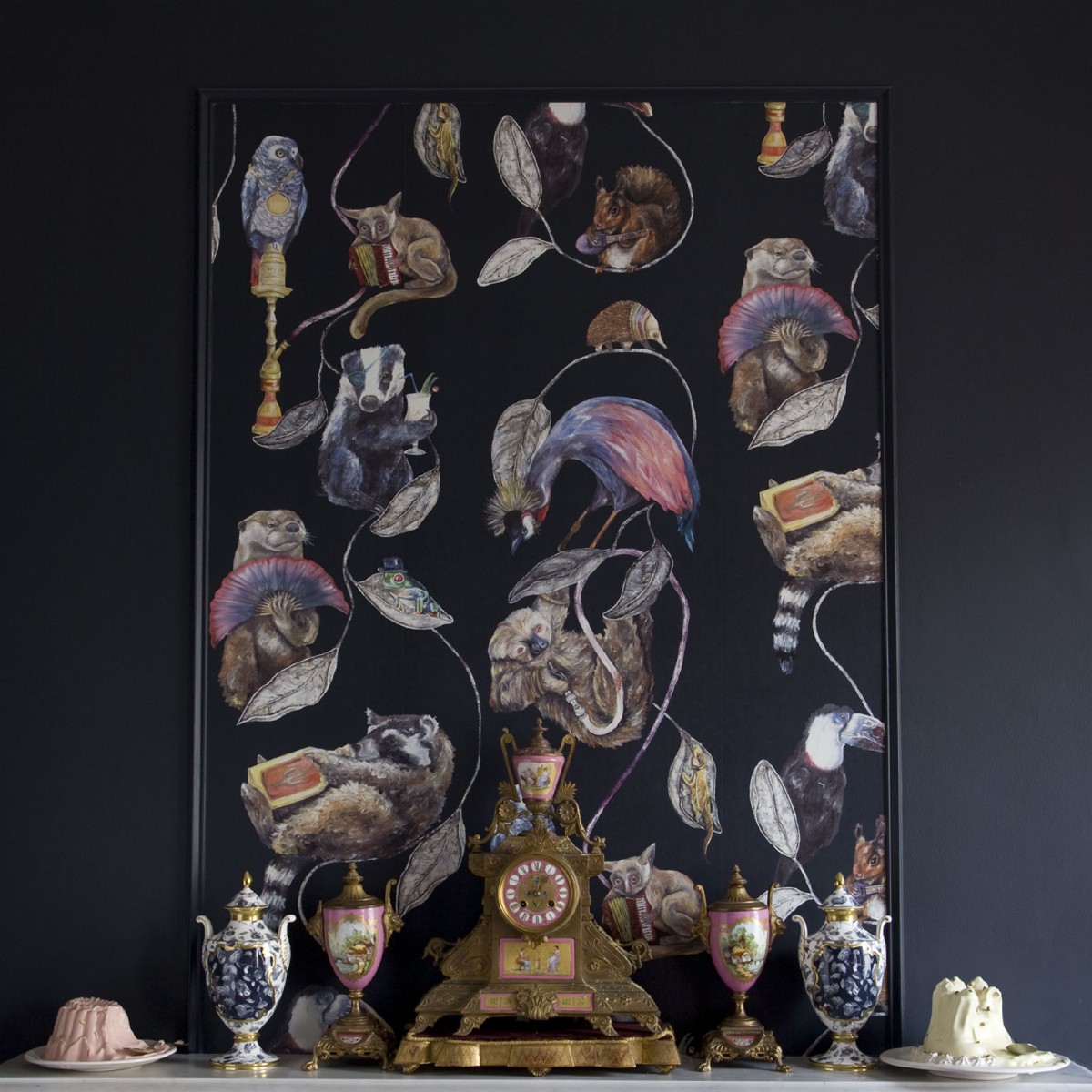
#2. I decided the painting wasn't working in here. I love it on dark colored backgrounds, but you were right when you said something horizontal would look better. But how about something round? Cuz that's what I came up with.

#3. For now I plan to go with gloss wall color for the shelves IF they stay on that wall... I'm still a bit undecided here. I think we may need to address the door situation first and see if the shelves intrude on the walkway. If the shelves don't go there, they can go on the opposite wall -- just as soon as I figure out what to do with the thousand pound limed oak hutch currently holding court on that wall.

#4. Exit coffee table, enter rug.

#5. I realized all I want in the world is for the office to look something like this room by Amy Howard (minus the wtf roses):

Mmmm mmmm delicious. I love the dark, low contrast wall paired with light sofa and peachy pink pillows/rug.

erin williamson

So here's my mockup, designed to head in that direction. I painted one shelf charcoal and the other wall color... I think wall color wins. I replaced the lady painting with a large round brass tray I already had (how to hang this behemoth?!), flanked by some small vintage lithos. Don't hate my peachy salmon pillows because they're beautiful. I already own the vintage malayer rug, but it's redder in real life and I fear it may overpower the space...

erin williamson

 Plan B

I think this may be better -- more masculine. The rug is definitely lower contrast in real life, so I think it will blend with the floor rather than chopping up the tiny space. And you'll just have to imagine that both shelves are wall color. Don't worry -- my paint job will look better than that in real life. I HOPE.

Just to mix myself up a bit, I tried painting the shelves green since I like the teal/jade/coral color combo, a la Kelly Wearstler:

My version:

erin williamson

I got lazy with the photoshop... sorry. So, the green isn't quite right, but it doesn't really matter because the wall color isn't accurate either (it's darker and greener in real life). I don't care for this much color on this wall, but I think muted jade shelves might look nice on the opposing wall, flanking the window with a neutral desk setup in front.

So maybe that is Plan B.

And that's what's happening with the office -- largely lots of photoshopping, head scratching, and fondling of paint chips.

Speaking of paint, I got a zillion samples from Sanders this weekend. We painted an attic closet that Matt enclosed for us, and I also started the process of selecting a whole house color palette that includes every bedroom plus wallpaper. So you know... I'm not overwhelmed or busy or anything.

Don't worry -- you'll be hearing much much more about this business later.

T minus 17 weeks until my due date...

!!!SHITBALLS!!!