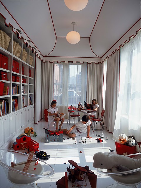
It's takes a lot to wow me on a morning when I'm coughing up a lung and still haven't had any coffee, even though it's almost 9am. Still, it can be done. But let us not mince words. Let us instead look upon some rooms that have the wow factor I found a little lacking in my mockup of Ike's room. And let us not make comparisons between me and Simon Cowell. I would hate to think that this blog is devolving into the American Idol of interior decor... or maybe that would be awesome? America -- you be the judge!


So what can we ascertain about the wow factor from these pictures?
#1. It looks expensive, because it often (but not necessarily) is.
#2. Scale is an issue -- bigger is better in terms of creating a focal point.
#3. It could be paint, wallpaper, lighting, textiles, a giant head shaped sofa, you know -- whatever. But it's the hook that compels you to look at the rest of the room.
Now my background is in art, not interior design, so someone will probably come along and tell me what an ignorant douche I am.
No biggie.
But I would like to know what your favorite means for creating a visual hook is.
Tell mama.
[too sick and lazy to link -- go to my pinterest for sources]