The Doors of Perception

When I was 16, I had this obsession with what my mother's life at my age was like. It would have been 1969, and I imagined her running wild and free on the beaches of California, hanging with hot surfer dudes and smoking the reefer (Legal Disclaimer: I have absolutely no first hand knowledge of said activities). Sifting through various old photos showed me that Mom was stunning, with long, straight 60's blond hair and big Twiggy eyes, and the kind of figure that a 16 year old late bloomer could only dream about. So between the hot dudes, reefer, and hot mom, it was easy to envision this super glamorous, ultra hip, swinging lifestyle set to the music and crazed colors and all of the happenings of the sixties. Sadly, my obsession materialized as a suede fringed vest, ankle breaker clogs, oddly braided hair, and a predilection for The Beach Boys and Jefferson Airplane. Yes, something was missing in translation. Although my tastes have (mostly) matured over the years, there will always be this part of me that yearns to turn my house into an all out psychedelic den of mindblowing prints, patterns and colors. Because I'm too old to do drugs, people. But I still like The Beach Boys.
m interiors

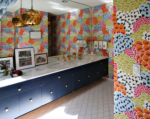
I wouldn't normally kick off a tour of my teenage dream pad with a bathroom picture, but the folks at M Interiors know something about mixing business with pleasure. The all-overness is killing me (in a good way), and I desperately need that swag light. STAT!

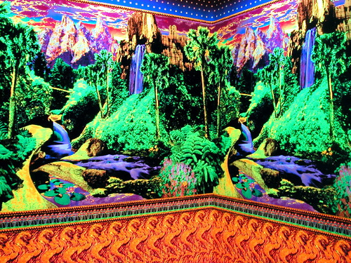
In the powder room, I will be featuring this wallpaper by artiste Virgil Marti:
virgil marti

Yes, that is fluorescent ink printed on black rayon flock. Hot damn, I love that wallpaper. Add some NyQuil, and you've got yourself an experience. Oh, and the blacklights would be sure to highlight any hygiene indiscretions.

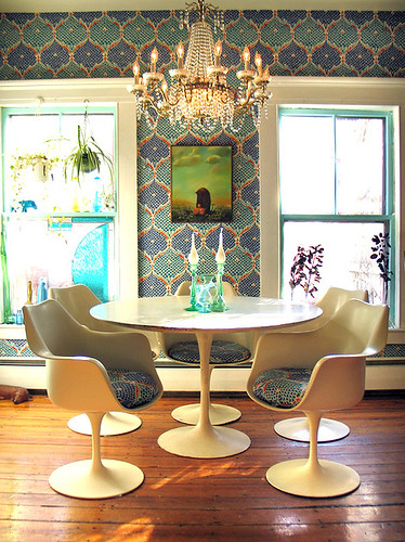
Now that your hands are clean, you can come eat. The dining area would go a little something like this:
wary meyers

Wary Meyers, scroungy heroes of hip brokesters everywhere, starched vintage fabric onto the walls and used the leftovers to upholster matching cushions for their tulip chairs. Genius on the cheap.

The hallway leading from my fantasy dining area to the fantasy living quarters would be swathed in a trippy pattern from floor to ceiling, like this crazy tunnel of love from Domino:
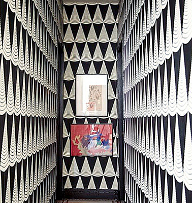
psychedelic tunnel

Temo Callahan (whoever you are), the rest of your batshite insane pad makes me claustrophobic, but this is an epic Willy Wonkaesque masterpiece.

The living room will feature a ton of funky fabrics and patterns, of course:
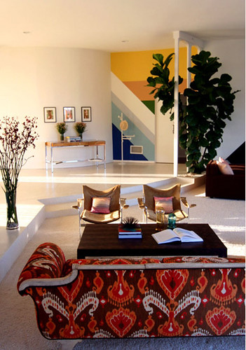
m interiors

M Interiors seem to be masters of mind reading, because I love this classic empire sofa recovered in a wackadoo print. Keeping the pieces vintage but recovering with fresh fabric prevents fauxchedelic syndrome:
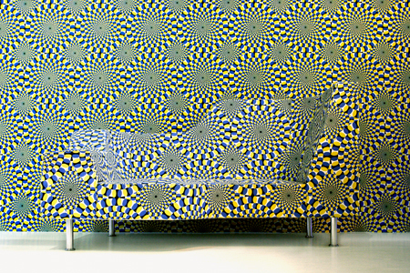
crazy couch

Woof. No amount of NyQuil can make that palatable. The chrome legs, especially, make my eyes bleed. Even though this is a designer piece presented in Milan, I just know that's a cheap Sofamart couch with a nylon slipcover stretched over the foam. And that is wrong.

Must get back to my happy place, pronto!
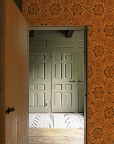
minh

Aaaahhhh... that's better. This picture by super photographer Ngoc Minh Ngo demonstrates the softer side of psychedelia. Of course, in my crazy fantasy pad, I would have to spice things up a bit. We'll be needing some art:

andy gilmore

My real life pad may have to borrow these Andy Gilmore pieces from the fantasy pad. Because they're AMAZING. And homeboy has an Etsy shop. Yes he does.

andy gilmore

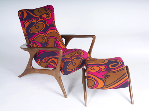
I'll definitely need a special chair to sit in and concentrate on Gilmore's goodness...
jack larsen

This groovy chair upholstered in rad Jack Lenor Larsen fabric ought to do the trick. That dude had vision. Like the kind that comes from peyote.

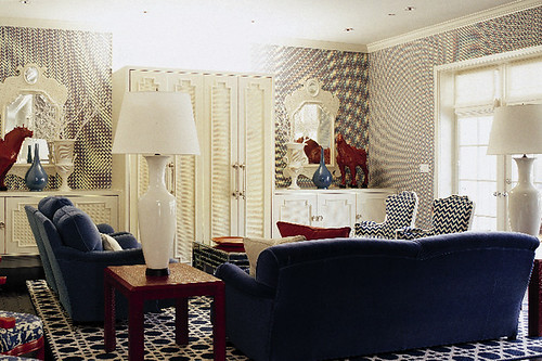
Or, I could always keep the furnishings lean and go the psychedelic wallpaper route, a la Kelly Wearstler:
kelly wearstler

Whoa. Who needs a tv when you could just watch the wallpaper dance?

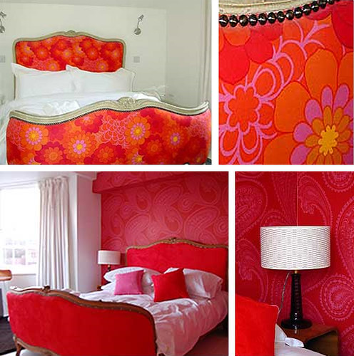
After all that dancing, I may need to chillax in my super restful bedroom:
miller on mansfield

Sorry about the terrible pictures, but I just had to show UK hotel, The Miller of Mansfield, getting its groove on. Bed In, anyone? I will be co opting that top headboard for the fantasy pad, thank you.

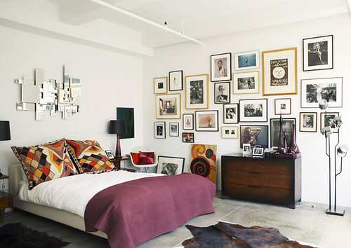
Perhaps I'll go a bit more minimal in the guest bedroom.
minh

I love everything about this bedroom from Ngoc Minh Ngo's portfolio for my real life pad, including the fab psychedelic pillows. For my teenage dream home, though, I think we'll need a wee bit more drama.
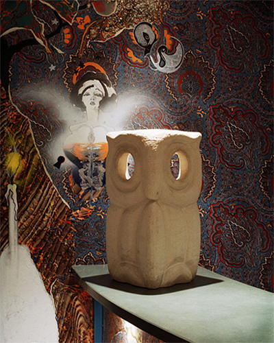
suzy hoodless

Let's see -- this crazy wallpaper in a Suzy Hoodless designed hospital seems to be about the right color scheme... and who doesn't want a giant creepy owl hooting at them in the middle of the night? Whooo? Whooo?

Phew, I'm tired after a long and stimulating day of looking. I may need to sit in my little nook papered with this chill Ferm pattern:
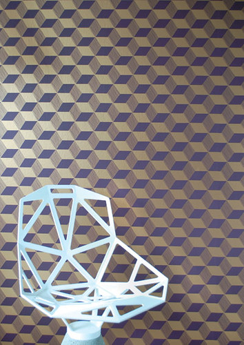
ferm

The chair is staying, fo shiz. I will need it to sit and meditate on how the future is going to be so much brighter since we will soon be out from under the thumb of oppression, and we won't need to protest the war anymore, or rebel against narrow minded conservative zealots. Unless you live in California. Or Florida. I guess there's always a need for more flower power.
Mural Mural on the Wall

Matt and I are finally going to break ground on our bedroom this weekend, which has me frantically sifting through my magazines and bookmarks fueling up with last minute inspiration.  While I am dying for a large-scale piece of original art, my bank account looks at me with a big frown and says:  yeah right. Thank god I have a projector that hooks up to my computer.  With this fancy device and my two-can-of-paint-budget, I can easily knockoff duplicate almost any one-color wall mural.  A few of the following are vying for my attention:

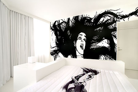
Room 206, Hotel Fox, by WK Interact

This beauty has been siren-songing my name for a while.  Matt likes her too (of course) but Erin says it will look like a big porn threw up on my wall - or something to that effect.  I wouldn't copy her exactly, but I am taken by the stark black and white of this room.

The Hotel Fox boasts several other murals, none of which are right for my room, but they are fun to look at nonetheless:

Room 106, Hotel Fox, by Geneviève Gauckler

GRRRRR, I steal children's souls while they sleep!!!

Note to self:  put this in your baby's room

I was really in love with the porn lady until I got wind of this kitty cat:

Larry the Cat at Portland, Oregon's Ace Hotel

Yes, I have written about Larry before, but really, can anyone ever get enough of this lovely feline?  I didn't think so.  Seems as though my love for animal decor will never die.

Specifically, my Love for Horses in Houses, yum:

Studio Ilse

I really really really want my entire house to be horse themed.  Horse couches, horse art, horse murals, horse dishes.  I mean seriously horse themed.  Screw one wall covered in horse art, I't talking top-to-bottom.  How's that for en masse?  I think I just felt a tear rolling down my cheak.

If I can't have wall-to-wall horses, pictures of people I don't know will work as well:

Hotel Particulier, room by Natacha Lesueur

The wall behind my bed is about 3 times the size of this one with the photos, so if I can score 6 giant head prints, then I'll be in business.

It seems as though I'm running to catch up with the band-wagon, as giant heads are all the rage:

Sixty Hotel designed by Studio 63

More big heads:

Interior by Concepts Interior Design

And just to drive the point home:

(L) Suite 5, The Lute Suites, Marcel Wanders Studio; (R) unknown, found on Studio Picaso's flickr photostream

Perhaps the heads are too much for you and you'd prefer to zero-in on the window to the soul:

Offices of Neogamma / BBH, via This Ain't No Disco

This mural in the offices of Neogamma BBH is certainly swoonworthy.  The fact that they have a second proves that these dudes know how to party:

I'm pretty sure they were able to zero-in on exactly what sheeps think about: "blurb. color. exclamation mark. splash."  sort of like me when I write blog posts.

In other animal mural news (I told you I couldn't get enough):

Unknown from Digital Picaso's flickr photostream

I never thought I'd say this but, that tromp i'oil chandelier is almost overshadowing those lovely animals.  

If, like me, you're diggin the faux furniture wall mural, and would like to leave the artwork creation to those who actually know what they're doing, perhaps you could try one of these wallpapers:

Semi-Drum, Semi Drum x 2, and Stripy Jumper available via the collection

Want something bigger?  That's my girl:

Wall murals by Surface View

There's those darn animals again.  Here are some wallpaper murals that don't belong to the creepy phyllum:

Femme Fatal available via walnut wallpaper

oops, that was only one non-animal image, now I'm getting back to my roots with this animal-house mural:

Home Made Restaurant

Yum, if the food at this restaurant is 1/4 as good as their design, then they shall be serving the people for eternity.  Great.  Now I'm hungry.

And finally, an image that is neither animal or silhouette:

Interior Shot by Gabby Zimmermann

Ok, so maybe this wall doesn't really fit in, but it sure is pretty and I would hang the hell out of that wallpaper given the right opportunity.

So, what do you guys think?  Should I go for a gigantic wall mural (please don't suggest a wall sticker!) or should I play it safe and do something that actually says "real people sleep here?" 


Can't See the Forest For the Trees

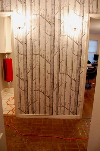
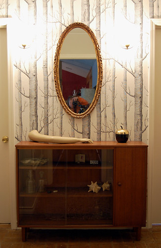
Sorry for the late post this morning, but I'm a little tired and under the weather from some of my weekend adventures, one of which involved a first foray into the world of wallpaper. Yes, my Cole and Son Trees wallpaper finally arrived from Merry Old England, and Hunny Bunny and I wasted little time in slapping it up on the wall. Which is kind of scary, honestly, when you're dealing with a $100 roll of paper, and, uh, you don't really know what you're doing. Ok, I've assisted my domestic diva of a mother with wallpapering a time or two, but this wallpaper is abnormal.

wallpaper

Here's a blurry picture of Hunny Bunny wrestling with wrapping the paper around a corner in the dorrway. If you've ever hung tradtional vinyl paper before, you know that you usually paste the paper, book the paper, hang it, then paste the top again. But this paper is super duper stiff, and you paste the wall instead of the paper, which is kind of awesome, but also kind of painful. It's really hard to keep the paste from touching the top of the paper, and it's hard to get the paper into corners because it's not very flexible.

wallpaper

The new breed of nonwoven papers are supposedly removable in one piece, and that was definitely a deciding factor in my choice of papers. I don't think I'll be pulling it off the wall anytime soon because it was a lot of work, and also because the band aid beige wall underneath is nauseating.

wallpaper

Drill, baby, drill! Light fixtures, that is. I have two sconces wired into the wall, and it was kind of heartbreaking to cut into the paper and screw them in. Actually, I couldn't watch at all. It looked like some kind of creepy surgical procedure.

sconces

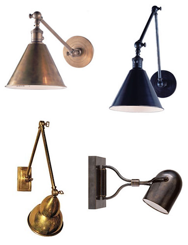
Sconces are implanted installed. Don't worry. I already have 800 pairs of better ones that I'm watching in Ebay. What I really want is something like this, though:

sconces

All these beauties are from Circa Lighting, and if I had $500 burning a hole in my pocket, I'd already have a pair ordered for the hall. Alas, I am agonizing about spending $50 for a pair. The real world is crappy.

Anyway, here's a bad picture of the finished hall:

hallway

(Sorry about the lighting... no natural light in the hallway, and I'm too lazy to drag out my light kit. And, no, my bathroom is not actually poo brown). All things considered, I like the paper a lot. I know, I KNOW. It's so overused. But it's nice and quiet, and in real life it feels very naturalistic, with quite a bit of depth.

So, I dragged all the stuff I used to have in the hall back into their respective places.

hallway

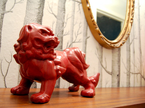
Hunny Bunny and Karly hate it. "It's too much stuff... it's covering up the trees... blah, blah, blah." In my weakened state, I have to admit that I'm beginning to agree. I hate it when they're right. Or maybe they are just objecting to my cheesy foo dog?

food dog

I did try restyling, though, because I have a stupid attachment to that display case. Don't ask me why.

hallway

Everyone likes mannequin arms, right? Sigh. Oh, and I forgot to duck when I took that picture...

chair

Wish I could put my sexy Milo Baughman chair there, but it's too darn deep. Or my hallway is too darn narrow. Gosh darn it, doggone it, you betcha it sucks.

Ok, how about this?

hallway

This is just a wee art deco mirror top table. I guess I could drop the mirror down lower and paint the table...

Are you sick of looking at bad pictures of my hallway yet? Only one more to go, because I'm running out of small furniture pieces.

mirrored chest

The mirror is a no go here. I could maybe hang some spiffy artwork? Something VERY simple and graphic?

Help, people. I don't feel well, I'm tired of moving furniture around, I'm indecisive and I can't let Karly and Hunny Bunny be the only bosses of me. You do want to get in on the action, right? Here's your chance. Tell little Erin what to do.