like a butterfly, a wild butterfly, I will collect you and capture you

I am obsessed with this picture I saw at desire to inspire last week:

perfection

I don't know if it's the mirrored wallpaper or the neon branches or the little stools or the wonderful screen print, but I MUST HAVE THIS somewhere in my house.  I think it's the mix of tacky shit with live-able comfort, which is pretty much my go-to style.

Oh, What A Feeling!

How about wallpaper on the ceiling? All of this back and forth about wall art made me realize that I've been putting off finishing one of the most important walls in my house -- the entry way ceiling. My foyer is kind of bland, and for the tacky hearted (like moi), that just ain't gonna cut it. So I've been cruising some of my favorite wallpaper sites, and I've put together a few selections that might do the trick. But first, a little inspiration:

lisa bengtsson

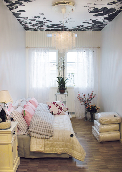
Lisa Bengtsson is a super cute graphic designer who also creates wallpaper patterns (among them is this paper, one of most featured of the year). The floral paper in the picture is custom, but I think you could have it made in different dimensions, or maybe even stencil some designs in a similar configuration.

For a more allover look, I like this Cole and Son wallpaper:

cole and son

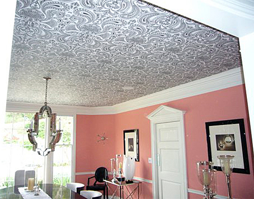
Cole and Son's Malabar wallpaper holds court on the ceiling of a cheeky Bel Air home. Photo courtesy of the inimitable Walnut Wallpaper.

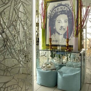
And I like that wallpaper can be used to define unique spaces:

point click home

This nifty nook seen at pointclickhome is saved from blandom by a creative application of wallpaper in the stairwell.

The key to making it work seems to be keeping the pattern graphic but simple, in limited colors, and choosing something that will work overhead, i.e., no toiles that imitate natural scenes (unless you often lay on the floor to view the ceiling... and hey, I'm not gonna judge).

Without further ado, my personal favorites for your viewing pleasure:

flavor paper

flavor paper

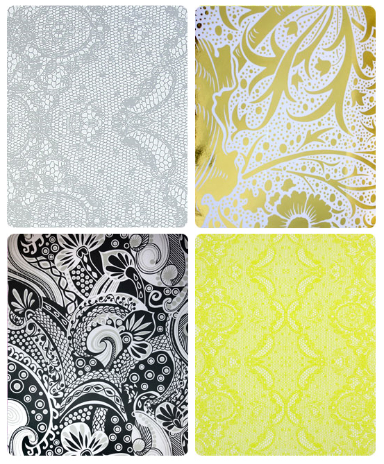
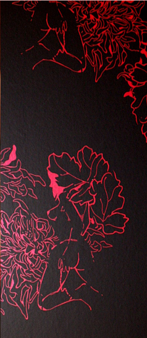
All of the above are selections from Flavor Paper. I definitely have a soft spot for psychedelic prints, and I'm currently leaning toward black and white to keep it simple, although GOLD is always an inspired choice. The neon yellow lace is just for fun, even though I think it would rock Karly's house.

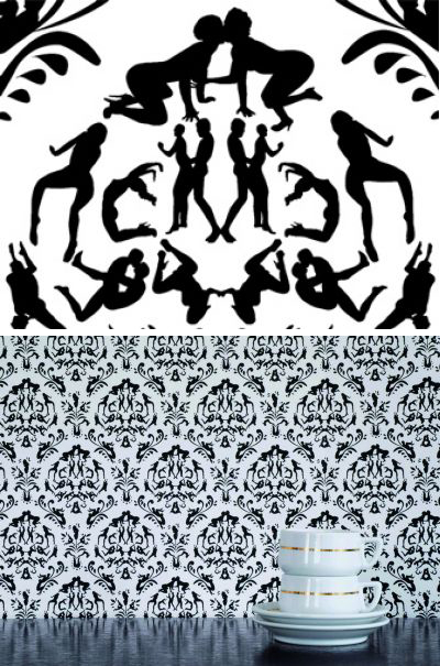
Next a sampling from Erica Wakerly's wallcoverings line, first seen over at Erin Loechner's loverly blog Design For Mankind:

erica wakerly

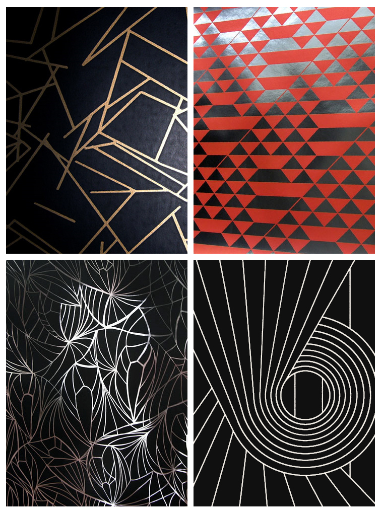
I kind of want to do my ceiling black because my walls are so pale that a little extra drama seems warranted, but I don't want the hall to look like an Oreo cookie... I think the gold and black Angles could be fantastic, although I wish I had an all white house so I could do that hot orange number. Delish.

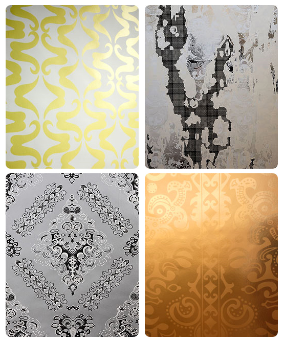
And finally, OG playaz Cole and Son have about 6 gajillion wallpaper patters, so finding a few stunners was easy:

cole and son

(pictures via Select Wallpaper)

The Malachite pattern on the top left by Italian designer Fornasetti is pretty amazing, but I'm not sure the scale will work... I wish there was an awesome wallpaper store here in Austin where I could look at and touch the actual papers. Hint, hint, fashionable Austin businessites!

Ok, here's my silly little hallway. Sorry in advance for the bad picture... new digital camera is on its way!

hallway

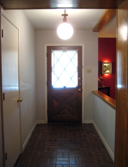
Yes, my baby was built in the 60's and it shows. Don't worry... those creepy miniblinds are OUT as soon as I choose a door color (shhhhh! don't tell my Hunny Bunny. He's one of those wrong people that believe you should never paint woodwork. As if! And yes, I want to paint the other woodwork, too.) So what do you think? Can you see some uber dramatic wallpaper on the ceiling?

Or should I go all Wary Meyers on it:

war ymeyers

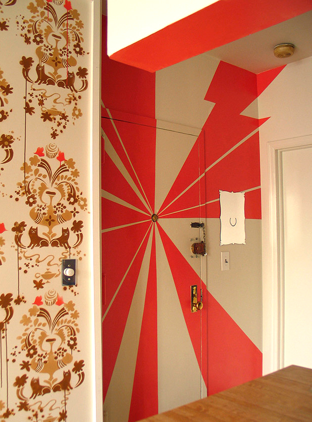
I could use the pendant light as the focal point instead of a peeophole (which I do not have). I might even get crazy and continue down some of the walls...

So, what do you guys think? Am I already in over my head with a crazy red dining room, a super 60's diamond cut out door, a weirdo brick floor, and a funky post and lintel archway, or should I just keep on going?

TrendStoppers!

A couple of weeks ago (back in the good old days when Erin was in town) we had Erin and Ben over for dinner, a couple several drinks into the night Erin and I started waxing poetic about how much we each really really want a Navajo rug.  My husband, who grew up on an Indian Reservation, gave us a grossly overstated argument as to why we could never ever have one in our house.  I don't really remember the slurred whirlwind of his verbal manifesto but I know it had something to do with the smell of mutton. Not only were Erin and I totally talked out of that which we had previously coveted, we were also inspired to start an entirely new column for our blog:  Trendstoppers!  (Currently accepting name suggestions)  We all see it every day, be it pirate ship lamps (which I'm still not totally adverse to), hypercolor furniture, or X-rated decor, it's out there building momentum and, well, sometimes it just needs to be stopped before it starts.  We need to lift the wool from atop the eyes of the greater populace and just say, hey, dudes, this shit ain't cool.  Par example:

dirty paper

rendez-vous wallpaper by Atelier Blink

Maybe it's just that I'm bored of Damask, and even more bored of variations on Damask.  Maybe I would like it better if the people were interacting with each other more, right now it's just a bunch of people doing (gasp) sexual acts floating independently on the canvas.  While it's reaching for edgy and shocking, I've really only got one response: yawn.

paper voyuer

Liquorice Cherry Wallpaper from the  Paper Voyeur Line by DED

I do like this version of dirty wallpaper a bit better, I really appreciate that you have to look closely to even notice the erotic ladies.  It's more thought out and less contrived than the Atelier Bank version.  With Atelier Bank, you get the feeling that they expect to sell tickets to the show based on how many people stand outside the theater protesting.  All shock, no design. Paper Voyeur brings a bit of style to the table but, well, I can't shake this as anything more than just a novelty that I'll want to rip down within six months days.  Besides, the fact that 2 companies are making dirty wallpaper just makes the whole thing tired before it even has a chance to really get going.

The trend continues with this acrylic abomination:

sexy back chair

'her' chairs, produced by casamania by frezza, 2008 via designboom

I really can't begin to express how much I hate this chair.  I can just hear the designer now, giving the obligatory argument about the female form.  Just thinking about it makes me want to barf all over his entire collection of sketchbooks (which I'm sure are filled to the brink with poetry and torn out pictures of water collecting in gutters and plastic bags gently tumbling across the street)  Now I need to barf all over this blog post.  I have no problem with the female form, but I do have a problem with the sappy term female form.  And with bad design.  These chairs are literally butt ugly and remind me of what Maxx Headroom would have made if he had a sketchbook and a Chinese manufacturing plant.  

Just to contradict myself (but also to prove the point that dirty minds are running rampant through our living rooms) I'll show you a  sexy chair that I wouldn't mind sitting in:

perspective chair

The Perspective Chair by Pharrell Williams

Don't you just see how much sexier (and sooo much dirtier) this chair is than that woman-butt chair above? It's so much more clever as well.  It's not all ass in your face, it's more like, hey, have a seat, woah, shocker!  

I guess there has to be an exception to every rule.  

At the end of the night, after we've all had too many drinks, it's probably best not to go home with the slutty decor, it's just a cheap thrill that you'll most certainly regret once the sun comes up in the morning.  And it just might smell like mutton.