Phillustration

One of my favorite art forms is staged photography.  I love when sets are built and photos are taken of a reality that could never truly exist.  I love when a medium that's used primarily for documentation captures something that's purely fantasy.  This juxtaposition between fantasy and reality also captures my wee little heart when photography and illustration are combined.

images via the cool hunter

You know I will never shy away from layered patterns.  When they are combined with some optical-illusion photo trickery, I pretty much want to pee my pants.  I've yet to see anyone do it better than Nikki Farquharson, the self proclaimed mixed media girl.

Be sure to cruise over to Nikki's website for a boatload more photo / illustration genius.

On a decidedly more rudimentary level is this photo / illustration combo of Kate Moss holding a cartoon doll.  Of course this exists.  Things don't really happen in photography until they happen to Kate Moss, right?  Oh, this here artist is un-the-f-known.  sorry dudes.

Alberto Seveso takes the photo illustration combo to the extreme.  While the design is striking, I feel like it may be just a hair too computer generated for me.  The patterns within the girls skin, however, are right up my alley.

Much like the Kate Moss cartoon image, Chloe combined Disney characters with actual photos for a campaign several seasons ago.  Do you guys remember this?  I never could get on board with all the Disney stuff everywhere.

via trendland

Ok, so there's actually no illustration in this photo / illustration image by Thomas Lelu.  It' paint.  It's my blog.  I like the image, sue me.

I know I've shown you this Antony and the Johnson's album cover before, but I really love the photo / illustration combo here.  And, look!  No paint!

via a glam little project

Here's a sweet little version of drawings on photographs.  I especially like the leaves in the upper left corner.

And another subtle example via fashion line Permanent Vacation

And bringing up the rear we've got one of my favorite examples of illustration on photography.  Illustrator Florence Johann spiffed up these images for Jalouse fashion magazine.  Did you see the girl in the middle has a goose for a hand?!  Holy lord that's good.

Lately I've been drawing over lots of found paintings, but I think it's time I start setting my sharpie on some photographs, clearly that's where the magic's at.
For Your Hot Date This Weekend

There are a couple of people who send me links to things they think I would like, most of the time they are pretty spot on (how transparent am I?).  This week not one but two of my favorite internet super sleuths sent me THE VERY SAME LINK, so you know that shit was good.  Raina and Hope, I pledge to you my undying devotion for showing me these:

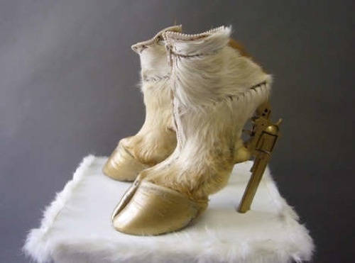
Gun Hoof Boots by Iris Schieferstein (via Jezebel)

While these boots are clearly a masterpiece and Iris could have stopped here, she didn't.  Check out the other creepy goodies she's rocking:

Just when I thought taxidermy was dead and buried for good, Iris comes along and makes it seem totally fresh again.

While I'm here, I'd also like to add an update to yesterday's post:

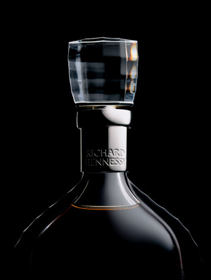
My mother (while working on her 2 martini lunch I presume) found this Hennessy bottle designed by Thursday's featured designer, Inga Sempe

Pair the cognac with your gun hoof boots and, girl, I think you've got yourself a weekend.  Tell me all about it monday, and yes, I want all the juicy details.

The Lichtenstein Look

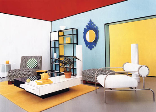
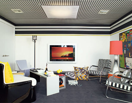
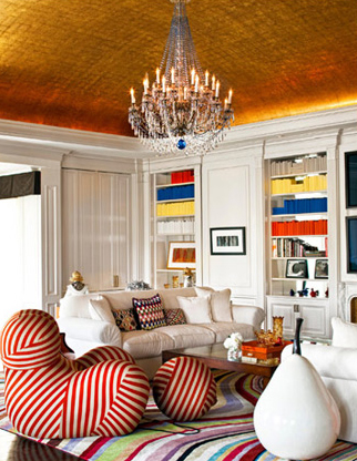
Finally! It seems there's a home design trend that matches my unwanted yet rapidly growing Fisher Price menagerie (note to Kartell: please make stylish baby toys. Hurry). Collectors and art enthusiasts have long appreciated the pop paintings of heavyweight Roy Lichtenstein, but now it seems that Lichtenstein's style is increasingly interpreted through textiles, patterns and paint. Yep. Primary colors are back in funky fresh force, along with a cartoonish panoply of stripes, ben-day dots and blocky solids.

roy lichtenstein

Lichtenstein himself did a series of interiors in his trademark style, hinting at the shape of things to come. Funny that he even anticipated the avalanche of Warhol's Mao paintings that covered the walls of bazillions of featured homes this past year.

roy lichtenstein

This room styled by Jeffrey Miller owes more than a wink and a nod to the piece above. But you don't have to be so literal to reference the look.

christopher coleman

Of course, having a polka dotted ceiling like this room designed by Christopher Coleman helps.

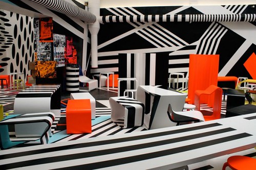
tobias rehberger

And a glut of seizure inducing stripes can't hurt, right? Cafeteria designed by Tobias Rehberger.

india mahdavi

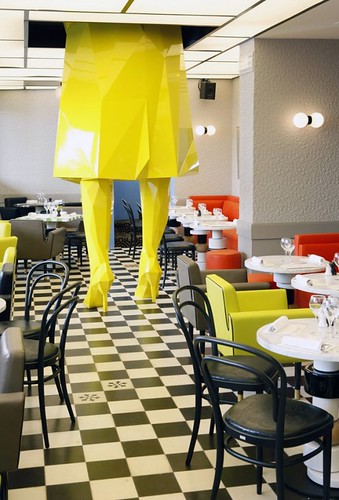
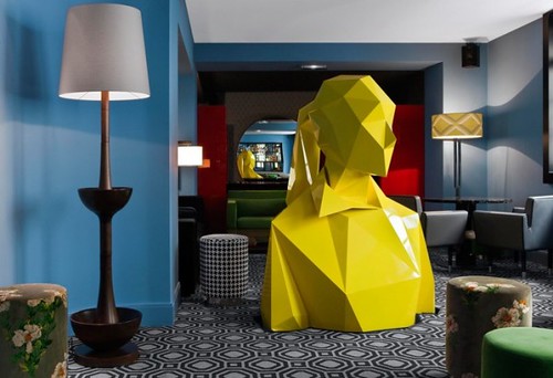
Obviously, what you really need is a giant stylized glamazon in the manner of Lichtenstein's famously blond heroines.

india mahdavi

The top half of this India Mahdavi designed restaurant is no less comic book chic.

max azria home

Not to worry -- you don't have to have a towering Barbie in your house (but what girl doesn't secretly want one?). Playful elements scattered here and there create major impact, as in this room in fashion designer Max Azria's home.

missoni home

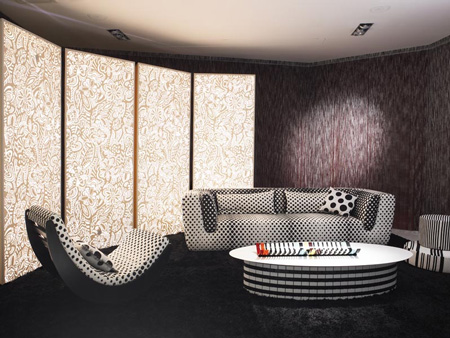
Just try and stop me from swathing my next couch in these Lichtenstein inspired Missoni prints.

missoni shower

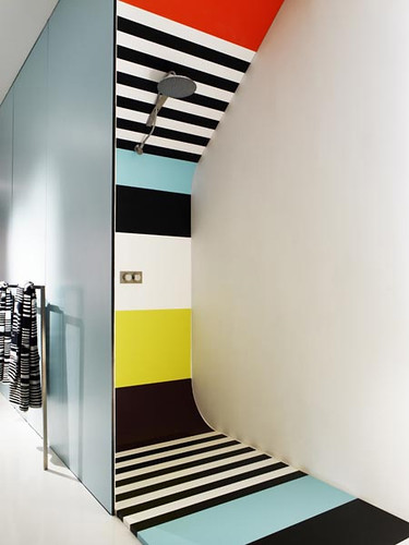
And I wouldn't be mad if my next house had a Missoni colorblock shower in it, either.

If you're feeling a bit overstimulated by all this crazy bizness, consider limiting the look to a simple painting by the man himself.

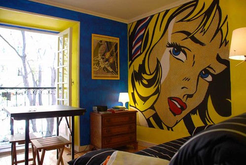
lichtenstein hostel

No, not like this hostel, which feels more tragic than comic. Although, note how easy it would be to paint a simple, similar mural in chic black and white...

roy lichtenstein

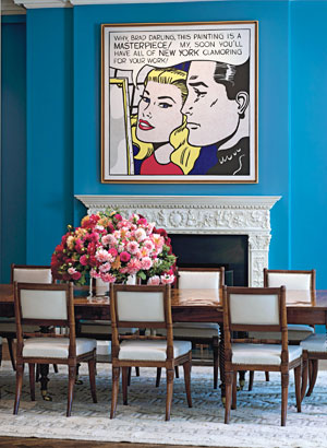
I was thinking more like this room designed by Vicente Wolf, where traditional furnishings are seriously lightened up by the addition of one of Lichtenstein's mod paintings.

roy lichtenstein

The flowers are killing me, but you get the idea.

roy lichtenstein

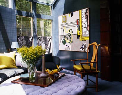
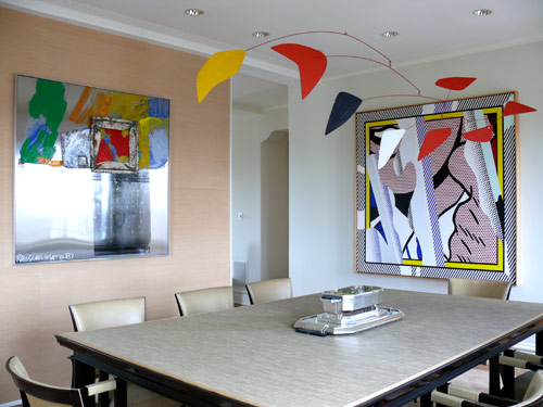
Personally, I like the pop look best when it's paired with contrasting elements. The Calder mobile in similar style and colors competes with the painting in Patsy Tarr's home.

jeffrey miller

On the other hand, there's nothing wrong with going full frontal on a small space, like this quirky vignette styled by Jeffrey Miller.

roy lichtenstein

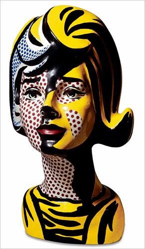
And what better than a Lichtenstein bust to make a popping fresh statement. Yet another idea for the reinvention of Beethoven?