Lightning Only Strikes the Same Place a Thousand Times

We are experiencing a major drought here in Texas.  My once lush green lawn is now on life support and with the city's water restrictions the prognosis isn't good.  Everyone in the lone star state has their hands clasped together in prayer for some serious serious sky water.  So, I'm not sure if I just have rain on the brain or if there really is a lightning bolt trend happening out there in the rest of the irrigated world.

This glorious wallpaper has been in my office wall inspiration folder for some time now.  I've written about the magic of Minakani wallpaper before and my love for them has only grown stronger since releasing this design.  Since my office renovation is scheduled to start next week (I'm doing it myself and just took a couple days off) I've had this design on my mind.

Then, low and behold, I spotted this genius art piece on one of my favorite blogs Me Melodia:

If ever I had the need to have a urinal in my home, it would most certainly be this Duchamp knockoff with lightning bolts by Hellovon.

Bombarded by TWO badass lightning bolt images, I decided to super sleuth the possible trend to see what else I could find.  Here's what I dug up:

Admittedly, much of what I found was clothing - but doesn't fashion usually preempt home decor?  There were gazillions of lightning bolt earrings, so, assuming that you've probably already seen them, I excluded them and only picked the best of the best.  This Miss Miln Lightning Dress from Asos certainly takes the cake.  If I had my way I would buy it and time warp back to 199X so I could wear it to the prom, then maybe I would have had a good time.  Note to self:  find a new date, too.

This lightning bolt skirt is feeding my craving for all things bright yellow.  And short.  At only $30 from Karma Loop, I think it just may become mine.  How rad would I look in my new lightning bolt office with this skirt?  It's totally work appropriate, right?

Don't worry dudes, I did find a few lightning items that will dress up your den, not your booty.  Like this watercolor from Etsy user HellsSewingCircle

Or this stamp set from another etsy artist, WhimsyByJess.  Get a load of that green background, pretty rad, Aye?

This laptop cover by another etsy user MichelleChristina will trendify your mac lighning quick

And finally, one last fashion image.  Sorry, but I thought it was too cute to pass up.  Etsy user Aeon's lightning tee

Real quick like I want to say Thanks so much to Waxyhearts for her awesome guest post yesterday and Jen for her yellow, black and white roundup on Friday!  Stay tuned this week for lots of fun and excitement:  Tomorrow Even Cleveland will be ripping your heart out with some to-die-for-designs.  I'll pose a design question for the ages on Thursday and Friday you really really won't want to miss:  our own Mrs. Erin will be dropping by to give you all an update on la bambino and to finally make a public reveal of his little name.  Sadly, it's not Berin.

Kisses!

10 Random and Totally Subjective Truths I Hold About Art and Design

The fabulous Sherri over at The Claw tagged me for a little show and tell game of truth or... truth. Phew! I really don't do dares. Anyhoo, I decided to make it design related, since you don't really want to know all about the first time I kissed a boy, about the time that I wrecked the family van before I even had a license, or about how I was a super nerd in high school, down to my rabid fascination with the Academic Decathlon and other such socially alienating activities. Boooooring! So here goes nothing... #1. Money is Wasted On the Rich

silver cross gold pram

So, I'm having a baby, and one of the biggest initial expenses is a stupid stroller. It's like buying a mini car for your precious. Now, I caved and bought a totally pedestrian Maclaren, but what I should have gotten is this 24 carat gold plated pram by Silver Cross for a mere $12,000. Of course, for that price I would expect a full sized car, but hey -- it does have a sound system and satin interior. As an added bonus, it looks like a very stylish coffin, which is exactly what you'd like to imagine your baby in, right?

#2. Maurizio Cattelan is vying with Damien Hirst for the Overstuffed Award

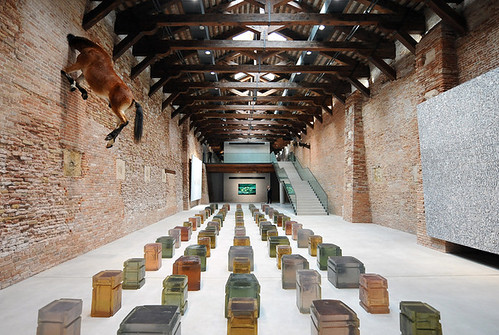
venice museum

I'm not sure why, but I have seen Cattelan's taxidermied, suspended horses in person at multiple galleries and museums. Maybe a giant, hanging horse is just really hard to forget? I don't know, but this headless version seen in Venice's newly opened Punta della Dogana Museum has been haunting my dreams.

#3. Flowers Are Gross

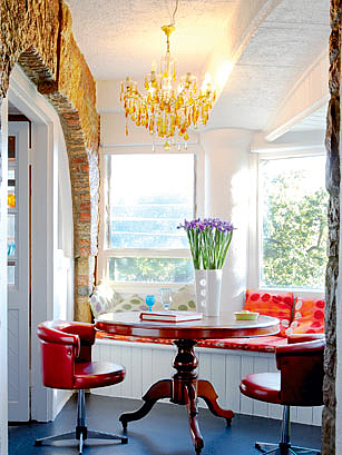
if the lampshade fits

I know this will be a controversial statement, but I think flowers are best left outdoors. I stole this case-in-point image from La Lampshade, because Raina has a knack for eviscerating cluelessly tacky rooms. That hideous purple floral arrangement in the wrong color, shape and scale, for this room is just icing on the already ugly cake.

#4. Plants Are Not Gross

nate berkus

Plants are like the groovier, less fussy sister to the flower. They still bring some green, recycle carbon dioxide, and fill space -- just like flowers. However, they do it architecturally instead of decoratively. I'm waiting for someone to call me out on this, but it's my truth -- so take that.

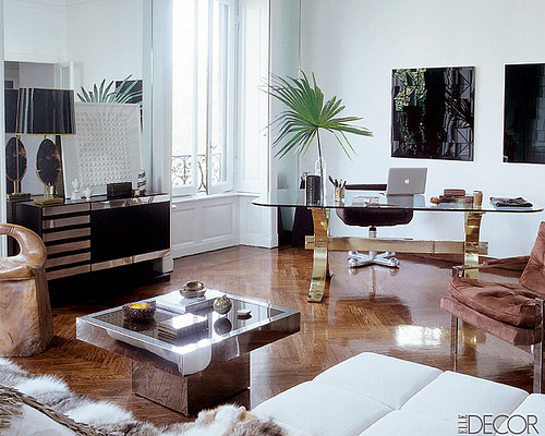
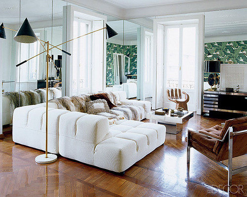
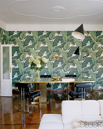
#5. Gold and Chrome Go Together Like Rama Lama Lama Ka Dinga Da Dinga Dong

nate berkus

nate berkus

These images are double dipped from the same Nate Berkus designed abode as above (in case you couldn't tell), and I would be totally comfortable scooping all of the furniture out, and inserting it into my own home. I love gold, and I love chrome. Never shall I be forced to choose between the two. Amen. Oh, and btw, if you live near Austin, those Pace chairs are available on Craigslist right here. That brings me to my next truth...

#6. Vintage Rules

craigslist

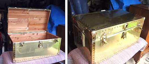
I would estimate that 90% of my furnishings are recycled via Craigslist, thrift stores, Ebay, or some other outlet for used stuff. Who has the money to buy quality new furniture in this economy? Plus I just like a lot of the older designs mo' better. I am currently eying this brass clad footlocker trunk on Craigslist for $28. Wouldn't it make the most stylin' toy chest, ever? But if you call up the seller and tell him that it bears more than a passing resemblance to a Sarreid piece, I will hunt you down and cut you.

#7. Cheap and Cool Lampshades Are as Rare as Three Legged Unicorns

gambrel

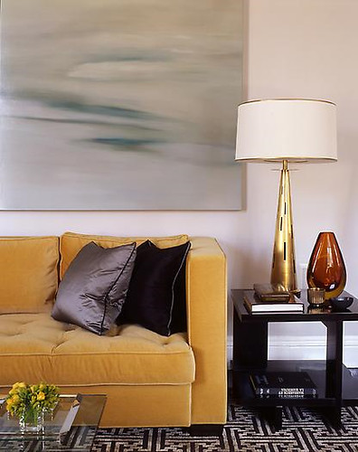
This is a nice room (except for the puny flowers) from Steven Gambrel, but there's nothing particularly standout about it. The couch, rug, other furnishings could have come from West Elm, or maybe even Target. So why is it crazy damn hard to buy a lampshade like that for a reasonable price at a big box store? You would think drum shades were all spun from Rapunzel's hair due to their cost and rarity. Ikea, where are you when I need you?

#8. Art Makes a Room

art

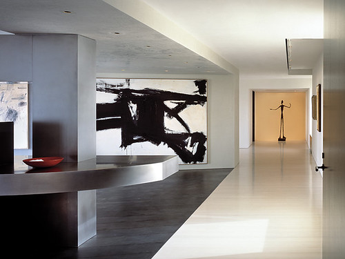
And if you're really rich, art makes your room into a museum. While us mere mortals are left to shop at Etsy and local art sales for our masterpieces, the elite collect Franz Kline paintings and Giacometti sculptures. But it's a good thing homeboy has money enough to buy the big names, because the rest of this 8,000 sq ft space is blah x snooze.

#9. Design Often Requires Stupid Compromises

yatzer

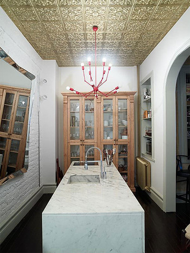
Sigh. Living with another person means you already have one too many cooks spoiling the brew. For example, I told Hunny Bunny that we should totally gild all of our ceilings in brass tile like this Istanbul home. Can you believe that he said NO? He did point out that our 1980s faux wood ceiling fans would look a bit out of place next to the golden goodness of that tile, but I truly felt that was but a minor hurdle to be crossed in the vague future of "someday."

#10. Beethoven Is the New Black

beethovens

Good pal that she is, Karly sent me this link because I bought a Beethoven bust at the Salvation Army and have been painting and repainting him ever since. First he was lame-o white, then I painted him turquoise (which was very cool, but too much for his setting), then he morphed into a bacterial blight of blue and white blotchiness before finally settling into a glossy black. I love my handsome black Beethoven, but in the right space he would also kick ass in sparkly gold, or work some magic in rainbow paint drips. He's just so versatile!

Well kids, that's it for all about me day. If you'd like to get lazer tagged to play this game, leave me a comment and I'll update the post. Holla!

Pod People

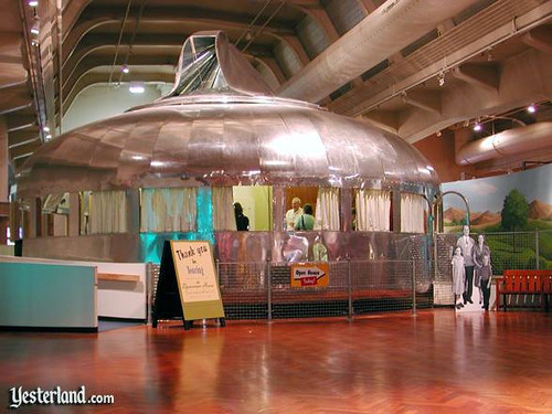
Monday's wackadoo post got me thinking about my childhood expectations for the future. I assumed that by 2001, we would be flying around in hover cars a la The Jetsons, ordering our robot maids to fetch yet another fat free Twinkie, and living in a deluxe pod house in the sky. As early as 1946, Buckminster Fuller created the Dynamaxion House to give the world a taste of what the future might hold, and yet here I am, still struggling to bring my 1960's ranch house into the 21st century. I am seriously considering scrapping all these pesky renovations and moving into Bucky's historic house, despite it being under lock down in a museum. I defy the police to arrest a cranky, giant pregnant lady for wee bit of harmless breaking and entering.

dynamaxion house

Behold! Bask in the glory of its Airstream shiny dinertastic roundness. Can you imagine living in the 40s and encountering this beauty on a house tour, like this cardboard cutout family did?

dynamaxion house

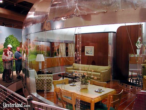
I love that a Heywood Wakefield dining set and Kroehler couches were the best that modern design had to offer at the time. Not that I'm dissing -- I sold four of those chairs on Craigslist for $500. See, the futuristic past is very popular in the present.

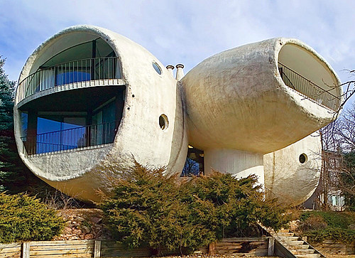
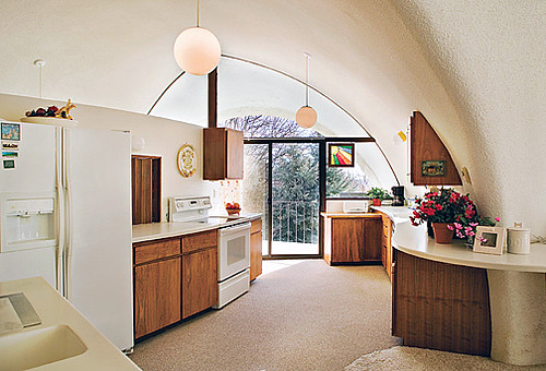
Somehow, as far as I can tell, the 50s were mysteriously devoid of podness. Instead, the world was populated by cheap tract homes. Yuck. But never fear -- the 60s and 70s ressurected the pod life. Check out this mushroom house in Boulder, built in the late 60's/early 70s:

pod house boulder

I think this place is communing with some prehensile proboscis laden aliens. Or maybe just The Snorks.

pod house boulder

Still, I do not hate this kitchen. Ikea Fado pendant lights -- I've got your number. But what goes in the triangular cabinet...?

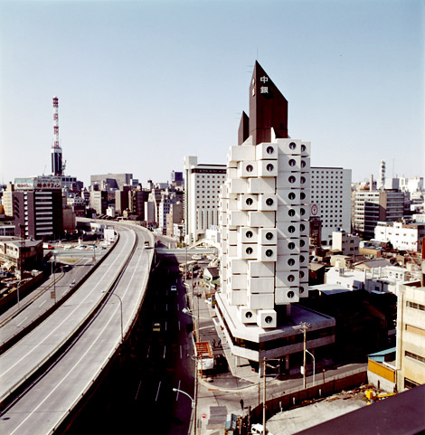
One of my favorite crazy pod structures is under attack from crazy people who just don't like it (ok, and maybe it wasn't built to standards and an earthquake could collape it any minute, but that's a minor detail).

nagakin tower

Seriously how awesome is Japan's Nagakin Tower, built by Kisho Kurakawa in the early 70s. That was not really a question, by the way.

nagakin tower

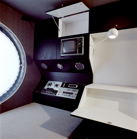
Ah, modern capsule living at its finest! Chillax in front of your big screen color tv and 8 track playah.

nagakin tower

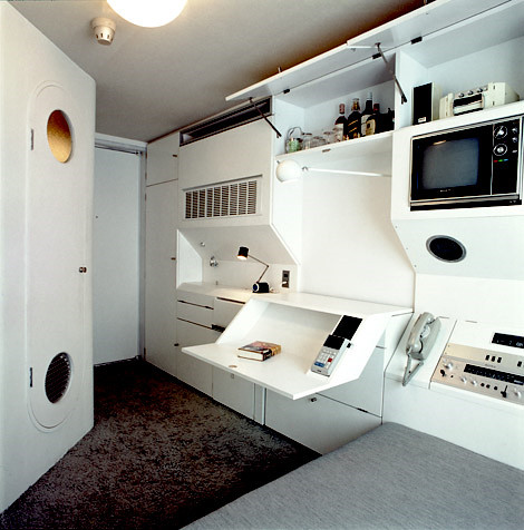
Do you think they have Wi-fi? No matter -- looks like they might have some Hennessey and Courvoisier, so it's all good. If you drink enough, maybe you can plug directly into the Matrix.

nagakin tower

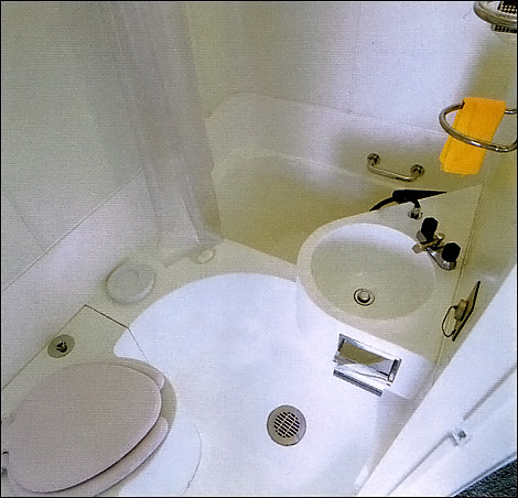
Sadly, the bathroom is a major downer. I just know pee would end up on my toothbrush, somehow...

kisho kurokawa

Here's crazy ass Kisho Kurakawa, the dude who built Nagakin Tower. I think he may have spent too much time marinating in a formaldehyde puddle in one of those teeny bathrooms.

mushroom house rochelle

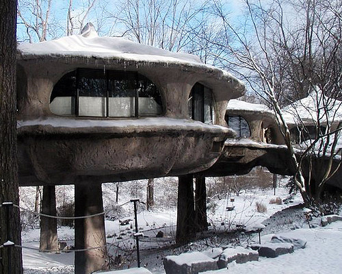
I have no idea when this concrete mushroom house was built, but I'm guessing it's high 70's, and by "high," I mean tinfoil hats and magic mushrooms high. Nothing like a little a lot of paranoia to make living alone in the woods a meaningful experience.

Let me tell you what is not going to be a part of my pod lifestyle. This:

80s suntan pod

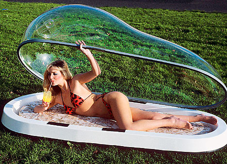
Built in the 80s, this sunbathing pod is beyond the pale. I know! Let's enclose ourselves in an airless plastic bubble, so we can focus and condense the sun's rays in a suffocating, cancer causing extravaganza! The 80s were stupid. But I want that bikini. And the drink. And this baby out of my belly.

eco pod

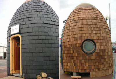
Since the 70s, it seems as though poditechture has gone downhill, fast. Why can't the future of the present be as cool as the future in the past? To wit: who wants to live in a 90k shingle covered poop turd pod that looks poised to rocket forth on a mission to brown town? Not I, said Erin.

pod house

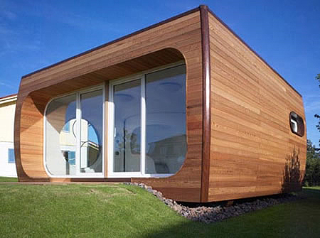
I guess this pod house by Hans Haus is ok with me. I like wood, I like windows, I like round windows, blah blah blah.

pod house

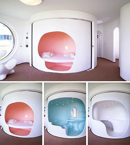
Stop the presses! The interior has a remote controlled platform that rotates four different rooms into view? AND it comes in pink?! Sold, and I don't even need a Heywood Wakefield table to live here.