TrendStoppers!

A couple of weeks ago (back in the good old days when Erin was in town) we had Erin and Ben over for dinner, a couple several drinks into the night Erin and I started waxing poetic about how much we each really really want a Navajo rug.  My husband, who grew up on an Indian Reservation, gave us a grossly overstated argument as to why we could never ever have one in our house.  I don't really remember the slurred whirlwind of his verbal manifesto but I know it had something to do with the smell of mutton. Not only were Erin and I totally talked out of that which we had previously coveted, we were also inspired to start an entirely new column for our blog:  Trendstoppers!  (Currently accepting name suggestions)  We all see it every day, be it pirate ship lamps (which I'm still not totally adverse to), hypercolor furniture, or X-rated decor, it's out there building momentum and, well, sometimes it just needs to be stopped before it starts.  We need to lift the wool from atop the eyes of the greater populace and just say, hey, dudes, this shit ain't cool.  Par example:
dirty paper

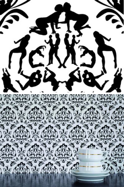
rendez-vous wallpaper by Atelier Blink

Maybe it's just that I'm bored of Damask, and even more bored of variations on Damask.  Maybe I would like it better if the people were interacting with each other more, right now it's just a bunch of people doing (gasp) sexual acts floating independently on the canvas.  While it's reaching for edgy and shocking, I've really only got one response: yawn.

paper voyuer

Liquorice Cherry Wallpaper from the  Paper Voyeur Line by DED

I do like this version of dirty wallpaper a bit better, I really appreciate that you have to look closely to even notice the erotic ladies.  It's more thought out and less contrived than the Atelier Bank version.  With Atelier Bank, you get the feeling that they expect to sell tickets to the show based on how many people stand outside the theater protesting.  All shock, no design. Paper Voyeur brings a bit of style to the table but, well, I can't shake this as anything more than just a novelty that I'll want to rip down within six months days.  Besides, the fact that 2 companies are making dirty wallpaper just makes the whole thing tired before it even has a chance to really get going.

The trend continues with this acrylic abomination:
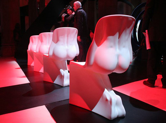
sexy back chair

'her' chairs, produced by casamania by frezza, 2008 via designboom

I really can't begin to express how much I hate this chair.  I can just hear the designer now, giving the obligatory argument about the female form.  Just thinking about it makes me want to barf all over his entire collection of sketchbooks (which I'm sure are filled to the brink with poetry and torn out pictures of water collecting in gutters and plastic bags gently tumbling across the street)  Now I need to barf all over this blog post.  I have no problem with the female form, but I do have a problem with the sappy term female form.  And with bad design.  These chairs are literally butt ugly and remind me of what Maxx Headroom would have made if he had a sketchbook and a Chinese manufacturing plant.  

Just to contradict myself (but also to prove the point that dirty minds are running rampant through our living rooms) I'll show you a  sexy chair that I wouldn't mind sitting in:
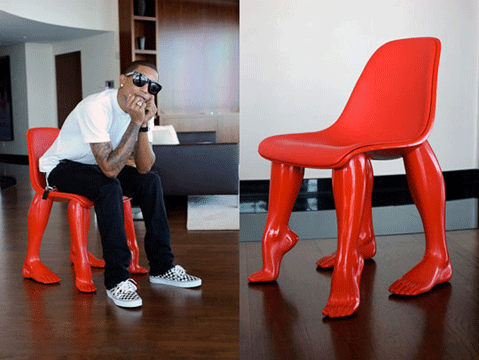
perspective chair

The Perspective Chair by Pharrell Williams

Don't you just see how much sexier (and sooo much dirtier) this chair is than that woman-butt chair above? It's so much more clever as well.  It's not all ass in your face, it's more like, hey, have a seat, woah, shocker!  

I guess there has to be an exception to every rule.  

At the end of the night, after we've all had too many drinks, it's probably best not to go home with the slutty decor, it's just a cheap thrill that you'll most certainly regret once the sun comes up in the morning.  And it just might smell like mutton.
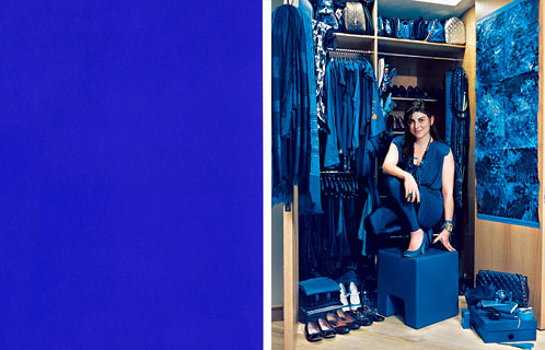
Klein Blue 2, Electric Bugaloo

In my last post I extolled the virtues of all things Yves Klein and therefore, by the transitive property A=B and B=C, also all things blue, and also all things crazy but awesome. I'm a little weary of the robin's egg blue that was so popular for the last few years, and I just painted over my tequila blue living room (so I think you can gather how I feel about that), but this blue is all neon excitement -- more sapphire than powder, more sexy than sentimental, and definitely not for the faint of heart.

This girl gets it:

klein lady

Comparing her wardrobe to a swatch of Klein's patented Blue, you can see that she's not entirely on the money, but her claim to wear nothing but IYKB is not without merit. And frankly, I think it does a lot for her complexion. And it's certainly better than the guy who looks like Paul Giamatti but isn't and only wears brown. Really? Brown? Do I even need to go into the associations there? It's too early in the morning.

Of course, this is an interior design blog (for lack of a better category), so I would be remiss in my duties if I didn't shower you with some home decor porn, and you know I live to serve you, my ladyfriends (and gay BFFs??? hellll-ooo? Are you there???).

Without further ado:

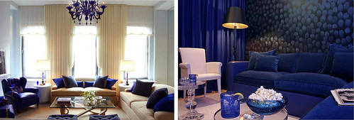
kevin suvlasky

Starting it off with a bang are these gorgeous rooms designed by Andrew Suvlasky. Is it getting hot in here, or is it just me? I love the gender neutrality of this color. Not so masculine as to say, "I like hunting and tweed" and not so feminine as to say "I like birds and twee pastels, thank you very much." And when it's blue on blue on blue -- par example, the right picture -- it just feels saturated instead of hyperactive. Try that with any other pop color.

And, of course, Klein Blue does work beautifully as an accent color, too:

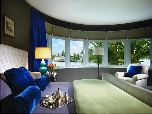
brown davis

That IS a pornoramic view in this bedroom designed by Brown and Davis, but those seductive pillows and drapes almost outsexify it. Plus whoever photographed this interior did an amazing job. The double gourd lamp in turquoise is a bit strange, though...

Another room that strikes a blue note:

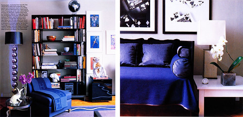
habitually chic

John Demsey's bachelor pad designed by Bibi Monnahan, via Habitually Chic. Check out the whole tour on her site because the guy has a great photography collection (as well as some chairs that Miss Karly would lurve). Again, there is some weird lamp action going on here, but I still think this is such a livable apartment, much more accessible than something done up all in beige like my uptight BF Patrick Bateman and his super sterile bachelor pad.

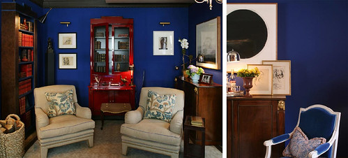
Of course, if you need some extra stimulation, you could go all the way, like this room designed for the Kip's Bay Showhouse by Christpher Maya:

christopher maya

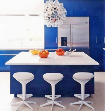
Yes, it's a little patriotic for my taste, but I like the wall color and blue chair. I think it could lighten up and take itself a little less seriously, though, like this bubbly kitchen spied in Domino's quirky kitchen gallery:

domino kitchen

All those balls make me giggle and the barstools are kind of killing me (anyone else offended by those ubiquitous pseudo-futuristic stools? Probably just me... as usual), but I do like the light 'n' freshness of the entire ensemble.

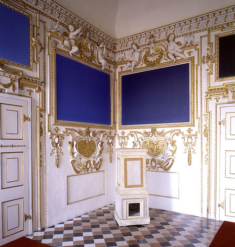
And finally, after the slew of blue and chrome combos, a reminder that electric blue looks fantastically sultry when paired with gold:

winston roeth

Ok, what would not look good in Italy's amazing Palazzo Ducale di Sassuolo? But these modern works by Winston Roeth are spectacular in juxtaposition with cherubic white and gold. (via, once again, Habitually Chic

Funny, those paintings look familar, don't they? After all, Roeth wasn't the first artist to paint a monochrome canvas in what is essentially, ahem, Yves Klein Blue. But I suppose if you're in the business of painting monochromes, then you must be aware that what you're selling is not talent, but a concept, and Klein understood marketing better than anyone. 

Yves Klein was always good at anticipating trends (pretentiously called "movements" in art, but the great cultural critic Walter Benjamin realized early on that art is inevitably bound up in fashion), and he was always good at creating something out of nothing. Witness his "Leap Into the Void," where he markets his greatest product, ever: himself.

klein void

Oh, hell, whatever. Enough art history. I like blue. Not to go Seussian, but take the leap. You might, too.

Cross your fingers we don't get grounded

As you may know Erin is out of town and she's left me here all alone to Run the DC headquarters. Just to prove to her, as I have proven to all of you, that I am a big girl and can be trusted to stay home all by myself I'm totally going to stay up late, watch R rated movies, eat tons of sugar and possibly throw a party that ends with every object in the DCHQ painted (almost klien) blue. With all of these scheduled activities how can I possibly be expected to write an entire post about boring old design? Huh? Huh? So, I've decided that, in Erin's honor, I will dig up one of my favorite posts of hers from back in the day when Design Crisis was just a wee little baby inside it's mommy's tummy. Don't worry, I fully plan to wake up bright and early Friday morning from a mind blowing sugar crash surrounded by piles of glitter, empty cans of gold spray paint and artfully arranged photos of Michael Phelps 100% ready to bring you the best damn design post of your scene-loving-life. Until then, without further ado, I give you: Flock Watch, by Stacy (yep!) Erin Williamson I heart sheep -- and especially their silky soft skins. I know, Peta is probably coming to splash my front door with faux blood, but I really can't help myself. I have, like, 500 (ok, two) of the Ikea sheepskin rugs covering suboptimal chairs, and I loooooove my Costco sheepskin rug. I used to have a flokati rug, but I couldn't vacuum it properly without fumes of burning rubber issuing forth from my workhorse machine, and shaking the stupid thing out usually induced a seismic allergy attack, magnitude 8.0. Yuck. Happily, my sheepskin rugs are a dream to clean, and they are so, so cuddly on my feet.

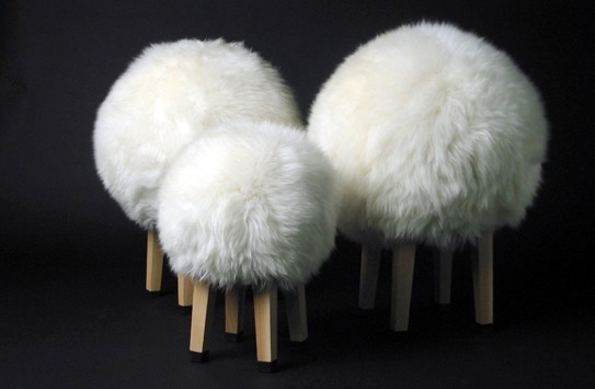
Yes, I love my pretty little pelts, but lately I've noticed sheepskin recalling its original form. Witness these stools from Sam Brown at Leigh Harmer:

sheep stools

These cute poofs would make a comfy landing spot for a guest when seating is limited, or perhaps as accessories in the little tot's playroom. I like the headless hybrid form and the juxtaposition of wood and fur.

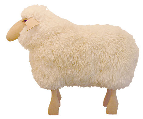
Hanns-Peter Krafft's vintage design in current production at Moss moves closer to the zoological end of the animal/furniture spectrum:

moss sheep

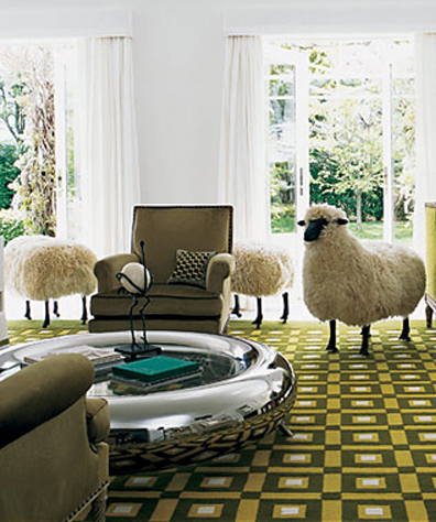
His stool evokes the designs of amazingly brilliant husband/wife team Claude and Francois-Xavier Lalanne, who have spent much of their lives creating animal-themed furnishings and objets d'art. In particular, Francois' sixties-designed Moutons are enjoying a contemporary revival:

lalanne

I am loving the life-sized sheep on abstracted "grass" carpet, and it helps that the chrome coffee table reminds me of a totally stylin' water trough! (Image courtesy of Topsy Turvy).

While Les Moutons are sheepishly cute and fuzzy in a stuffed animal kind of a way, a couple of newer designs may belong in the cabinet of curiosities. Check out this three-headed monster courtesy of freshome:

3 headed chair

I don't know. I love me some taxidermy, but I'm not sure I want to sit on it. On the other hand, it's kind of awesome. I'm torn.

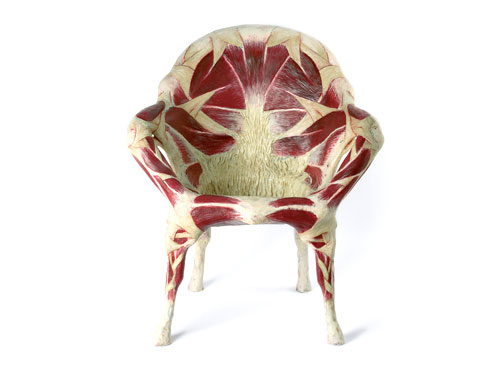
I feel less ambiguously repulsed by this meat chair, a gruesome creation of Italian artist Simone Racheli featured at Paola Maria Deanisi Gallery.

meat chair

That's really the point, though, right? I definitely think of this one as art, designed to provoke a strong reaction, and on that level I find it to be extremely successful. And gross. And kind of mesmerizing.

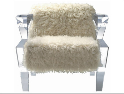
I think I'd most like to have this fabulous lucite and sheepskin chair at Waazwiz, a Japanese design site:

sheep and lucite

Cozy yet cool, I need this one. No meat required.

+++++++

See, wasn't that fun?  Aren't you glad I slacked off like that?  Don't you see why I LOVE animal furniture (and Erin)?