I'm bringin sexy black

This morning's post is 100% in honor of my good friend Tod (toddybear, todler, todathon, todathalon, tod-a!) who is smack dab in the middle of a renovation insane foray into the deepest darkest depths of home rebuilding.  He's just now approaching the fun cover-up-the-drywall-pick-out-the-pretty-stuff portion of his hero's journey, which is right where I LOVE to butt in.  Everyone needs a little k-dawg input, right?  Of course.  We spent a good portion of last Sunday evening pontificating on the glories of various floor finishings:  while Tod is uber-minimalist to the ma-xxx (note the lack of an excessive second 'D' in his name) and high polish concrete would look divine in his 1920's rehab, homeboy is livin large on a pier and beam foundation that simply doesn't lend itself to that sort of earth-shattering weight.  He's going with my dream surface: hardwood.  Now I just need to convince him to use my dream color:  black (midnight, darkness, ebony, inkjetness, onyxabod, blackademicawesomeness). I reminded Tod of last year's Top Design finale where - married with child(?) - matt went head to head in a bloody loft battle with Carisa.  Both designers chose to use black floors, Carisa won my heart with the use of wood:
top design black floors

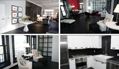
Top left:  Matt's painted black floors.  Top right & bottom left: Carisa's luxe black hardwoods.  Bottom right: Carisa's kitchen (tod just wanted to know what color she used, I don't love it).  I did get all hot and bothered over the stained black hardwoods and decided to see what else I could find.  Tod, look closely.  Everyone else, take a shot every time I type Tod's name.
Kelly Wearstler Black Floors

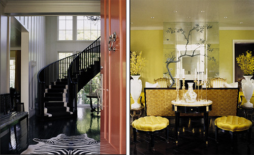
Two residences by (Erin's term) Uber Glam Goddess Kelly Wearstler.  Both with magnificent black floors.  I LOVE the zig zag installation in space #2.  If Tod (shot!!) really wants to go all gangsta, he could lay the wood on a diagonal, helping to expand the space and counter-acting the room-shrinking dark floors.

More sexified darkness:
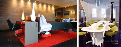
black floors

Left: a suite at Paris's Hotel Sezz; Right: private residence by Ghislaine Vinas interior design.  (Does anyone know how to make a little spanish do-dad over that N in Vinas?  There's supposed to be one there.) I la la la love the image to the right: black, white, lime & light-friendly partitions.  Hey, who stole my dream and turned it into a room? C'mon, stop kiddin around.

TOD! TOD! TOD!

If everyone can still read after that last round of typing TOD! TOD! TOD! then go ahead and take a gander at this:
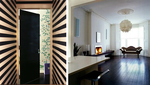
black floors

Right: Private residence shot by Paul Costello; Left: Private residence from Survivestyle5's flickr photostream.  Ok, so clearly the stripes in image one are the showstopper here, but the unadulterated hotness of those black floors simply can't be denied.

Are you convinced yet?  Teetering?
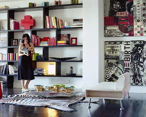
black floors

True or False:  a zebra rug is required with black wood floors?  Just wondering.  I really do love how the black floors anchor all of these spaces. (Image courtesy of Survivestyle5's flickr photostream)

However, if, like me, Tod (drink up, we're coming to a close) wants to survive the living nightmare that is spending every single day wondering who/what/where/why people are walking on his floors, he can always go with white:
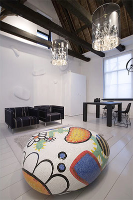
white floors

Suite 7: The lute suites.  Yes, I know I know, the rock is blowing my mind too.  Let's save it for another post... perhaps a nice fantasy vacation segment, oh yes, it's going to be lovely.  For now, go get some sleep and dream about your new bodacious floors, you're going to have quite the hangover in the morning.


Chevronathon

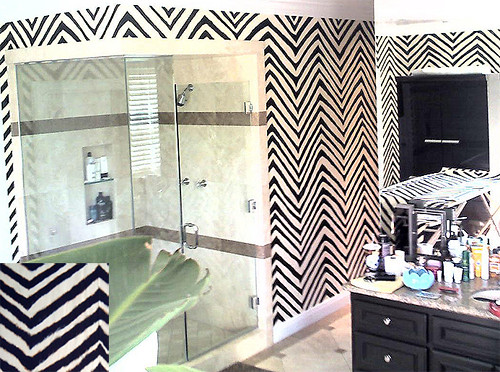
Did you know chevron (no, not the gas station) is the new zebra? Seriously, it's everywhere. Exhibit A:

walnut wallpaper chevron

Walnut Wallpaper's amazing collection of wall coverings includes this hand printed beauty by Paper Mills, which is even named Zebra, although clearly it's a chevron pattern, right? I like this so much better than zebra (even though I do, of course, have the ubiquitous rug in my dining room) because it's less safari and more classic. Plus I totally feel like I could paint or stencil this (a la Karly, the stencil queen) on a wall myself!

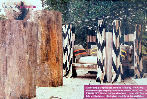
Exhibit B: When I saw this post on Decorno's blog featuring House of Mann fabric in the grandest scale ever, I knew I was going to have to do some serious shopping research into this chevron business.

chevron canopy

I already see myself lazing away in this canopy while DH fans me with palm fronds and feeds me grapes... I have a feeling he probably doesn't share the same vision, but I may have to order some of that fabric for outdoor cushions anyway. House of Mann swears it's mildew and UV resistant, and since hemp is a renewable resource, it might temporarily assuage some of the guilt borne by my rampant consumerist tendencies. Probably not, though.

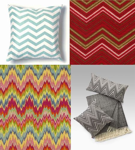
Exhibit... whatever: Once I started looking in earnest, I found that chevrons come in a zillion color combinations, some resembling Missoni from its heyday in the seventies, and some even produced by Missoni today.

chevron montage

Clockwise from top left: Pillow by Twinkle Living at Design Public, Lulu DK chevron fabric, Missoni's current offerings at Sak's Fifth Avenue, and a crazy awesome hooked wool rug from the American Country Home Store. Yep.

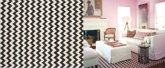
Although I am digging some of the colorful options -- especially that insane rug -- I really like chevron  best when it pairs one light tone with one dark one, because simplicity is the chevron's ace in the hole. Check out these amazing Madeline Weinrib Rugs. Don't worry. They're not expensive. They are ridiculously expensive, because Madeline Weinrib is an atelier, you see, and things made by an atelier (insert accent) cost a lot of money. Don't ask me why.

madeline weinrib

(Photo on right courtesy of Domino)

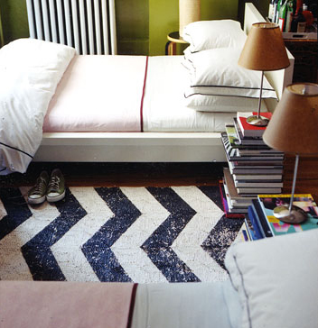
God, I really want that rug, but I'm not a millionaire... crap, I'm not even a thousandaire, so I may have to do as adorable deal hunter Nick Olsen did and whitewash a flatweave rug (like a dhurrie, sisal or seagrass) and then paint some colored chevron stripes on it:

nick olsen's apartment

(Photo courtesy of Bellasugar)

Love the navy, white, and oregano green, paint palette... and do I spy a hint of my new favorite color in there? Dreamy!

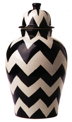
My last issue of Domino also featured this super cool chevron patterned urn distributed by Zocalo:

chevron urn

Hooray for the foray into 3D surfaces! The chevron does a great job of defining volume and classic black and white always works because it's graphic enough to be punchy, white still accommodating a range of decorating possibilities. This chevron has all the positive attributes of the beloved zebra print, but it just doesn't feel like it's trying so hard.

Shine On

I find it strange that most people don't give a lot of thought to ceilings. I mean, that's kind of like ignoring the sky, right? Lately, however, I've noticed more ceilings becoming part of an interior's overall design, perhaps because we've exhausted the ornamental possibilities for every other surface. I like the idea of using ceilings as fifth walls. After all, Michelangelo didn't paint the floors of the Sistine Chapel... possibly because he thought it was a little blasphemous for poo encrusted shoes to sully God's face, but that's really for another discussion. As far as the 21st century goes, I think uber glamor goddess Kelly Wearstler may have kicked off this latest development of transfigured ceilings. Behold:

wearstler

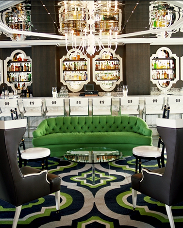
A little bordello and a lot Sinatra-era Las Vegas, but the mirrored ceilings expand the height of the room to a much more impressive scale, and the patterned rug fits with a bit of breathing room into a space that may have felt squeezed and claustrophobic without its reflective counterpart.

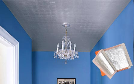
If the mirrors are a little too honeymoon suite for you, Domino featured a DIY segment on silver leafing your ceilings a while ago:

silver leaf ceiling

It's still pretty bold relative to ordinary flat white ceiling paint, and at least you wouldn't be worried that guests were looking down your blouse while checking out the chandelier. I think it's softly sweet (though not with that blue paint, and I would prefer the baroque solid gold of Karly's old discotheque bathroom); the real issue is the cost -- Domino listed the price for this project at slightly over $3500. Dollars. For a teeny tiny space. And gold costs a lot more. But if you gotta have it, you can check out gilded planet for more info on how to (tediously) do it yourself.

While catching up on my Decorno posts, I saw that New York Magazine featured this frankly awesome Christopher Coleman designed apartment replete with ultra shiny everything, especially the ceilings.

coleman

Sterile, yes, but how often do you see surfaces so smooth outside of a museum? There is serious obsession at work here; for everything to be so glossy and white, the finish has to be absolutely flawless. I don't think I could ever live here, but I admire the (piercing) clarity of vision.

Flickr user Survivestyle5, who I found on Jennifer Perkins' Naughty Secretary Club blog, showcases this quiet beauty designed by one of my heroes Miles Redd:

survivestyle5

Ah, exhale. Now I could live here. I love the combination of darkish ceiling with ultra glossy paint -- shiny is almost always sexy, but the blue keeps it serene and the dark floors keep it cozily grounded.

My faves are the rooms designed by Vicente Wolf. He's like a maturer, er, cleaner version of me:

vicente wolf

I'm sure a lot of people will find these rooms boring -- there's no Hick's Hexagon fabric, no pink and red color palettes, no zebra or coral, and no turquoise foo dogs in plain view. And, yes, for the record I do have pretty much all of the above mentioned things in my own home, but sometimes it's nice to focus on texture and scale and light. The glossy white ceilings are such a huge part of everything that is right and refreshing in these rooms -- they're like a vacation from sensory overload.

In fact, I'm feeling so cleansed that I may have to run out and buy some paint to outfit my hallway in crazy black stripes. Definitely glossy.