And now dear friends, I bring you the last post of the year. Don't be sad -- we'll be back after all the booze has burned off, but I need a break (ok, I need a chance to get some projects done). Besides, you really won't care what I have to write after you see this incredible house tour, brought to you by Graham & Co bloggers (and generally cool people) Jeff Madalena, owner of fashion label/boutique Oak, and Jason Gnewikow, creative director at NY Design Studio Athletics. Jeff happened to leave a comment on my terrifying fireplace post, suggesting I take a page from his book and go clean and minimal a la his house. I think I cried a little after I followed the flickr link to his gallery, both because I was a smidge insanely jealous, but also because my faith in humanity has been restored. It is possible to finish things! Your house can look amazing!
MIRACLES CAN HAPPEN!

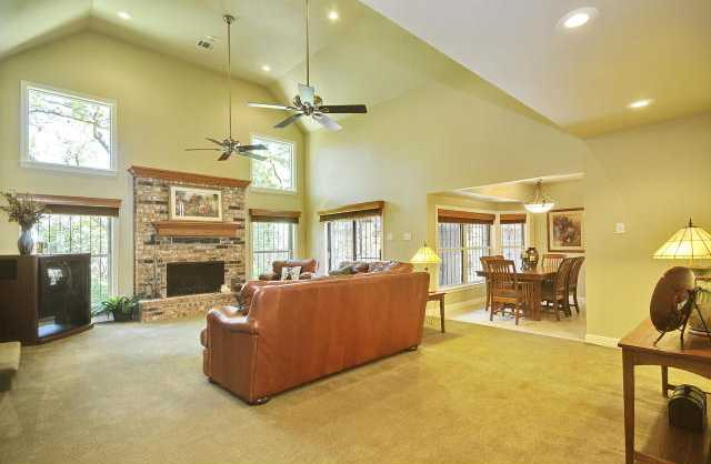
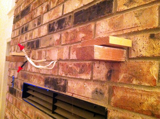
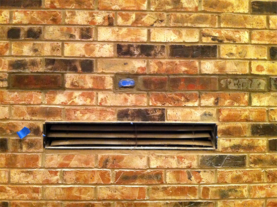
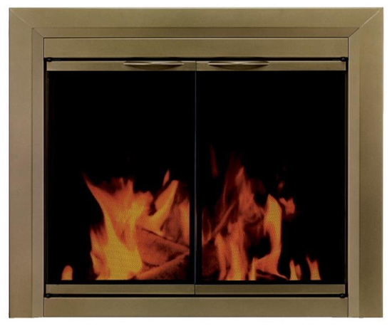
Just check out that before and after! My fireplace is weeping tears of joy at the possibilities.
So without further ado, I bring you a Chriswanzmukkuh gift for the ages. From tiling to flooring, a ton of this was DIY. You (and more importantly I) can make things pretty, too. Let's do this!
Location: The Catskills, NY
Size: 2100 sq ft.
Time you’ve lived there: 3 Years
J&J: We found the home more or less by accident in early 2008 while visiting friends for a weekend in the Catskills. It had not been inhabited for quite some time and had been on the market for about 18 months. The house itself was not much to look at and was in need of a full gut renovation, but what really drew us to it was the sweeping views of the mountains. The renovation was done in three stages. We started by reconfiguring what was a kitchen, bathroom and sunporch into two bedrooms and a new bathroom. The second stage was incorporating the kitchen into the great-room to create an open concept kitchen/dining/living room. In the great room we raised the ceiling and clad them in pickled-pine wood planks. We also boxed in the original brick fireplace and had it refaced with concrete. The third stage was converting the old garage into a master bedroom with full a bath. We brought in reclaimed, unfinished barnwood floors and replaced the garage door with a floor to ceiling picture window and additional door to the patio outside.

The great room is definitely where we spend the most time. Lighting is a cluster of classic Nelson pendants, the sofa is the Long Life by Ihreborn from Scandinavian Grace. The big picture window in the background we designed to echo the shape of the adjacent hallway.

The refaced concrete fireplace.

This is our Philodendron who is easy like Sunday morning. He doesn't need a whole lot of attention, just a front row seat at the window and a bit of water here and there. In the background is an odd chair we found at a garage sale that is sort of a mid century style love seat. We stripped it, pickled it and reupholstered the cushions in a geometric black and white Anni Albers print.

This old chair has been dragged from apartment to apartment and here's the truth kids, she's from Macy's....yep,we said it..Macy's. We're not hating, she's cute.

The kitchen is positioned at one end of the great room. We do a lot of entertaining in the Summer so this makes it easy for everyone to be in the same place and also provides easy access to the outdoors where we eat a lot. We used simple Ikea cabinets.

Between the two of us and adobe illustrator, we were able to visualize most everything for our contractors. We didn't actually do anything too crazy -- really just moving walls here and there, so we spent a good bit of time figuring out what would work for us and then did very detailed (to scale) aerial drawings of the floor plans.

The table here is a 10 foot long farm table. We found the top at a barn sale and constructed the base out of reclaimed 4x4's. A host of bits and bobs live in frequent rotation at the end of the table.

This was our main bedroom before completing work on the downstairs master. The bedrooms are all pretty modest in size. We embrace the low to high -- simple white bed linens and pillows from Ikea, throw pillows are Belgian linen Libeco from High Falls Mercantile, the wall hanging is actually a hammock we bought in Tulum, Mexico, and the print next to the bed is a Cy Twombly we bought in Paris.

The closet door in the second bedroom actually took us forever to find since we had to source the door after we had the framing done; we finally found it at a barn sale in Stone Ridge, NY. Light fixture is an industrial table lamp we found at the Brooklyn Flea Market. Bed linens and pillows again with the Ikea, the throws are the same Libeco Belgian linen from HFC. The print is a Joseph Albers from the 1972 Munich Olympics.

This is the hall that connects the upstairs bedrooms and bath to the great room. We installed and finished a lot of the flooring and then stained the upstairs floors black using india ink for a true black. It's actually pretty simple -- india ink is super black, relatively cheap and surprisingly only needs to go on very thin. The only wrinkle we ran into was that we first tried to finish it with pure tung oil which didn't really work so we ended up using waterlox to finish it because we wanted a really matte finish. That stuff was kind of nasty odor wise. I think we're going to use osmocoat next time, which is supposed to be pretty odorless. Windows in the hall and one wall of the living room were rehabbed factory windows.

The upstairs bathroom is a bit tricky to photograph. On the opposite side of the vanity wall is a open shower. The pillar wall shares all the plumbing for both the sink and shower. Sink basin is Duravit, fixture is an industrial wall mount from Chicago Faucets and the cabinet is from Robern.

We had to build up these downstairs floors as they had previously been a garage. We used reclaimed barnwood for the floors throughout. We did a lot of heavy black and white down here. The doors are some old store doors we found somewhere and painted black, of course. The photos in the background are by NYC artist Ellen Frances and were made for an Oak Gallery event.

The master bathroom houses a black bottomed clawfoot tub. A lot of the fixtures in this room were sourced from really random places. The tub fill is a brass spigot originally used for a laundry basin found on ebay. Subway tile on the walls and Carrara mosaic tile for the floors.

The master we converted from the garage is a pretty straight-forward minimal bedroom. We replaced what was originally a garage door with a floor to ceiling picture window. The throw is a charcoal grey, wool army blanket. Linens are Ikea.

This was our first renovation so the biggest challenge was bringing what we saw in our heads into reality, and communicating with contractors to bring that vision to life. The details are always the tricky things -- seeing how a window finishes against a wall or where moldings come together are the things you never really think about until you have to make a decision. The other big challenge is also the fun part -- sourcing and buying all the fixtures and furnishings. The style of the house is a mix of Scandinavian modern with touches of vintage industrial pieces, like steel factory windows sourced from a local architectural salvage yard. We are fortunate to have a handful of really talented NYC ex-pats that have established great interiors shops here in the Catskills, like Scandinavian Grace and High Falls Mercantile, so that makes shopping locally a bit easier. Renovating the house was a labor of love and and a real learning experience. Now that we're just about to embark on a new project in Brooklyn we're glad to have somewhere escape to on the weekends.
Thanks so much to Jeff and Jason for allowing us to scrutinize their beautiful home via the wonder of the internet! Rest assured I will be stalking this post during the holidays to read all your comments. I hope you enjoyed this tour as much as I did.
Happy Everything, homies! See you in 2012!
