Laser Light Show Wins!

After months of zero zilch nada progress made on my home due to analysis paralysis, I finally made some decisions and got to work this weekend.  Everyone had awesome suggestions for my room last week, Sherry had the genius idea to use photoshop to test drive designs and I loved From the Right Bank's idea to switch the black wall and paint my fireplace a bright color... but I wasn't up for painting over black.  In fact, you all had so many awesome ideas, I almost had to spend another 6 months in hibernation trying to figure it all out. But!  My mind was about to explode and I had to make a move.  I decided to go with my gut and laser-light-show it up.  A visit to the always brilliant Sanders sealed the deal when he gave his nod of approval and pointed me to the metallic paint (!!!!) display.  Sanders and I quickly agreed on pearl white and I was out the door with some fancy paint and lots and lots of tape:

I started by free-form taping the wall behind my bed, making each stripe about 1.5" wide.

I continued around the corner and onto the 3rd wall.  I didn't tape the entire 3rd wall, I let the design taper off so that there would be a spot for your eye to rest.  Fancy, huh?

I was actually pretty smitten with the kelly green tape (of which I used 180 yards) and was almost remiss to paint it all white, but green angles are too crazy for a bedroom and I had a plan and I was going to stick to it, dammit.

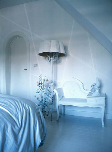
Ta-Da!  Laser-Light kicks kelly green's ass!  To understand how amazing and fabulous this looks in real life, please take the awesomeness of this picture and multiply by eight hundred thousand, give or take.  It is seriously out of control.  Do you want to see more pictures?
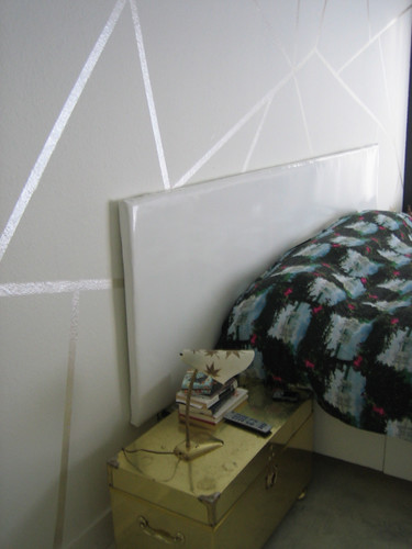
A close up.  Don't worry, we're shopping for new lamps next.  (I will be taking Camilla's advice and finding some with black drum shades)

Doesn't the dog bed just make this picture?  What about the crappy bathroom door that's about to be replaced?  Ok, Ok, focus on the wall... j'adore?

last one, promise:

Once Erin comes out of maternity leave, project #1 is to have her take some decent looking photos of this joint.  You'd think I could have at least photoshopped myself out of the mirror.  lazy lazy Karly.

This project was actually super simple despite my gigantor walls, from start to finish (including clean up) it only took about 5 hours.  With all that extra time left over, I decided to tile my living room fireplace.

WHAT?!  HUH?!  But, Karly, you've been indecisive about tile for months!

I know, I know, but Friday night I was having cocktails in Hope's back yard when I spotted a stack of white marble 1/2 inch tile going to waste on her porch.  Apparently it had been given to her roommate who never got around to doing anything with it.  A few drinks in and I was ready to end my tile misery and make an offer:  $3 a sheet.  Done and done.

If I were to search the world over and could have my choice of tiles, would I pick this?  No.  But is it 800 times better than the bare fireplace I've been living with for the last year?  Can I get a hellz yeah?!

Here's a close-up:

It's marble, it matches my room, and it shimmers, so I'm happy with it.  Oh, and it was dirt cheap, so I'm really happy with it.  I did some web sleuthing and found out that in the real world it costs $11 a sheet here, still pretty cheap.

I have visions of finding the world's most perfect tile one day and replacing this but until then I don't have to hang my head in shame when the first thing people see when they walk in my house is a bunch of junky drywall surrounding my fireplace.

So, there you have it, my weekend in a nutshell:  cocktails and decorating, what more could a girl ask for?

PS. stick around this week as we have some badassical guest bloggers in store:  tomorrow Andrea from House of Slappy does a fantastic (I mean really fantastic) artist roundup; Thursday, the always lovely Tula of Whorange brightens up the joint with my favorite palette; then Friday, it's lame old me again wrapping up the week.  Come on back now, ya hear?
Help Me Decide, Pleeze

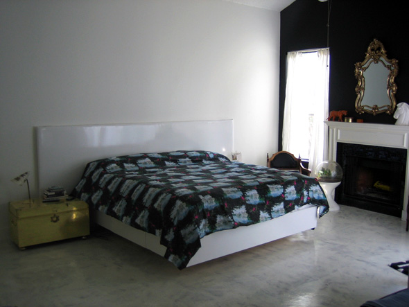
You dudes may remember the bedroom makeover I started a hundred million years several months ago.  Well, we were moving right along, then I got busy with work so the project got put to the side for a bit.  I'm ready to wrap it up now but I am at a MAJOR impasse:  I can not decide what to do with the walls.  I have one black wall, which I love, and the rest are white, also great.  So, what's the problem?  I want to do something to the white walls to make them a bit more interesting and to make my headboard stand out.  Let's start with a pic of the room now:

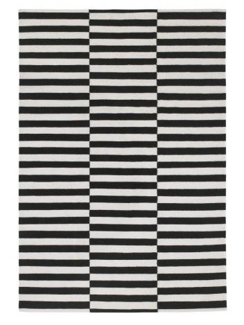
Sorry, I'm no Erin so the picture isn't so great.  The curtains are going to be rehung a few inches higher, art and lighting are still being picked out, and I'm thinking of getting this rug for under the bed:

Yes, we have all seen this Ikea rug before.

I thought doing something simple like this on the walls would be good, but I'm not sure the headboard will stand out enough:

I don't have to do a laser light show, I could vary the shape:

Or should I do something with subtle black lines to tie in the black wall?

I'm really open to any and all suggestions, even if you want to tell me to paint the whole thing kelly green (which I probably won't do, but girl, I will listen!)

help!!!!!

Erin's Extreme Kitchen Makeover: Panic Edition

I wish I had a cyber tour bus to drive in front of my kitchen, just so I could drive it off, thereby making the big reveal dramatic! and exciting! I would jump up and down -- propelled by the overwhelming spirit of joy and gratitude -- screaming and crying about how amazing it is, and about how getting a new kitchen has changed the very core of my being. But that would be untrue, because (let's face it) macaroni cooked over a bunsen burner in a dorm room is the same as macaroni cooked on a brand new stove in my pretty new kitchen. But that don't make it any less pretty.

Remember when I first enlisted your help with my junky kitchen a looooooooong ass time ago?

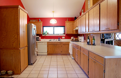
erin's kitchen

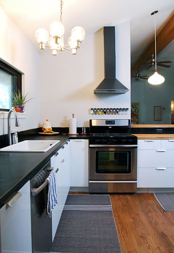
Yes, the red is very charming (unless you have to live with it), but everything else in the kitchen deserved to be burned in a pressure treated blaze of glory. Trust me, it was a LOT WORSE than it looks in my awesome picture. Well, a mere six months and 10k later -- with only one week to spare before the baby is due -- it looks like this:

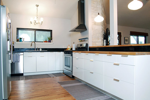
erin's kitchen ikea

I know, I know! You miss the tile and the bank of head bonking cabinets, the chipped almond formica and the spectacularly filthy appliances, but at least the rugs are cute, right? In all seriousness, this was crazy hard to shoot because the light was not cooperating and the paint wants to read as brown instead of gray, but hopefully you get the idea.

erin's kitchen renovations

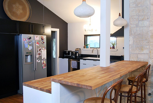
We still have a lot of trim issues to deal with and loads of accessorizing to do, but it's 95% done! Hooray! And despite what must be universal hatred of barstools, I love that we have some extra seating near the kitchen instead of wasted space on the living room side, like we had in our old kitchen. Plus, you have to admit that my vintage Thonet stools are pretty fly.

erin's kitchen ikea

Hallelujah, you can even see into the living room without busting your head open on a fortress of low hanging cabinets! Downside: I have the sudden urge to replace those hideous ceiling fans, STAT! Any recommendations?

erin's kitchen ikea

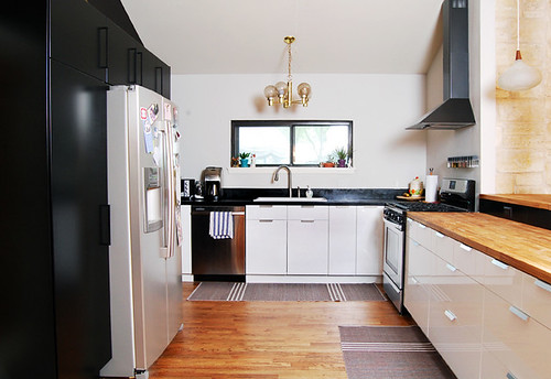
So, what did we do in here, anyway? I detailed the floor renovations a while ago, but you can read about them here. We yanked out all the old oak cabinets and mounted them in the garage (whee! extra storage), then replaced them with Ikea Abstrakt gloss white cabinets, and Ikea Applad black cabinets mounted to form a pantry wall.

erin's kitchen ikea

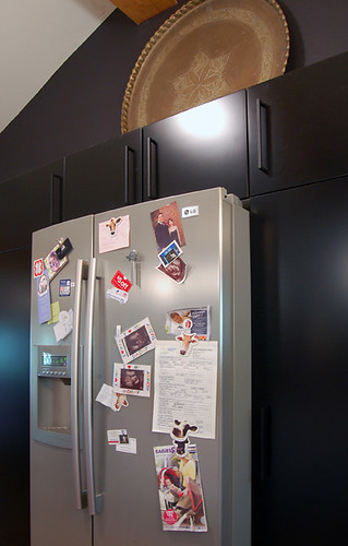
So much better than the floating fridge situation we had before! Oh, and surprise! I am the kind of person who sticks stuff all over the refrigerator. Hunny Bunny hates it, but how else will I know where to find my Babies R Us coupons? What do you think of my crazy Moroccan brass tray up there? I know it's kind of passe to stack stuff on top of your cabinets, but because our room is vaulted, it felt really naked without something...

erin's kitchen ikea

The peninsula was ripped out and HB built a new, taller wall for the bar to anchor the cabinets onto. He and Matty bear also tore out the old post and replaced it with a smaller, dry walled post. The counters are Ikea Numerar in oak, and the backsplash is soapstone, which Matt installed. Karly bought the vintage Danish pendant lights on Ebay and decided they didn't work for her. Bonus! They are perfect in my house. I got a new stove on sale at Lowes, the Datid hood for half price at Ikea, and I am unnaturally obsessed with our new Ikea spice rack. Now I just need three more spices to fill it...

erin's kitchen ikea

On the sink wall, Matt installed a soapstone tile countertop in a very labor (and dust) intensive process so that the countertop looks like a slab. No grout, and half the price! He did a super excellent job, and if you live in Austin I highly recommend you contact him for all your handyman/renovation needs.

We bought a Kohler cast iron sink that has a very low divider, so it's kind of the best of the single/double sink worlds. Love it! The faucet is also Kohler, and the dishwasher was on sale at Lowes. I had the vintage light fixture already and it's ok (I like the brass), but I think I could do better. Someday. Maybe. Oh, and the reversible cotton rugs are from Ikea, of course.

erin's kitchen ikea

The window wall feels a little unfinished, so we're planning on putting up a couple of shelves where I can display cute dishes and whatchamadoodles. What do you think: glossy white? black? or butcherblock? Who knows when we'll get to it, since we've only got a week until the baby is due and still need to clean renovation dust out from under the furniture, but we can dream, right?

So, that's it for my kitchen tour. We hatched a half baked plot in November of last year, started gutting in January, and "finished" just days ago. I think our original idea was to slap some paint on our ugly cabinets and call it a day, but I'm glad we took the advice that many of you gave us -- which was to rip it out and go for it. Including the appliances (except for the fridge), the floors, counters, sink, hardware, cabinets, lights, paint, and Matt's labor, we came in at around 10k, which was pretty close to my original estimate. It took the short side of forever to complete, but because Hunny did most of the work himself and Matt helped out a lot, we were able to spend most of our budget on materials instead of labor.

So far, we're super happy with it, but I'll be sure to let you know if any of the walls fall down...