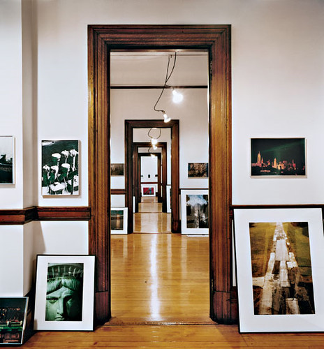
For weeks I've been filing away little bits of this 'n' that for an ultra mega multi post on industrial style. Perhaps because there's a cloud of impending financial ruin hanging over the head of almost every person nationwide, sorting through my tangled web of ideas is somehow more than my distracted brain can currently handle. Then I can across photographer Jay Maisel's UNBELIEVABLE apartment entire building that he owns in New York City, featured in New York Magazine. Not only is it possibly the greatest real estate score in the history of the universe, the 1898 building retains an aura of industrial optimism, of hope for the future in a time when The Captains of Industry had not yet evolved into first class Robber Barons. Read on.

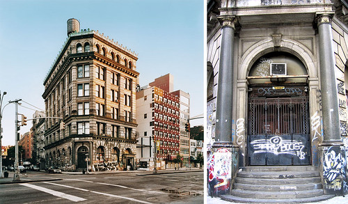
Maisel purchased the entire 35,000 square foot ex-Bank of Germania 42 years ago for $102,000. No, I did not leave off a zero or two. If that seems like a financial windfall -- it is. Real estate experts estimate 190 Bowery to be worth at least $30 million, and there are rumors that Maisel was once offered $70 million for it.

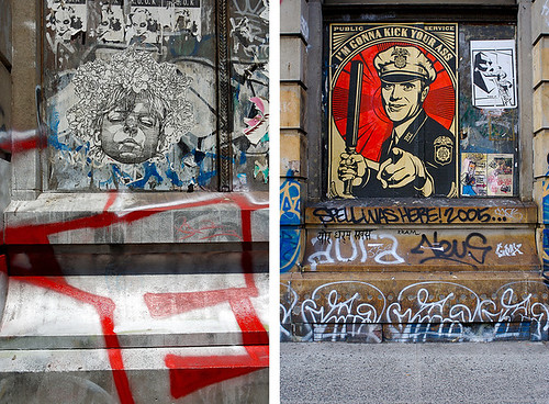
He didn't sell, and currently only he, his wife and daughter live there. That's 3 people living in a 35,000 sq ft building in the middle of New York City (!). But it's also 3 people to upkeep an enormous piece of property, and graffiti is but one of the many hurdles they face. There are minor issues such as air conditioning, heating, window repair and so forth. Since the building is on the Historic Register, apparently getting building permits is nigh impossible. That means it's DIY or die.

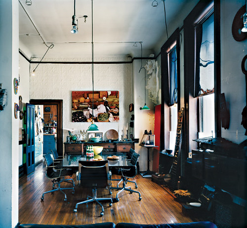
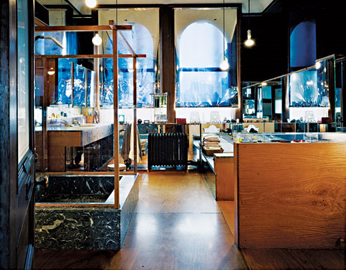
What makes this place a magical wonderland (besides the sheer fantastic lunacy of it all) may be the aesthetic decisions cobbled from relatively limited resources. Necessity is the mother of invention, and I love the exposed fixtures, back to basics chrome bars, sleek finishes and natural materials. Everything is functional and harmonious.

There is an agelessness in the melange, the mix, of turn of the 20th century industrial and the simplicity of newly added necessities. Nothing is overdone because it can't be. There's too much to do.

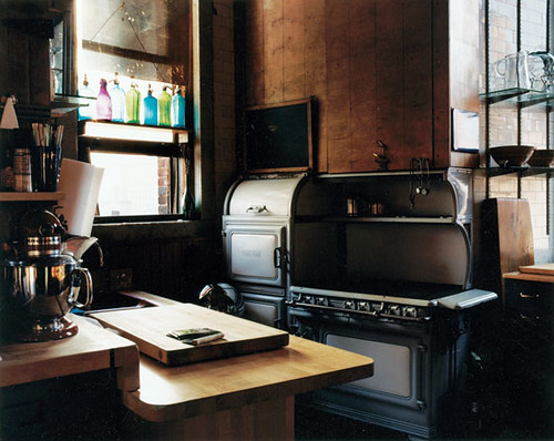
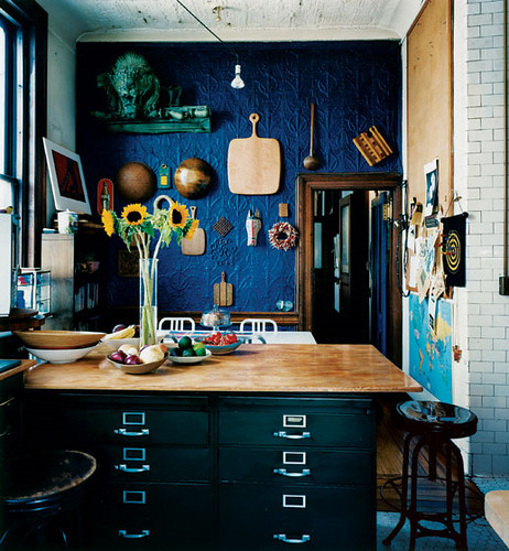
A painted wall becomes an exercise in luxury in a space where daily endeavors run more towards maintenance than decor. All of the recycled furnishing -- the flat file tables, the laboratory stools, the old and beautiful stove -- are charmingly zany but right at home. Not a Saarinen table in sight. It's so utilitarian that it's almost shocking in today's culture of adornment.

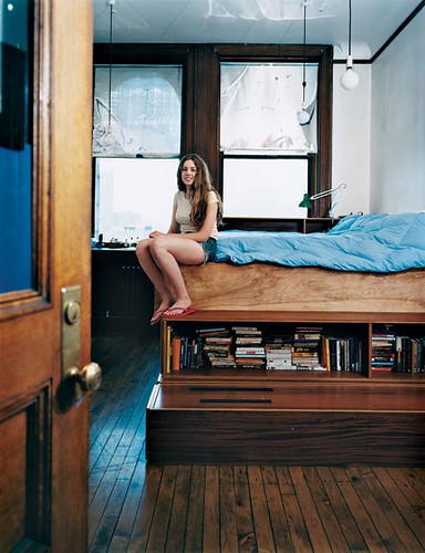
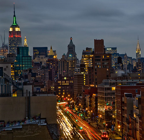
He even built his daughter a platform for her bed so that she could watch the skyline at night. And as this image from a student at one of Maisel's photographic workshops shows, what a skyline it is:

Many people thought that 190 Bowery was vacant because of its exterior neglect relative to the shiny new shops springing up like mushrooms on Bowery. Photos of graffiti from nizno's Flickr stream document an everchanging panorama scrawled upon the sides of Maisel's home.

But I feel like there is beauty in a place that just is and doesn't have to be perfectly new and sanitized for our hyper-consumerist culture. The interior speaks to the same philosophy of respectful dilapidation.

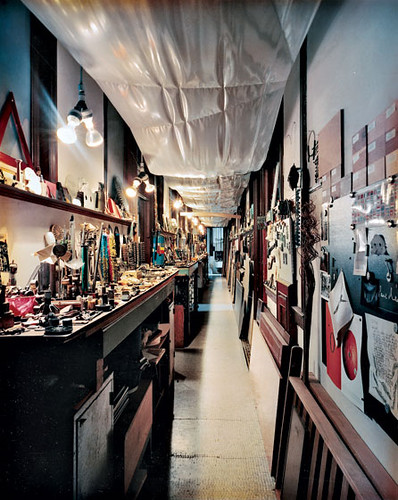
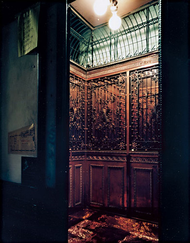
This tiny portion of Maisel's work space shows greenhouse-like ducts overhead that carry cool air across the room. And the original elevator that continually runs up and down 12 flights of stairs is still intact -- and has only broken down once or twice.

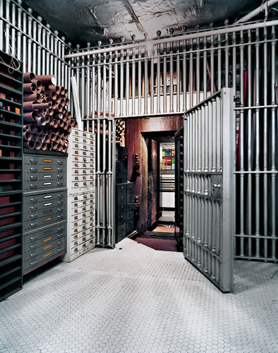
I love that so much effort went into making a functional grate so beautiful. There's a sense of pride and respect that has -- for the most part -- been replaced by cheap materials and stylized muzak. Neither of those things are welcome industrial improvements, aesthetically speaking.

And of course, there is the sheer magnitude of space, unfathomable in a nation where most of us think that a tenth of the square footage would be enormous. Population density has driven the dream of owning one's own personal frontier to the brink of extinction.

NY Magazine says that the basement bank vault alone -- where Maisel secures his completed works -- could easily serve as a spacious studio apartment. And in fact, parts of the building have been rented before and may be rented again. Most notably, Roy Lichtenstein once kept a floor as an art studio, and the bottom floor, which houses an indoor basketball court, may be rented out again.
Part of me might feel resentful about breaking up my kingdom and sharing it with strangers, but the pragmatic part knows that Maisel should do whatever he must to pay his taxes and keep 190 Bowery livable.
Whatever you do, Mr. Maisel, please don't ever sell it. Not for all the money left in our dreary, washed up economy. Alhough it may be tempting to take the money and run, that would be like selling a piece of the American dream, and now -- more than ever -- we need it.
