Everybody's Working For the Weekend

I'm totally jazzed, brimming with a new found sense of hope and purpose, so I've been cleaning and rearranging furniture like a crazy lady and -- oh, talented readers -- I find that I need your help once again. Yes, you did such an AMAZING job commenting on my dining room woes that I thought I'd enlist your help with an even more dangerous mission, one fraught with peril and certain death at every twist and turn. Ok, just kidding about the death thing. But seriously, I have been putting off redoing the kitchen for nearly a year and a half because I want to make sure I get it right. Do you think you can help me? Great! Let's get to work!

Here's a panorama of the dining/kitchen area. If you click on the link, you can look at it in a more useful size:

kitchen panorama

Hopefully it's pretty apparent how this wonky house is put together, but basically, the two red window walls face each other. There are lots of beams everwhere, and 500,000 cabinets. Yes, that many.
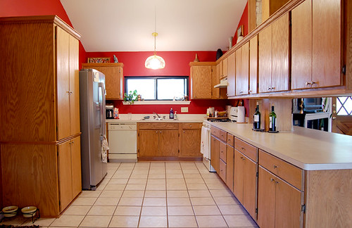
kitchen

Note the gigantic pantry with hideous dental molding. And there are even more drawers behind the refrigerator... So, anyway, the problem is that there might be too many cabinets. At eye level. Which would be swell if they were on a wall, but they're not. They're floating over the bar like a levitating forest.
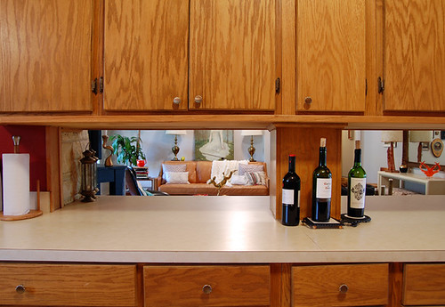
kitchen

This is the view to the living room if I duck my head down six inches, and I'm only five foot one. Poor Karly and Hunny Bunny practically have to get onto their knees if they want to see into the living room.

kitchen

Here I am with my chin on the counter, calling over the Great Divide. I feel like I'm at a peep show.

So, I don't really like all those cabinets getting up in my face, calling me short and telling me what a messy cook I am. Oh, and wait until you see what they look like on the other side.
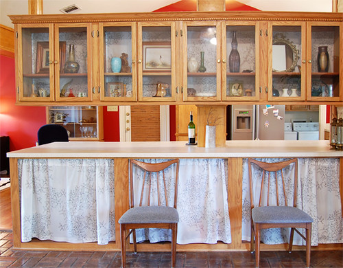
cabinets

That's as good as they're ever going to look. I got sick of looking at the acres of wood grain, so I hung some Ikea fabric over the built in shelves (read: crap repository) and lined the glass shelves with the same fabric. Half that junk is getting sold in our upcoming garage sale extravaganza, and I am truly loathe to buy stuff just to fill a dead space. Speaking of dead spaces, how about the end of the bar? This is the first time that side of the formica sea has seen the light of day in quite a while. Usually it's just a landing pad for junk mail and keys. Also, what good is a GINORMOUS bar if you can't sit at it? If you tried to sit here and eat, your nose would touch glass. So, if I rip the cabinets out, we can take the undermounted shelves out (which go back a ways) and carve out space for an eat in bar. Easy huh?

No. There's another problem. The Beam:
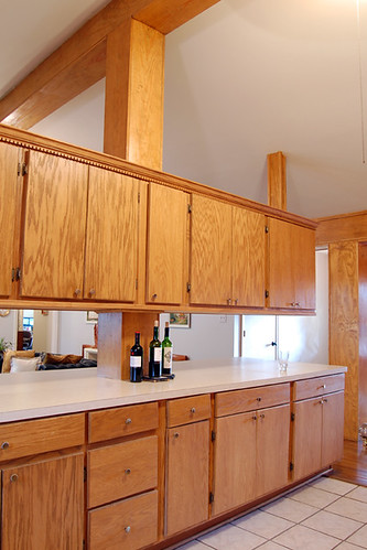
kitchen

The one that goes all the way down to the bar (carefully crapoflaged by wine bottles) is load bearing, so it has to stay. Yep. The janky one at the end of the bar that goes to the ceiling is just to keep the cabinets from collapsing under their own fat ass wood weight. I've really got to stop feeding them so much! Anyway, if I rip the cabinets out, will The Beam look weird, just floating there?

And what do I do about the wall space?

kitchen

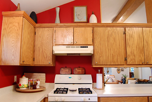
This is the window wall with potentially salvageable cabinets. The ugly corner could be fixed by using some surplus doors... but do I really want to do that?
kitchen

Because I can't save the cabinets over the stove (and Santa better be bringing me a new stove because this one is a health hazard). They don't end at the wall, so there's really no graceful way to keep any cabinets but the pair that flank either side of the window.

I was thinking I'd rip out all the uppers anyway, and do some kind of shelving. My plan was to keep the lower cabinets oak, re-oil them and get some new hardware, buy matching oak shelving for the wall space, and maybe throw in a few stainless rails here and there for spices and whatnot. But I have to have something to mount my hood underneath (no, I cannot afford a freestanding hood).

Down to the brass tacks: My budget is $1000. I know many of you will think it can't be done, but it has to be. I'm keeping the formica for now. (Even though I want soapstone, I have 75 square feet of countertops, so it's gonna be formica for a while.) I'm not buying new cabinets, but I could paint them if everyone thinks they're truly hideous. I'm getting a new range and dishwasher in stainless, and they won't be included in the budget. But I need a new faucet, shelves, hood and labor, which will be provided by Hunny Bunny and Karly's hubby (for a fee).

So, what do you think? Should I rip everything out? Should I paint, or leave the cabinets natural? What kind of hardware would you recommend? What kind of shelving and where should it go? Am I crazy for even thinking about this because it's going to destroy the resale value?

Here are some kitchen images for inspiration (and also just for pornographic purposes):
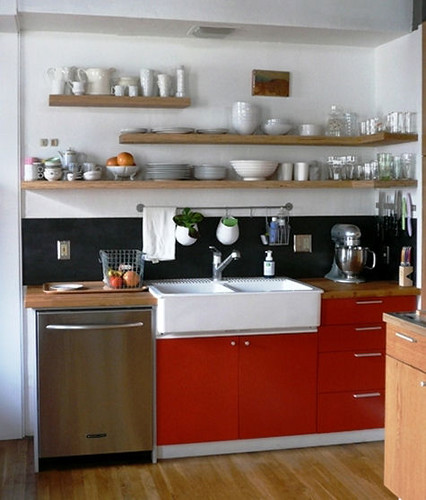
alyson fox kitchen

Fellow Austinite Alyson Fox's newly renovated kitchen featured at Design Sponge is a definite source of inspiration. She even has some similar Beam issues:
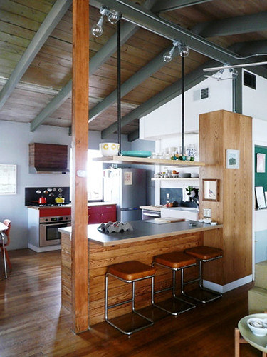
alyson fox kitchen

Habitually Chic did a post on open shelving and featured these kitchens:
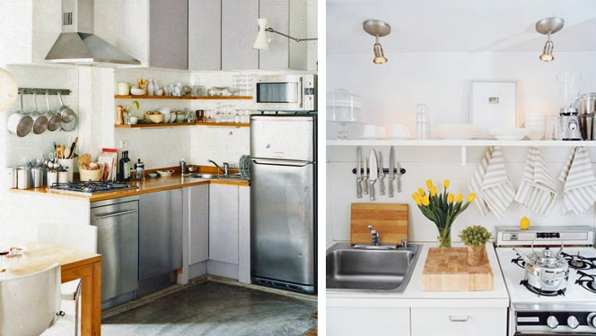
habitually chic kitchens

Here's a lovely open bar and no upper cabinets seen at If The Lampshade Fits (in another drool worthy kitchen post!)
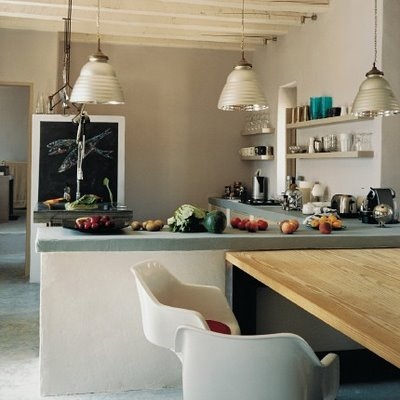
if the lampshade fits

Some lovely and simple pictures via Domino:
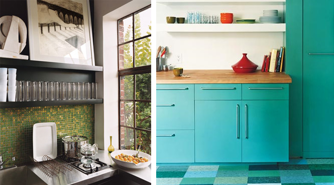
domino kitchens

I found this one at Door Sixteen, in a great post on unfussy kitchens (and you can also see Anna's own kitchen renovation over there):

door sixteen

So that's it for the roundup. I hope each any every one of you is formulating a master plan to save my kitchen from its hulking wooditude!

Whew! I'm tired from all this what iffing. But tune in next week for an interview with my Benjamin Moore paint buddy, Sanders, and all his colorful wisdom. Won't it be nice to have someone give information -- instead of me taking it  -- for a change?

But I really appreciate all your commenting love, so thanks in advance!

ObamaNation

OOOMG!  OOOOMG!!  It's finally here, and you bitches better be reading this post from your iphone* (*or equivalent) while you stand in line at the election booth.  Unless, of course you're a good little American (but not a REAL American) like myself who voted weeks ago.  Good job. Anyhow, it's no secret who we here at the DC headquarters are rooting for.  Hey, we make about $250,000 less than the required amount for extra taxing, so, yep, he's our man.  I know you've all seen 8 hundred trillion pieces of Obama propaganda, ushered in by Shepard Fairey's brilliant Hope poster, but stay with me here.  I think I've managed to uncover items 8 hundred trillion and one - nine for you to enjoy on this, hopefully, historic day.

This is an interiors blog, let's start with home decor:

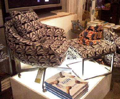
Obamottoman and Chair set from ABC Carpet and Home

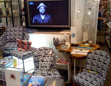
smaller chairs, for those living on bob the builder's sallary

The next photo doesn't have an obama picture or slogan anywhere in site, it's more of an observation.  The Color Association of America sites pop and political culture as it's main source of inspiration for their seasonal color trend selection.  It was noted that the lime green craze of the early millennium intentionally coincided with the release of the first Shrek movie; country blue of 2002 was ushered in as a nod to our nation's patriotism after 9-11.  Based on the above, I'm willing to bet dollars-to-doughnuts that the recent resurgence of Klein blue (which we have lovingly discussed ad nauseum) is symptomatic of our (HOPEFULLY HOPEFULLY) liberal-leaning populace:

This could be in the break-room of the DNC headquarters.

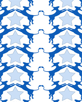
But, then again, they may want this wallpaper for their walls instead:

Democrat Donkey wallpaper available through TODAY ONLY at Given Campbell

They also have an elephant version, but this blog is totalitarian, so you'll have to cruise over there to see it.  Yo.

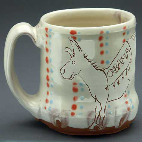
For a less Dramatic Obama-inspired influence, how about the best darn animal mug ever?

Ayumi Horie has raised 10,516.17 for the Obama Campaign with the sale of her lovely Obamaware.

The hand-made Obamanation craze has swept Etsy as well, which shows literally hundreds of Obama items (I didn't even bother seeing how many McWhatever ones they had).  Here are some of my favorites:

Clockwise from top left: Yo Gabba Gabba for Obama button by Etsy user Monkiss: Reppin' For Obama necklace by Etsy user Beebles; Democratic Finger Puppets by Mullishmuse; and Yes We Can Obama bag by Etsy user Belleslettres

Of course, my very very favorite Etsy item is this button:

Rescue Dogs For Obama button by Etsy user the dogcoatlady

The fact that I want this button has nothing to do with my very own pound puppy, Rowdy.  I just think it is straight-up hilarious.  Look at how scruffy that dog is.  HA!

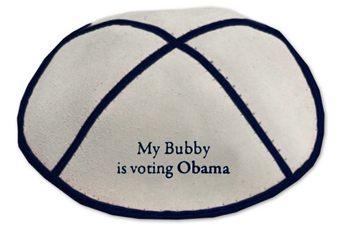
Let's take a look at more Obama fashion.  I know at least one reader down-under who will insist that her husband wear this next time they go to temple:

The Obamica available at Vanity Kippah

I am willing to support any measures she needs to take to get this hot little number on his noggin.

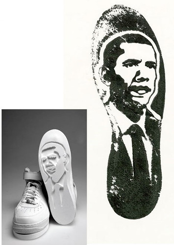
Incase you like your hair free to blow in the wind but still want to rep, you can always sport either of these kicks:

Air Force 1 by Jimm Lasser

Don't walk on sand all day?  Try these:

Obama Custom Air Force 1 sneakers (popular name, huh?) by Van20

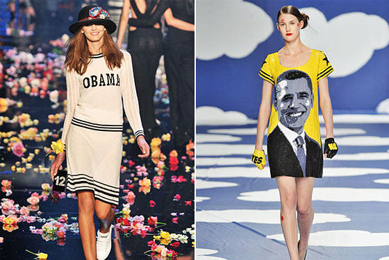
If you looking for less street in your Obama gear, try these dresses:

Spring 2009 looks at Sonia Rykiel, left, and Jean-Charles de Castelbajac.

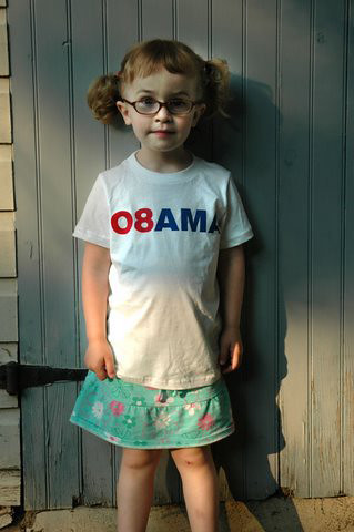
And for the littlest Obama fan:

O8AMA kids tee available at Supermarket

And finally, I've uncovered the last remaining piece of Obama artwork that you haven't seen:

Photoshop montage as seen on Freaking News

Let us all hope that this is a portrait of our favorite presidentS from Illinois.  Come on everybody, let's do this.   I really don't want to have to take all my campaign goods to the thrift store tomorrow.

Feelin' Fussy

I'm on pins and needles, people. Have bitten my nails into the quick. Stomach in knots big enough to anchor a billionaire's yacht. Election Day is almost here, but instead of pumping up the volume on CNN and turning my living room into campaign headquarters, I think it may be best for me to focus on something else right now, to go to my happy place. Yes, it's I Spy Art Day here at Design Crisis, where I bring you a roundup of interior design's latest muse. Today's special is the always interesting photographer, Adam Fuss.

adam fuss

Adam Fuss is one of those old school dudes that I can identify with. Instead of embracing the novelty of digital wizardry, Fuss goes back to basics by frequently ditching the camera altogether and dealing with the light sensitive properties of photographic paper itself. In the home of Pieter Estersohn, seen in New York Social Diary, this photogram of Estersohn's son Elio hangs as a super realistic, one of a kind baby portrait. Instead of capturing a representation of the baby, Adam Fuss captures the shadow of the baby crawling over the paper, and in a sense, he captures the baby itself (but not literally, because that would be illegal).

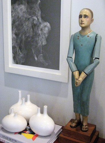
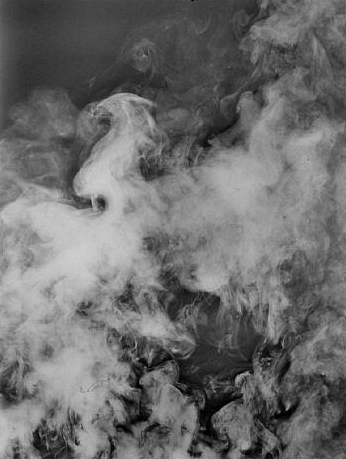
While Estersohn was lucky enough to have a portrait made for him, most of the pictures floating around the designosphere are of Fuss' black and white photograms of smoke.

fuss smoke

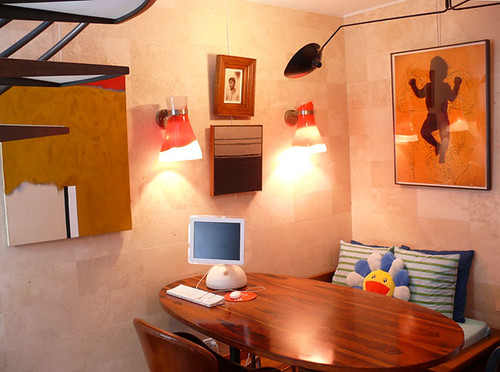
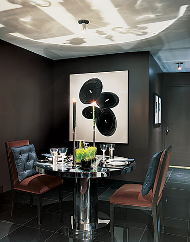
Donald and Phillip's amazing art filled home in San Francisco features this small Fuss photogram (courtesy of More Ways to Waste Time).

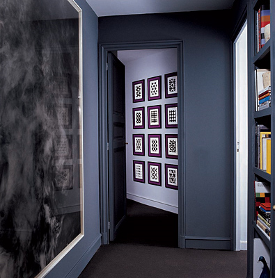
Generally, Fuss' pieces tend to be large in scale, so that they become a viewing experience where one is enveloped in the image, as seen in this gorgeous Paris apartment.

two for the road

To stand in front of one of Fuss' photograms of smoke is to stand in a whirling maelstrom of eddies and currents. Sounds like my stomach. So much for happy distractions!

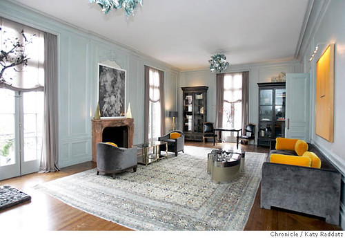
smoke and mirrors

All of Fuss' work is intensely aesthetic, seductive in both its delicacy and first generation sharpness. The print over the fireplace makes a lovely addition to this Smoke and Mirrors themed room designed by Steven Volpe featured in the San Francisco Chronicle.

Earlier works involved hanging bare bulbs on a string and allowing them to move, exposing the paper in a pattern of spirals, as seen in this home of Charles Allen, featured in Architectural Digest.

adam fuss

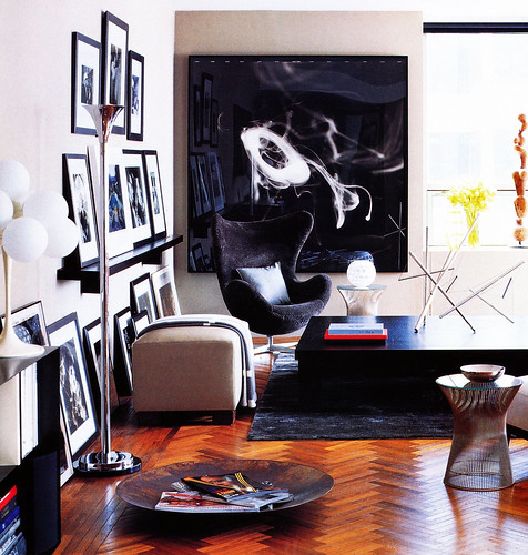
Fuss' black and white works may be particularly popular in the design world because they behave so minimally on the wall, as seen in this apartment featured on Habitually Chic.

adam fuss

It's like very elegant (and expensive) white noise. But I have followed Fuss' work for years, and he certainly didn't start out as a decorator's favorite. Many of his earlier works recalled death and decay, and a very studied interest in photography's unique ability to capture the "what has been," as philosopher Roland Barthes said.

adam fuss

These beautiful plants were pressed onto paper, exposed with light, and captured with a permanence that a real pressed flower can never emulate. It's the intersection of mortality and immortality, and it gets back to the basics of what photography initially set out to do: to preserve a slice of time.

adam fuss

This exact configuration of smoke only existed for the split second that it was illuminated by light. And then it was gone.

adam fuss

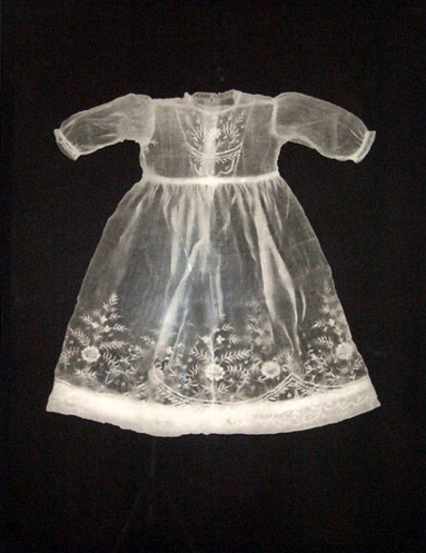
The images in his My Ghost series reference the impermanence of time and, consequentially, of life. A child could fit into this christening dress for a matter of weeks, perhaps, before she/he outgrew it. As the Greek philiosopher Heraclitus said, "Panta Rhei." Everything changes. You cannot step into the same river twice.

adam fuss

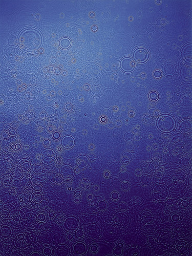
And raindrops will never fall in this same pattern again.

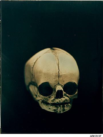
Recently, Fuss has begun experimenting with other forms of image making, taking up the Daguerreotype (at which time he became my hero, since I used to make them, too) as another way to create one of a kind images. The Daguerreotype was the Victorian's medium of choice, and its clarity was shocking to them (and still is - the sharpness of digital isn't even close).

skull

The Victorians famously used Daguerreotypes to record (in addition to more conventional portraits) images of their deceased children, posed as if sleeping. Perhaps they were creating an alternate universe where the child might have lived. Or perhaps the images acted as reminders that nothing lasts forever. Fuss has a similar predilection for Memento Mori and its imperative to seize the day.

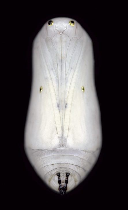
Once again changing his method of production, Fuss photographed butterfly chrysalis and enlarged them to six feet tall for his latest series.

chrysalis

As iconic symbols of transformation and metamorphosis, they are compelling both in their stasis and potential energy.

adam fuss

Fuss' photographs act as talismans, reminders of the past and its contrast to the present. And so they are also avatars of change. Nothing can stay the same.

Nor should it.

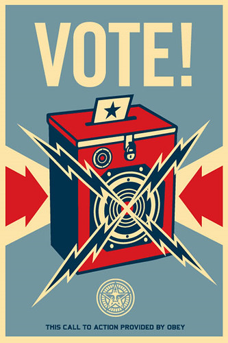
vote

(Art images courtesy of the artist and Fraenkel Gallery, Art Lies, Artnet, and Photography Now.)